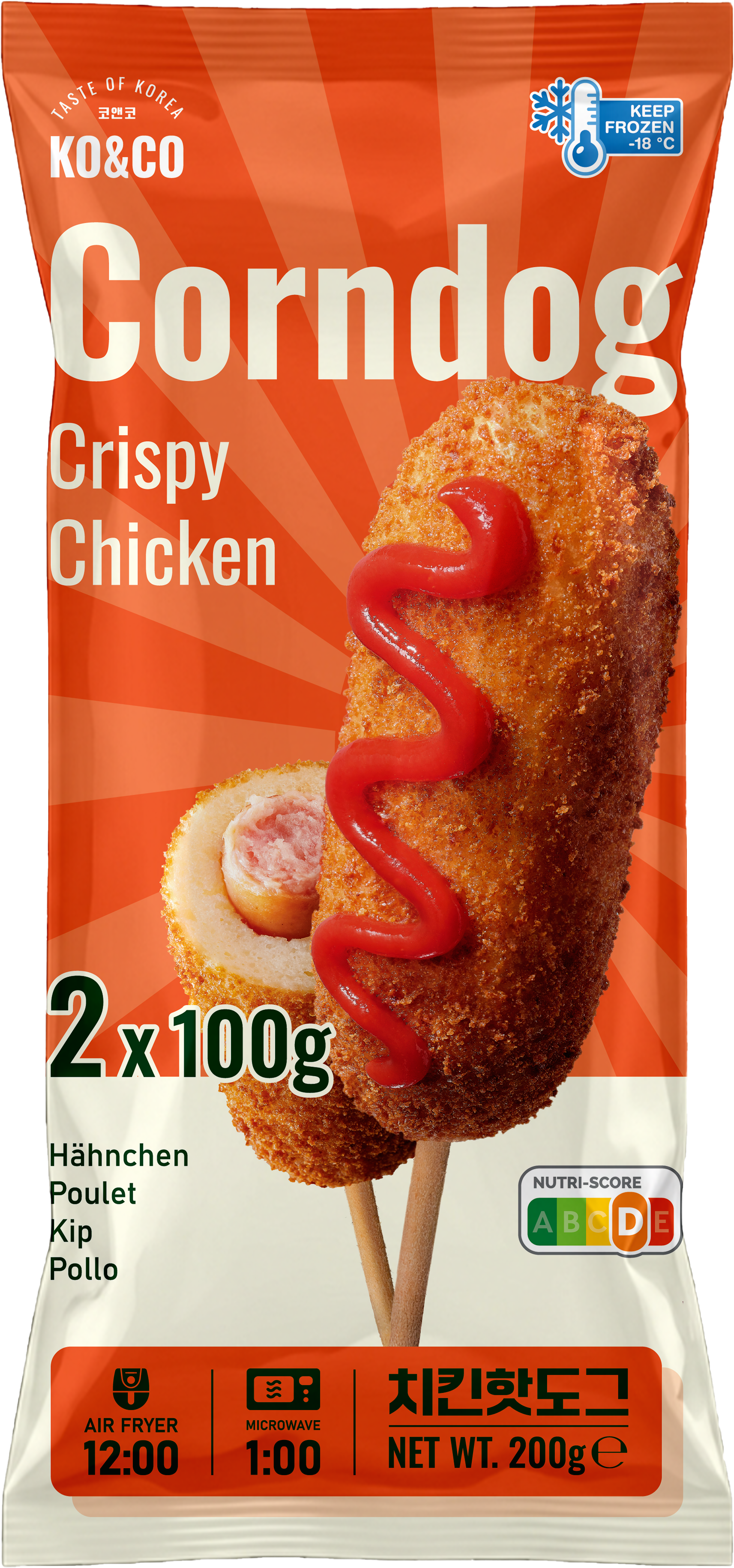
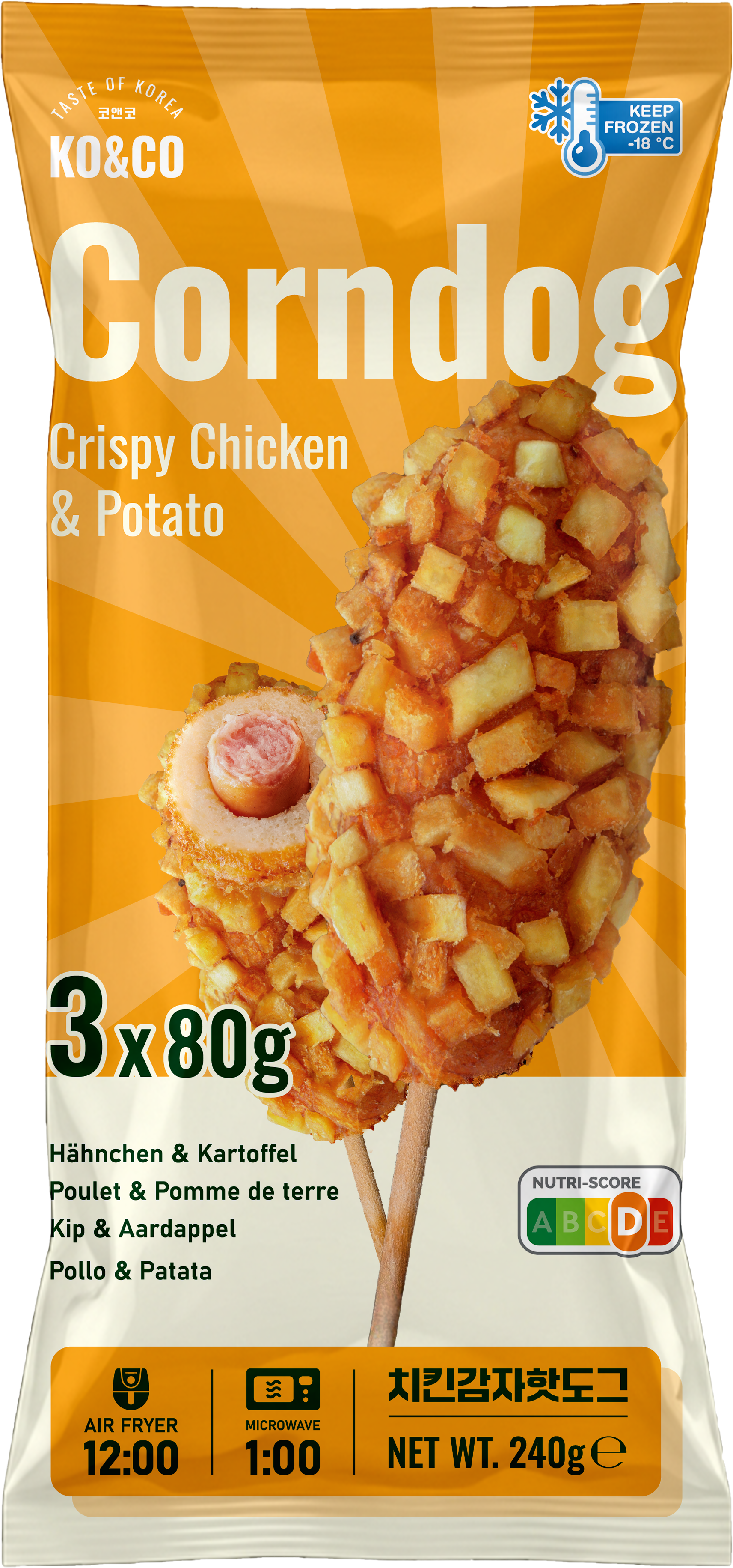
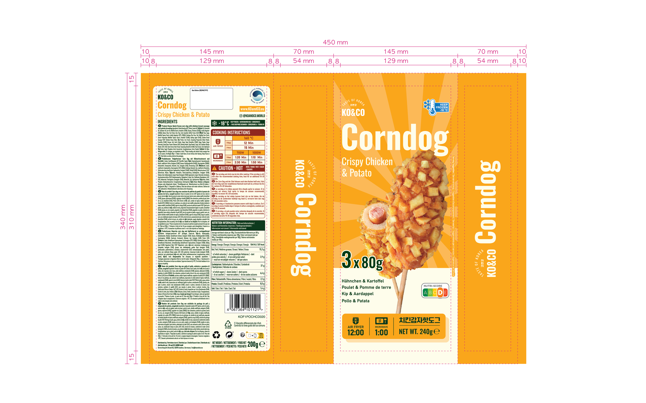
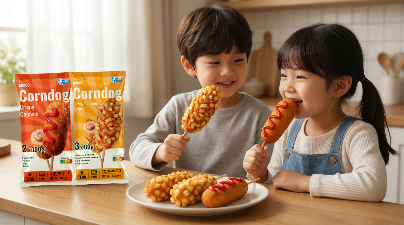
KO&CO Corndog
Package Design
Brand: KO&CO ("Taste of Korea")
Product Category: Frozen Savory Snacks / Korean Street Food
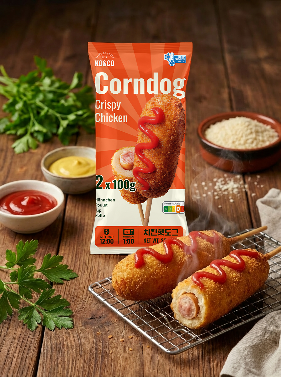
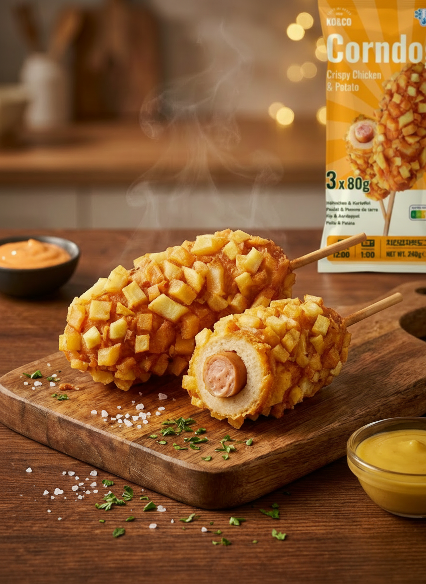
Deliverables: Packaging design for two SKUs (Crispy Chicken & Crispy Chicken Potato)
Role: In-house Graphic Designer for Product Packaging
Location: Aachen, Germany
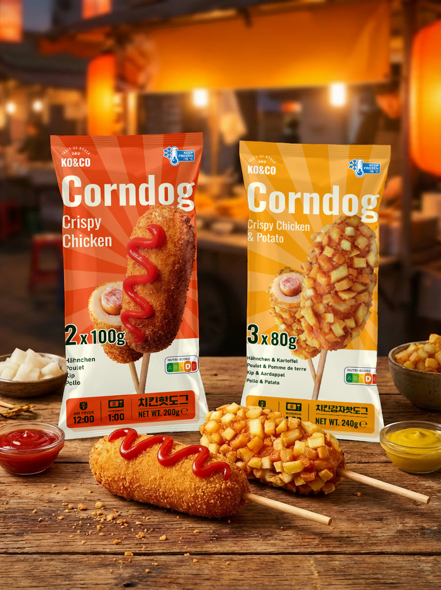
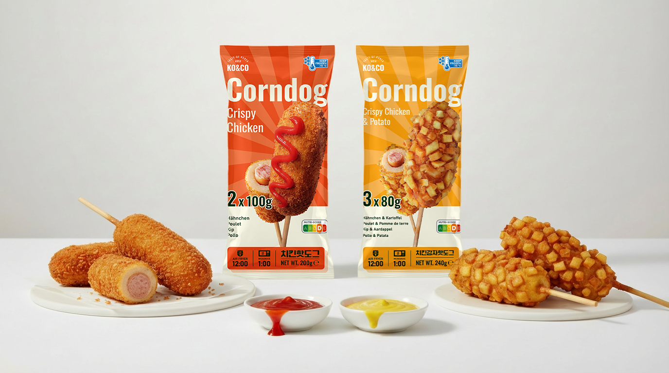
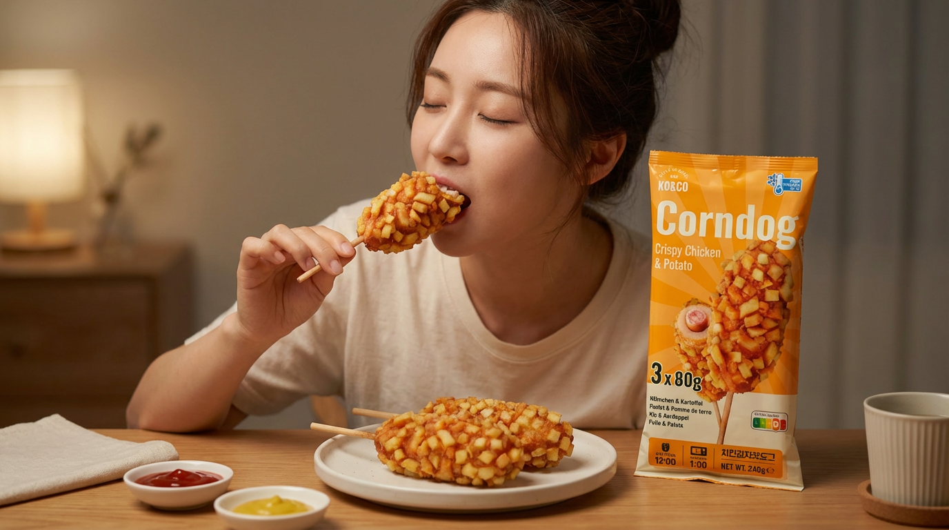
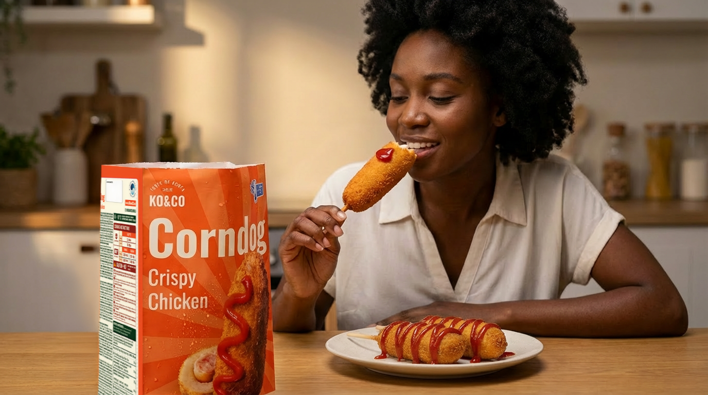
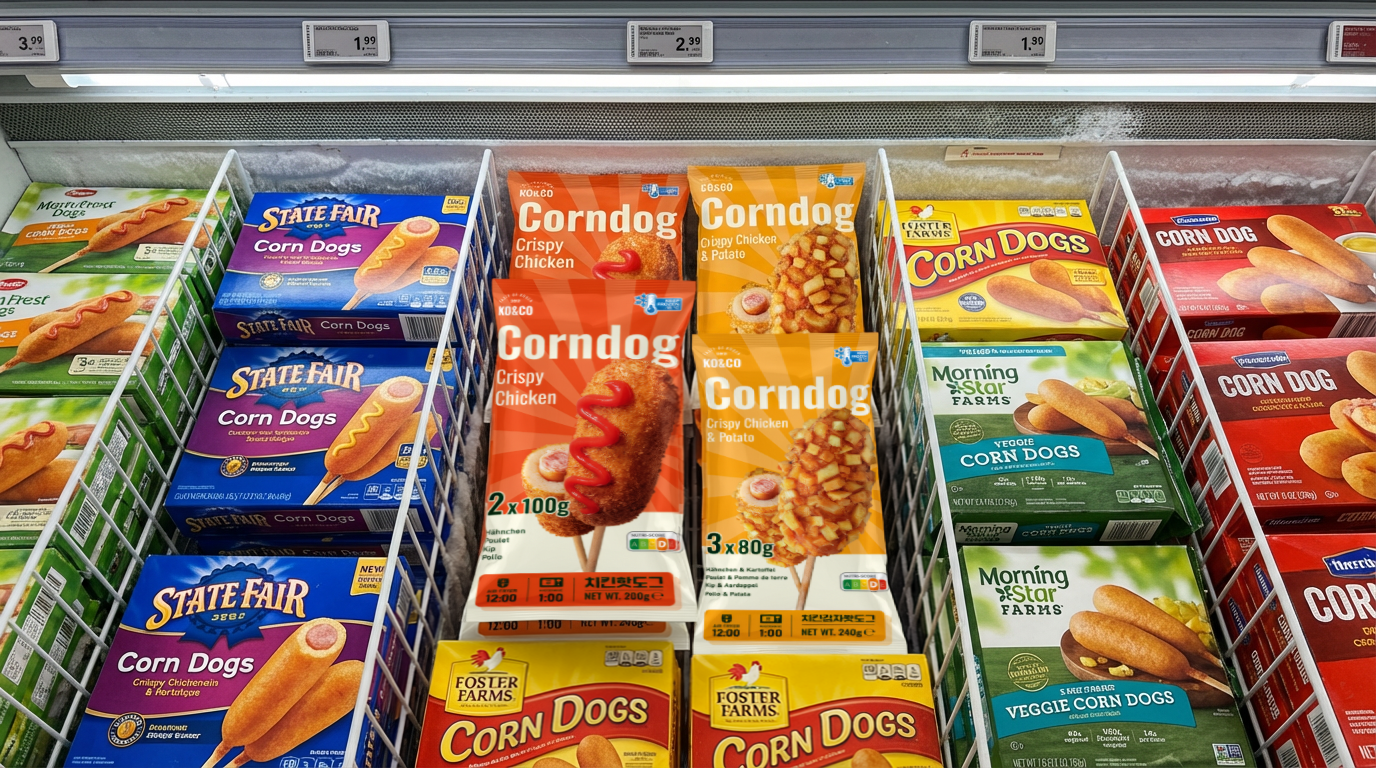
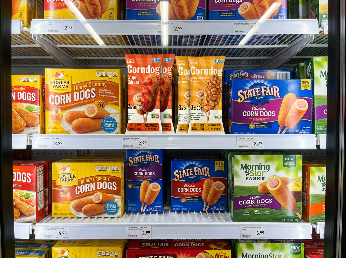
KO&CO aims to bring the vibrant energy of Korean street food into the European frozen food aisle. The primary objective is to design high-impact packaging that captures the authentic "K-Food" trend while adhering to Western retail standards. The design must pop visually in a crowded freezer section and clearly communicate the product's unique texture and flavor profile to consumers who may be trying corndogs for the first time.

Appetite Appeal
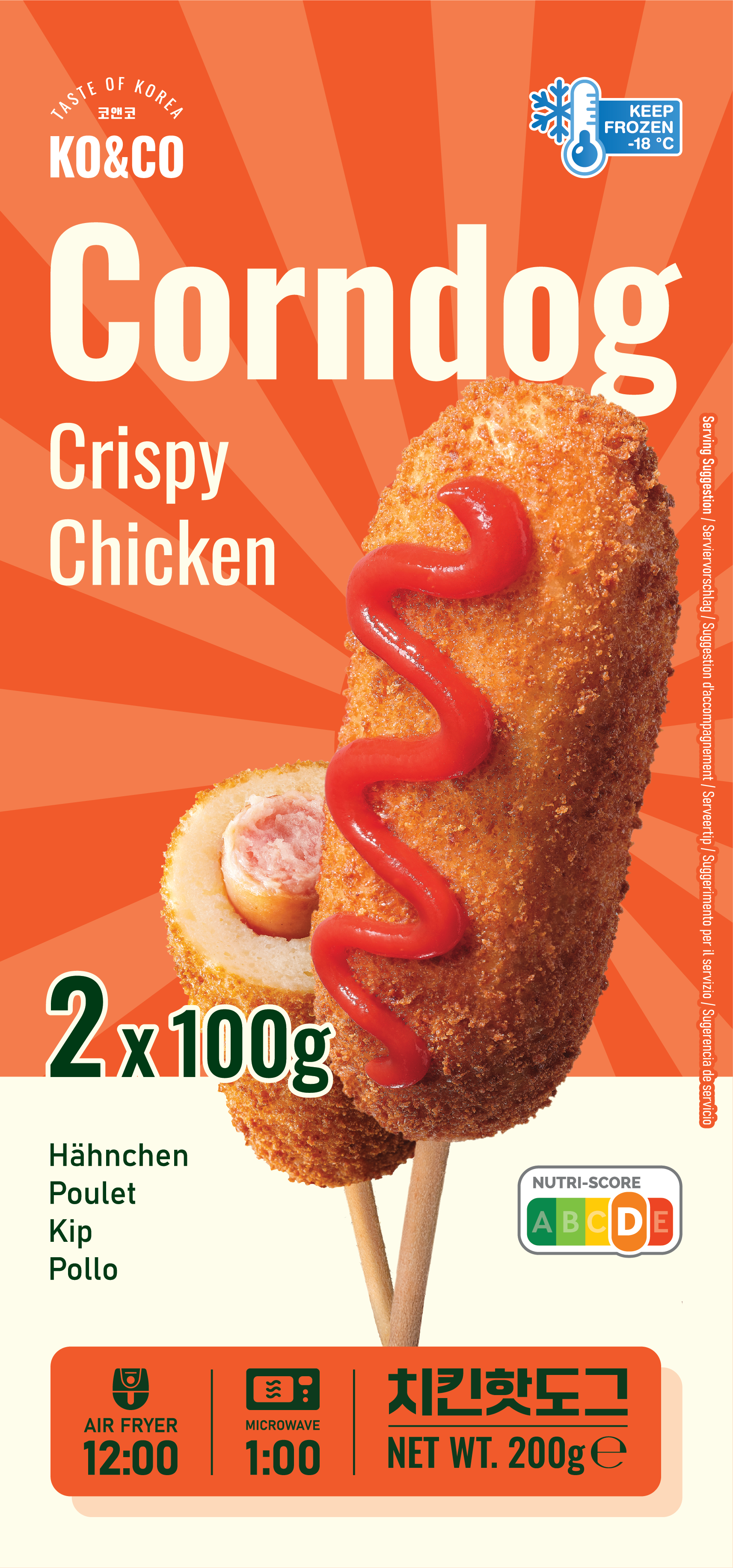
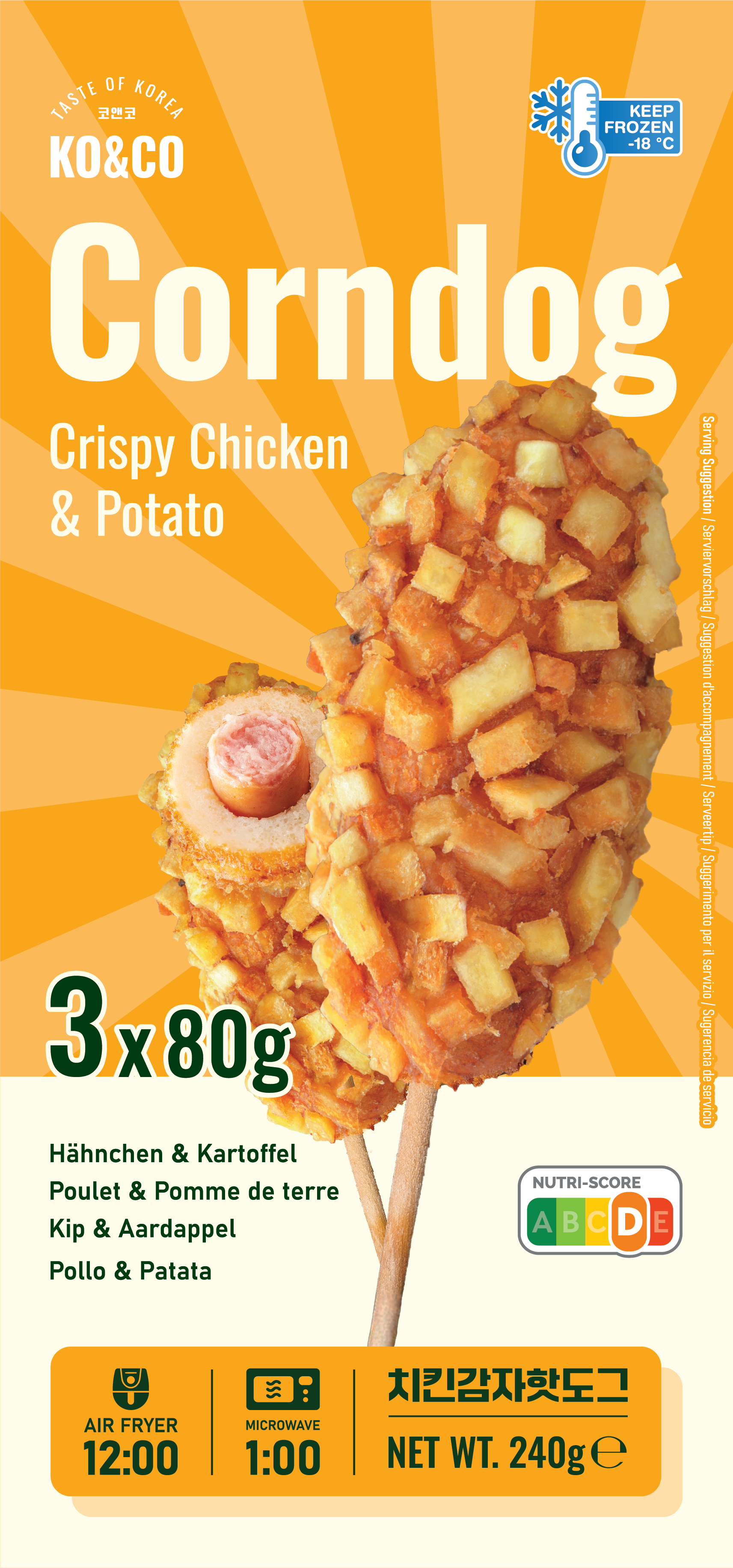
Since the product is frozen, the packaging must rely on high-quality photography to do the selling. The user needs to see the "crispiness" and the filling inside.
Differentiation: The design must clearly distinguish between the "Crispy Chicken" and "Crispy Chicken & Potato" coated versions while maintaining a cohesive brand family.
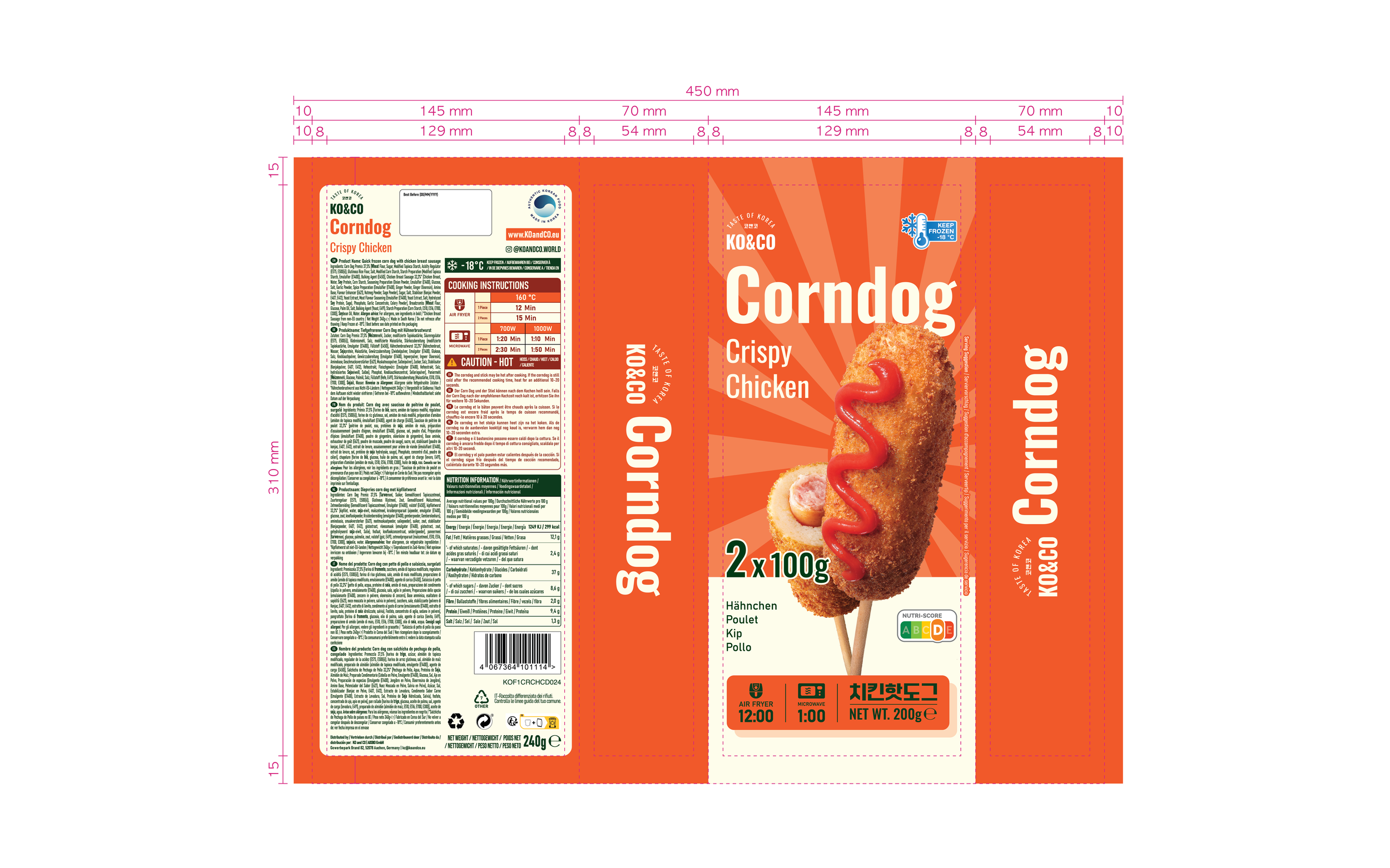
Bilingual/Multilingual Clarity: The packaging must legally and clearly display product names and ingredients in four languages (German, French, Dutch, Italian) without looking cluttered.
Product Design

Target Audience
Primary: Gen Z and Millennials familiar with Korean culture/food trends (K-pop, Mukbang culture).
Secondary: Adventurous foodies and busy families looking for convenient, quick-prep snacks.
Market: European Retail (specifically targeting German, French, Dutch, and Italian-speaking regions).

Visual Identity & Creative Direction
A. Color Palette & Mood
Base: Batter Cream (#FFFDEA)
Serves as the light, neutral foundation, mimicking the pale golden hue of raw batter or the clean canvas of the information panels.
Accents: Zesty Ketchup (#F15B2A)
Provides a vibrant, energetic pop of red, visually representing the tangy sauce drizzled on the product and stimulating the appetite.
Accents: Ballpark Mustard (#FAA61B)
Used as the dominant background color, this warm, golden-yellow hue captures the essence of classic street food condiments and fried textures.
Contrast: Relish Green (#003A16)
Offers a deep, organic counterpoint to the warm tones, used for flavor descriptions (e.g., "Hähnchen & Kartoffel") and nutritional badges to denote freshness.
Detailing: Dark Brick Red (#8f291f)
A deep, earthy shade used for structural details, weight badges, and critical information headers (such as "Cooking Instructions" or "Caution"). It adds visual weight and ensures brand consistency with the KO&CO Mandu product line.
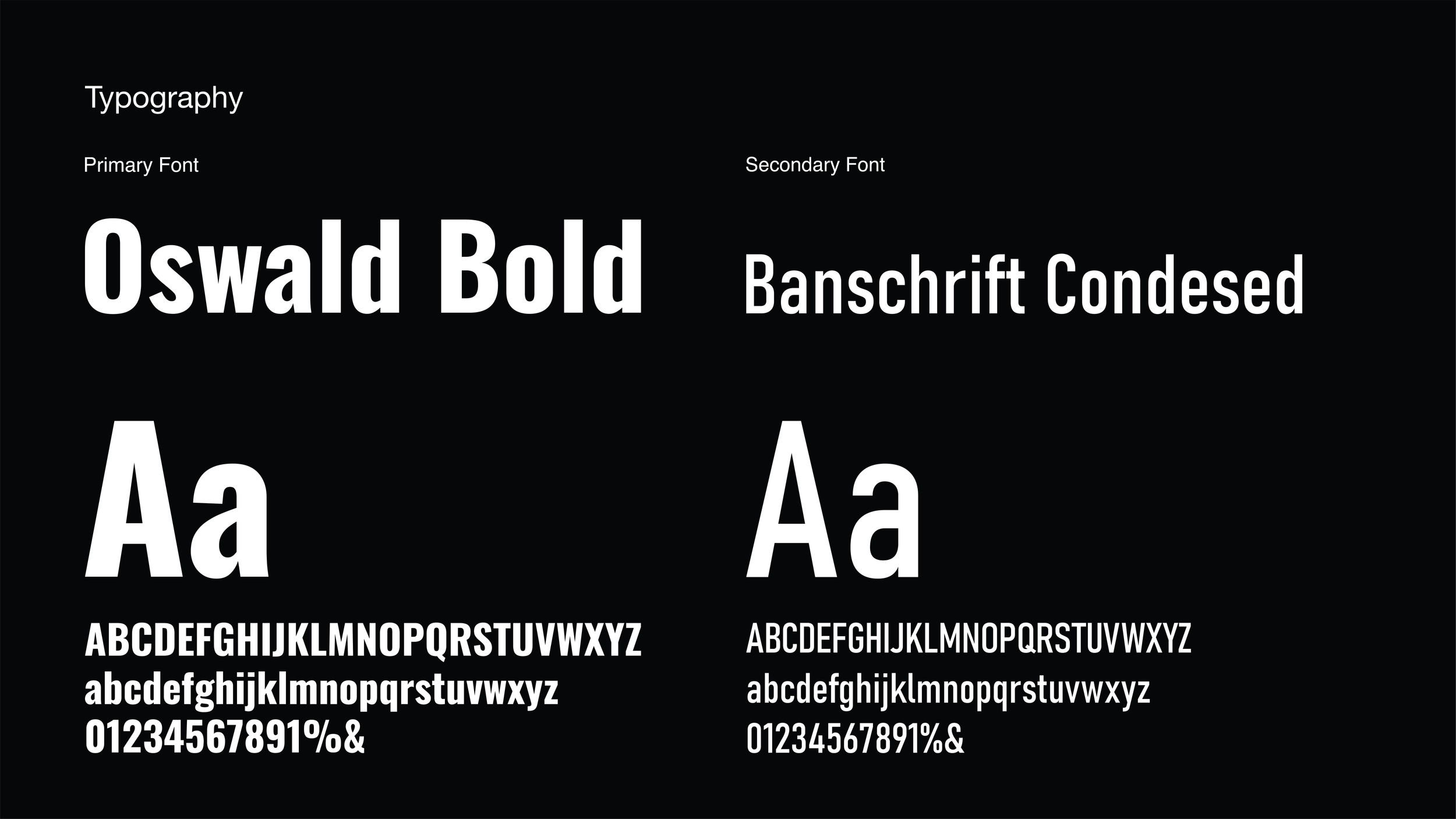
B. Typography
Primary Font: Oswald Bold is used for the main headlines to ensure maximum impact.
Secondary Font: Banschrift Condensed is utilized for sub-descriptors and secondary text.


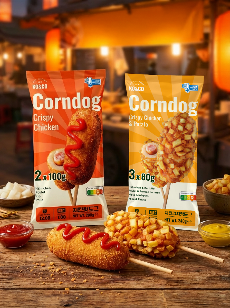
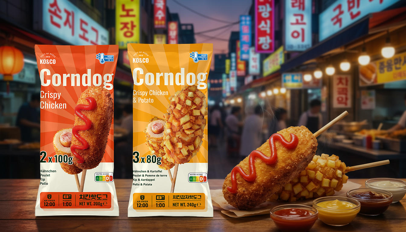


The final design successfully balances the vibrant, chaotic energy of a Korean street market with the clean, structured information hierarchy required for European supermarkets.
The use of color coding (Red vs. Yellow) allows for instant shelf recognition between the two flavors.
USED TOOLS