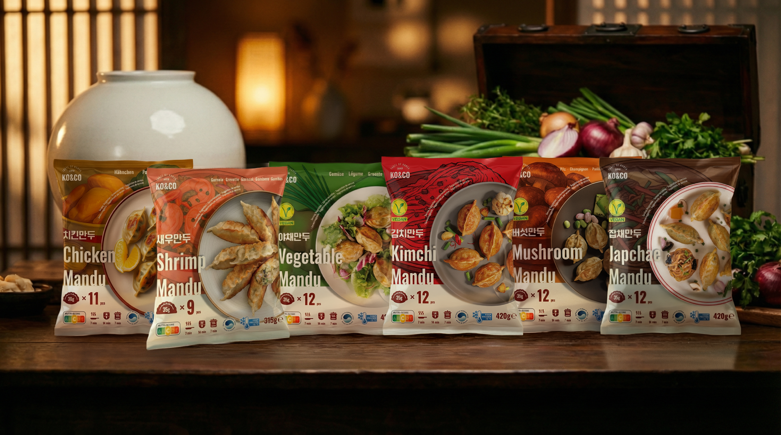
Project Overview
KO&CO Mandu Lineup – Strategic Packaging Redesign for European Market Entry
Role: In-house Graphic Designer for Product Packaging
Location: Aachen, Germany
KO&CO is a young Korean food brand poised to enter Europe’s highly competitive frozen food category. As a late entrant, the brand needed a packaging strategy that not only communicated product quality but also differentiated itself from a saturated field of Asian dumpling brands.
During on-site market research across major European retailers, I identified a consistent pattern: many Asian frozen products rely on dark backgrounds, ethnic motifs, and heavily stylized “traditional” visuals. While recognizable, these cues often blend on the shelf, making it difficult for consumers to distinguish between brands or understand product differences at a glance.
-
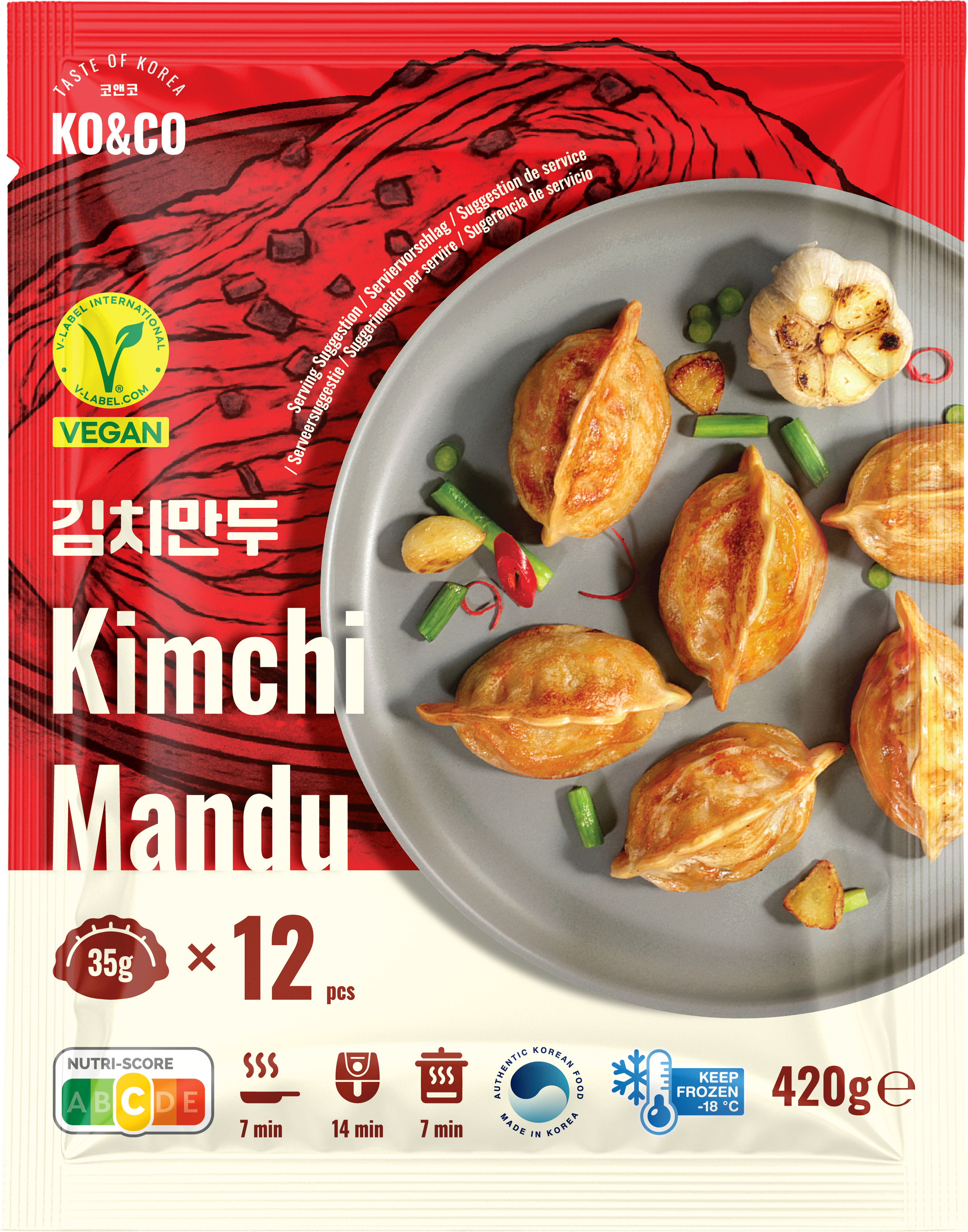
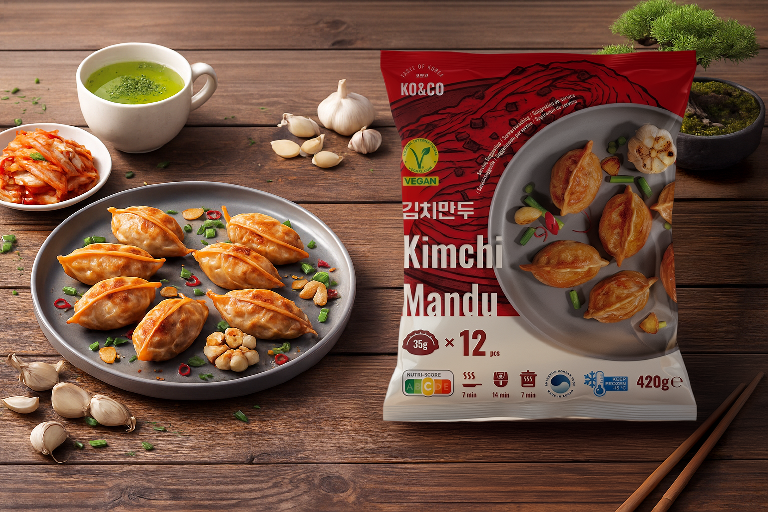
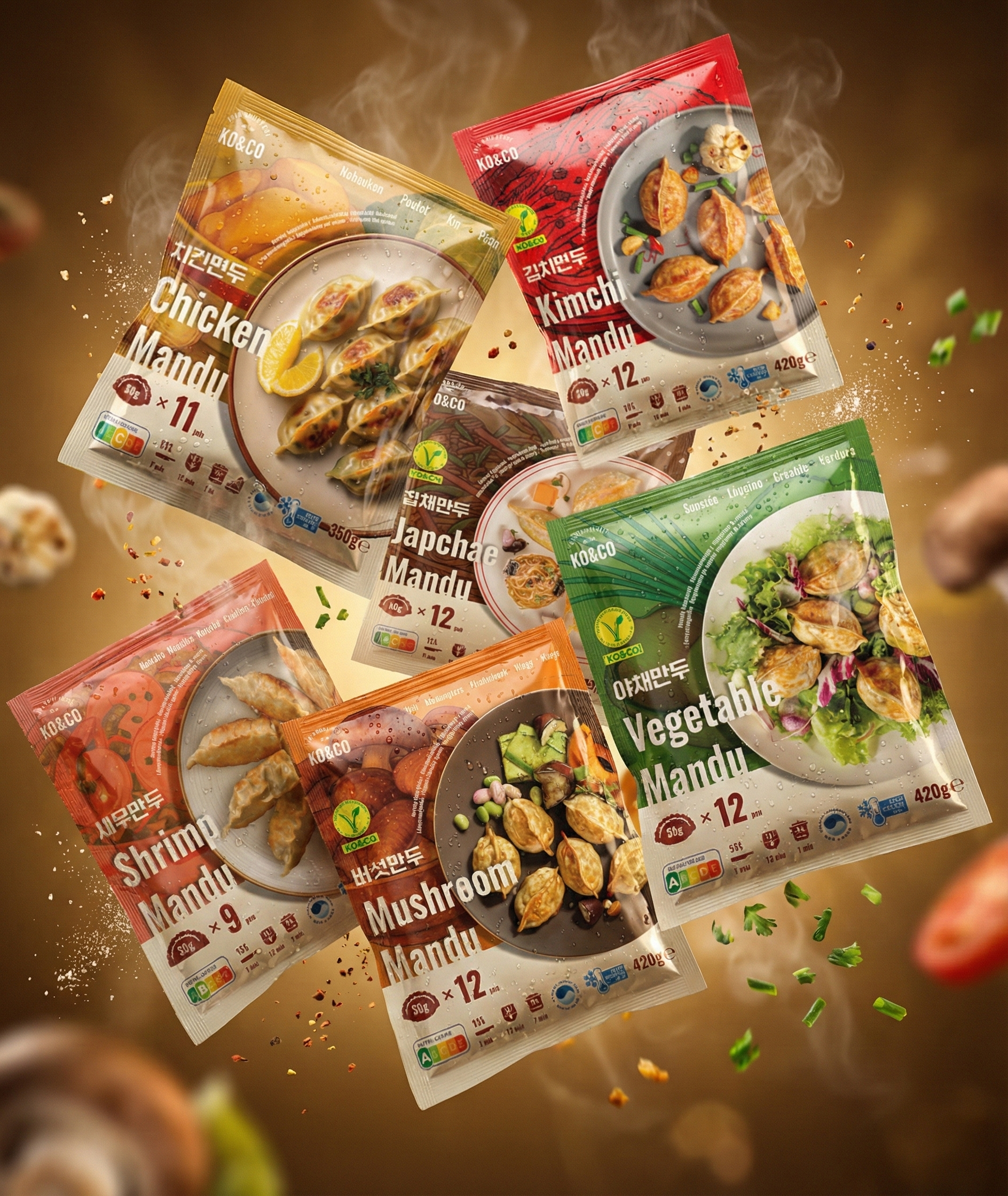
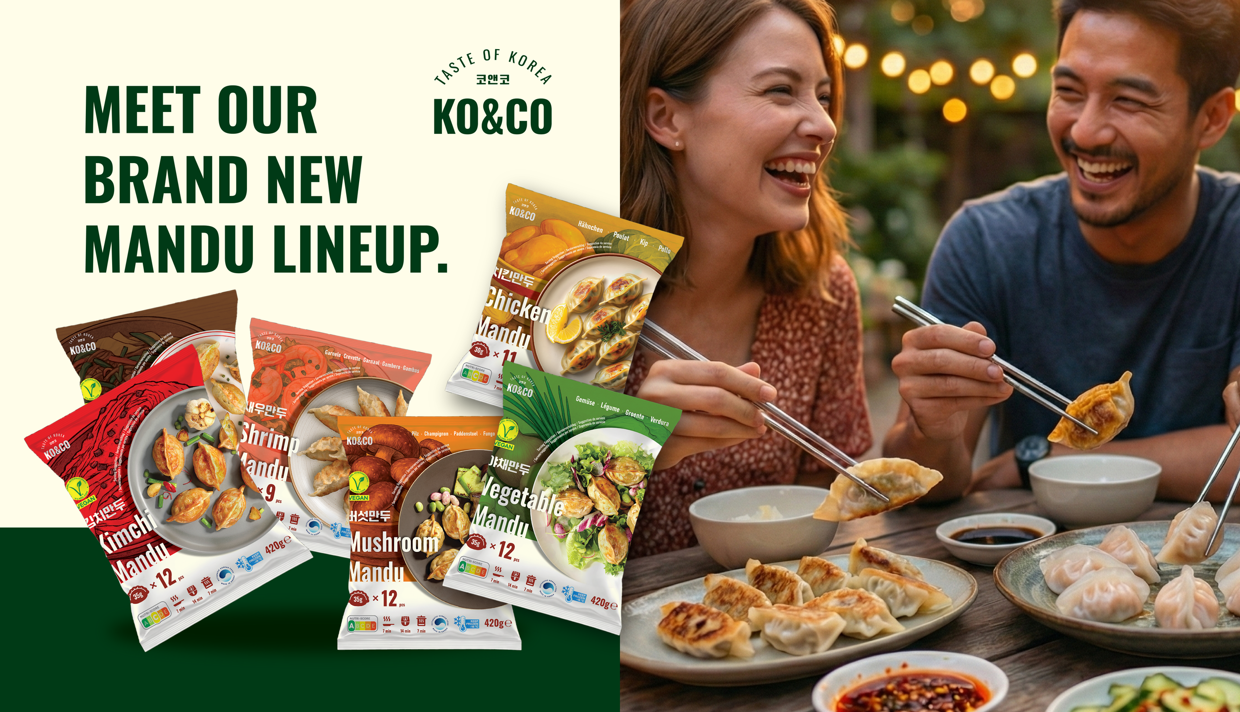
![]()
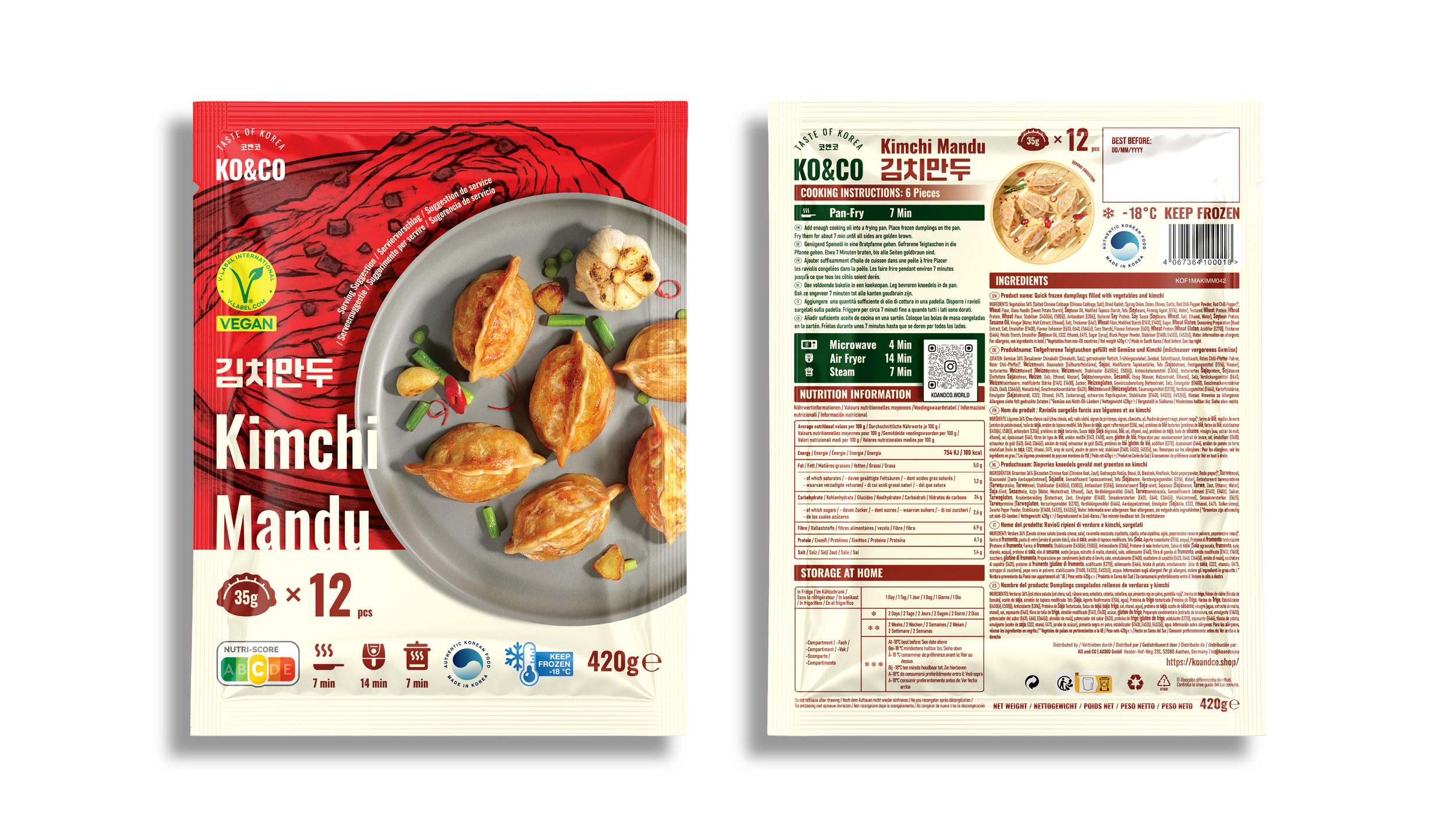
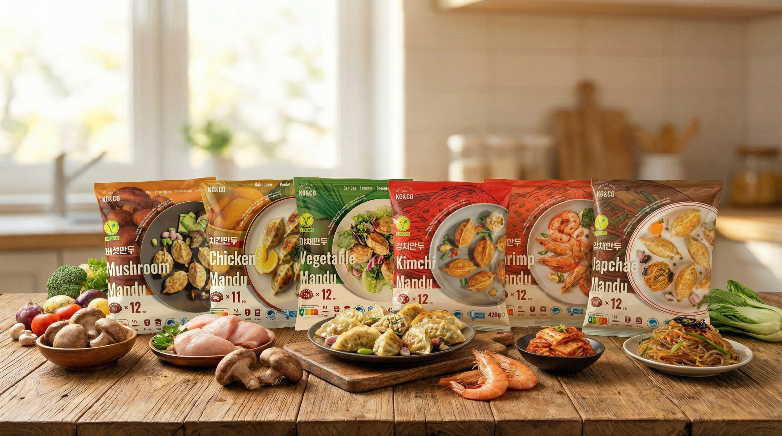
Kimchi Mandu (Vegan)
With its bold red palette and expressive kimchi background illustration, this product delivers an instant visual cue of Korean spiciness.
The design balances intensity and approachability, presenting kimchi as a flavor that is exciting yet easy to enjoy. The V-Label ensures clear recognition of the vegan formulation. -
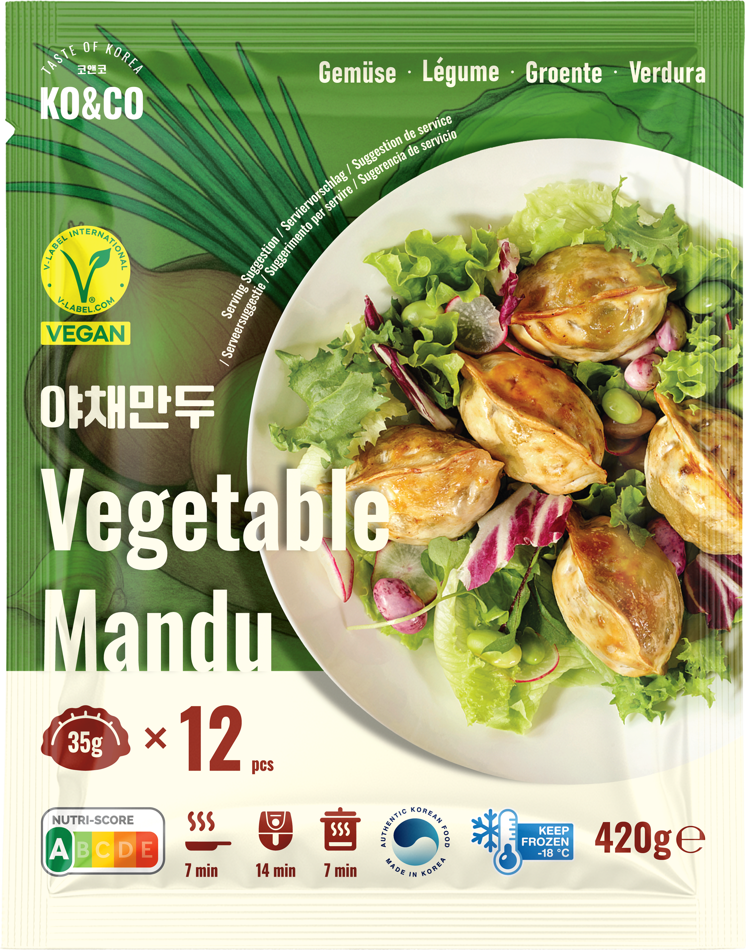
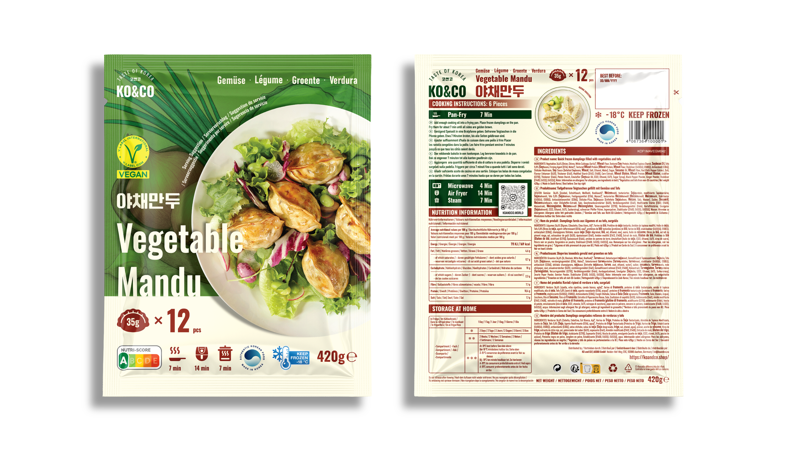
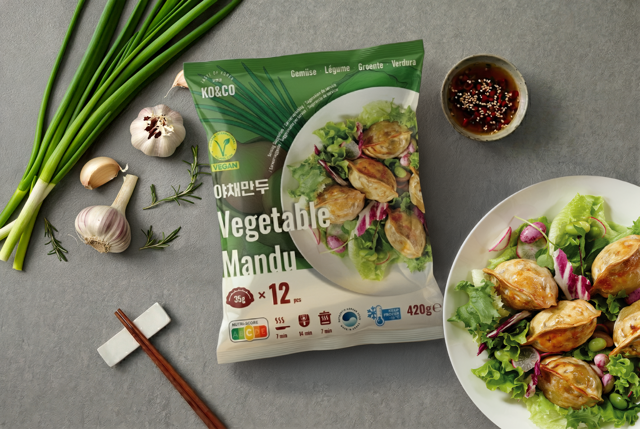
![]()
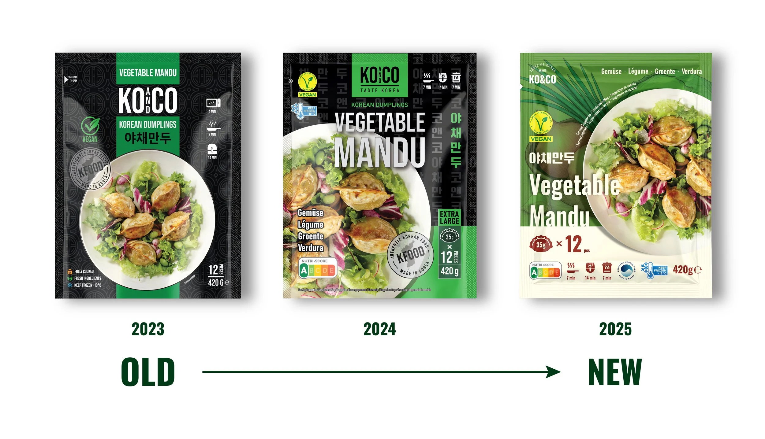
Vegetable Mandu (Vegan)
Vegetable Mandu is the freshest and cleanest SKU in the lineup.
The green palette and large vegetable illustrations create a wholesome, natural impression, while the salad-style plating communicates lightness and versatility. Its visual identity appeals not only to vegan consumers but also to shoppers seeking a healthier choice. -
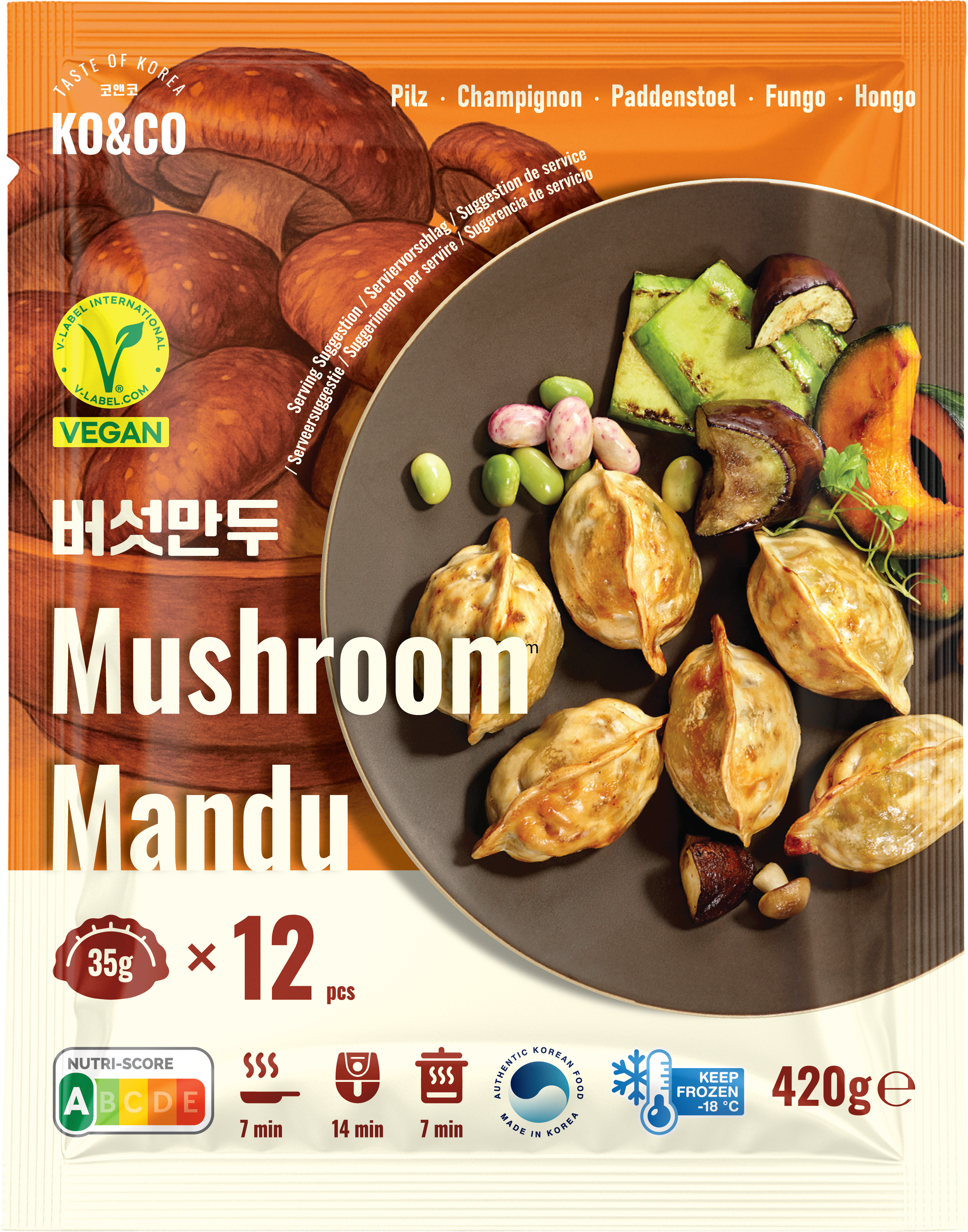
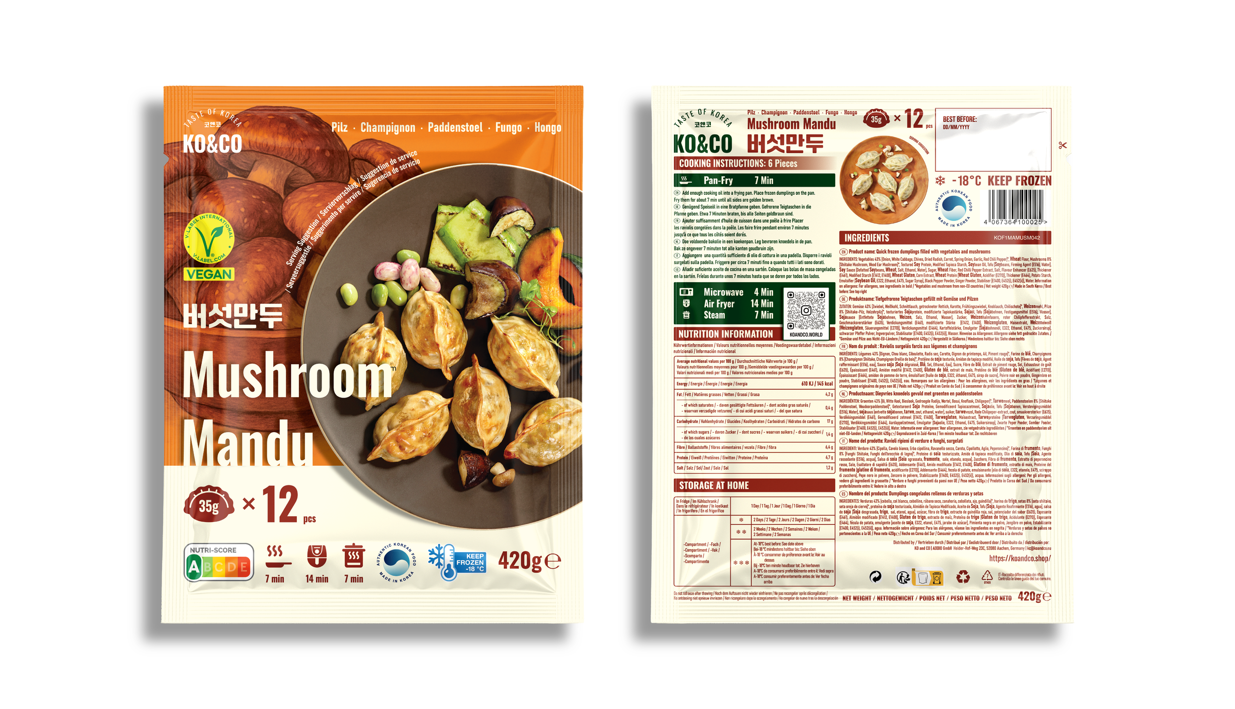
![]()
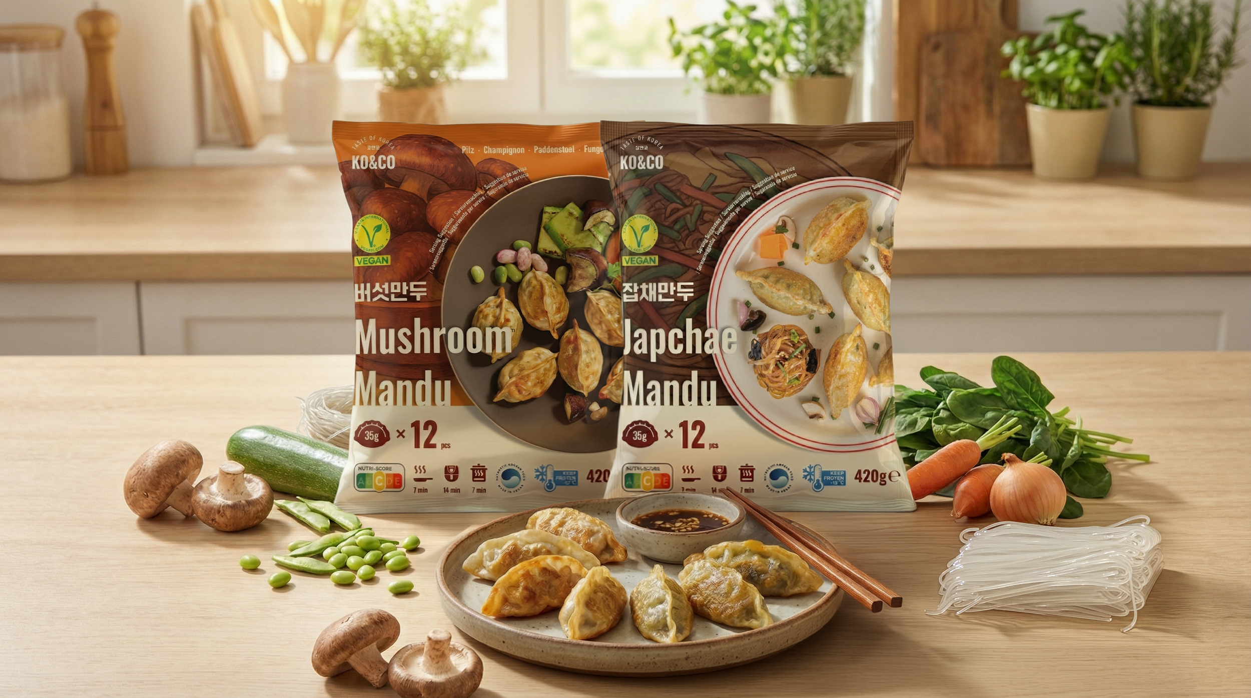
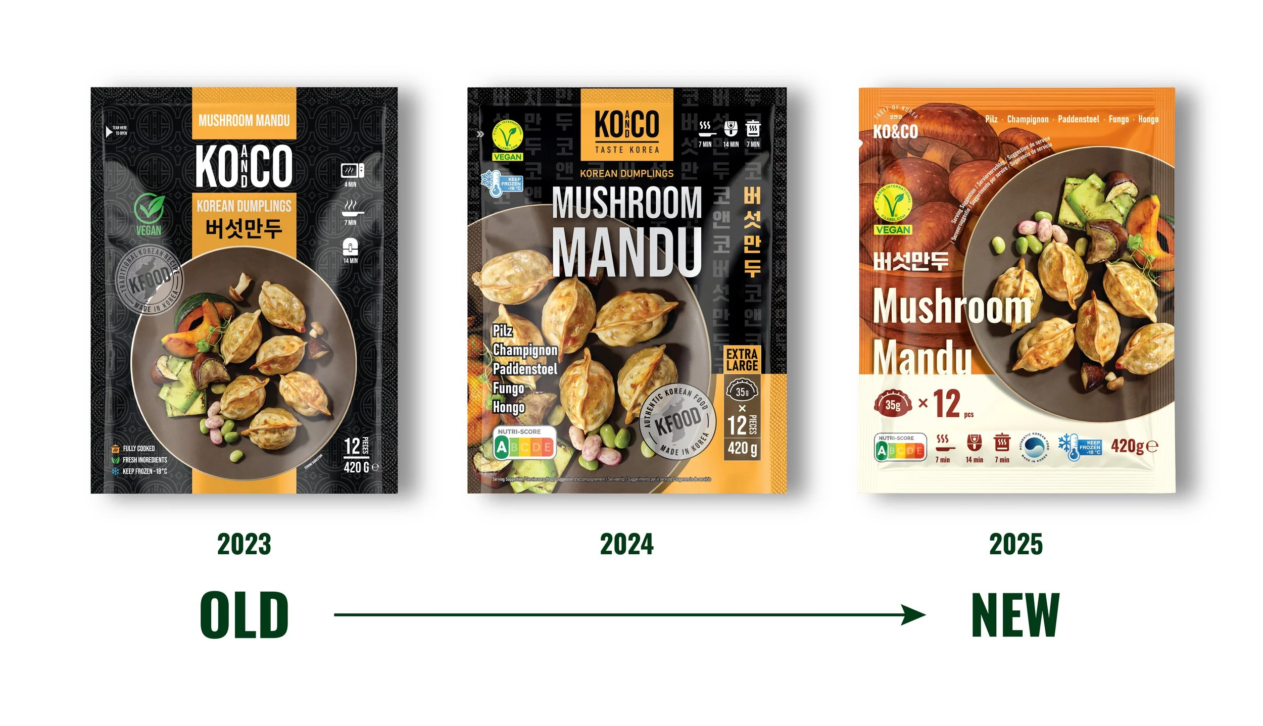
Mushroom Mandu (Vegan)
A rich brown–orange palette and a variety of hand-drawn mushrooms set the tone for this SKU.
It visually expresses the depth and aroma of mushroom-based fillings while maintaining a warm and comforting aura. The V-Label reinforces its plant-based positioning without relying on clichéd “healthy food” visuals. -
![]()
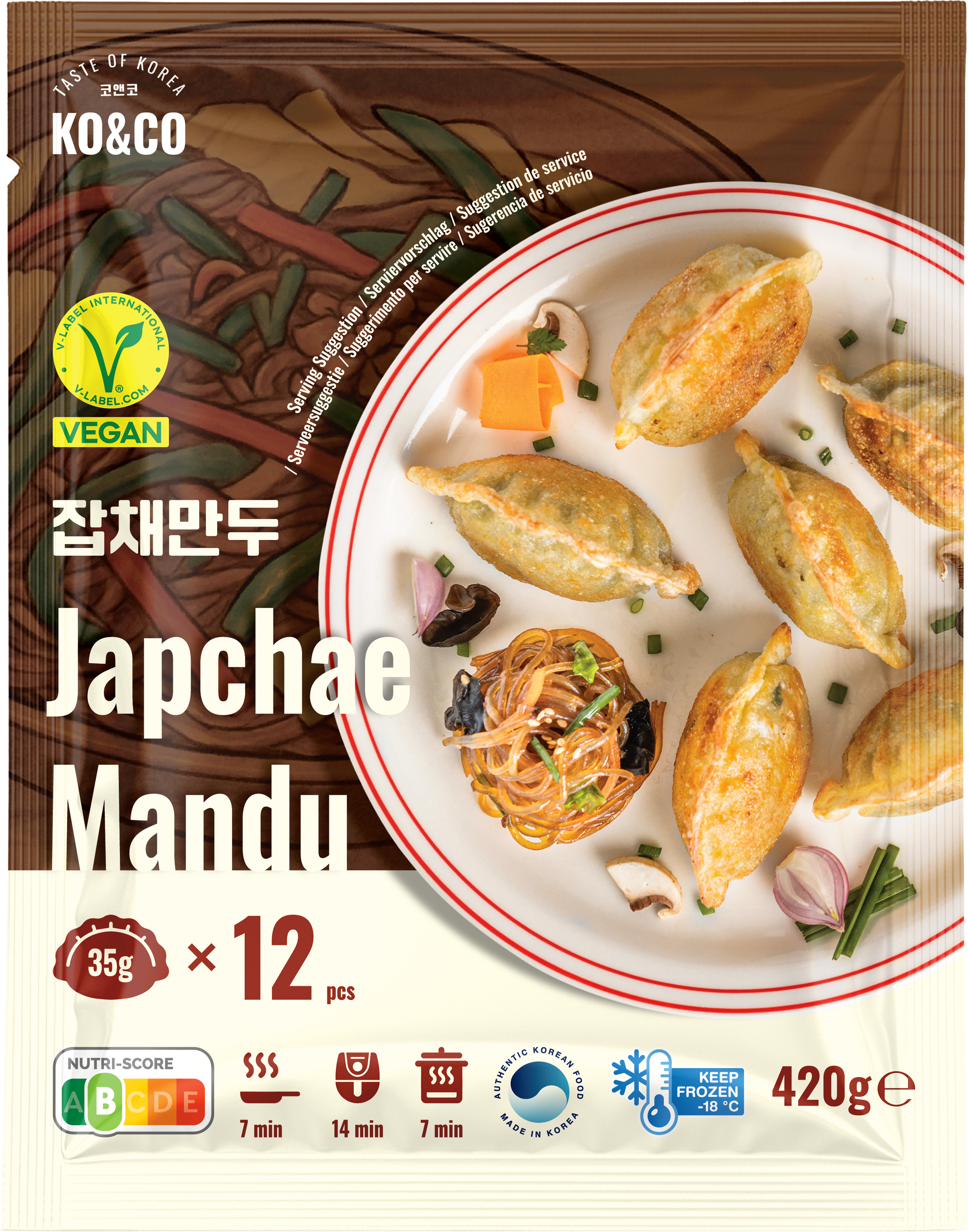
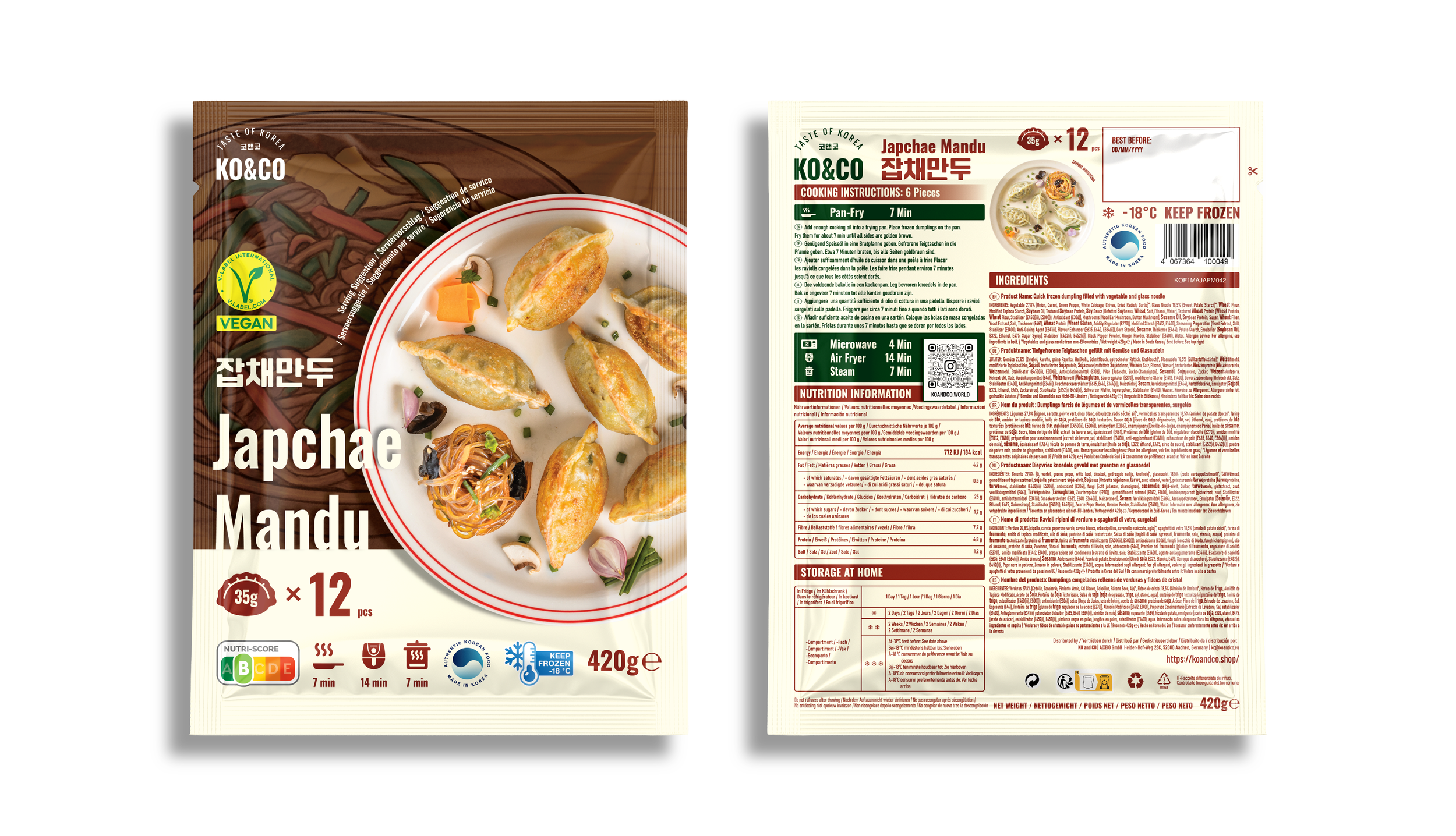
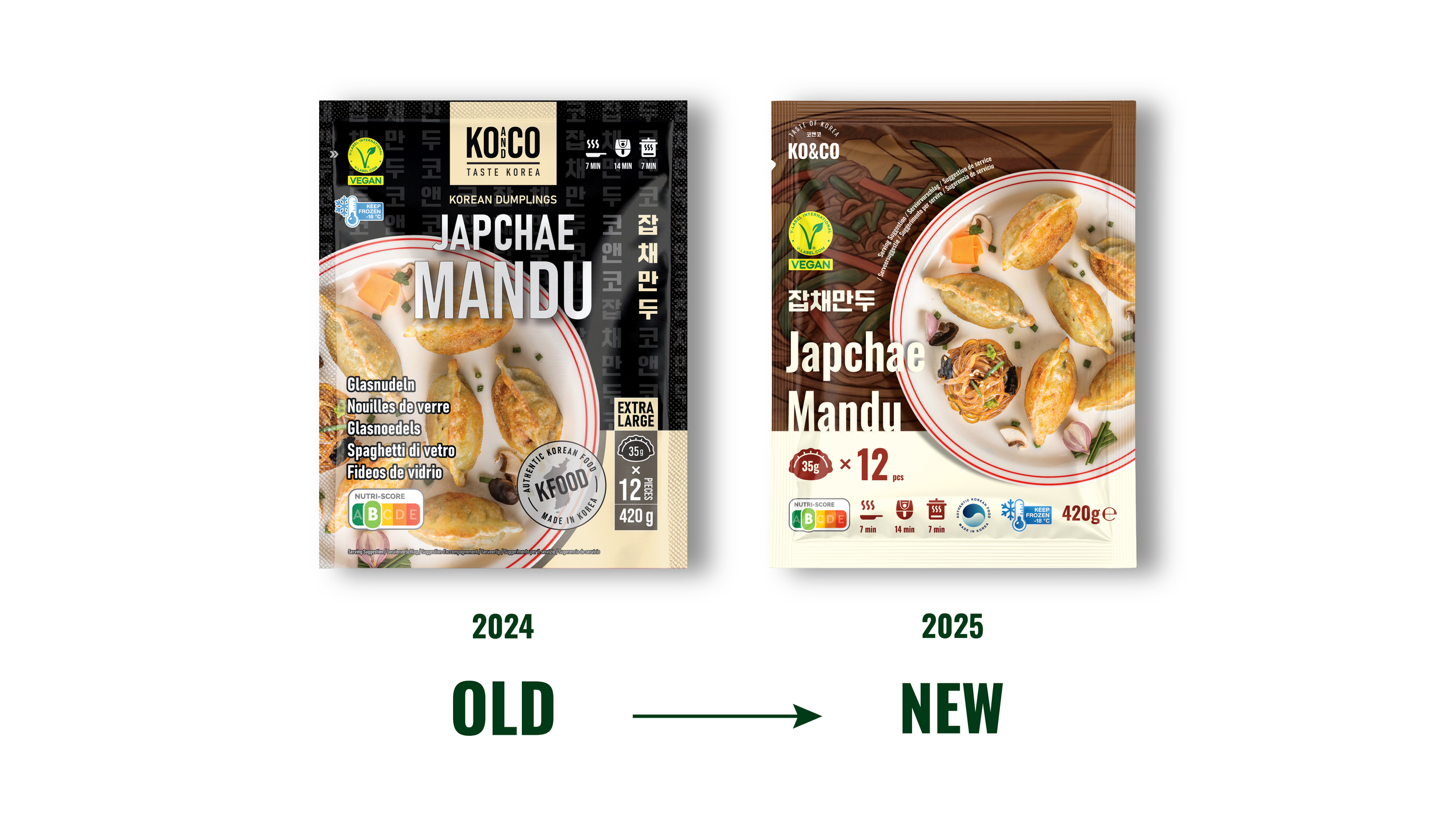
Japchae Mandu (Vegan)
This SKU highlights the signature transparency and texture of Korean glass noodles.
The hand-drawn japchae illustration and warm brown color palette present the product as a plant-based option with depth and authenticity. The V-Label certification appears prominently to build trust and speed up decision-making for vegan consumers. -
![]()
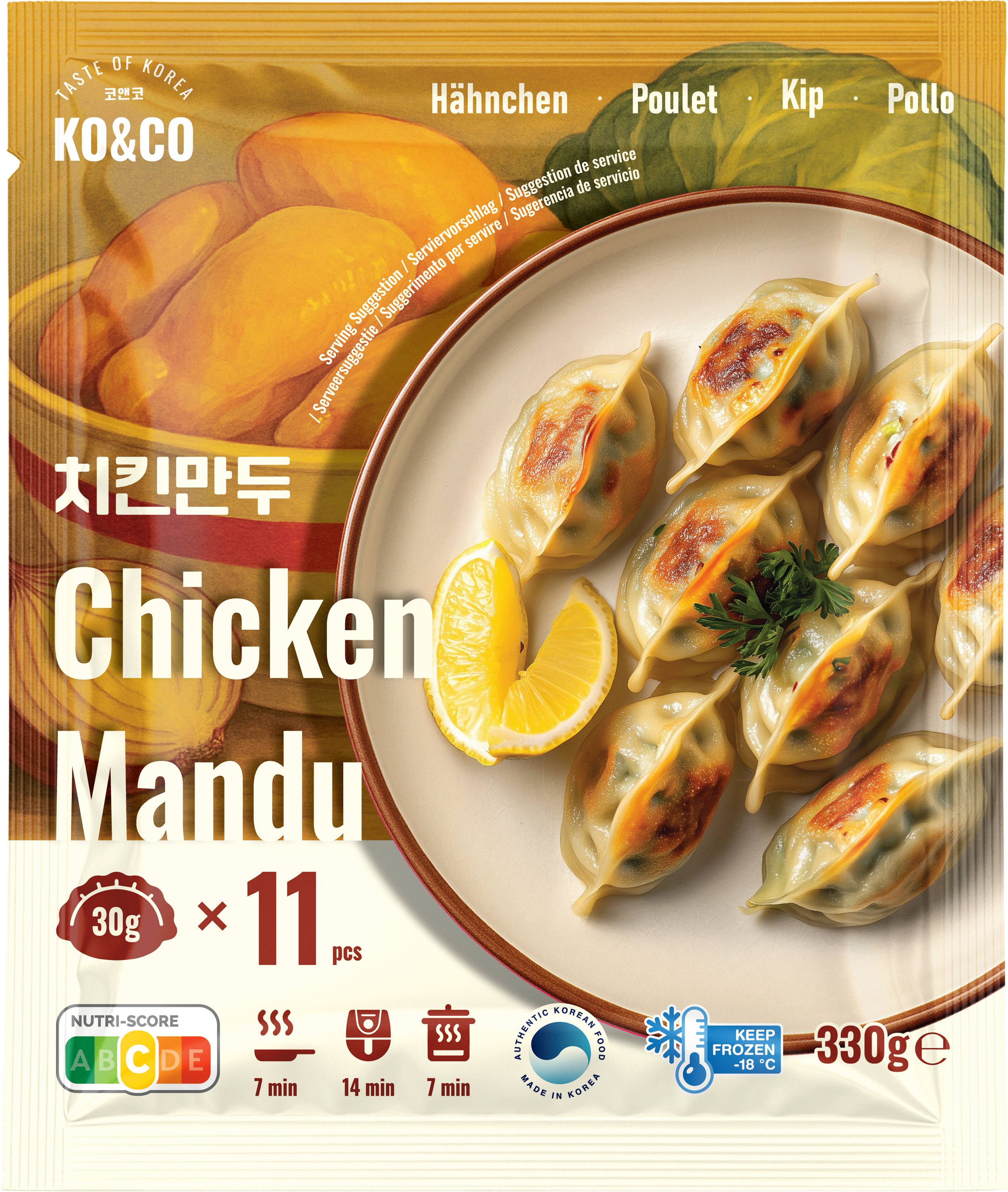
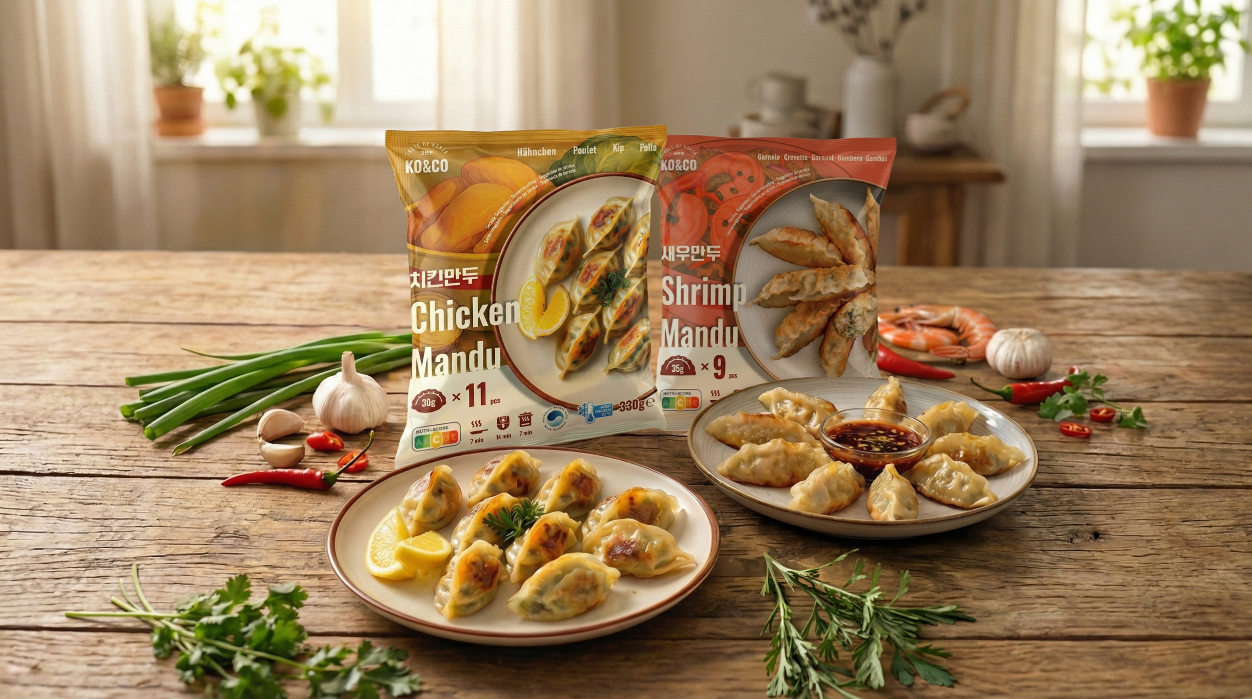
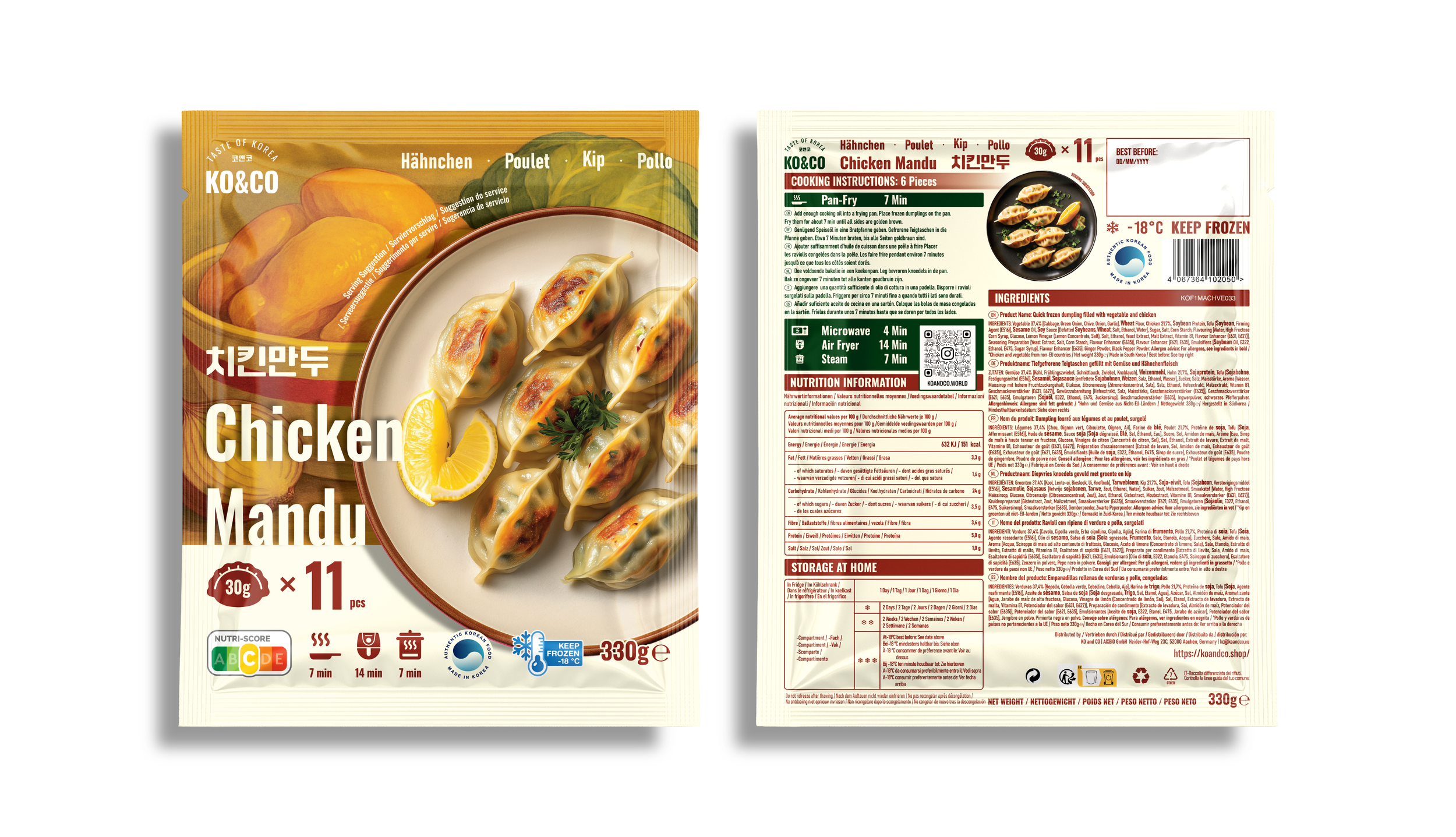
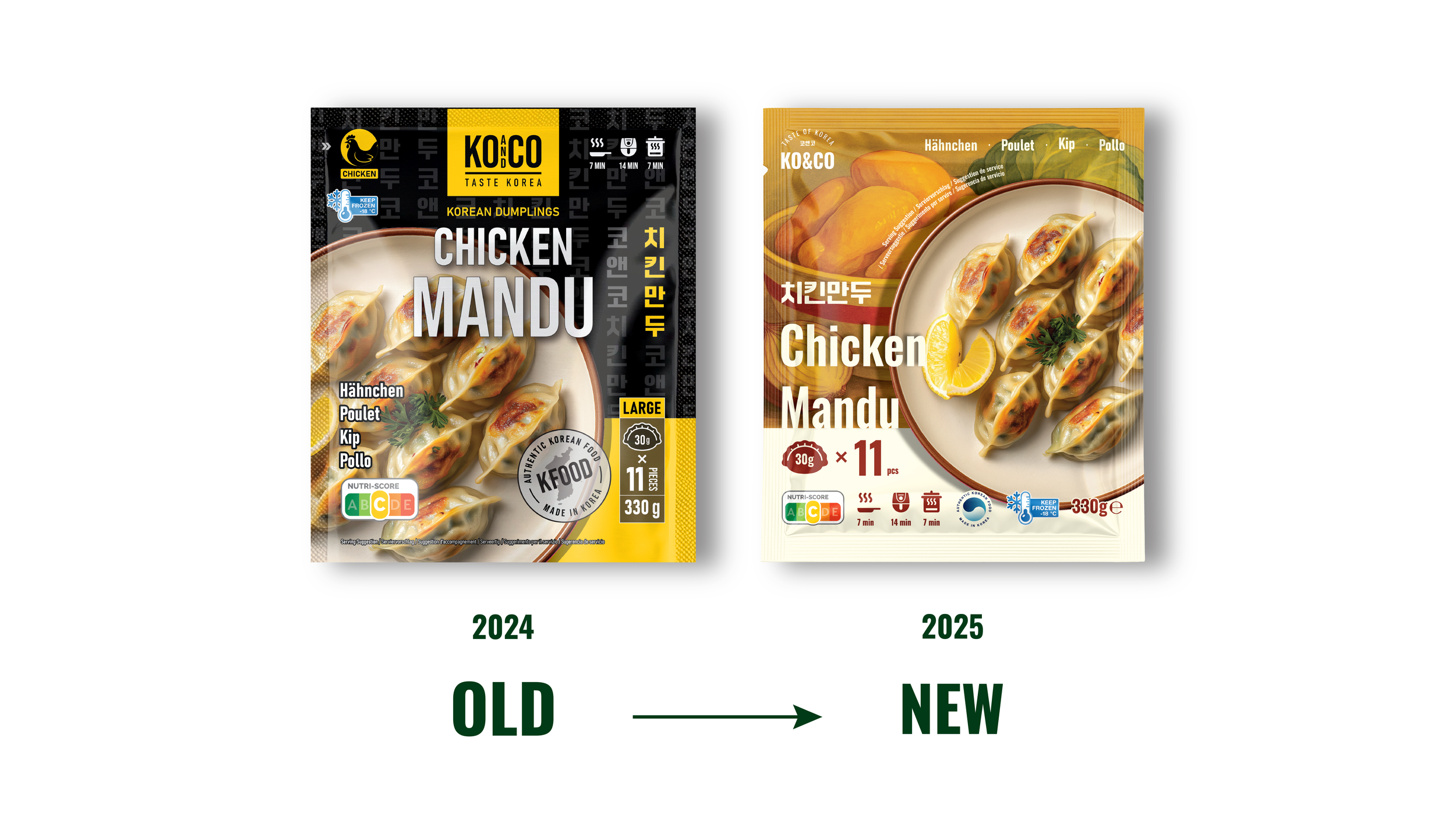
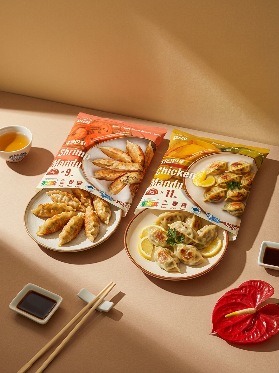
Chicken Mandu
Chicken Mandu is designed as the most approachable and familiar SKU in the lineup.
Soft yellow chicken illustrations paired with a clean, bright plate shot communicate a light and everyday-friendly flavor profile. The multilingual labeling and simplified cooking icons ensure clarity for shoppers across different European regions. -
![]()
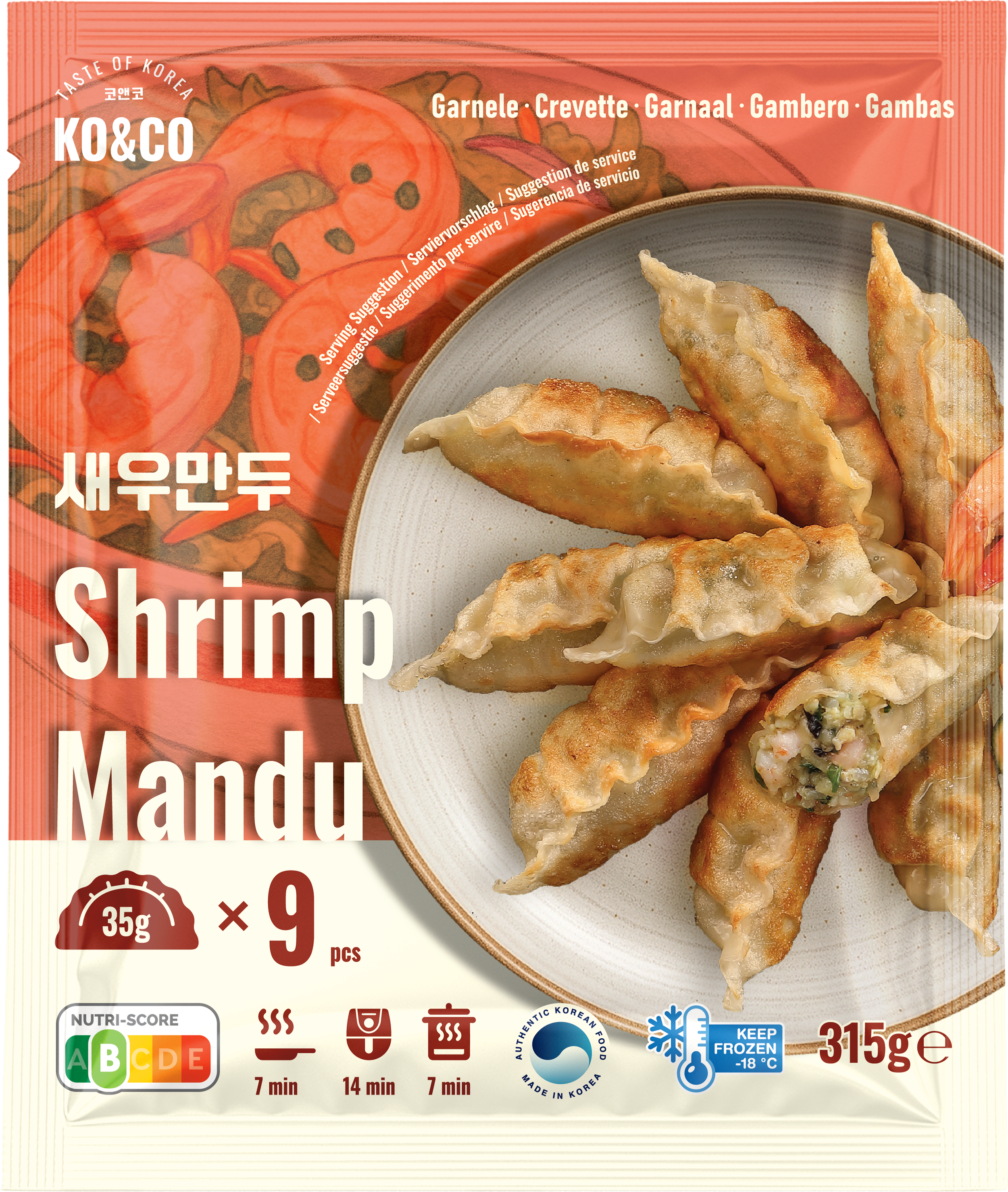
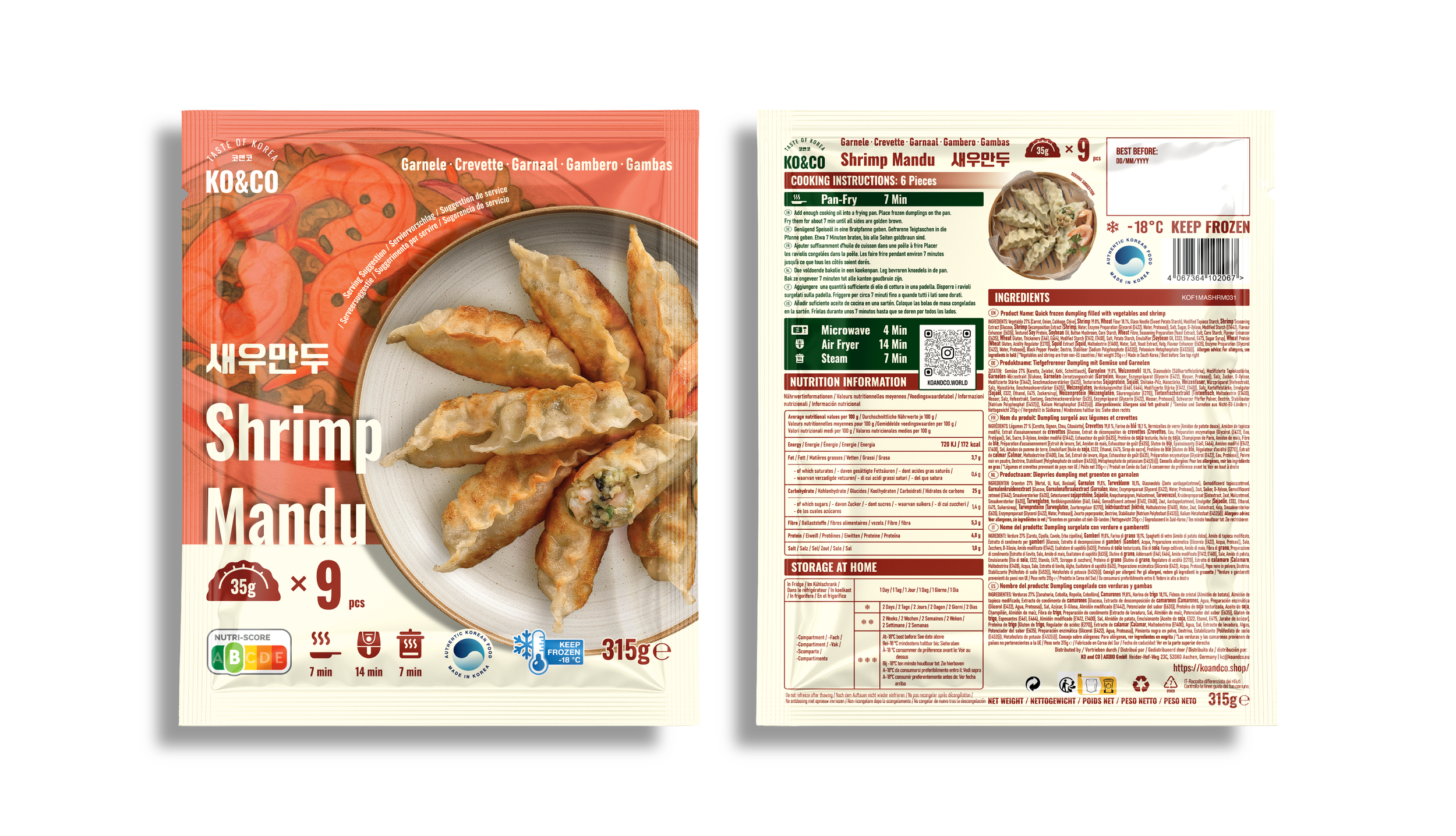
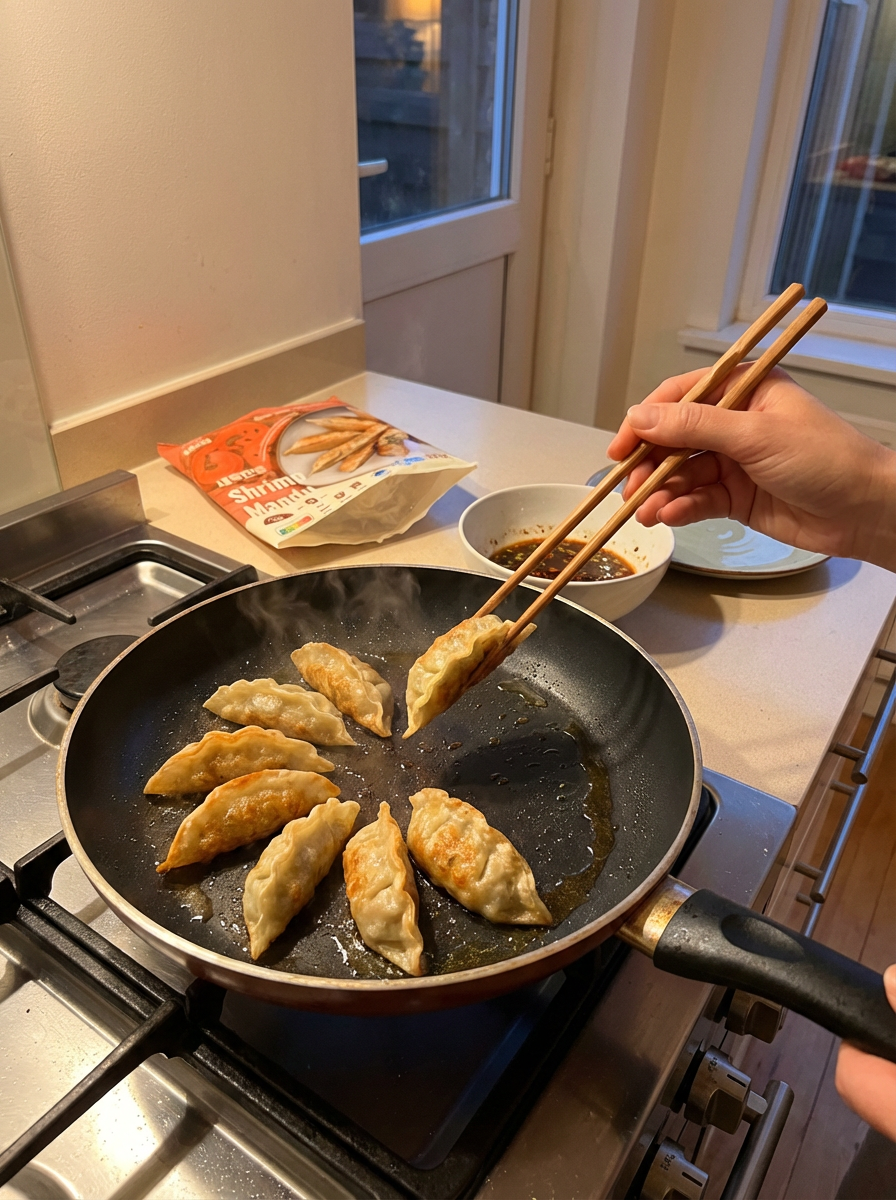
Shrimp Mandu
Shrimp Mandu uses a vivid orange–salmon color palette and playful shrimp illustrations to communicate freshness and a clean seafood profile.
The open-cut dumpling shot highlights real ingredients inside, giving the product an elevated, premium impression suitable for European shelves.
The strategic objective of this redesign was clear:
Position KO&CO as a modern, transparent, and consumer-centric Korean food brand—easy to understand for newcomers, differentiated from category norms, and visually aligned with European shopper expectations.


Key strategic design decisions
Ingredient-first storytelling
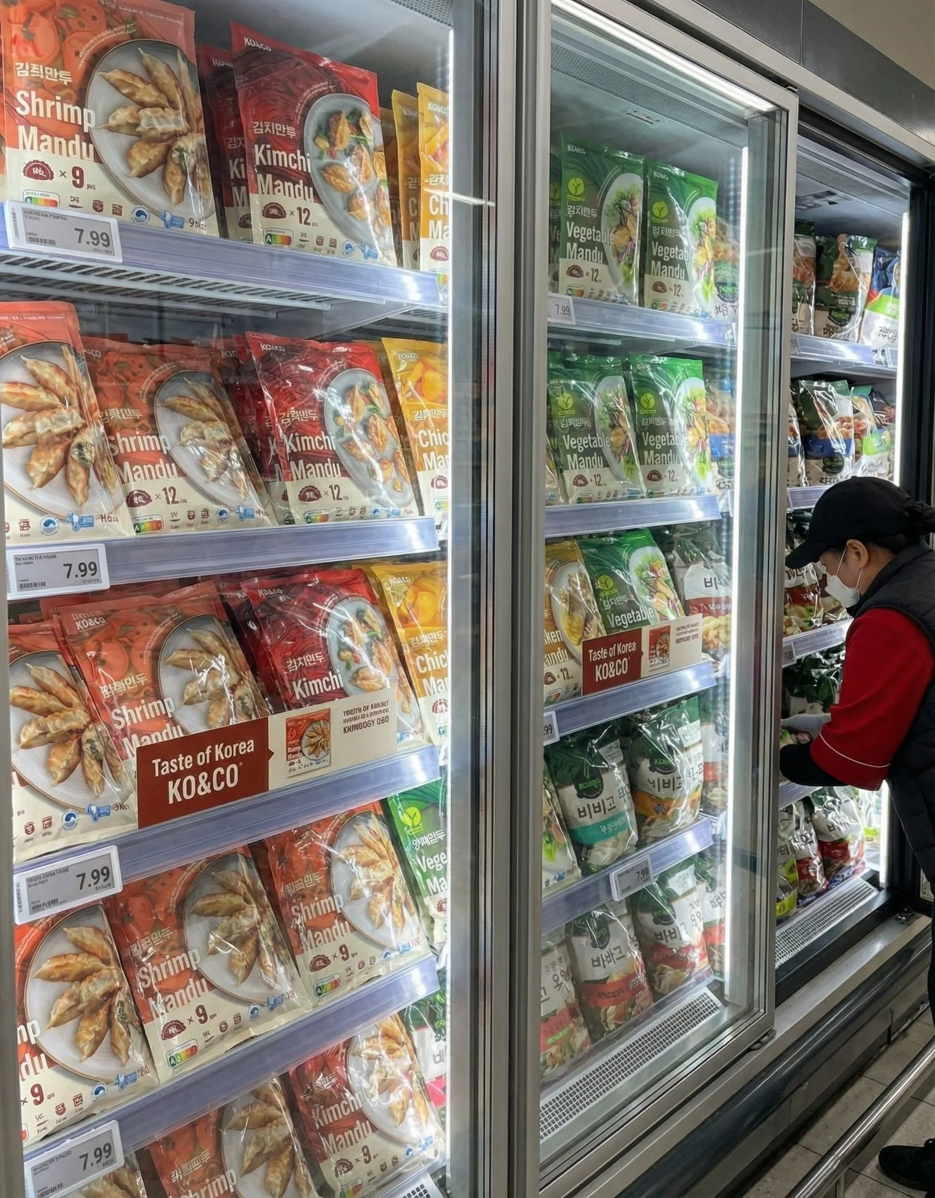
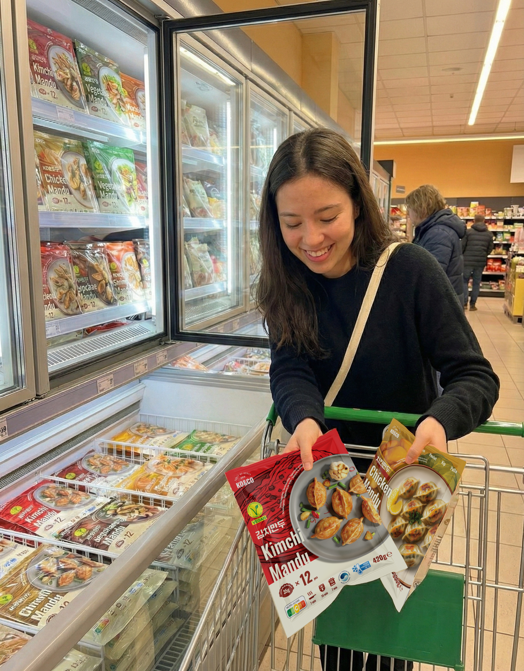
Each SKU uses illustrated ingredients behind the plated product photo to instantly communicate flavor and improve lineup navigation.Color-coded differentiation
SKU colors are derived from each filling (Shrimp, Chicken, Kimchi, Japchae, Vegetable, Mushroom) for quick shelf recognition and a cohesive family look.Clean, minimal layout
A simplified hierarchy highlights core purchase drivers—weight, piece count, Nutri-Score, and cooking methods—meeting European transparency expectations.No ornamental motifs
Removing heavy traditional patterns shifted KO&CO from an “ethnic” niche toward a modern, mainstream brand identity.
KO&CO MANDU
Typography & Color
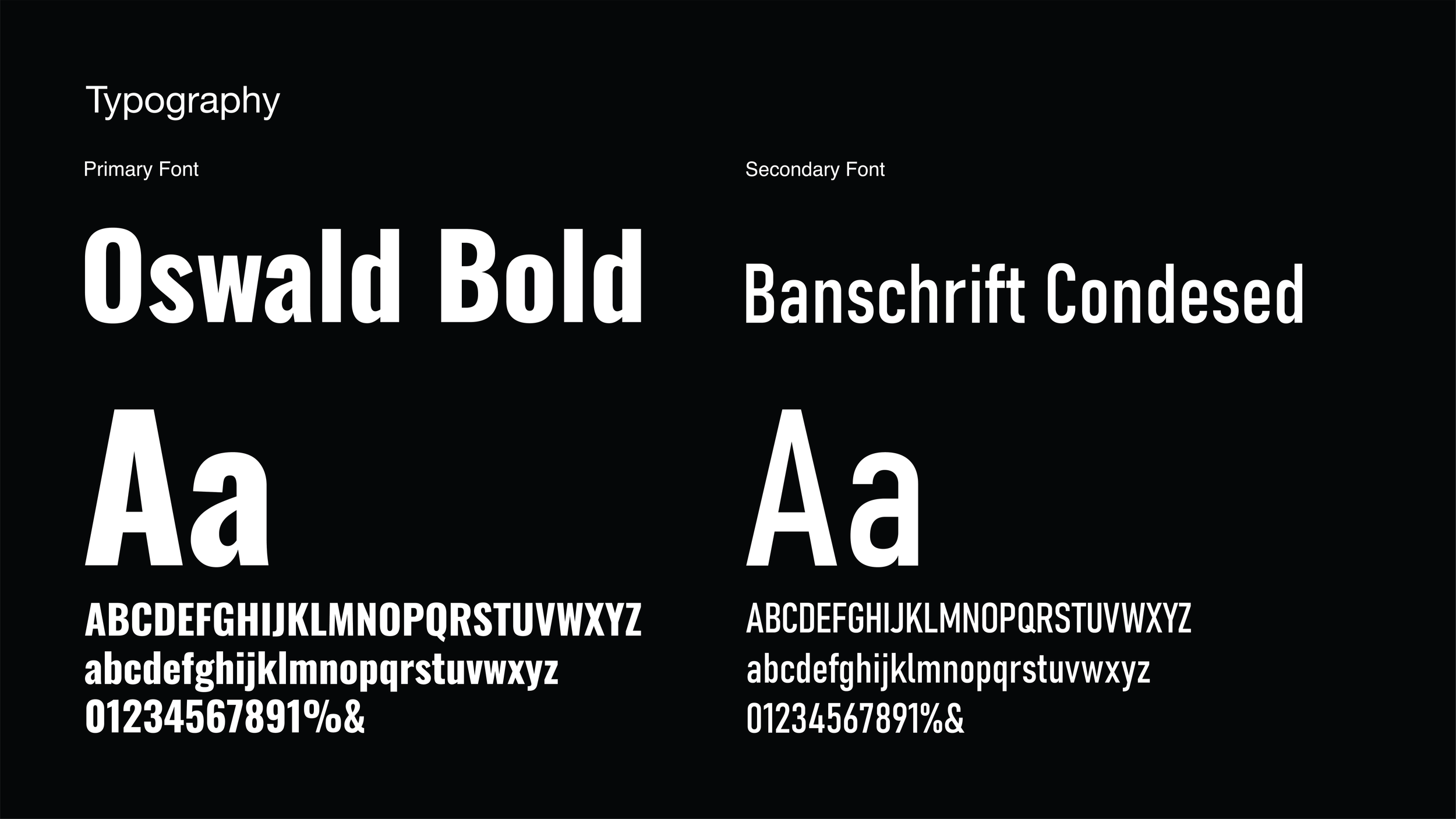
Typography
The packaging design utilizes a combination of sans-serif fonts to create a modern and clean aesthetic with high legibility.
Primary Font: Oswald Bold
Characteristics: A strong, vertically condensed typeface that creates a bold impact.
Application: Used for the English product names (e.g., "Kimchi Mandu", "Shrimp Mandu") in the center of the package. It serves to instantly grab the consumer's attention and clearly imprint the product name.
Secondary Font: Banschrift Condensed
Characteristics: A modern typeface with mechanical proportions. Its narrow width allows for efficient information layout.
Application: Used for detailed information, such as product descriptions or multilingual text at the top, harmonizing with the main font while providing clean readability.
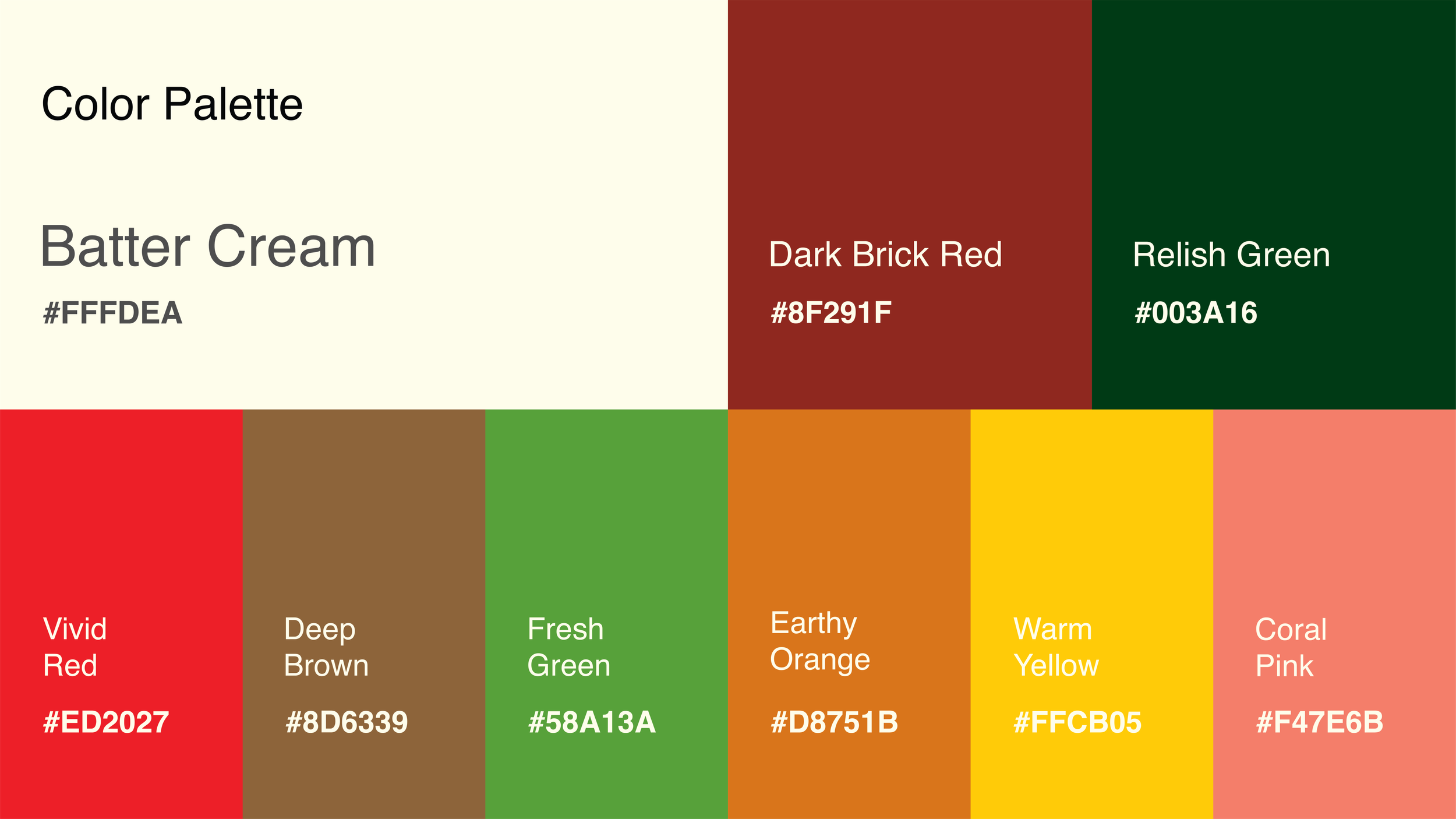
Color
Each product features a unique color code reflecting its core ingredients, helping consumers intuitively distinguish flavors.
#ED2027 (Vivid Red) - Kimchi Mandu
Symbolizes the vibrant red color of well-fermented kimchi and spicy chili powder, stimulating the appetite.
#58A13A (Fresh Green) - Vegetable Mandu
Represents the freshness of chives and green vegetables, emphasizing a healthy and clean image.
#D8751B (Earthy Orange/Bronze) - Mushroom Mandu
Reflects the natural brown tones of shiitake mushroom caps, conveying the deep, savory flavor and earthy nature of the ingredients.
#8D6339 (Deep Brown) - Japchae Mandu
Visualizes the rich, savory taste of the soy sauce seasoning, glass noodles, and wood ear mushrooms used in Japchae.
#F47E6B (Coral Pink) - Shrimp Mandu
Uses the soft coral hue of cooked shrimp meat and shells to highlight the seafood flavor profile.
#FFCB05 (Warm Yellow) - Chicken Mandu
A bright, cheerful yellow evokes the warmth of chicken broth, golden dumpling wrappers, and ingredients like corn.
Design Evolution
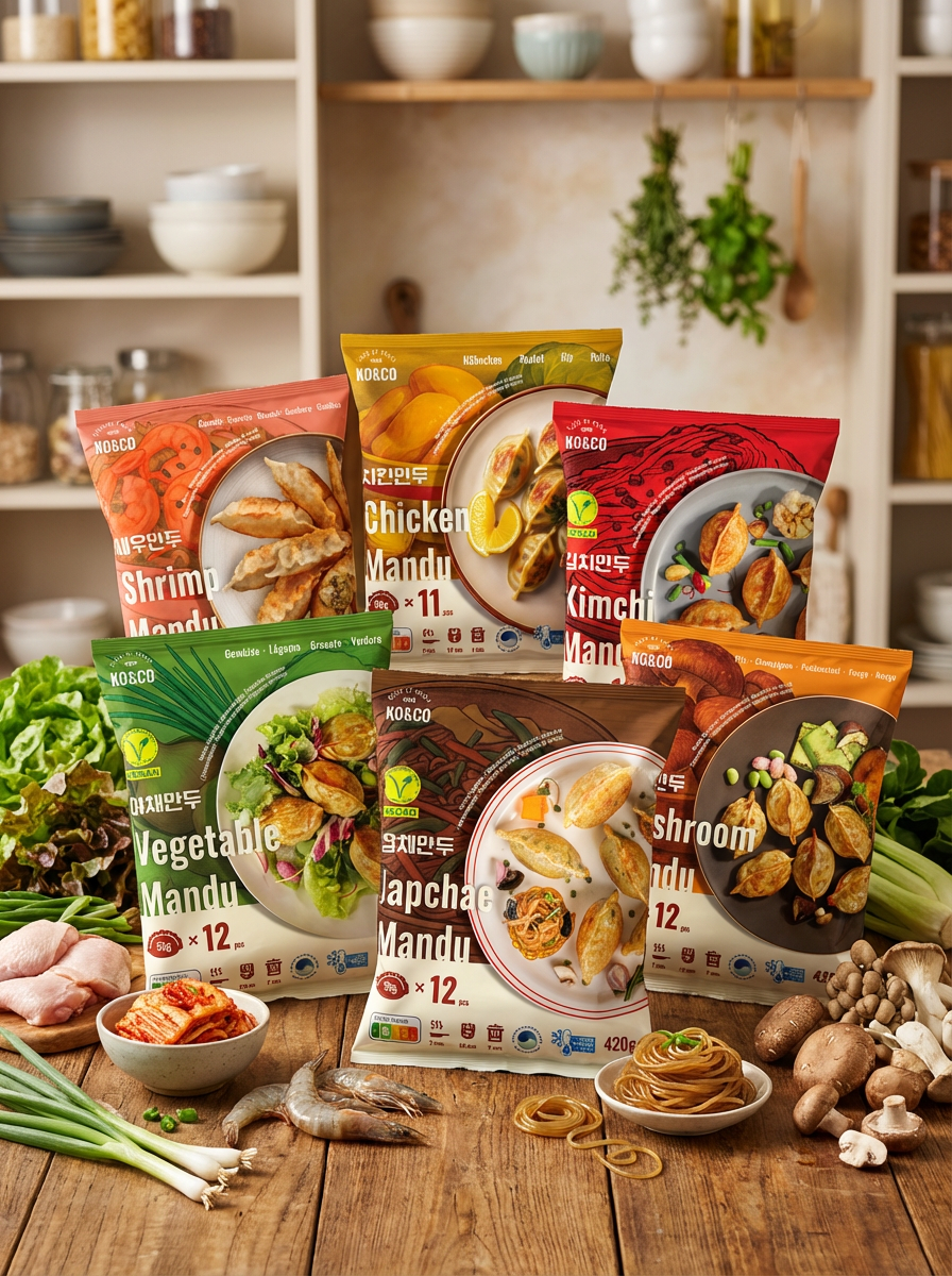
I moved away from dark, complex patterns to a fresh, minimal look. The 2025 redesign focuses on vibrant colors, clearer hierarchy, and making the food the star of the show.
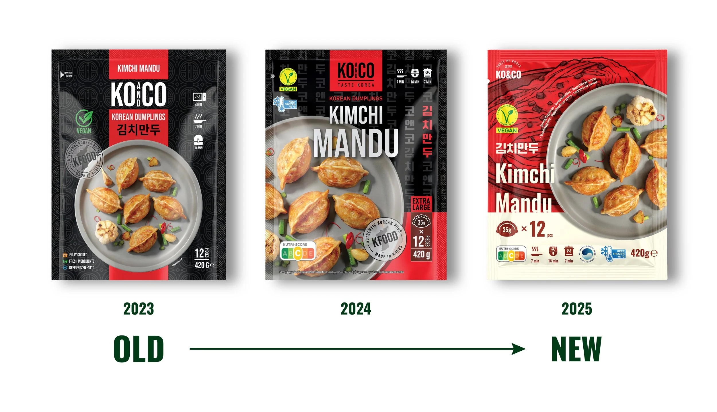
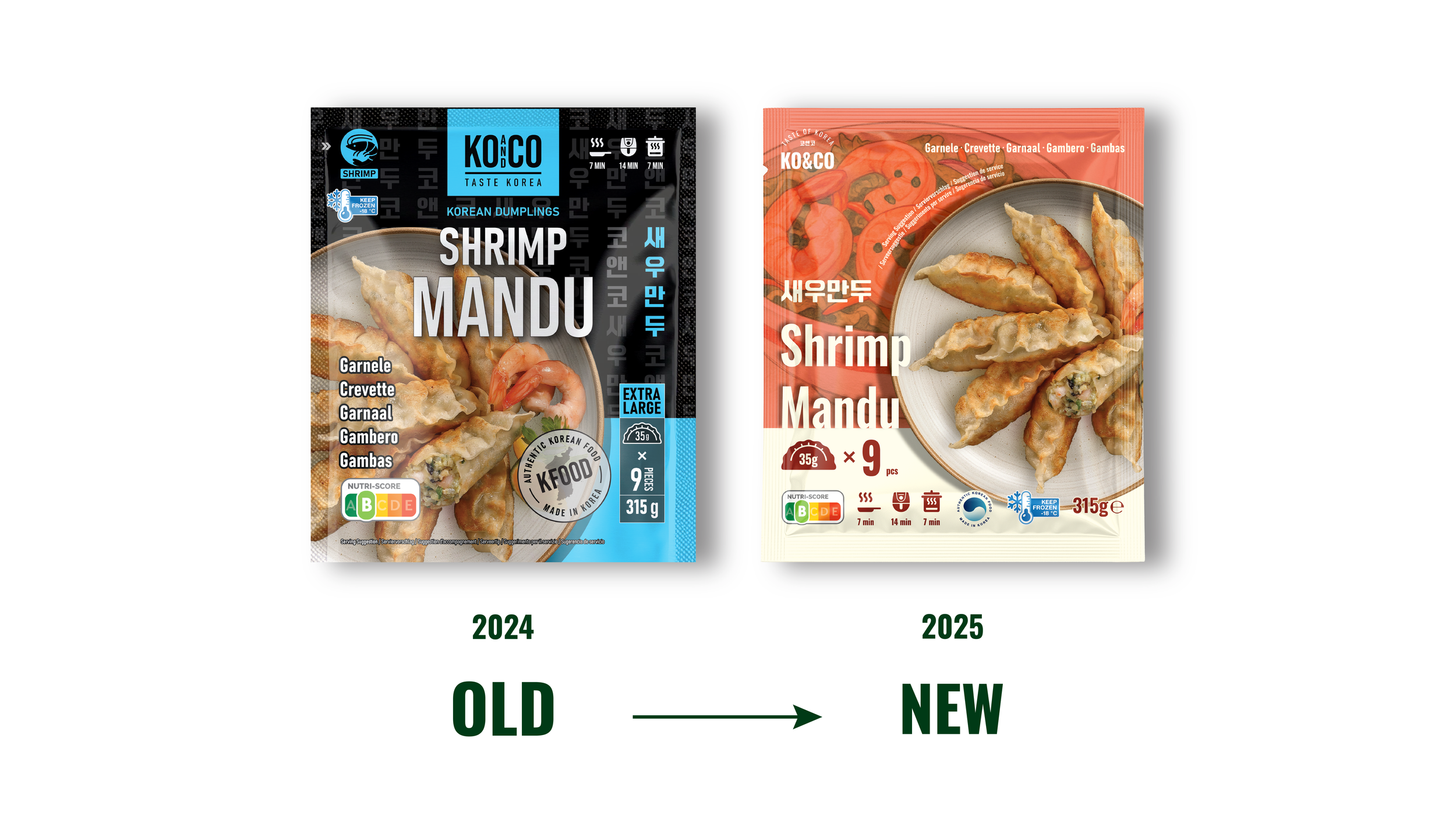
This redesign reframes KO&CO’s Mandu lineup not as an exotic import but as a fresh, high-quality, and globally accessible product optimized for European consumer behavior and shelf competition.
The case study includes both the previous packaging and the redesigned concept, highlighting how strategic design interventions can reposition a brand and enhance its market-entry potential.


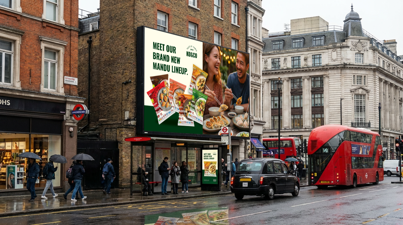
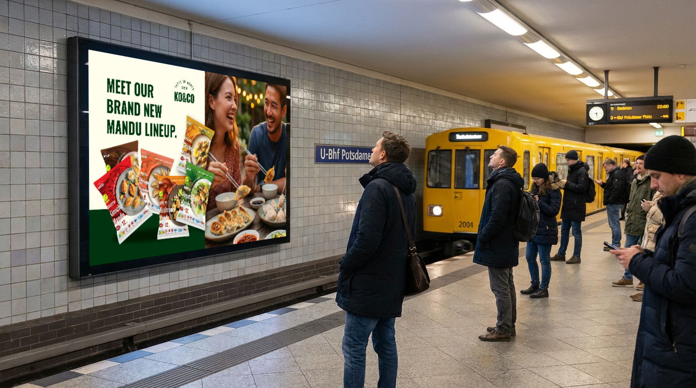
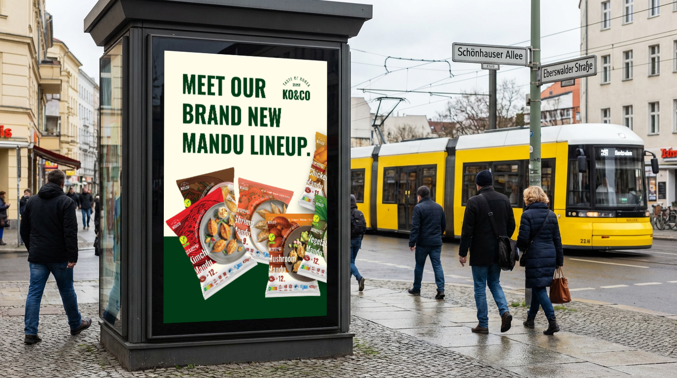
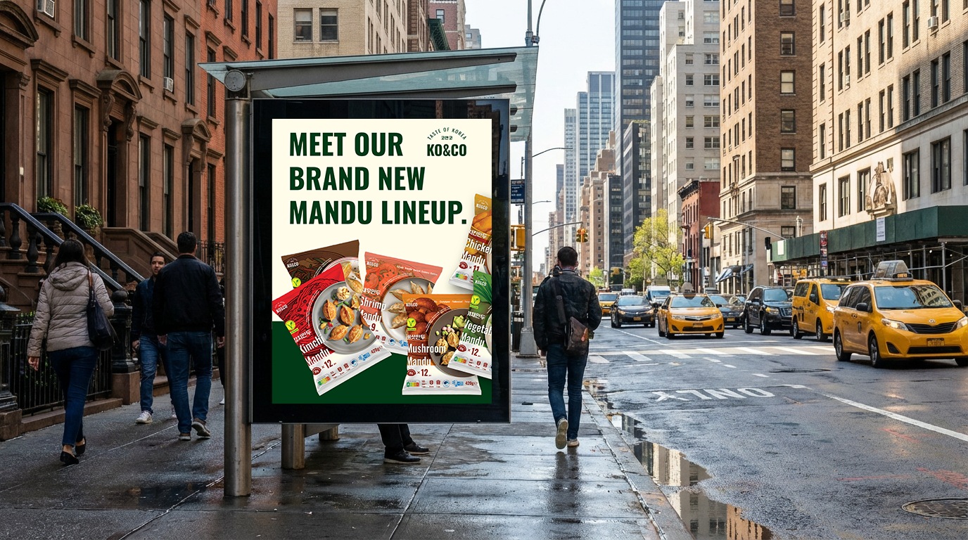
OOH Marketing Design
USED TOOLS