Café FRAGILE
Identity Design Concept
A Cafe Concept Inspired by Museum Storage
Project Overview
FRAGILE is an imaginary cafe brand I developed as a visual storytelling exercise to explore how graphic design can shape unique, immersive brand experiences. Inspired by the humble yet evocative "FRAGILE" graphics found on museum crates, this cafe transforms that utilitarian icon into an aesthetic anchor that invites customers to slow down, observe, and reflect.
Conceptual Drive
I was struck by how the bold, stark lettering on these museum crates conveys a sense of preciousness and care, qualities I wanted to bring to the cafe's atmosphere. In today’s fast-paced world, FRAGILE is a reminder that even everyday moments can be cherished as artifacts. This idea of "everyday artifacts" and preservation resonated deeply with me, inspiring me to create a space that feels delicate yet powerful.
Logomark & Subgraphics
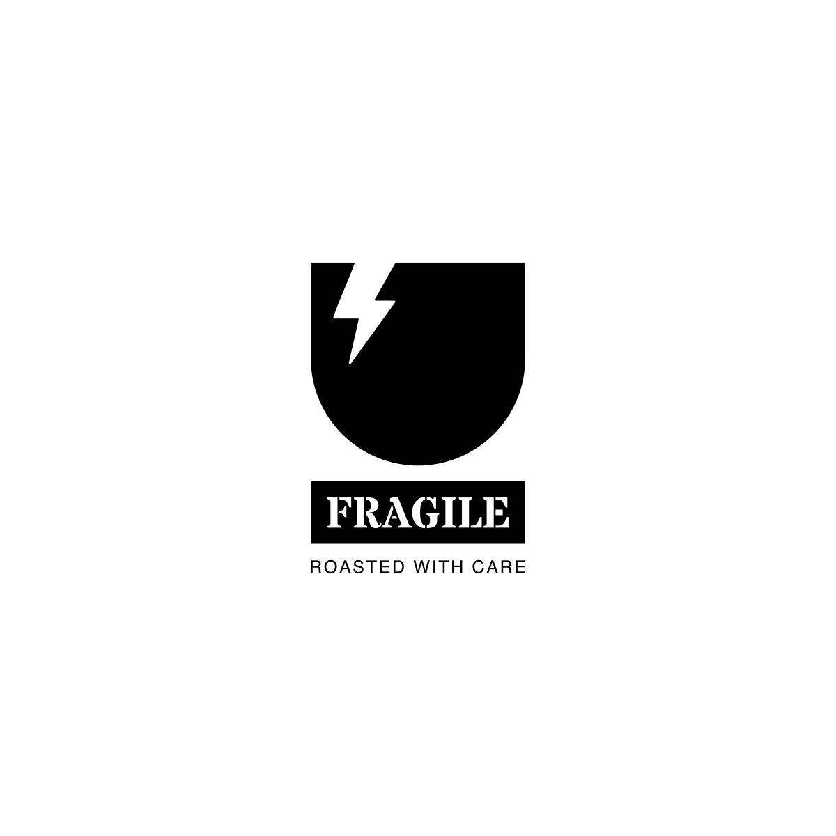
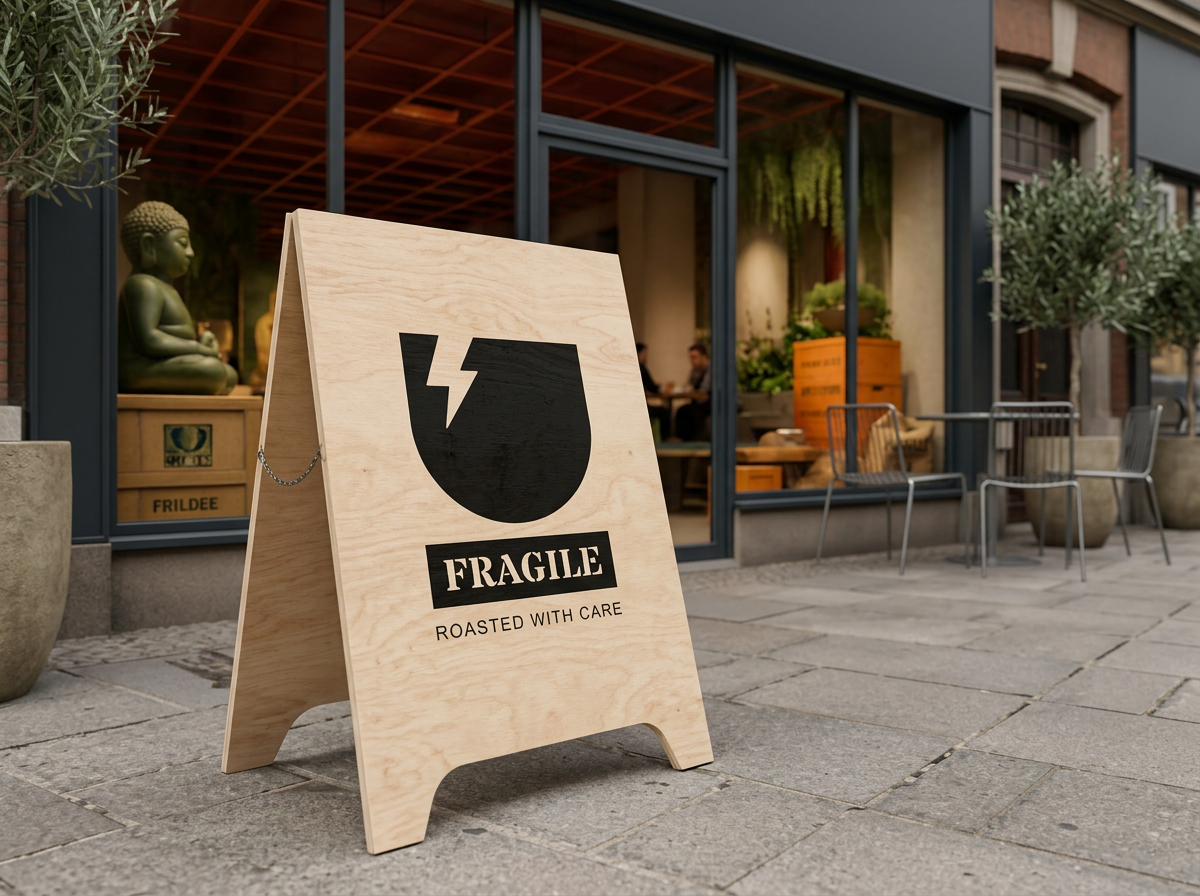
The cracked cup icon, featuring an underbar and enclosed in a box, is inspired by museum crate tag design.
This symbolizes the character of the space: “Fragility.” This design element gives the brand a personal touch and sparks customer curiosity about the brand’s identity.









Typefaces
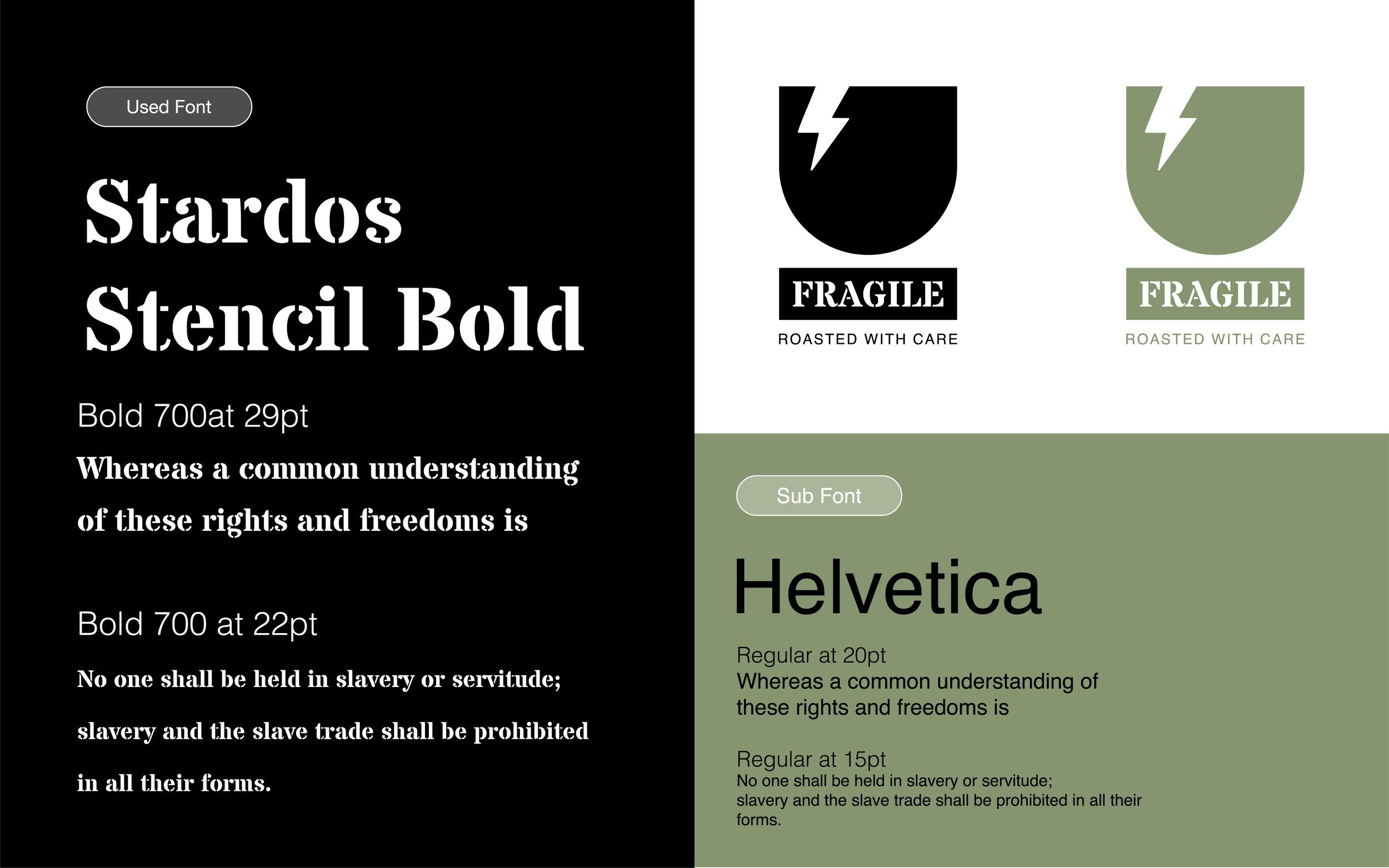
Primary Typeface: Stardos Stencil Bold
Style: Strong, impactful, and carefully fragmented
Reasoning: Evokes the industrial nature of coffee logistics (like shipping crates and labels), emphasizing the brand’s narrative of delicate handling and craftsmanship
Visual Impact: Provides a bold, instantly recognizable logo that commands attention while communicating strength
Secondary Typeface: Helvetica
Style: Clean, neutral, and highly legible
Reasoning: Balances the drama of the stencil font, ensuring clear readability and modern sophistication for supporting text
Visual Impact: Creates a contemporary, refined brand presence that appeals to design-savvy and quality-conscious audiences
Color
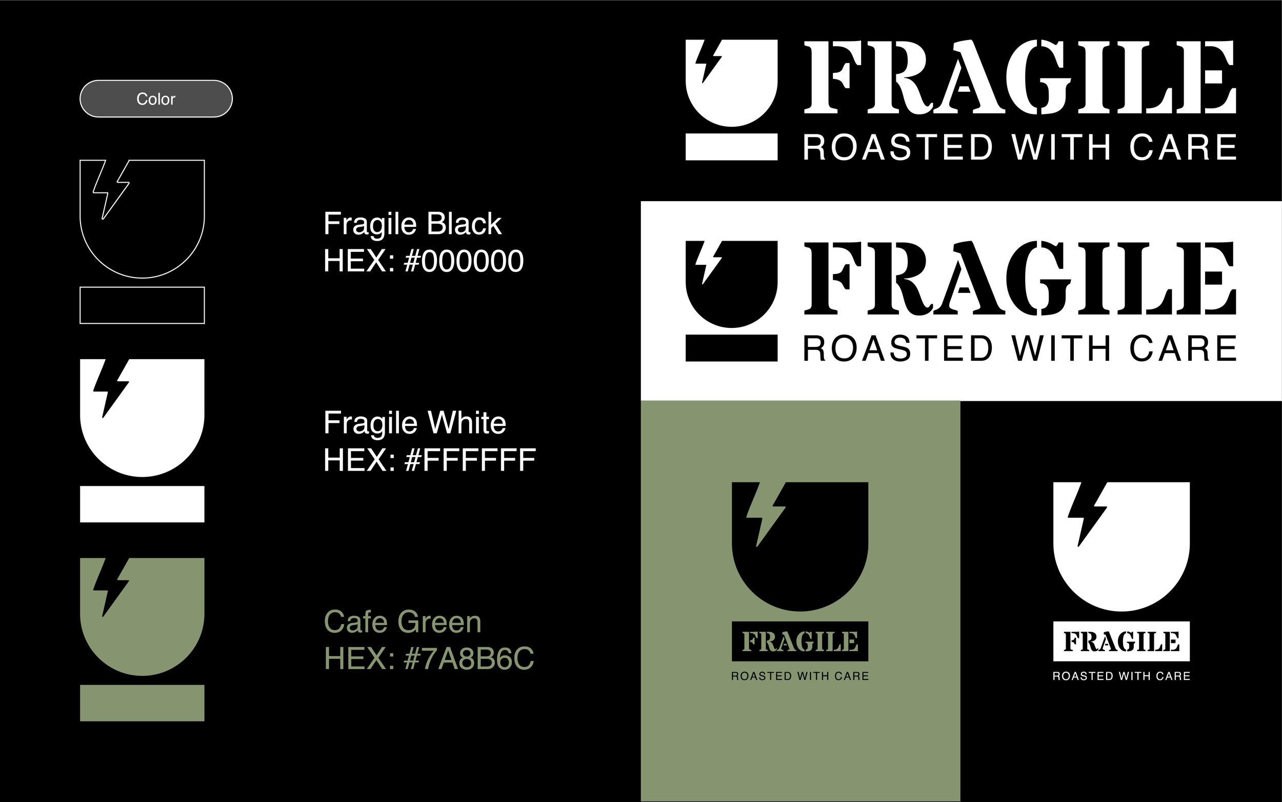
The color palette for Cafe FRAGILE is thoughtfully chosen to reflect the brand's core philosophy—the quiet poetry of fragility and care.
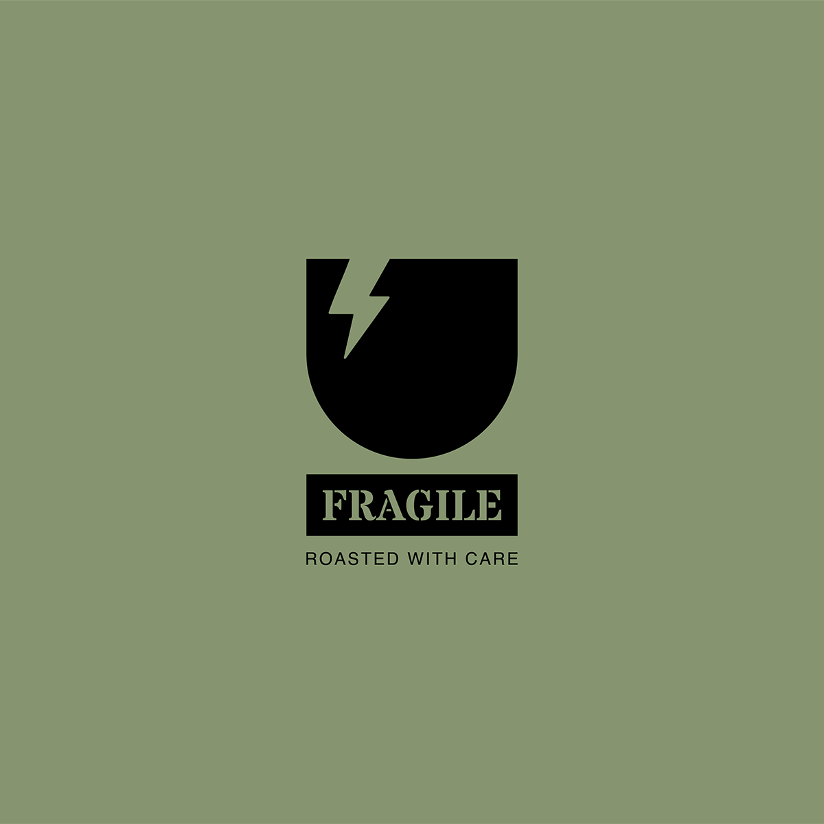
Cafe Green (#7A8B6C) serves as our signature accent, an earthy, muted tone that evokes the natural textures of wooden crates and the delicate balance of artisanal coffee craftsmanship. Reminiscent of museum crate tags and vintage storage materials, this precise shade creates an immediate connection to the brand’s story of careful handling and respectful presentation.
Supporting Colors
Fragile Black (#000000) grounds the visual identity, offering high contrast and a sense of permanence. Much like the bold, stenciled warnings on museum crates that protect precious artifacts, it commands attention while anchoring the brand's structural elements.
Fragile White (#FFFFFF) provides essential clarity and calm. Like the deliberate white space surrounding a carefully curated object, it ensures the brand’s narrative of care, precision, and the stenciled typography are never lost or overwhelmed.
System Integration
These colors are woven into every brand touchpoint, from digital presence to in-store details. They stand in harmony with the cafe’s wooden textures and tactile materials, reinforcing the message: "FRAGILE: ROASTED WITH CARE."
By blending these specific hues with the brand’s iconography—a stylized cracked cup signaling both breakage and careful restoration—the palette supports the cafe’s dual promise: to honor the fragility of objects and the warmth of the human experience.
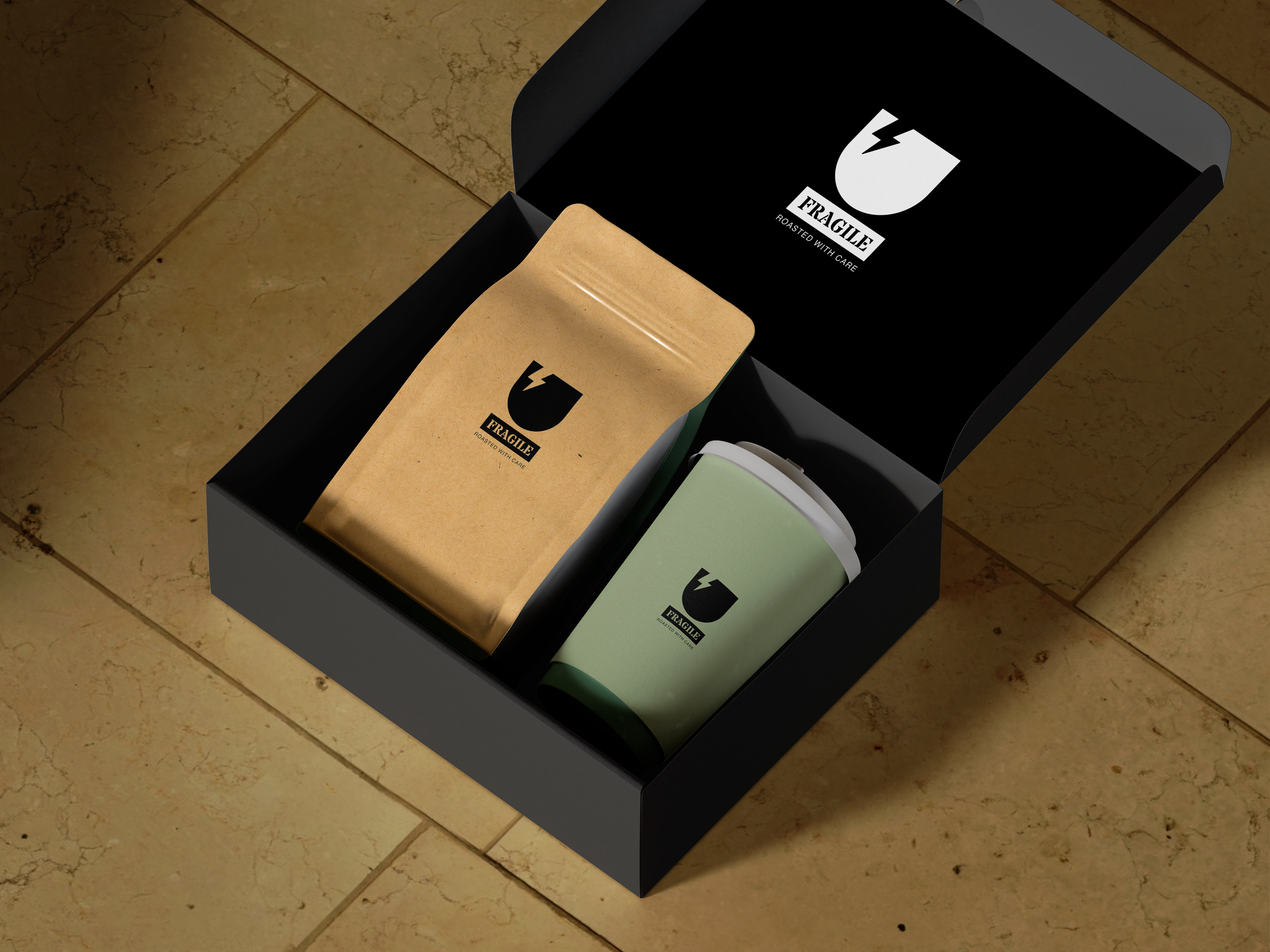
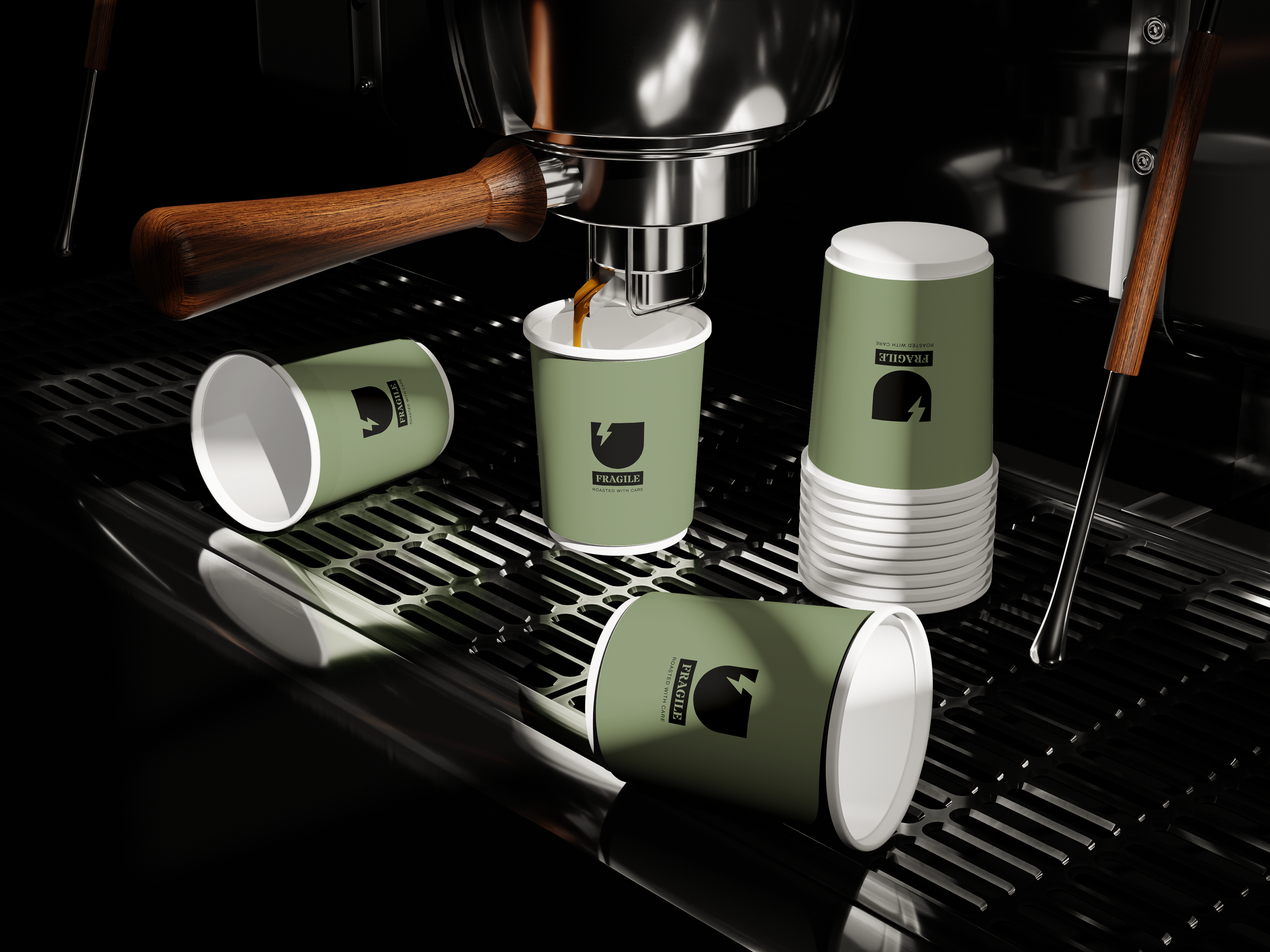
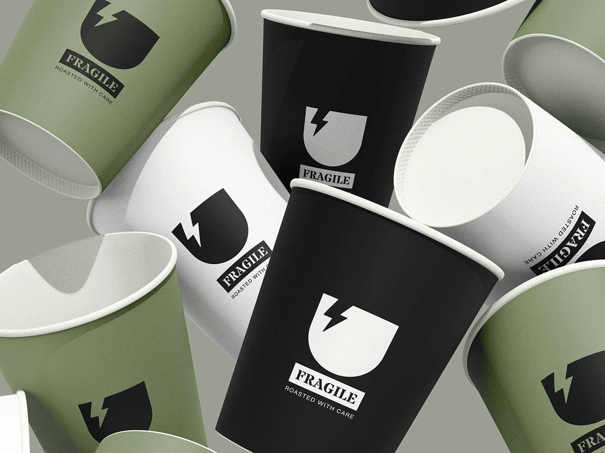
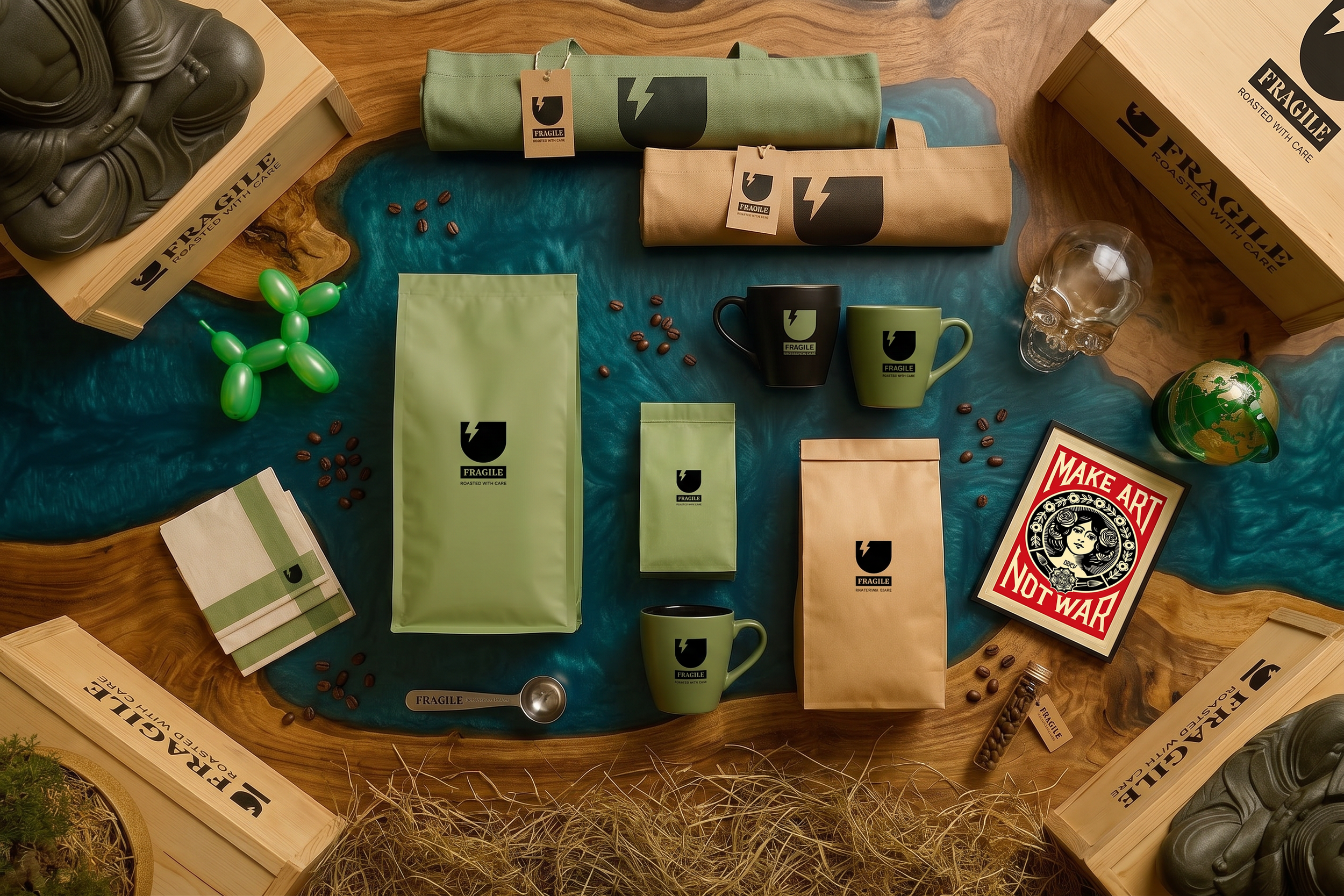
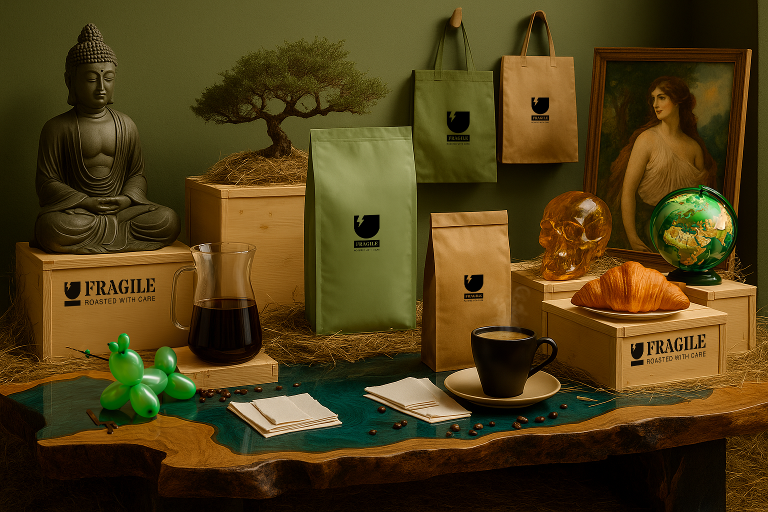

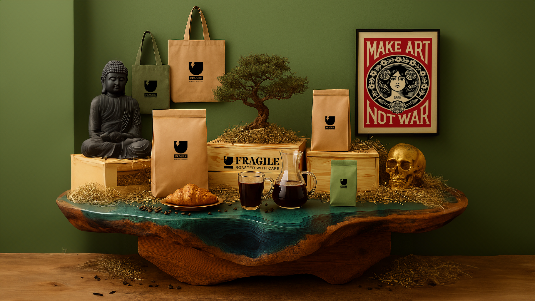
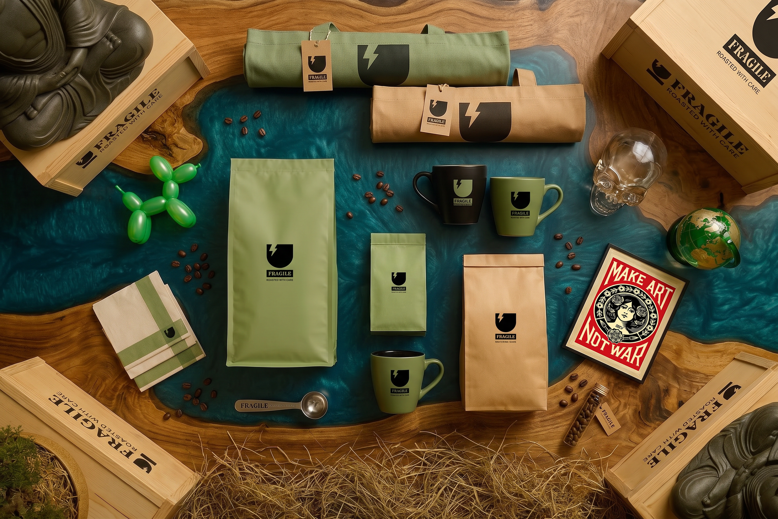
Cafe Merchandise Design and VMD Styling shots via Midjourney V7 + Google Gemini 3.1 Pro
Concept Visuals
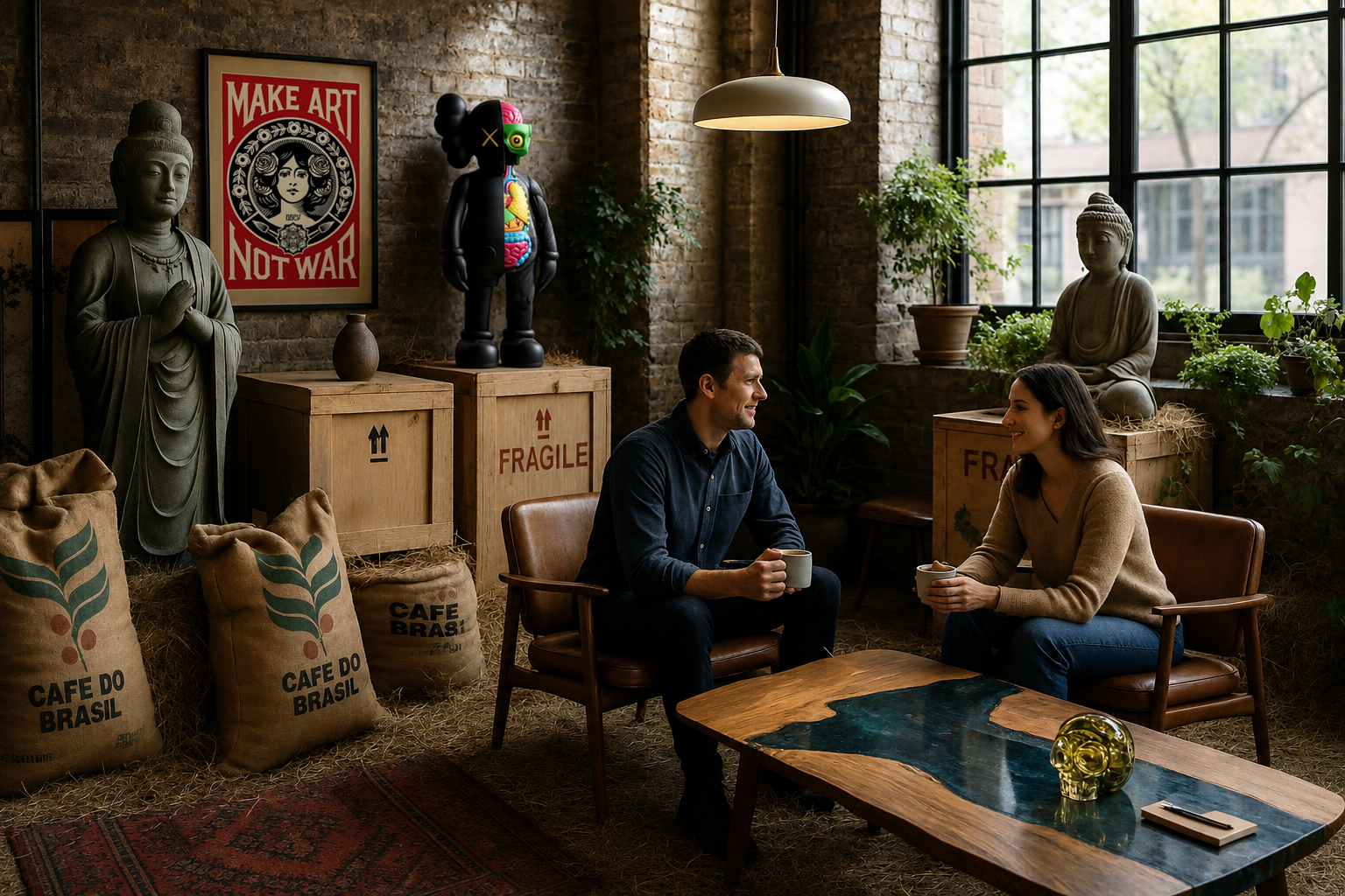
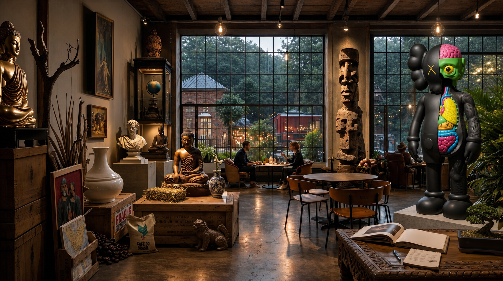
The visual concept for "FRAGILE" grew directly from my deep fascination with ancient relics and antiques. To create the atmosphere of a curated museum archive, we brought in a mix of elements, from art-handling crates to diverse cultural pieces.
Wooden museum crates and river tables serve as display plinths, while natural materials like hay and coffee beans are paired with minimalist styling to highlight the brand's artisanal roots. An earthy, muted color palette ties the space together, reinforcing our natural and eco-conscious values. Finally, pairing the FRAGILE logo with sleek modern typography creates a unique balance of rich heritage and premium care.
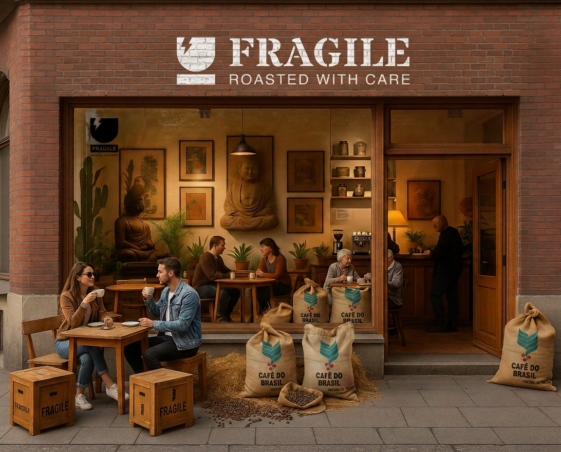
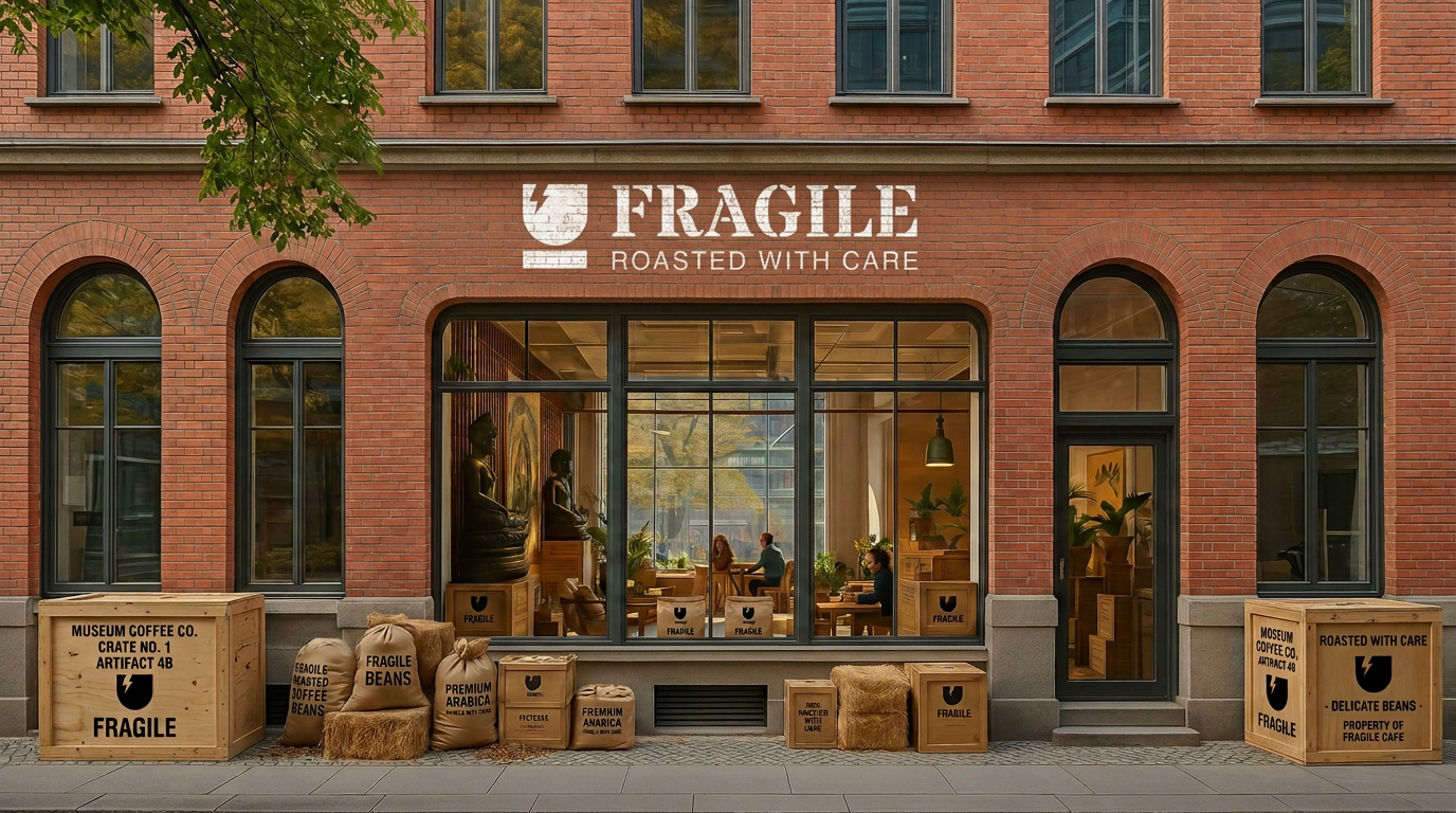
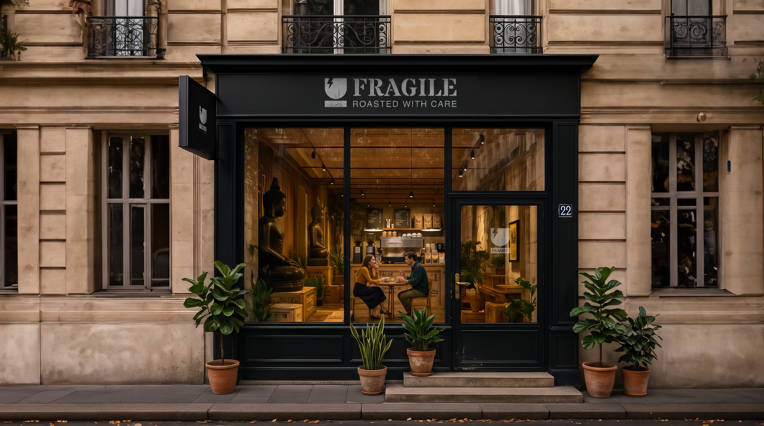
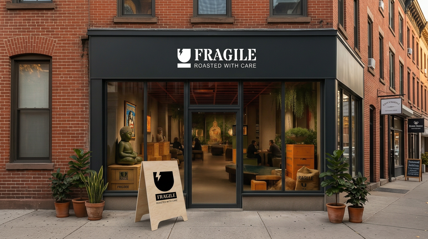
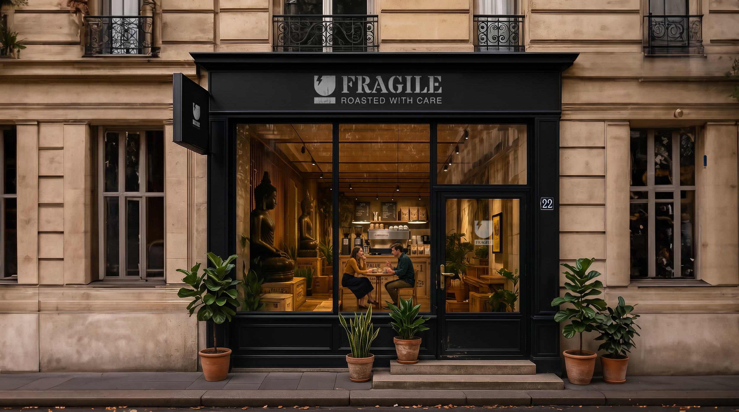
Exterior concept visuals generated via CHATGPT, Google Gemini 3.1 Pro + Photoshop
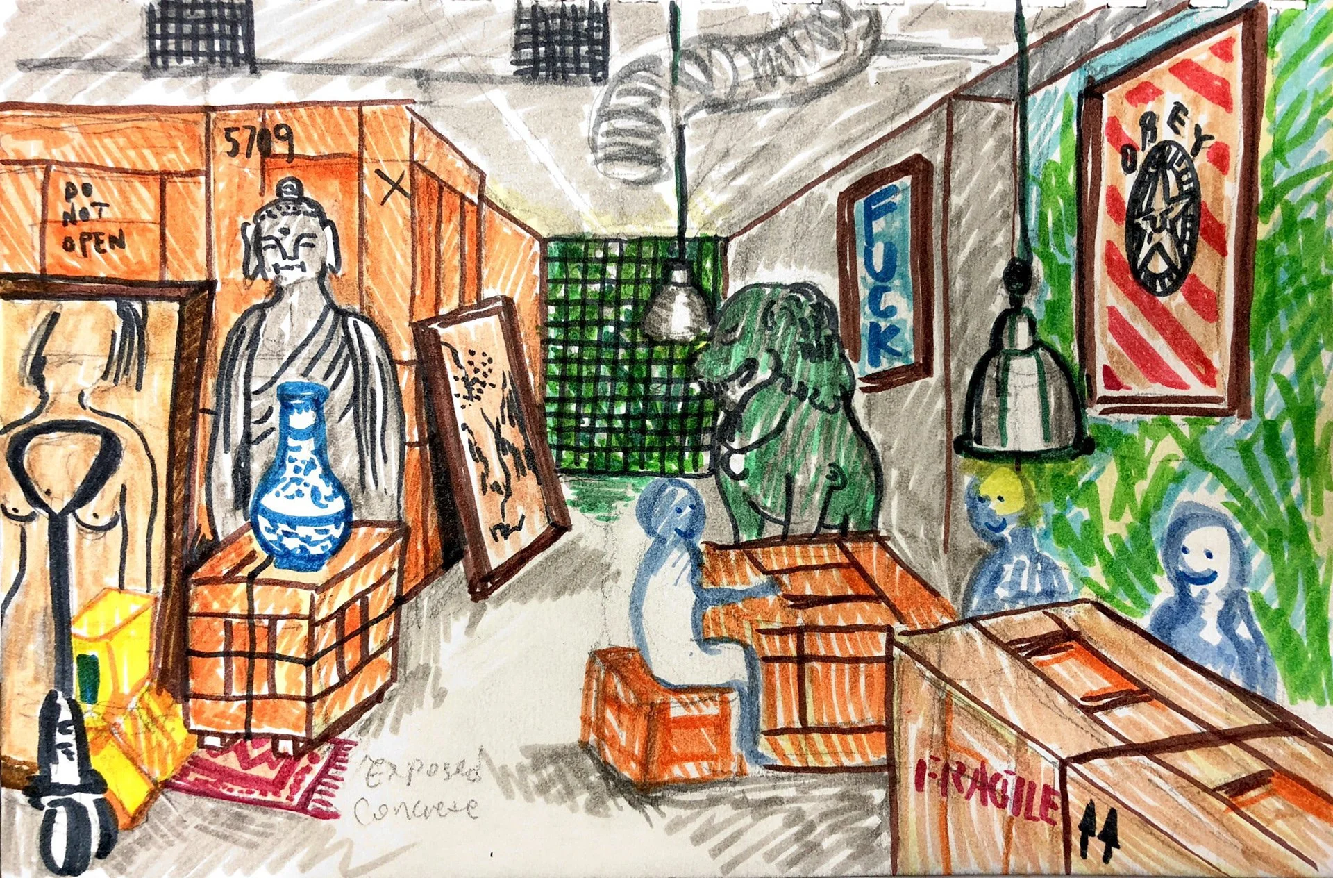
Original Sketch
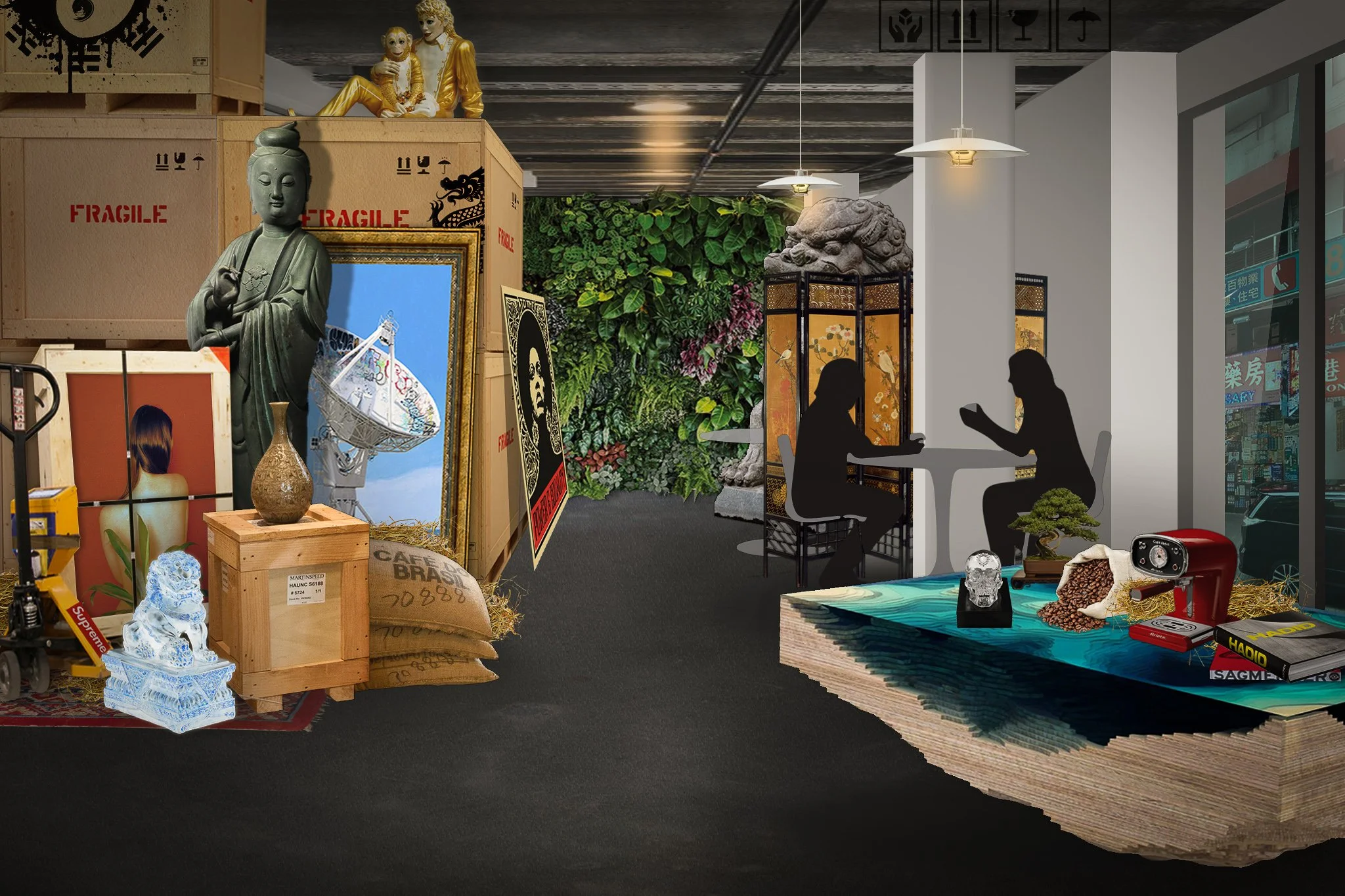
Early Ideation Visual via Photoshop
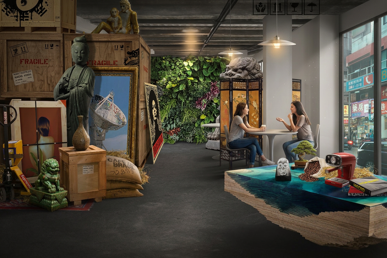
Rendered Visual with Google Gemini 3.1 Pro
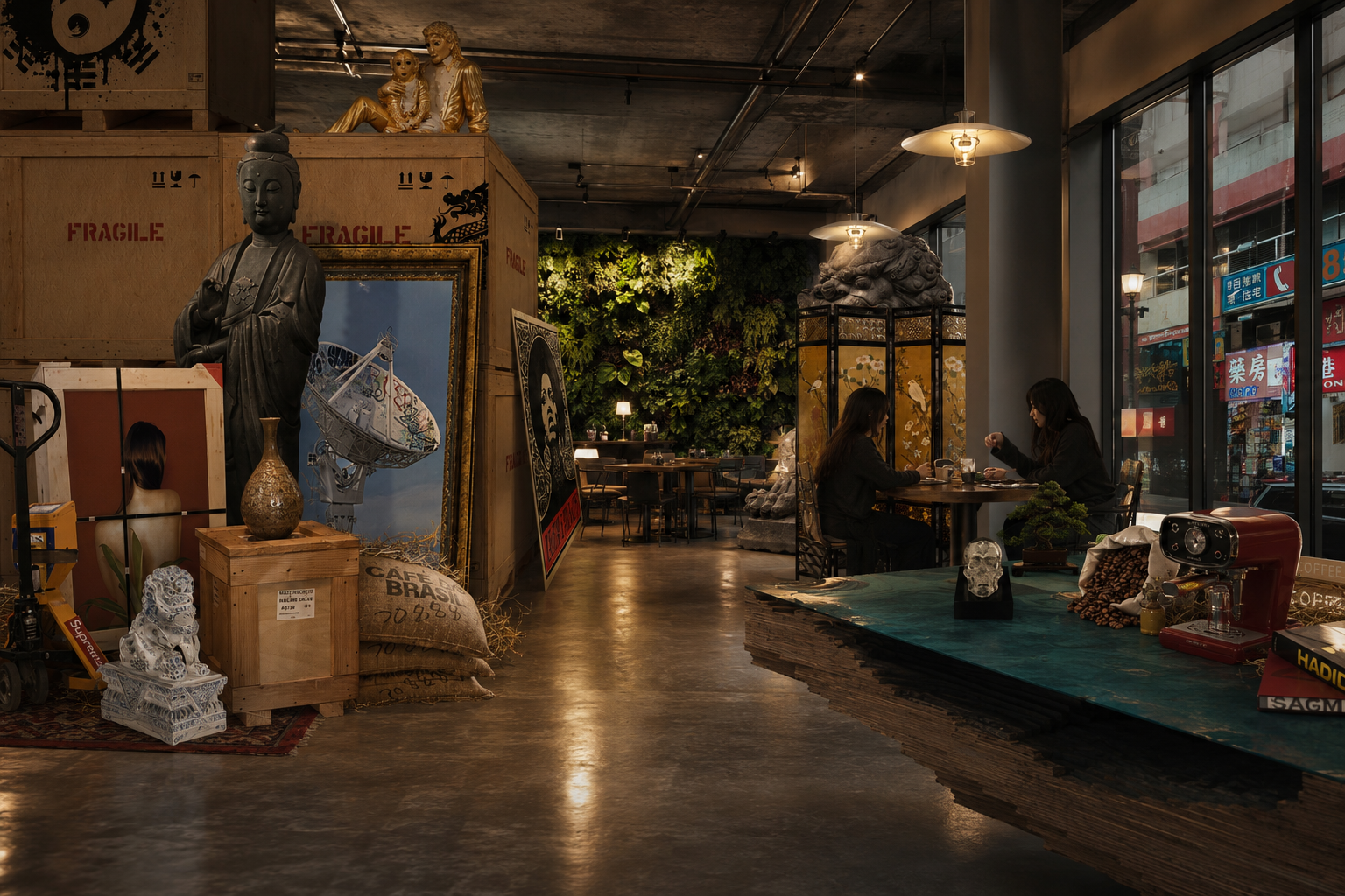
Rendered Visual with CHATGPT
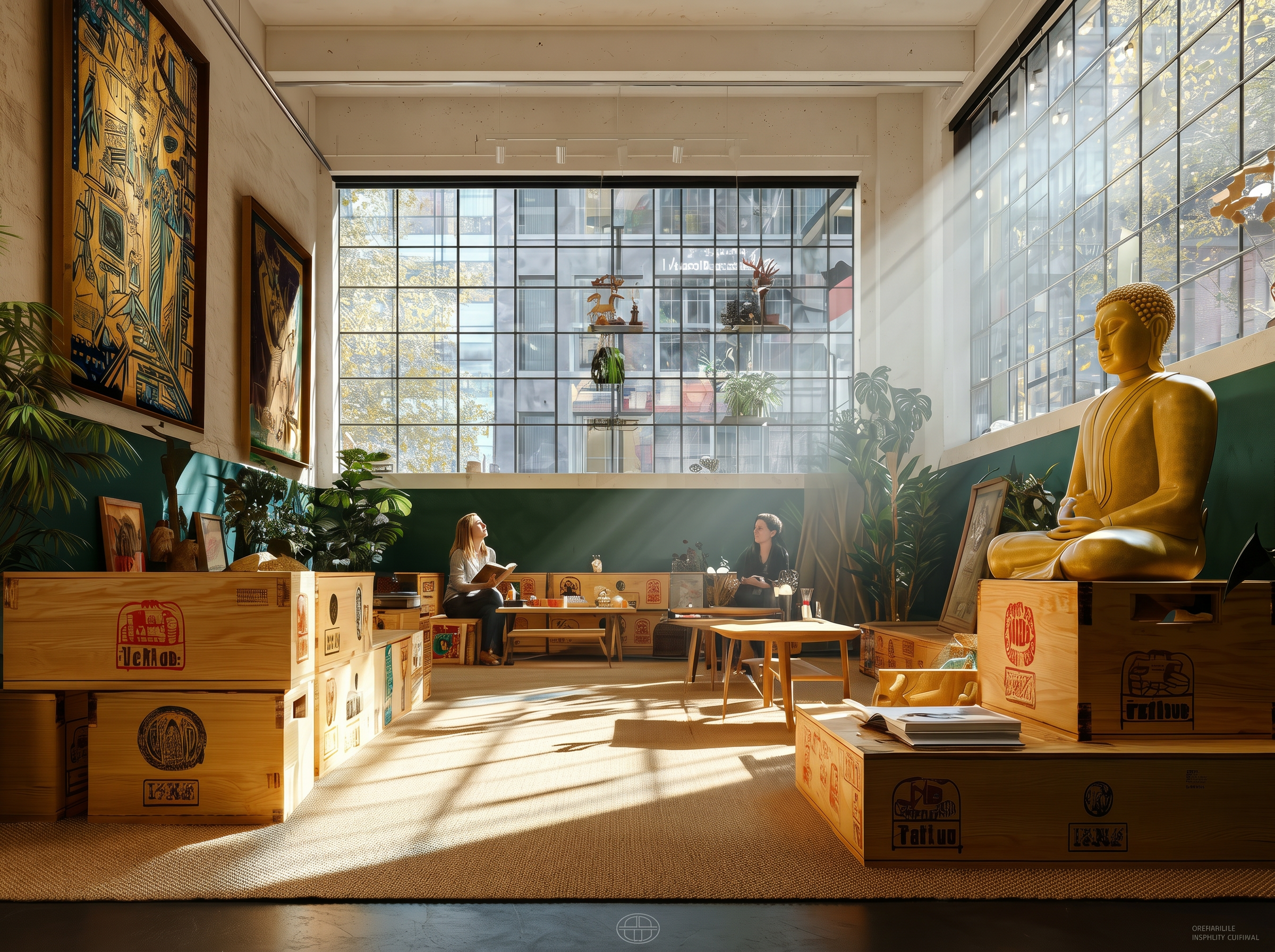
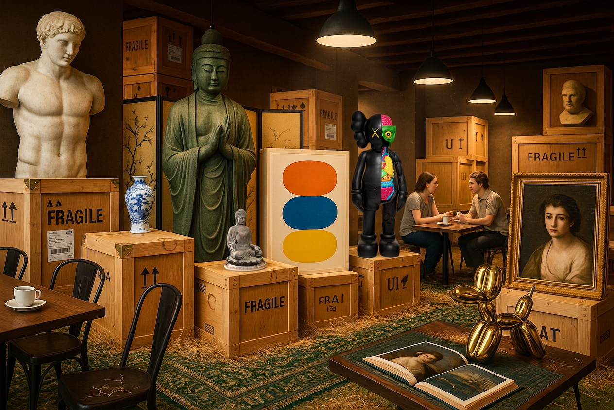

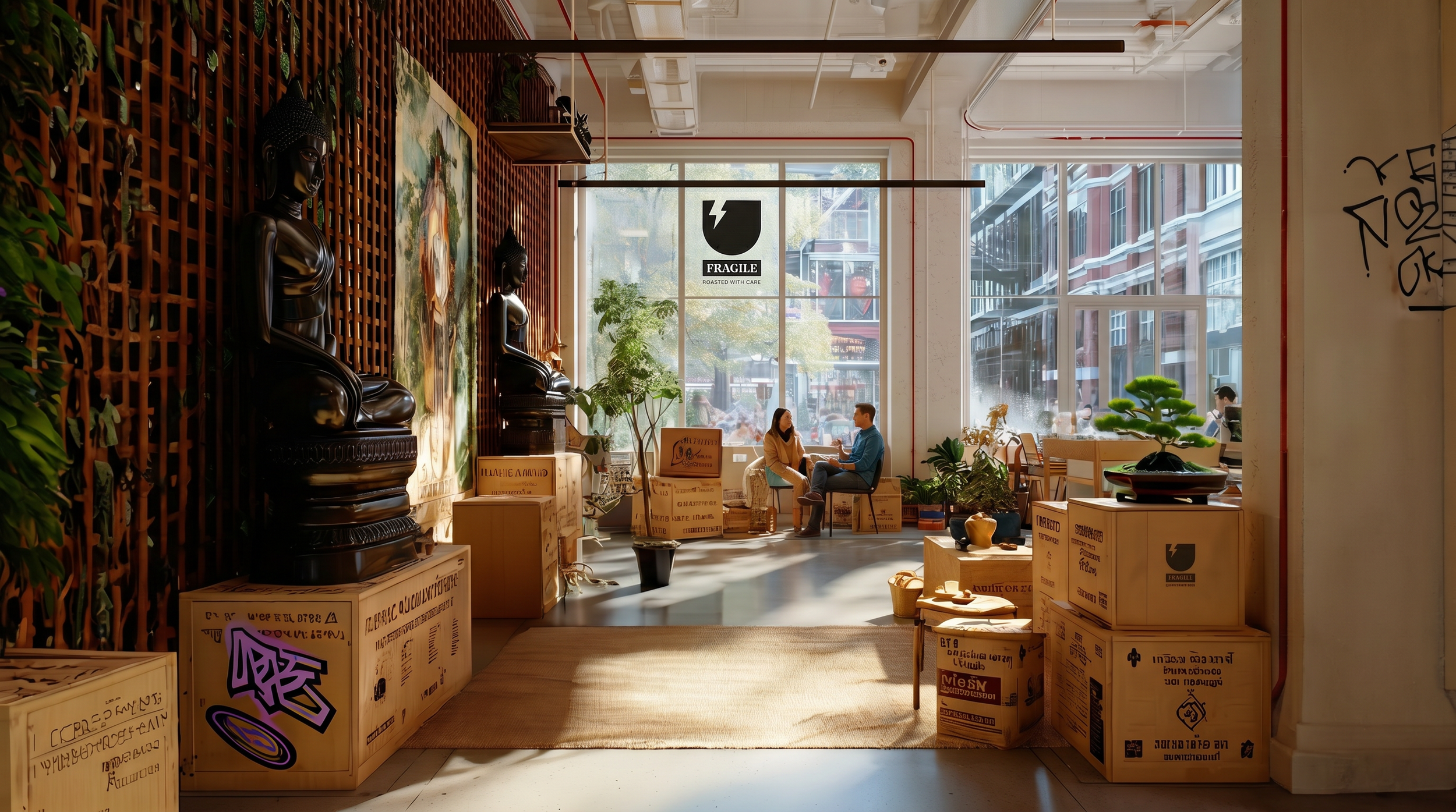
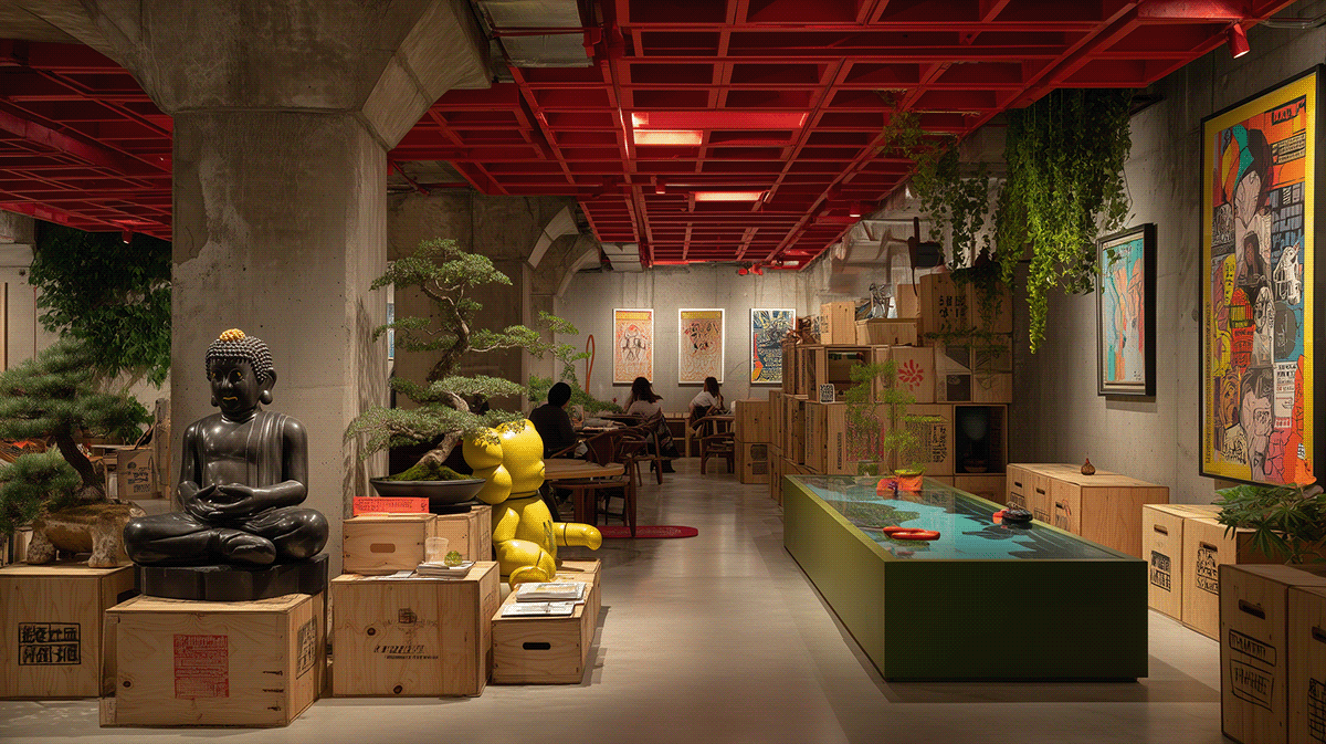
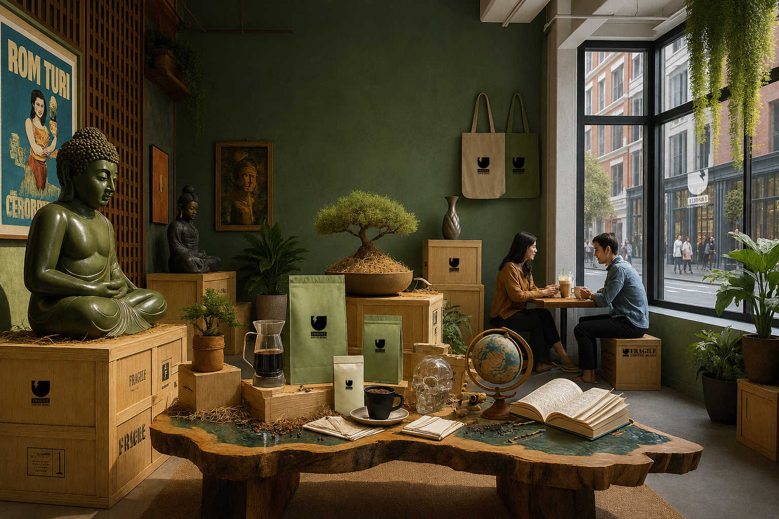
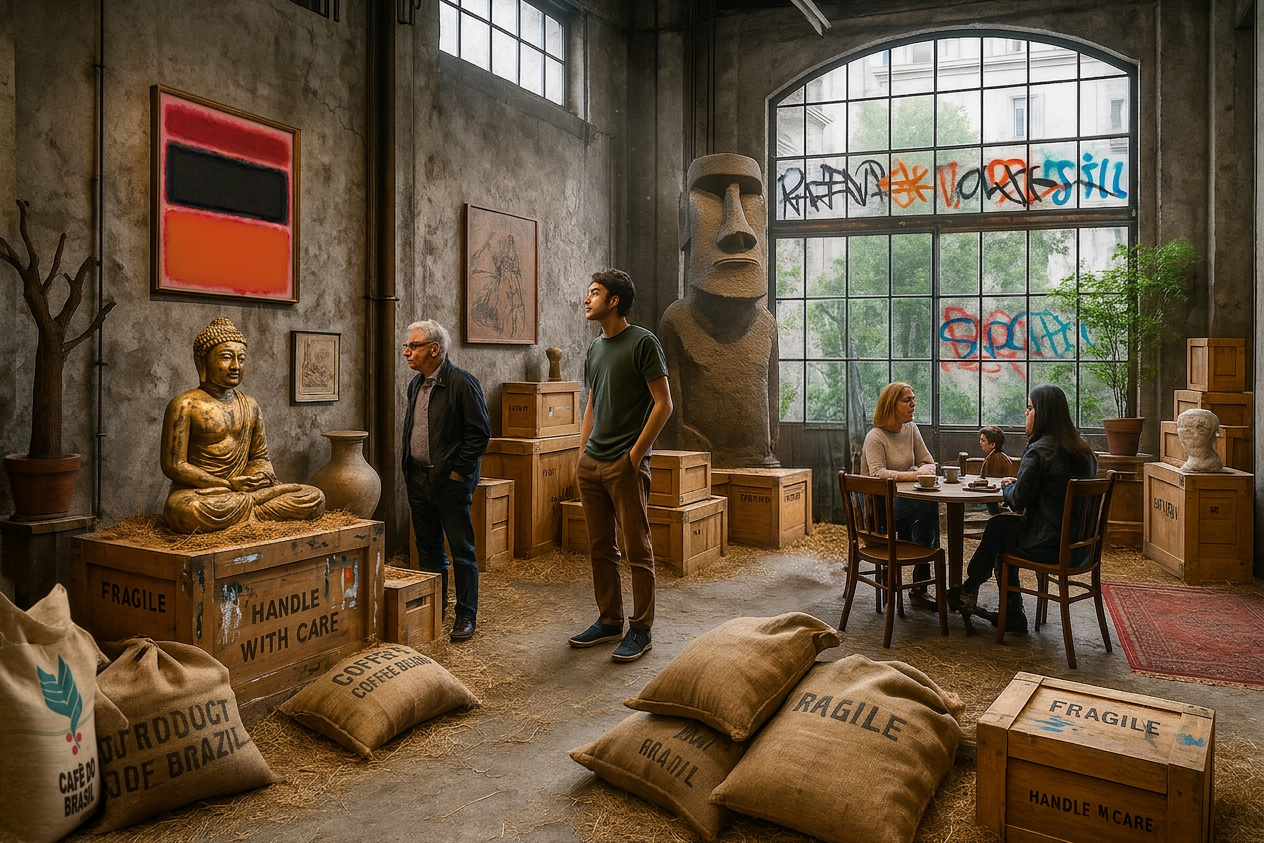
Interior concept visuals generated via Midjourney V7 & CHATGPT, Gemini 3.1 Pro + Photoshop