ETERNITY
ETERNITY: Korean Modernism for BESPOKE
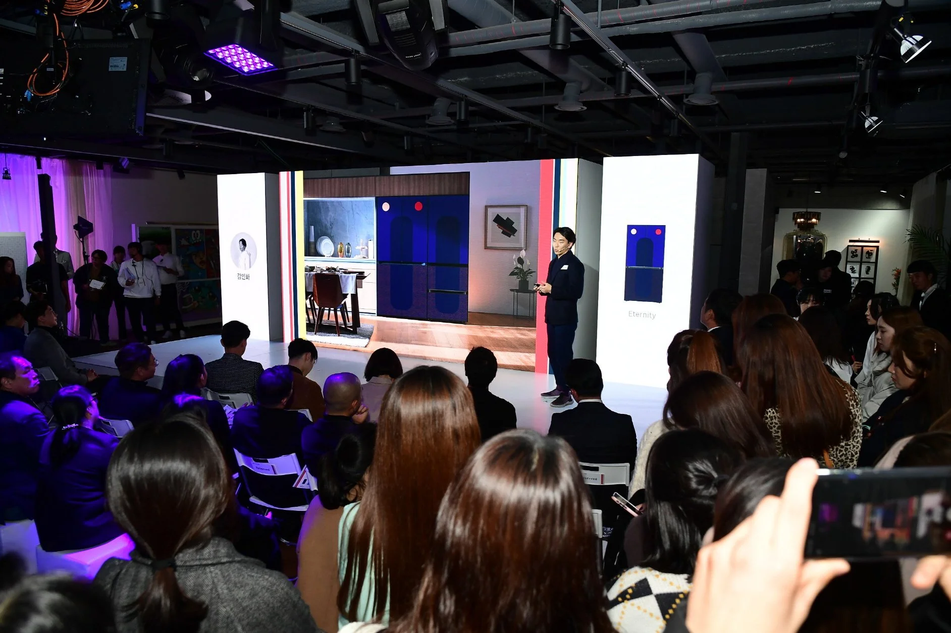
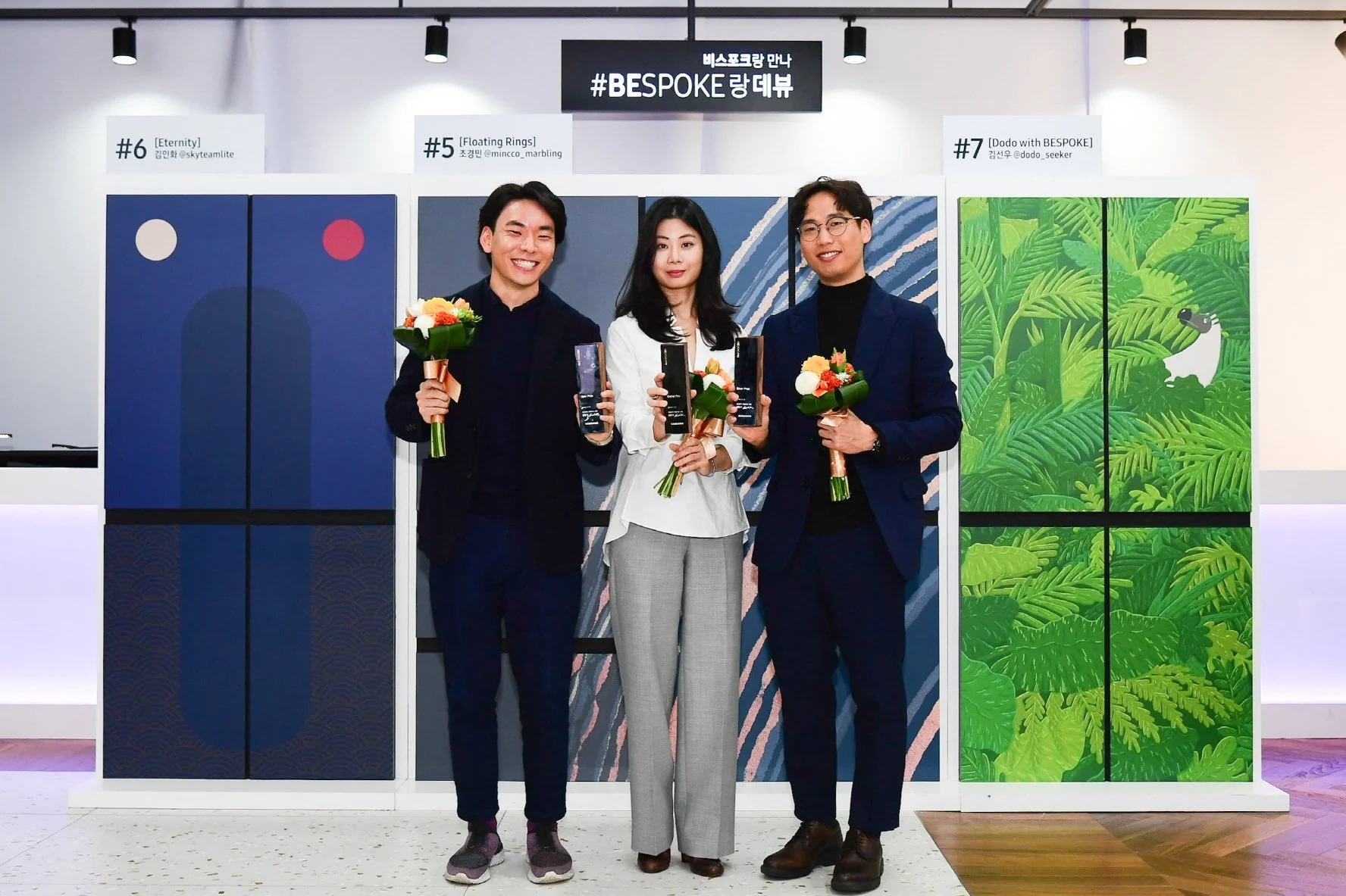
Grand Prize – Samsung Electronics BESPOKE Rendezvous Design Competition (2019)Award & Recognition
Top Honor: Selected as the 2nd place winner out of 1,114 submissions globally.
Recognition: Highly acclaimed by industry experts and the public, voting for successfully translating traditional Korean heritage into a contemporary product design language.
Public Favorite: Recognized for its unique approach to "Korean Modernism," receiving significant attention and votes during the public evaluation phase.
ETERNITY
Design Concept
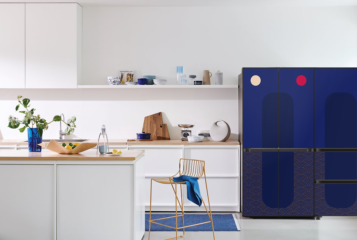
"Bringing the majestic aura of the Joseon Dynasty into the contemporary kitchen.
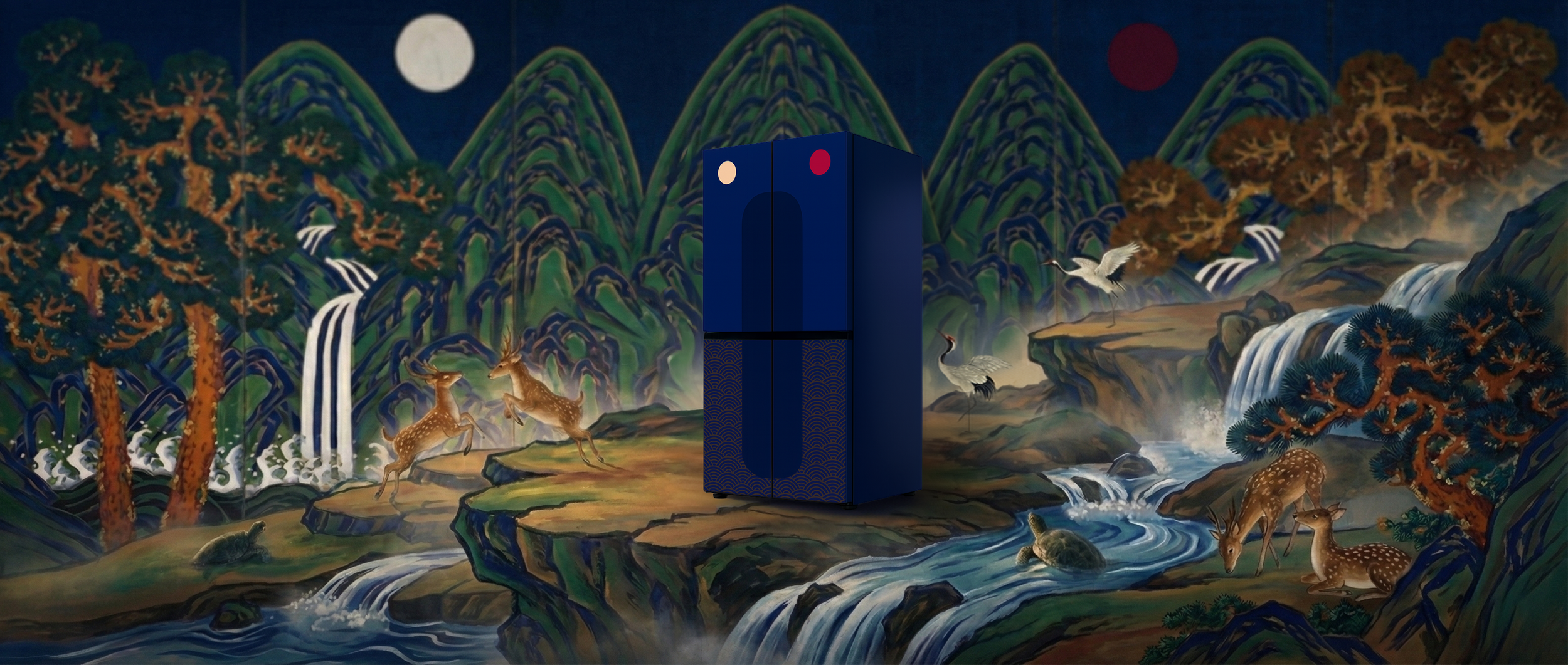
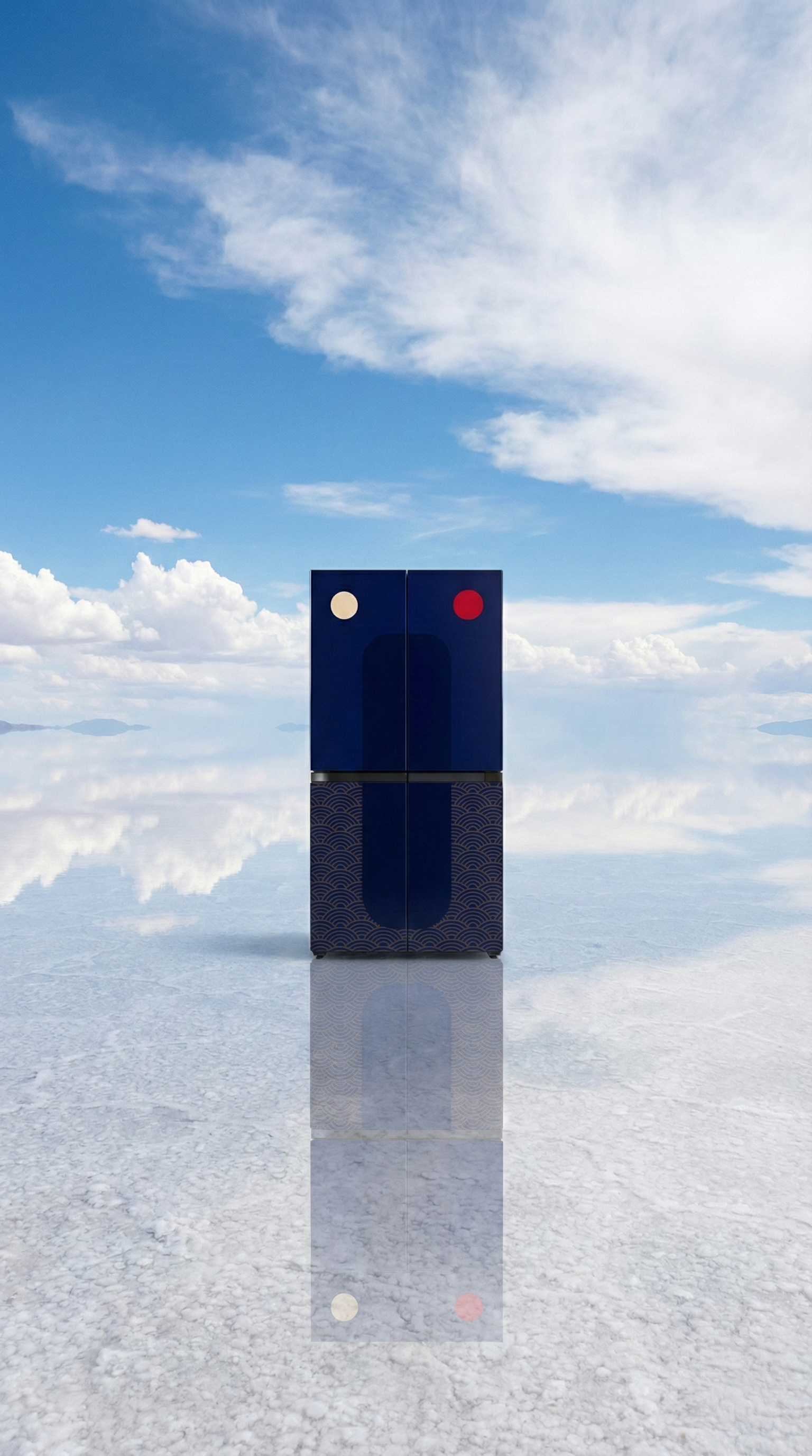
This project, Eternity, reimagines the traditional 'Ilworobongdo' (Painting of the Sun, Moon, and Five Peaks) through a lens of geometric minimalism. By distilling the historic symbol of royal dignity into abstract forms, the design challenges the boundary between appliance and art. It transforms the Samsung BESPOKE refrigerator into a cultural objet d'art, perfectly harmonizing timeless heritage with modern lifestyle."
Inspiration
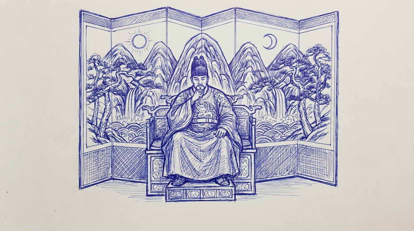
Source: Ilworobongdo (The Sun, Moon, and Five Peaks)
Symbolism: A traditional Korean royal painting representing eternity, majesty, and balance.

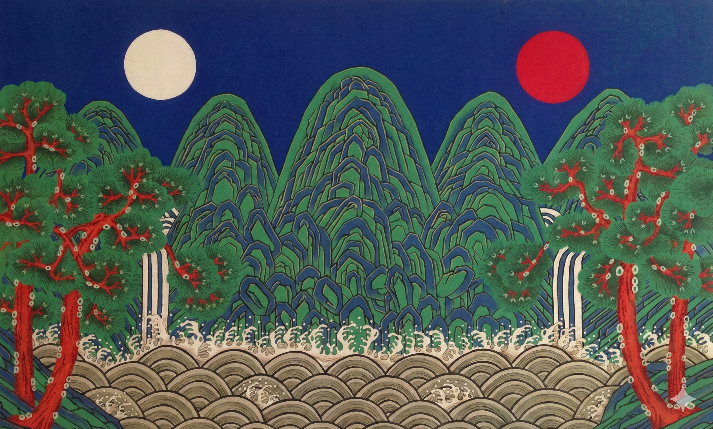
Inspiration Source: Ilwolobongdo (Sun and Moon, and Five Peaks), a Traditional Korean Royal Painting symbolizing eternity and majesty.
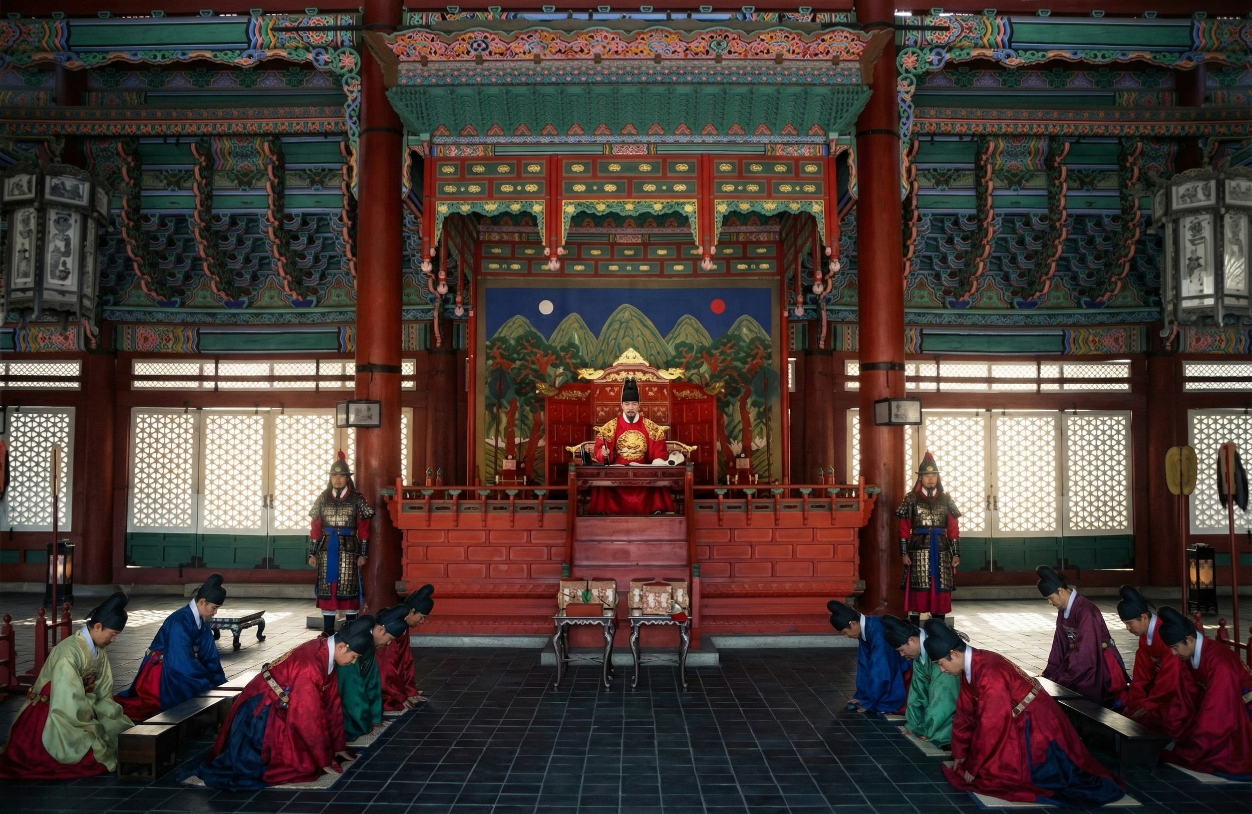
Ilwolobongdo (Sun and Moon, and Five Peaks), being in place behind the King's throne.
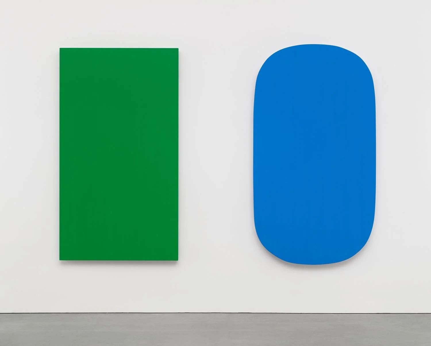
Ellsworth Kelly, Green Blue, 2015, Oil on canvas. © Ellsworth Kelly
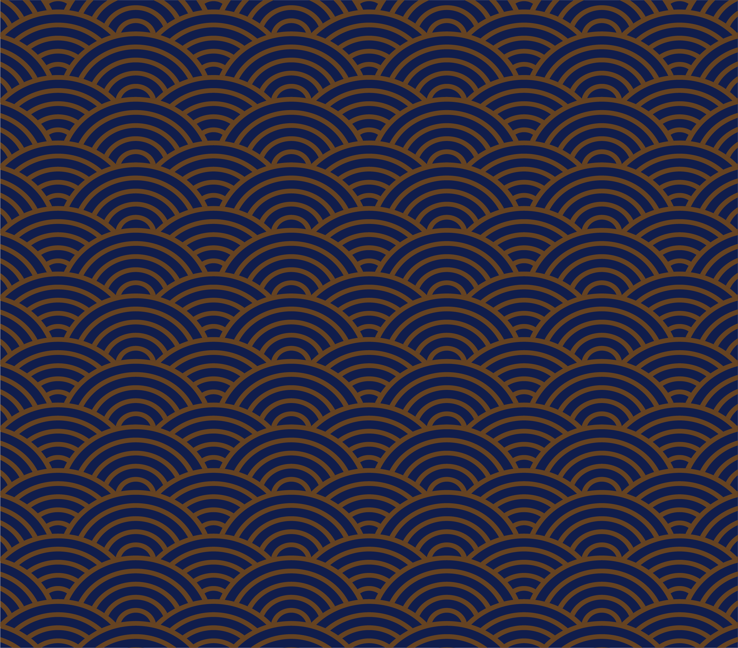
A Traditional Korean Wave Pattern
Key Design Features
Korean Modernism
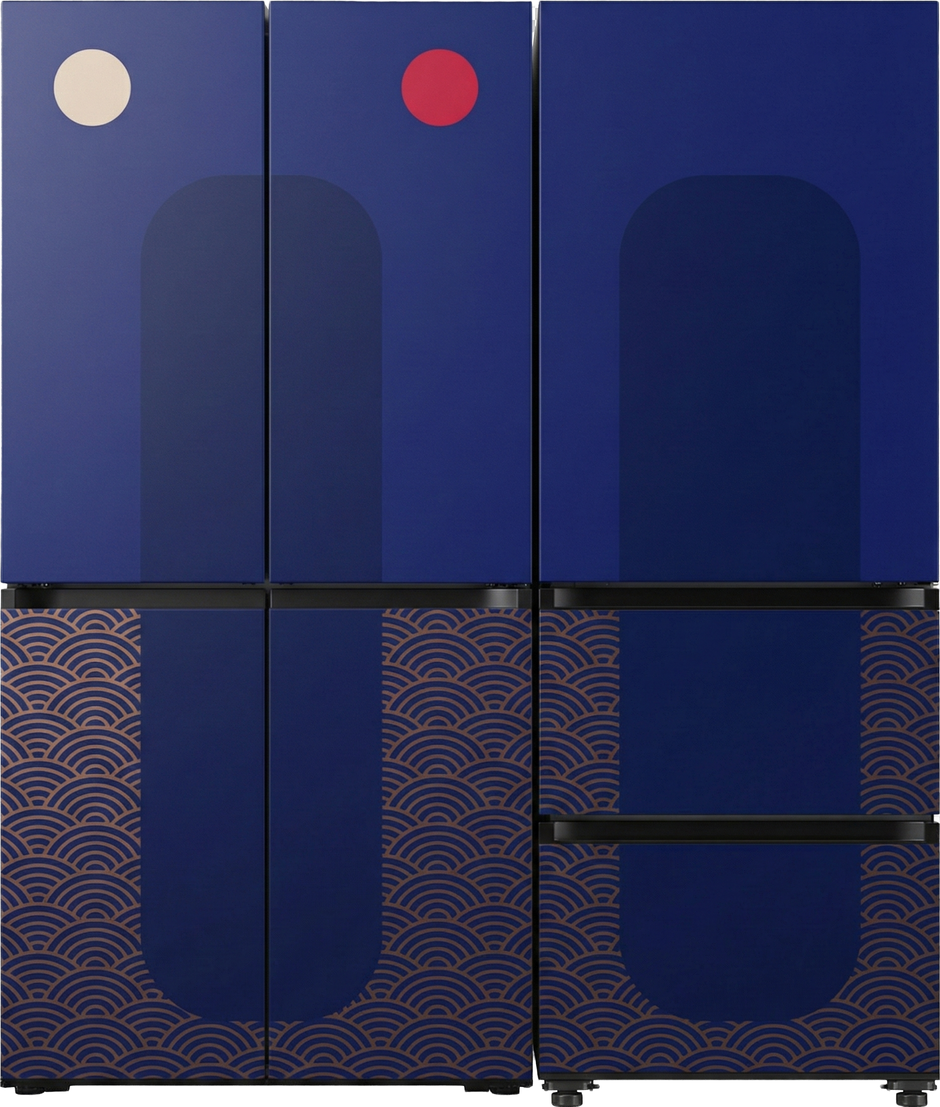
By simplifying the complex patterns of the traditional painting into geometric forms and bold colors (Deep Royal Blue, Sun Red, Moon Cream), this design visualizes "Korean Modernism," making it relevant for 21st-century interiors.Versatile Harmony
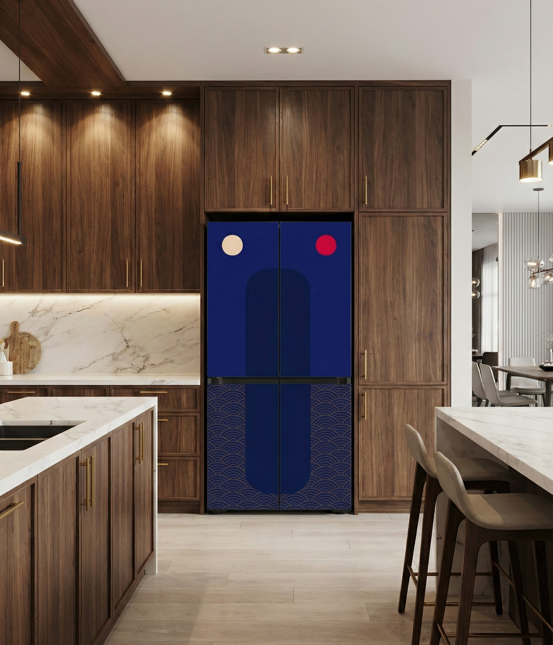
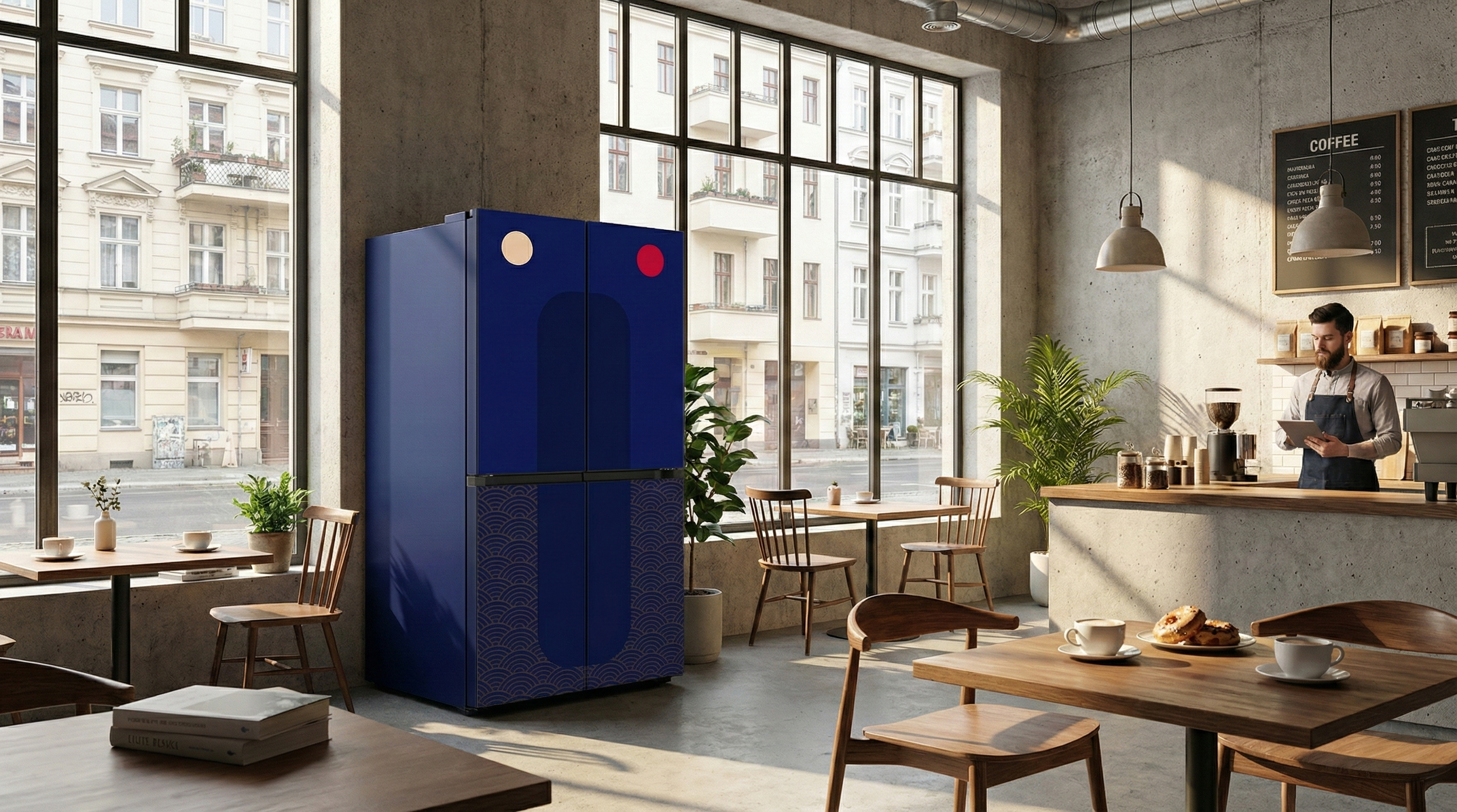
While rooted in tradition, the aesthetic is strictly modern. It is crafted to harmonize seamlessly with diverse high-end environments, ranging from luxury residential kitchens to professional executive offices.True Customization
Embracing the core philosophy of the BESPOKE line, this project offers users not just a refrigerator but a customizable piece of history that elevates the dignity of their space.
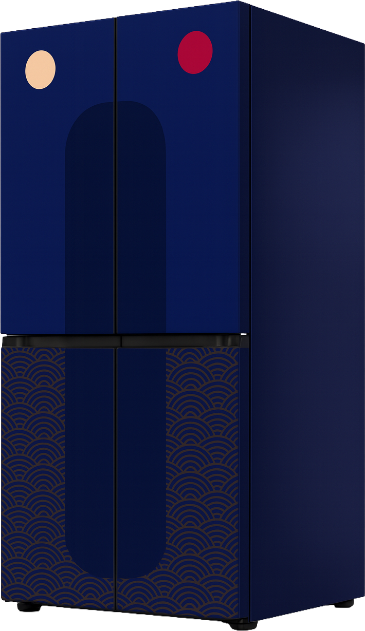
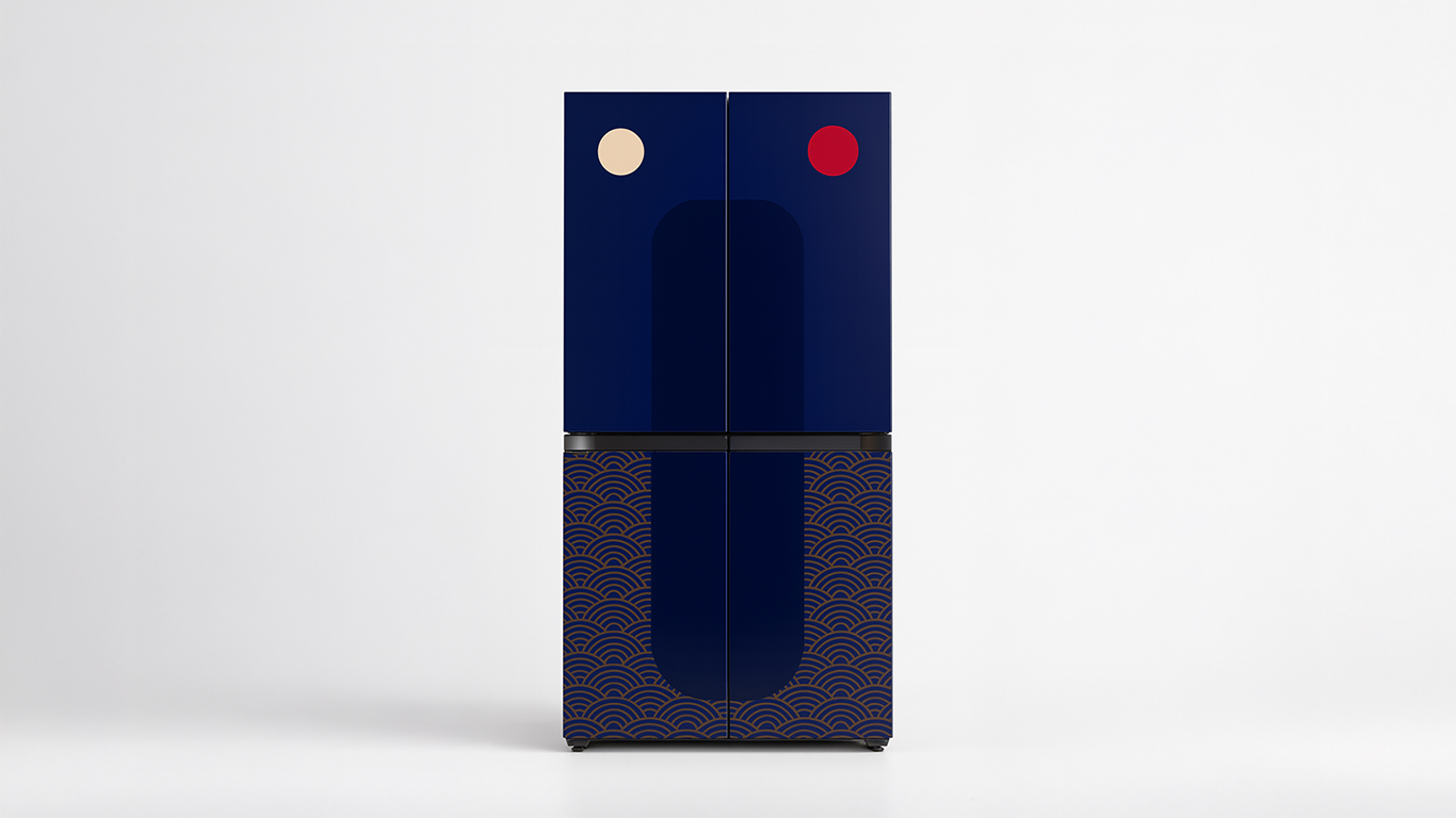
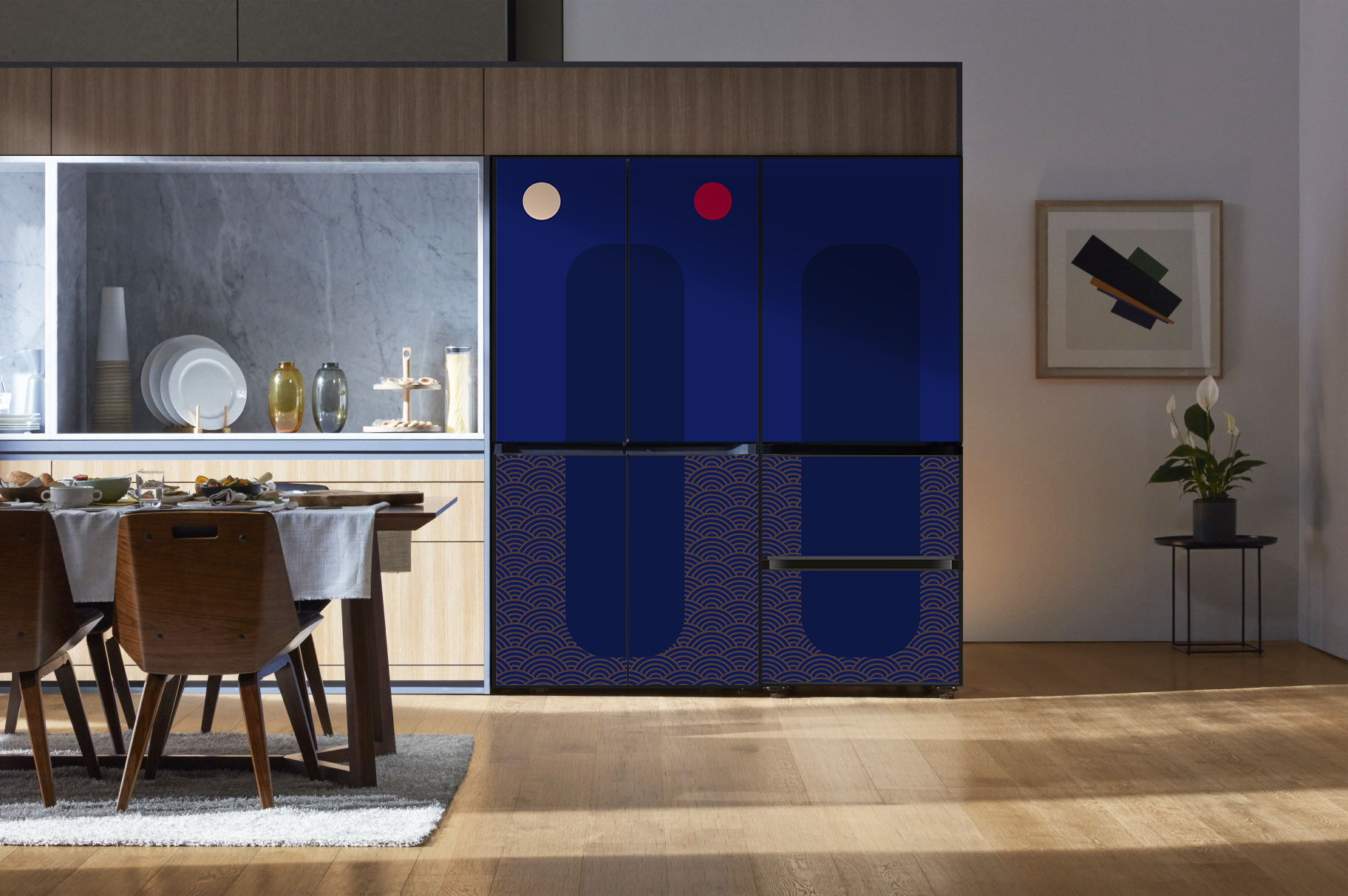
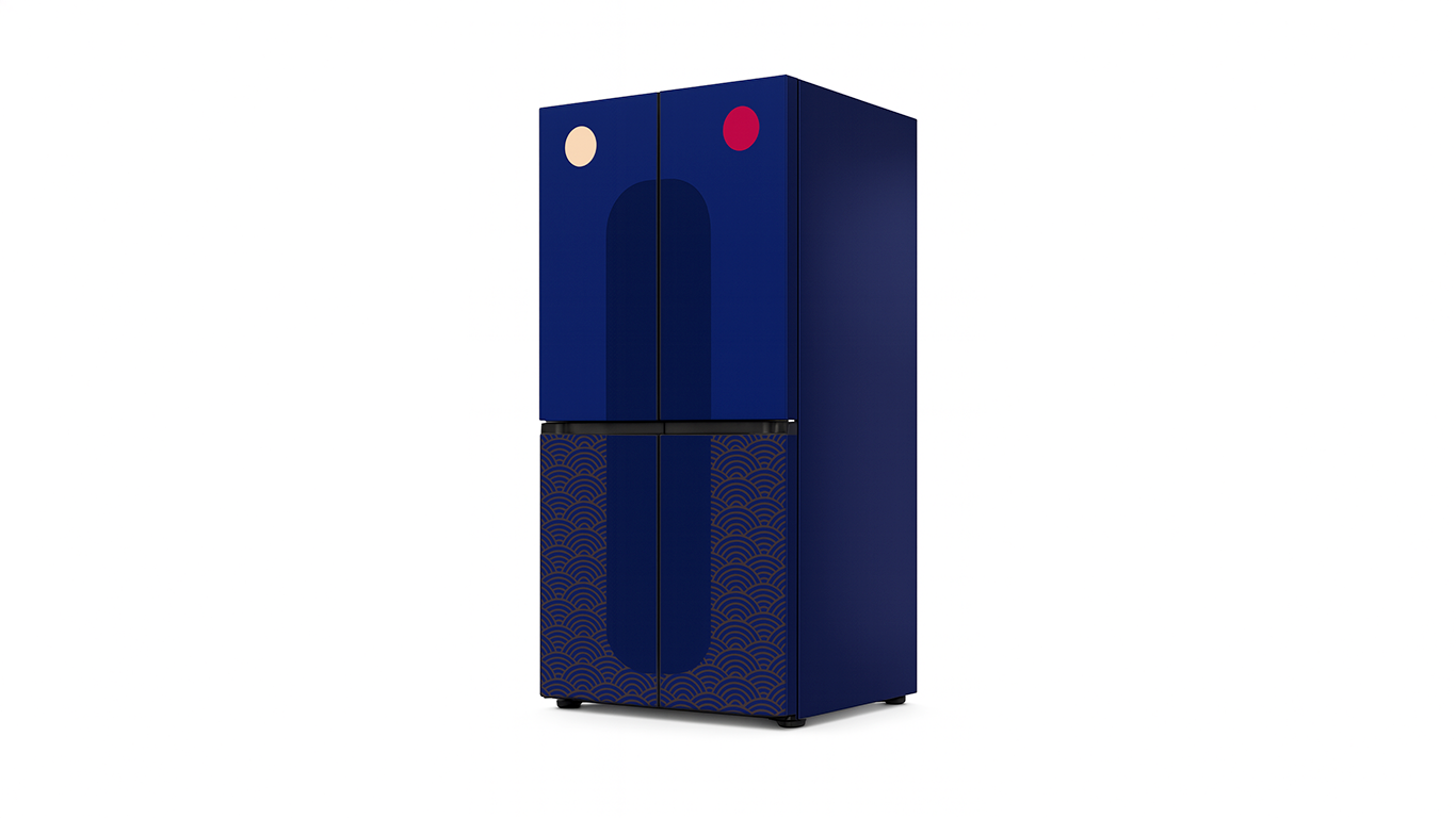


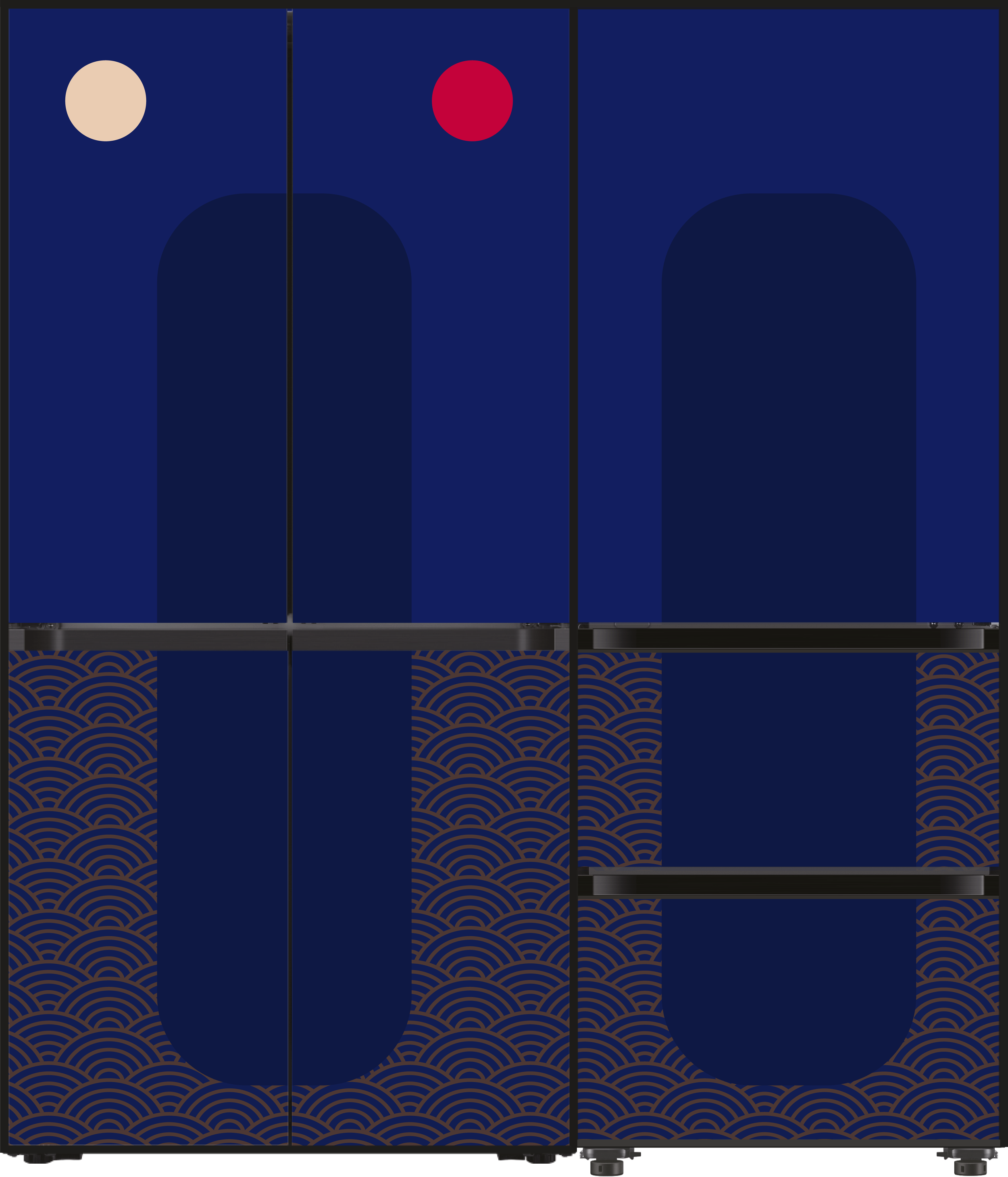
Single Type + Sub 2D image
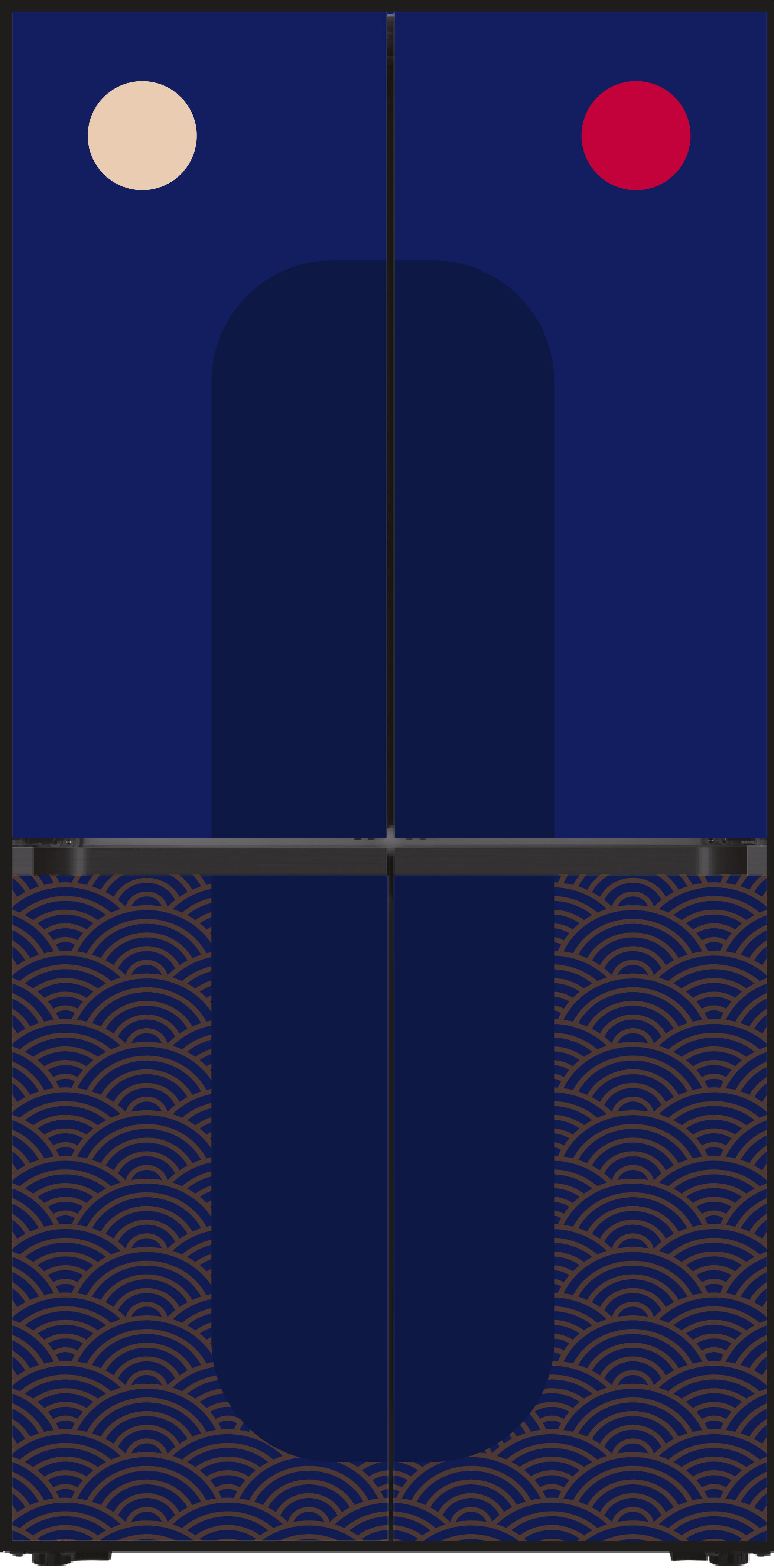
Single Type 2D image

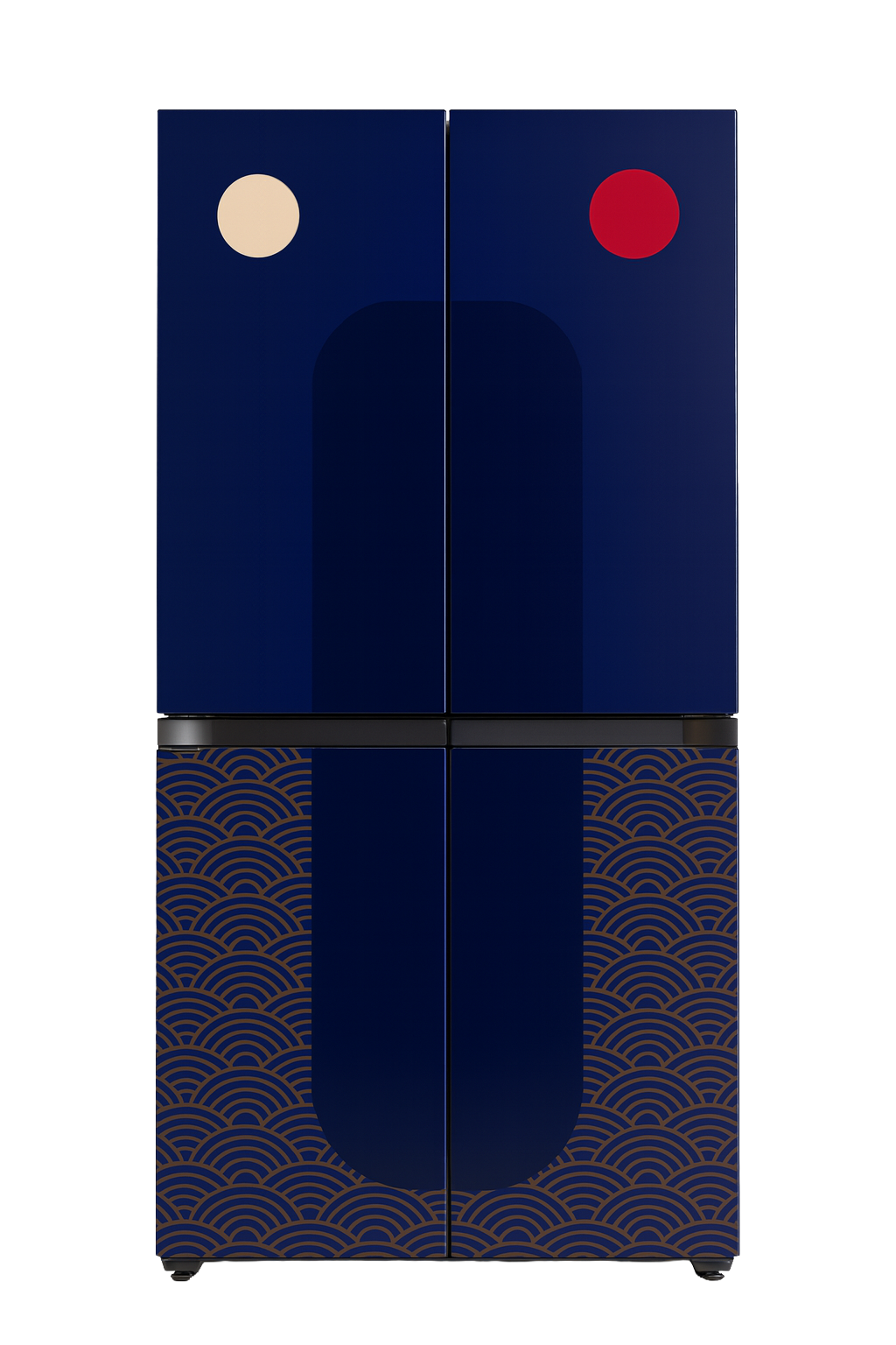
Single Type + Sub Render

Single Type Front Render

As a designer, my goal is to bridge the gap between the past and the future. With Eternity, I wanted to prove that traditional cultural assets could be refined into sophisticated industrial designs that appeal to global consumers. This award validates my ability to reinterpret heritage with a modern sensibility and apply it to mass production constraints.
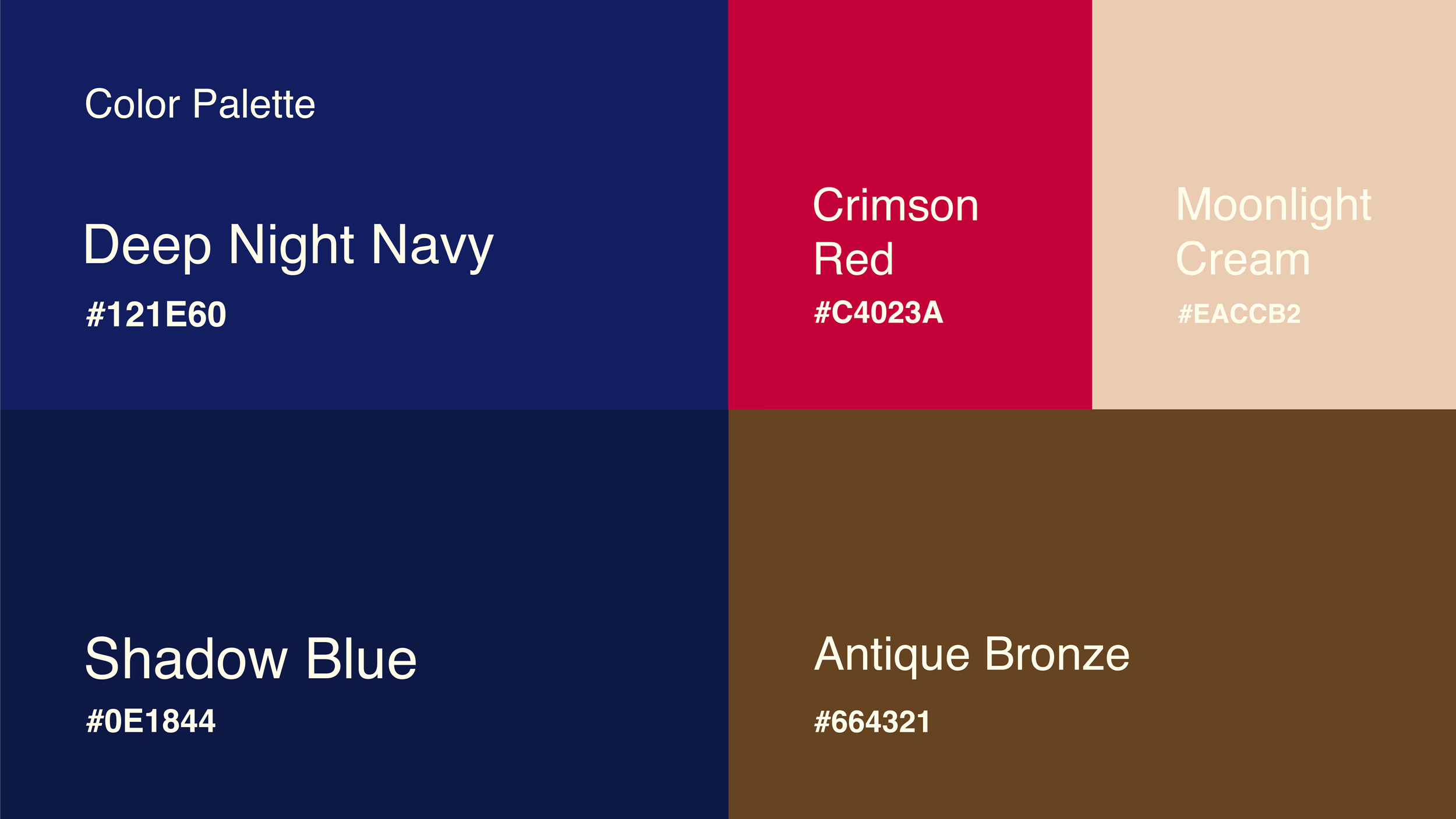
Color Palette & Rationale
Deep Night Navy (#121E60)
Role: Primary Background
Rationale: Symbolizing the infinite depth of the night sky, this dark navy serves as a sophisticated canvas that enhances the vibrancy of the accent colors. It conveys premium stability and calmness.
Crimson Red (#C4023A)
Role: Accent (The Sun)
Rationale: Representing the 'Sun' and 'Yang' energy. This bold red adds a focal point of vitality and authority, creating a striking contrast against the dark background.
Moonlight Cream (#EACCB2)
Role: Accent (The Moon)
Rationale: Representing the 'Moon' and 'Yin' energy. This warm cream hue balances the intensity of the red, adding a touch of softness and serenity to the overall composition.
Antique Bronze (#664321)
Role: Pattern & Texture (Waves/Mountains)
Rationale: Inspired by traditional brassware and natural earth tones. Used for the wave patterns, this color grounds the design with a sense of history and luxurious texture, bridging the gap between tradition and modernity.
Shadow Blue (#0E1844)
Role: Secondary Background (The Arch)
Rationale: Used for the central arch, to create a subtle tone-on-tone contrast with the deep navy background. This geometric layering adds visual depth and modern sophistication, abstractly representing the majestic silhouette of the mountain peaks.