Café FRAGILE
Visual Identity & Spatial Concept
A café identity that turns the language of museum shipping crates into an invitation to slow down and handle everyday moments with care.
Self-initiated concept project
A Cafe Concept Inspired by Museum Storage
Overview
Café FRAGILE is a fictional café brand inspired by the crates, labels, and handling symbols used to transport artworks. The project translates these practical graphics into a visual identity, merchandise, and a series of spatial concepts.
At its heart is a shift in meaning: “fragile” becomes an expression of care, extending from the objects we protect to the coffee we serve.
From Warning to Welcome
Museum crates suggest that something worth protecting is inside. I used that association as the starting point for a café built around attention to everyday things.
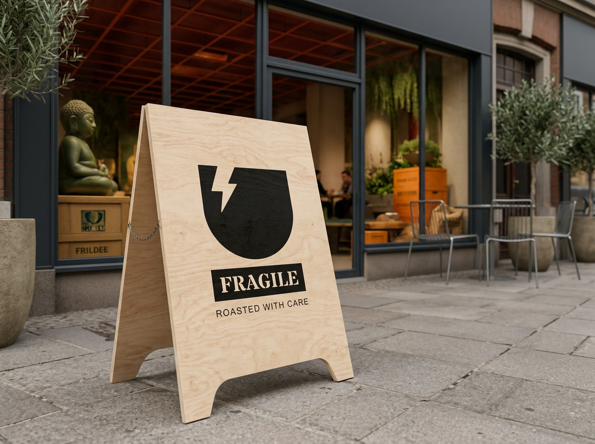
Stencil lettering, a fractured cup symbol, and crate-inspired displays connect the identity across different scales—from a small product label to a storefront.
Logo System
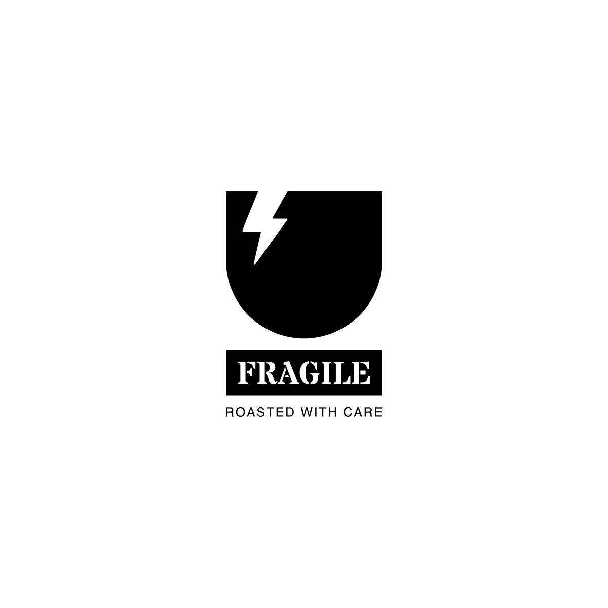
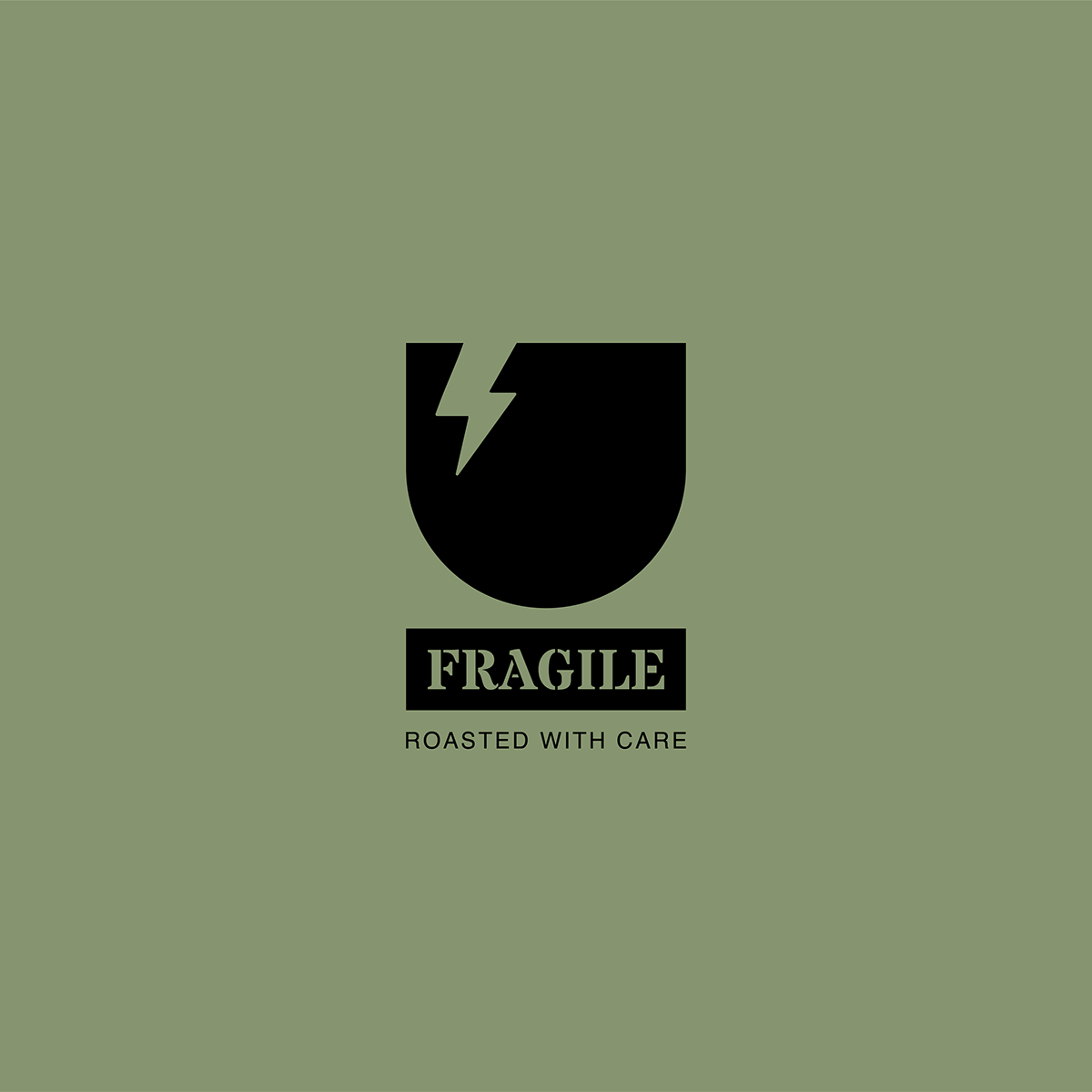
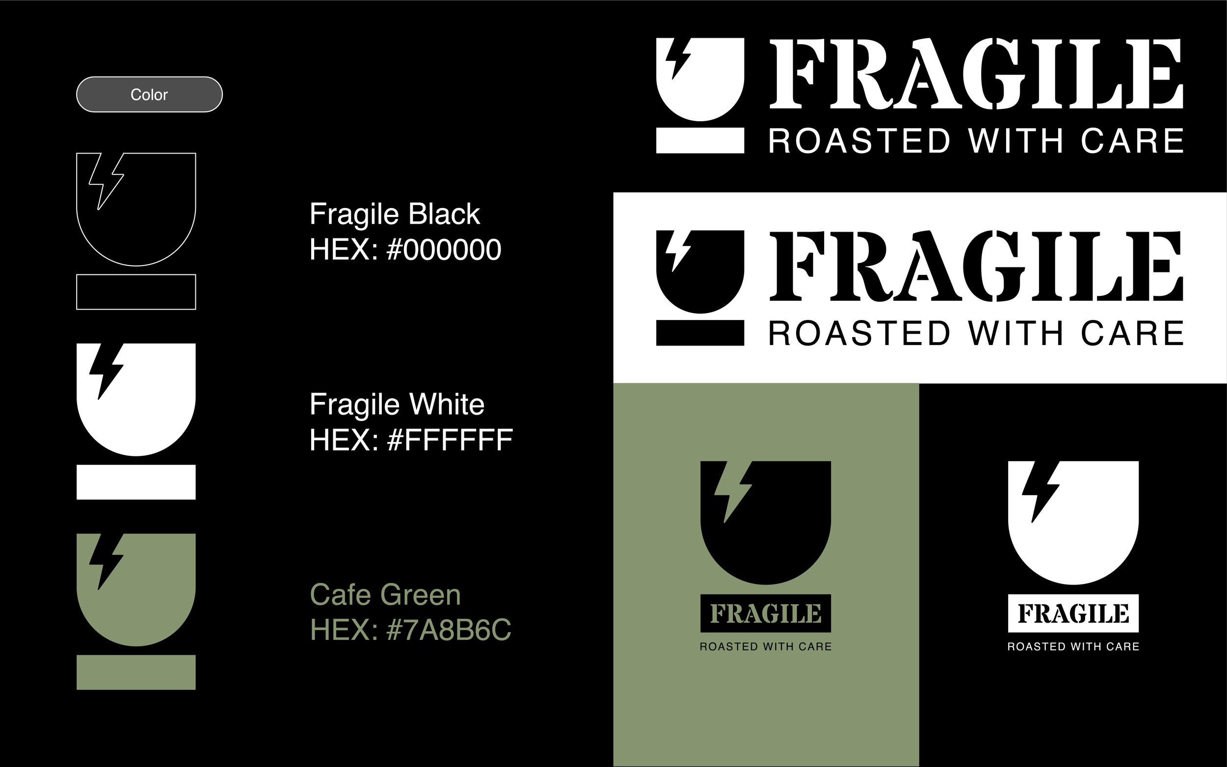
The symbol reinterprets a fragile-handling pictogram as a simplified cup with a sharp fracture. A solid bar beneath the cup gives the mark a stable base.
Paired with the FRAGILE wordmark, it carries the visual directness of a shipping label. Standalone, stacked, and horizontal arrangements allow the identity to adapt to packaging, merchandise, and signage.
“Roasted with care” connects the name to coffee and gives the warning-inspired identity a welcoming voice.







Typography
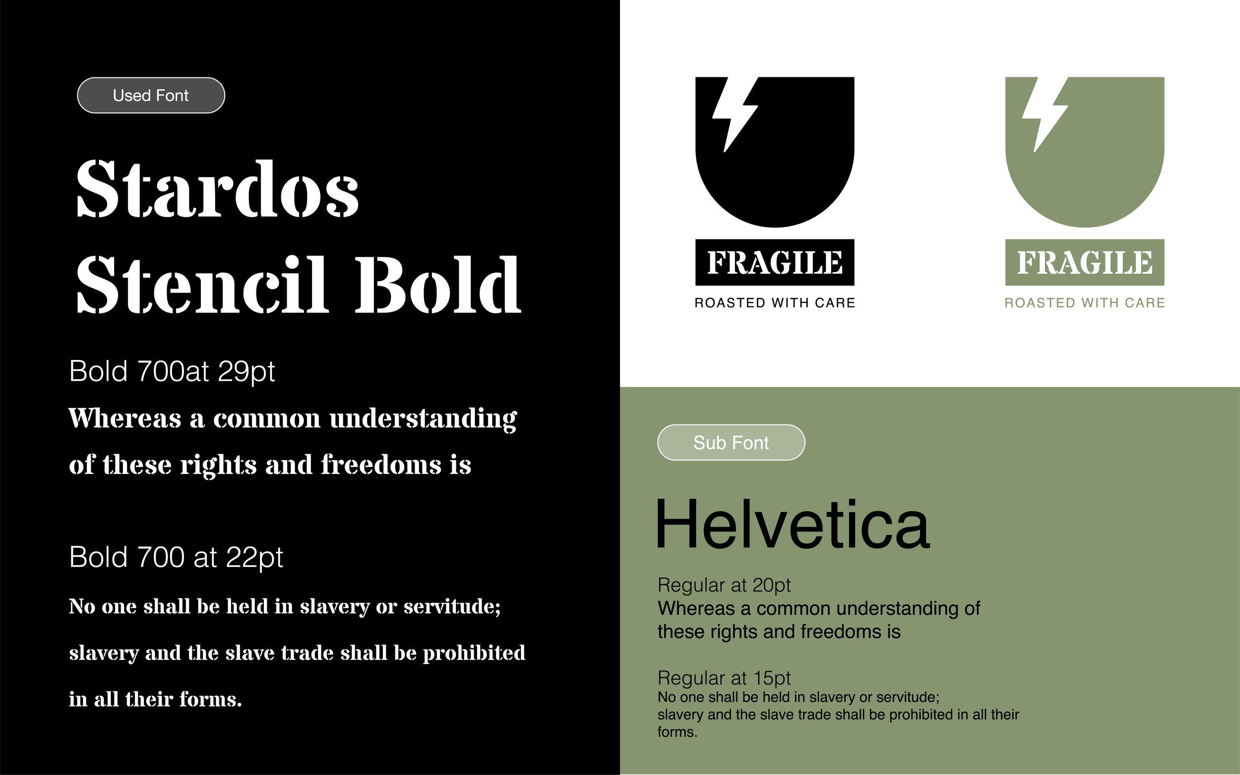
Stardos Stencil Bold gives the wordmark its crate-inspired character. Its interrupted letterforms echo the practical markings used on transport packaging.
Helvetica supports the identity with clear, understated typography, keeping product information and supporting copy easy to read.
Color Palette
Muted green softens the identity's industrial character and connects the graphic elements to the wood and natural textures in the concept visuals.
Black gives the logo and typography a clear presence. White provides space around them.
Cafe Green — #7A8B6C
Black — #000000
White — #FFFFFF
Brand Applications
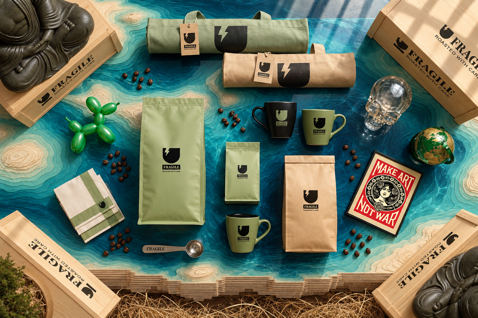
The identity extends across coffee packaging, cups, tote bags, and signage. The cup symbol and wordmark provide a consistent point of recognition, while green and neutral surfaces connect the different objects.
Crate-inspired presentation brings the original reference into the display, linking the merchandise to the wider café concept.
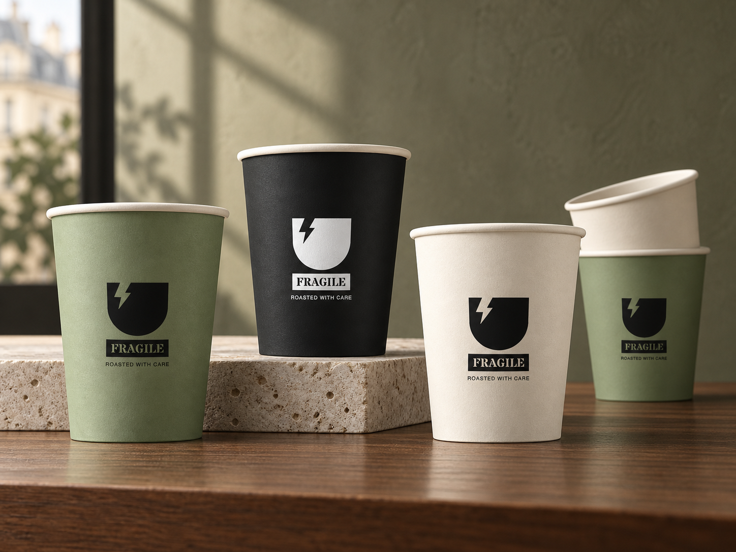
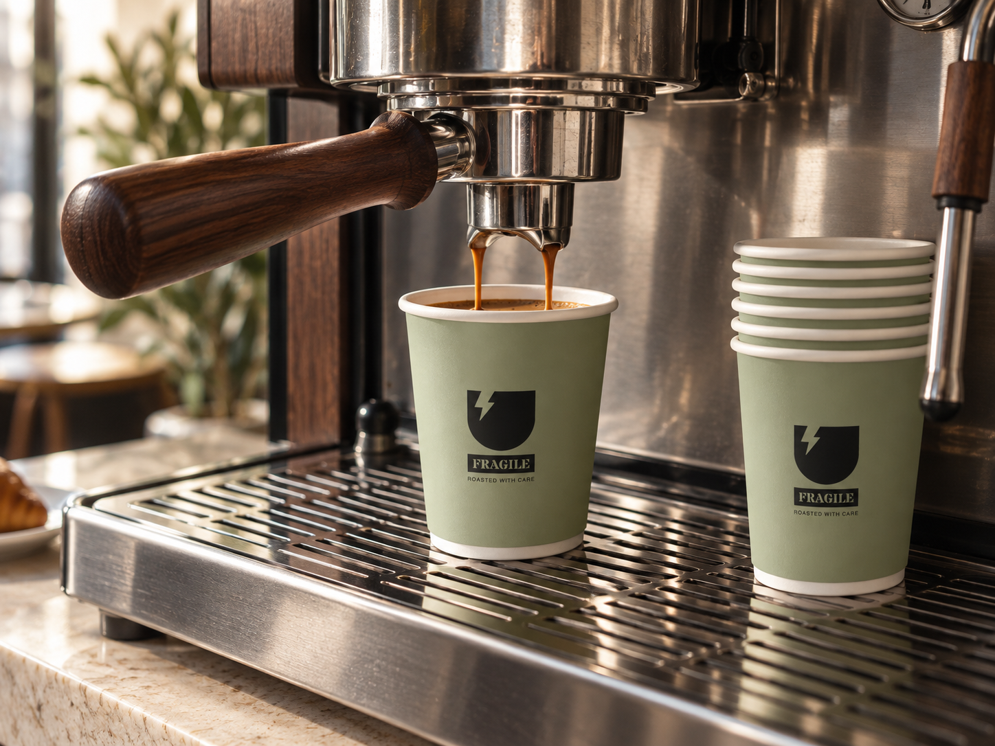
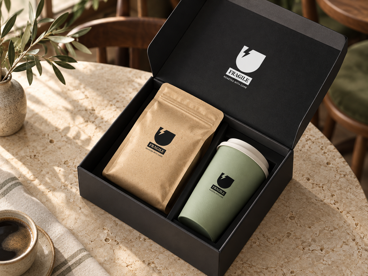
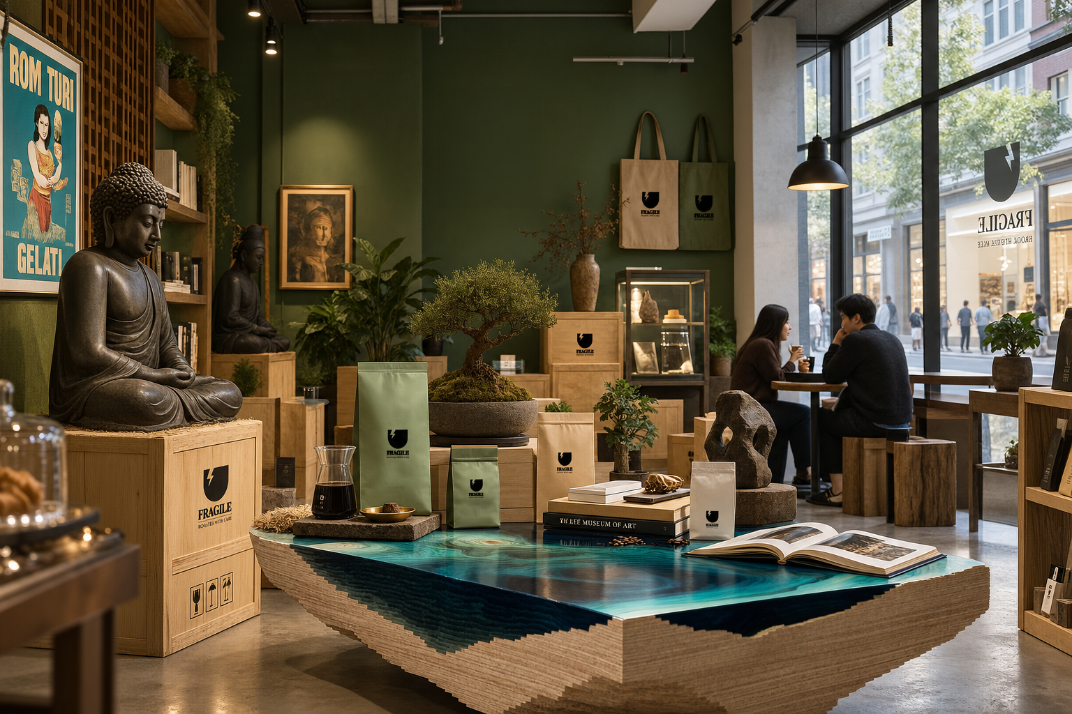
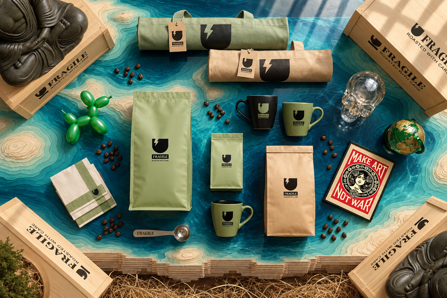
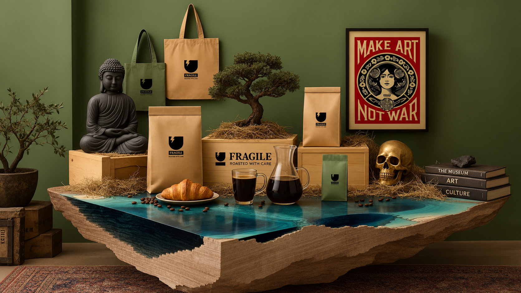
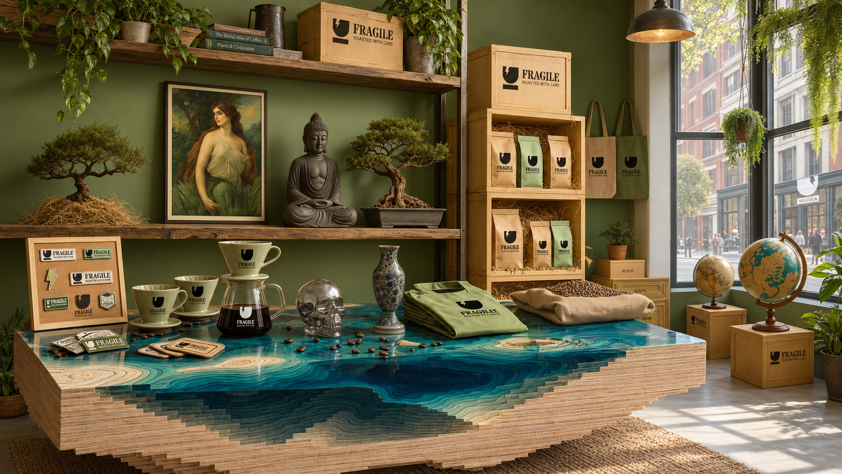
Cafe Merchandise Design and VMD Styling shots via Midjourney V7 + ChatGPT Image 2.5
Spatial Concept
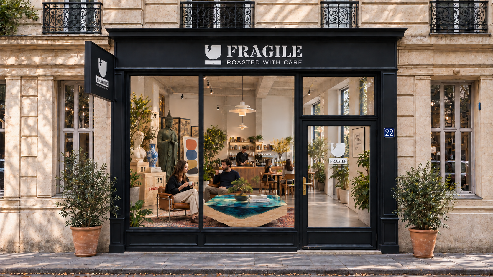
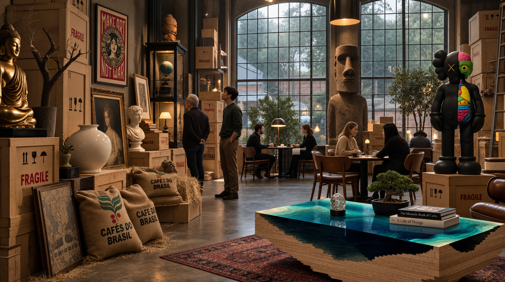
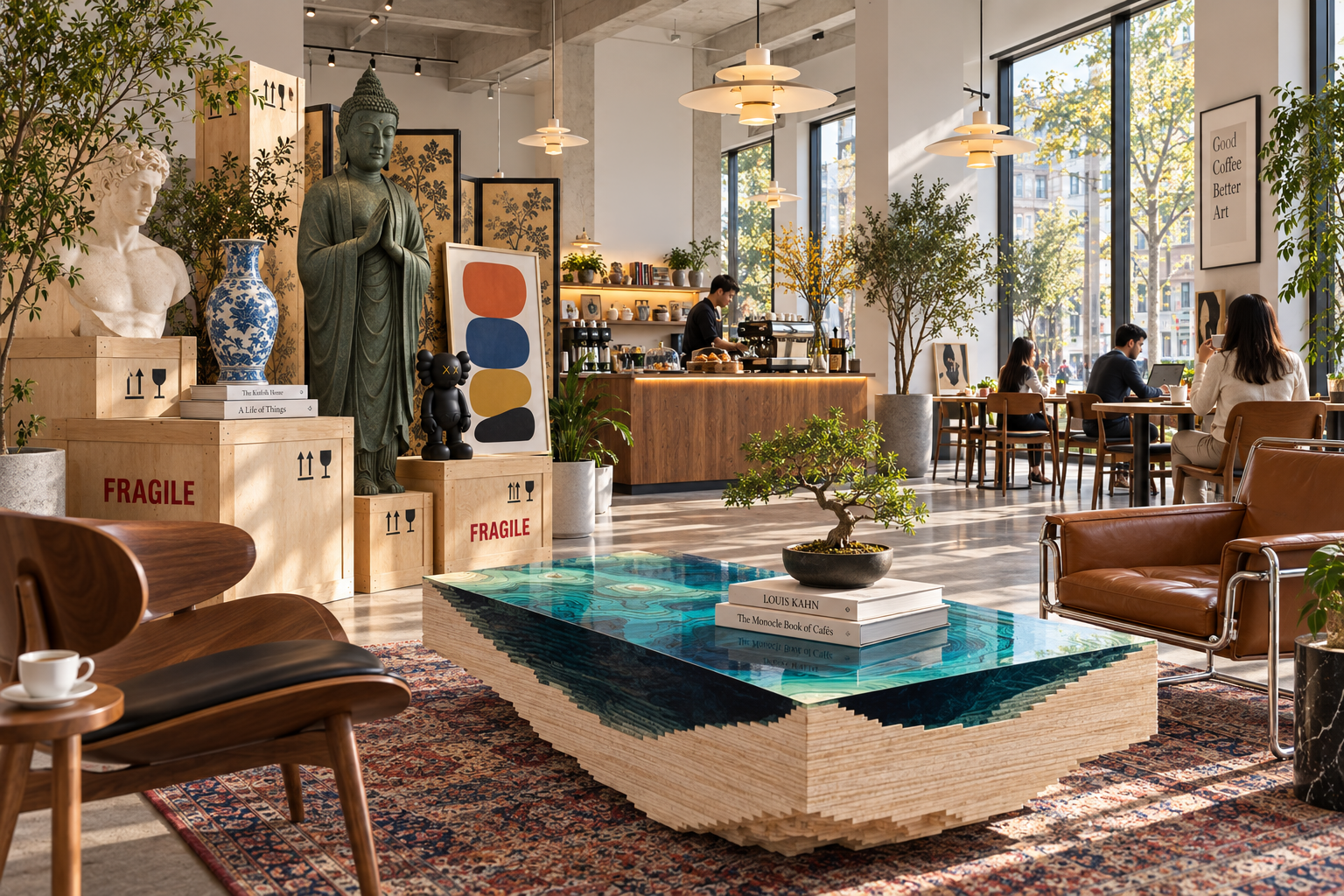
The spatial direction imagines a café with the atmosphere of an open museum archive. Wooden transport crates become display elements, placing coffee and collected objects within the same setting.
Sketches and an early Photoshop composition explore this relationship. The concept visualizations extend it through materials, lighting, and the placement of branded objects.
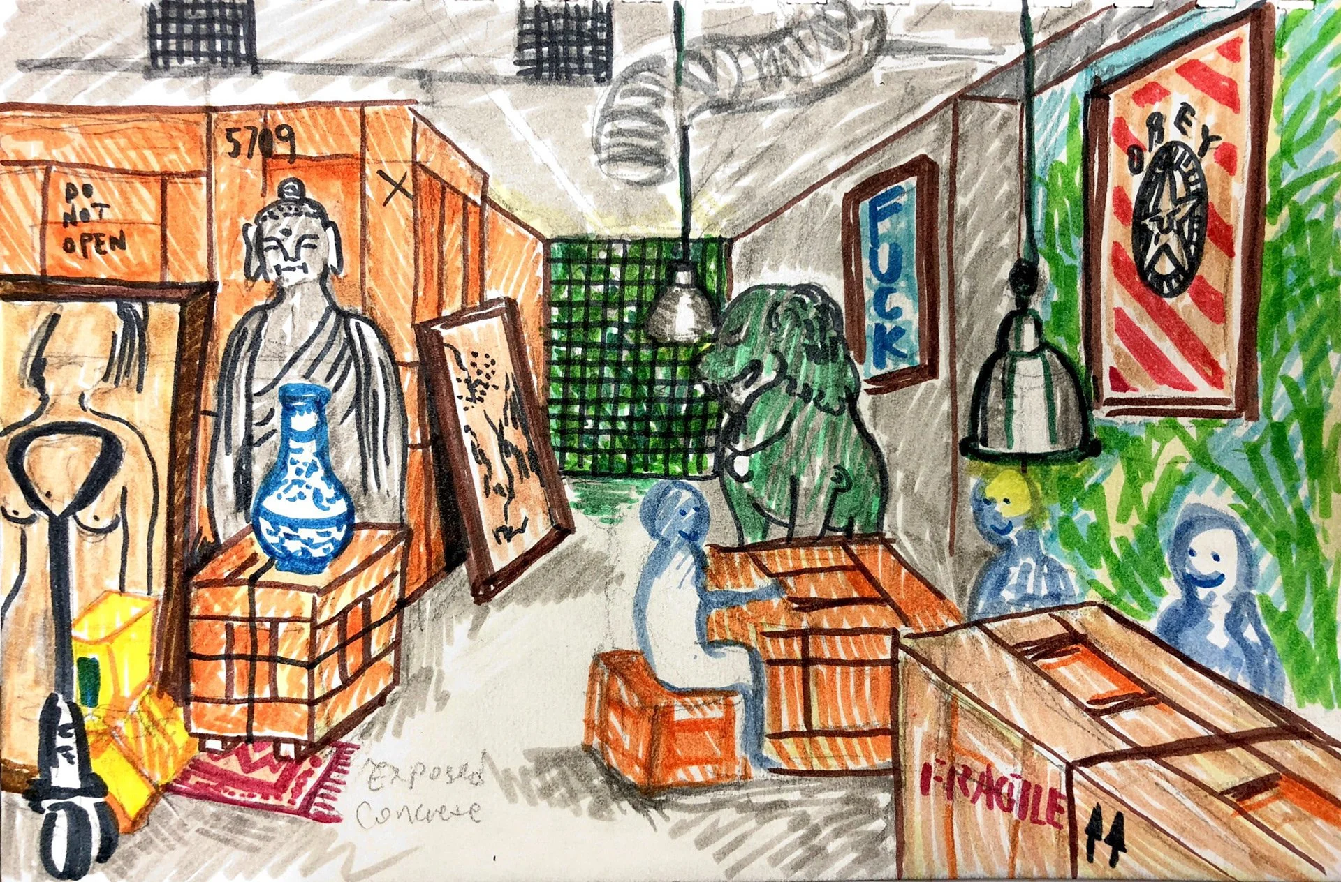
Original Sketch
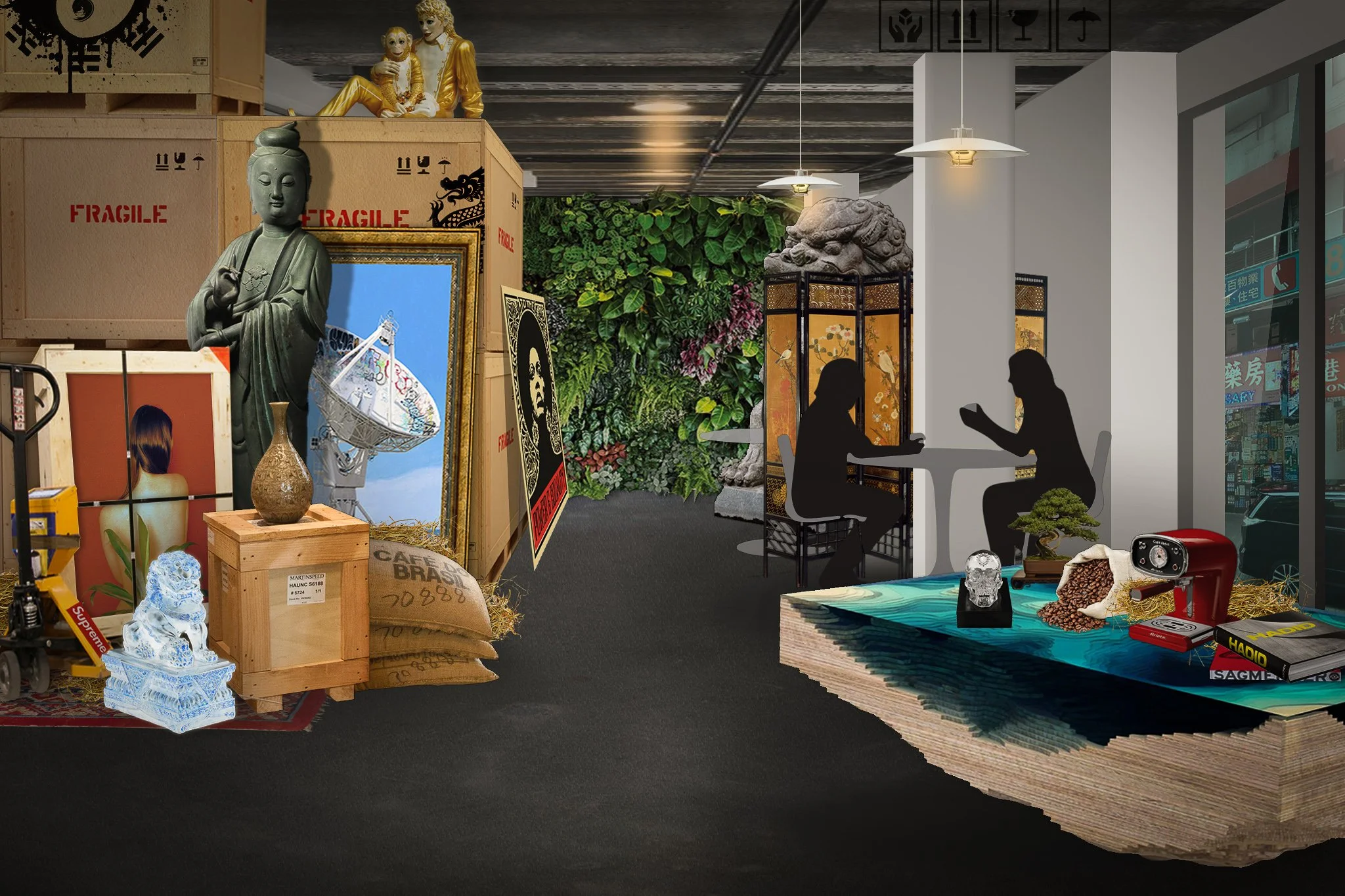
Early Ideation Visual via Photoshop
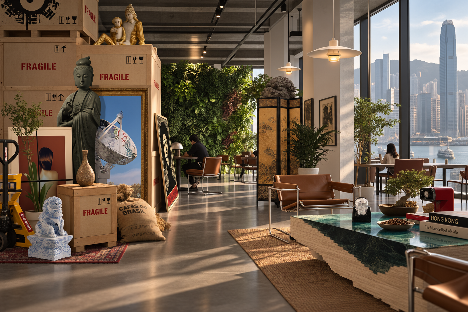
Image generated via GPT Image 2.5
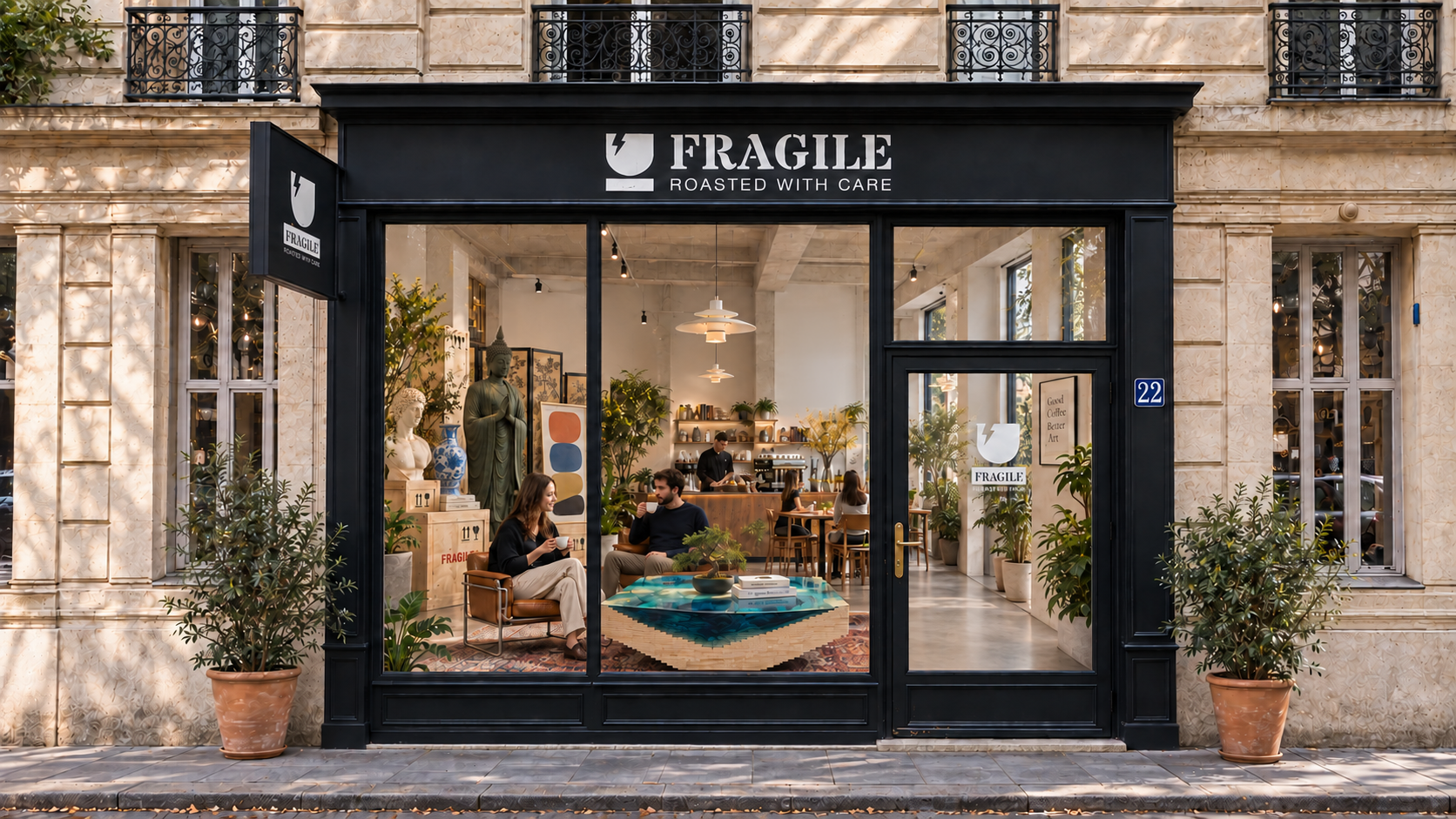
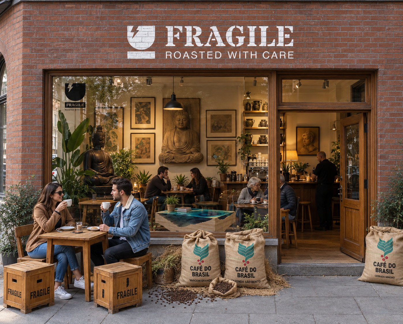
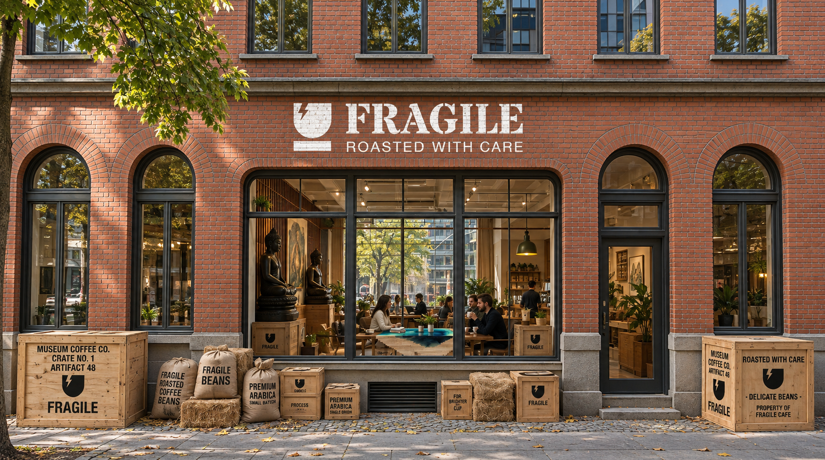
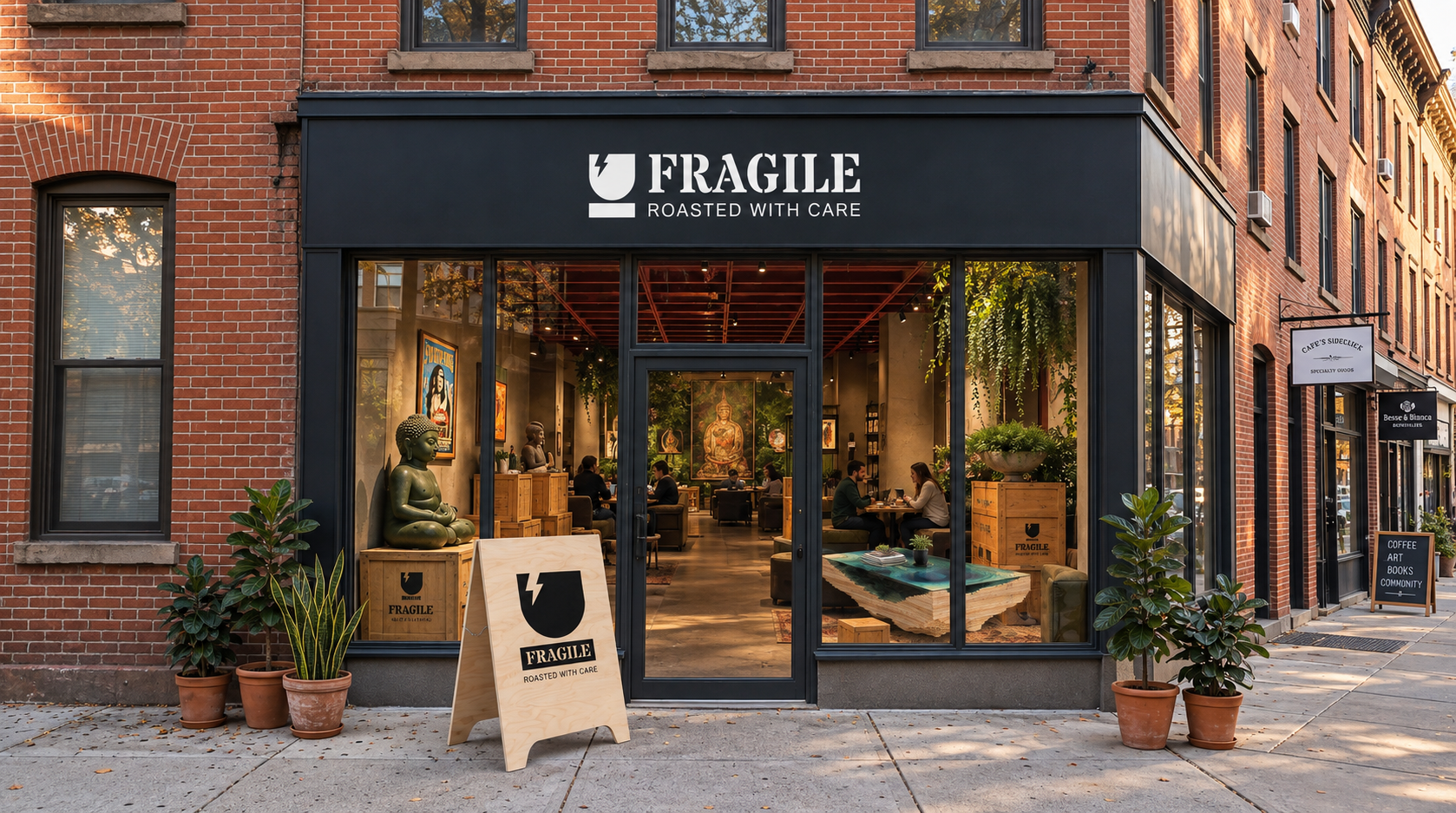
Exterior concept visuals generated via ChatGPT Image 2.5 + Photoshop
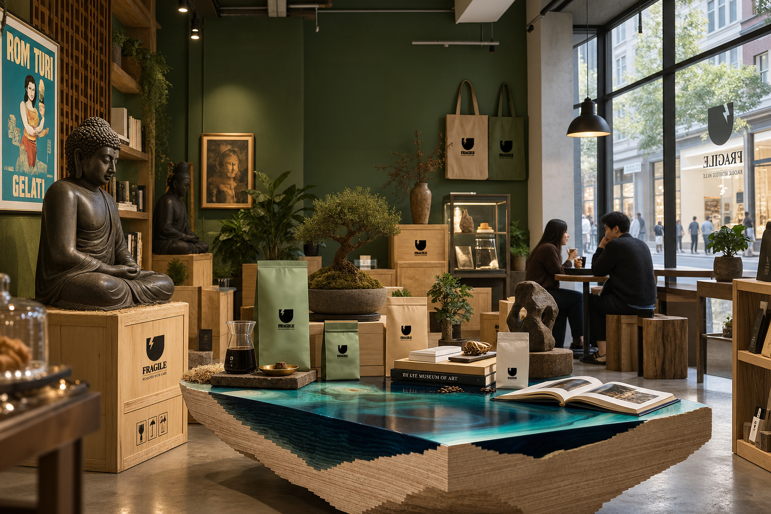
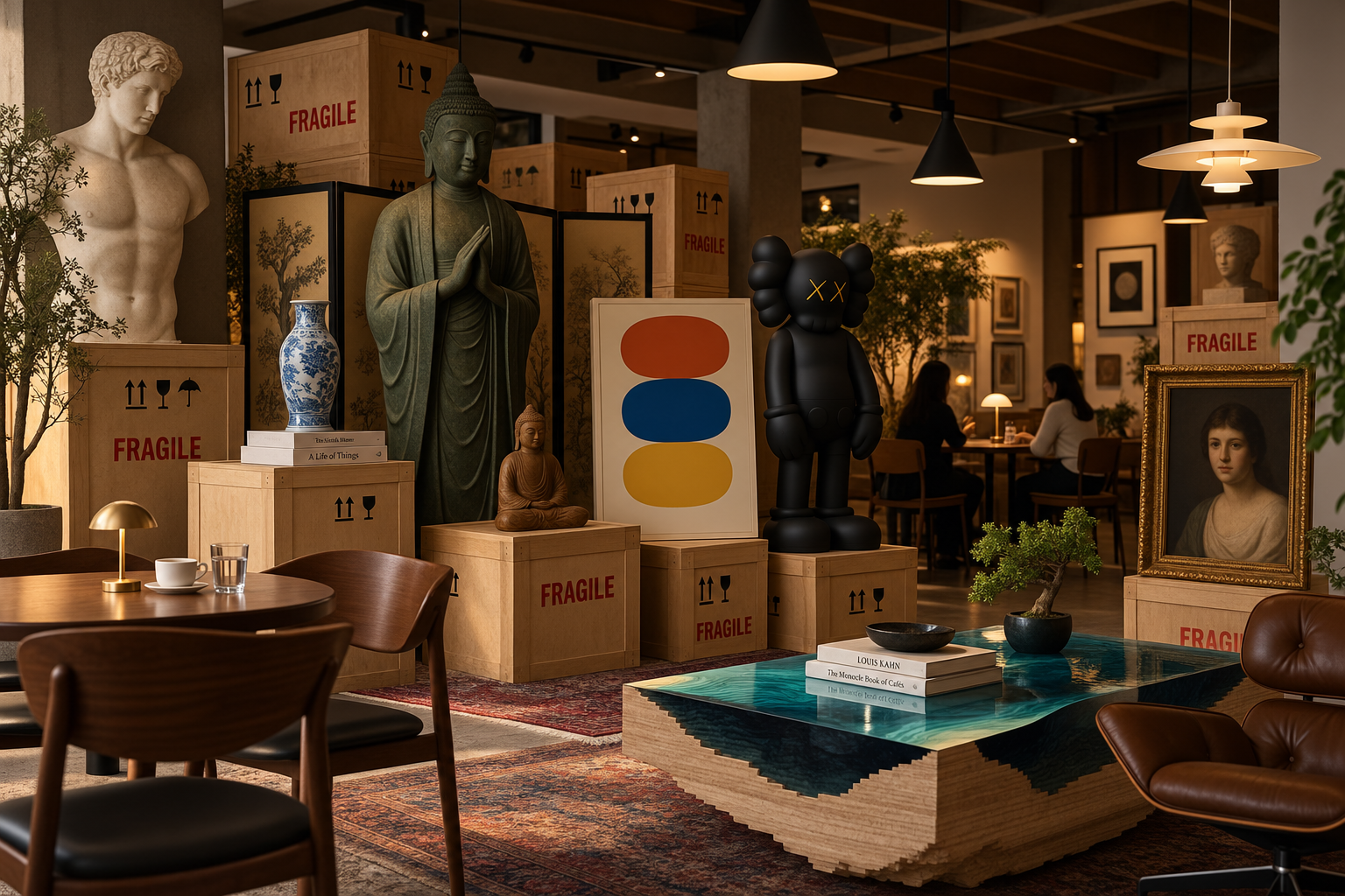
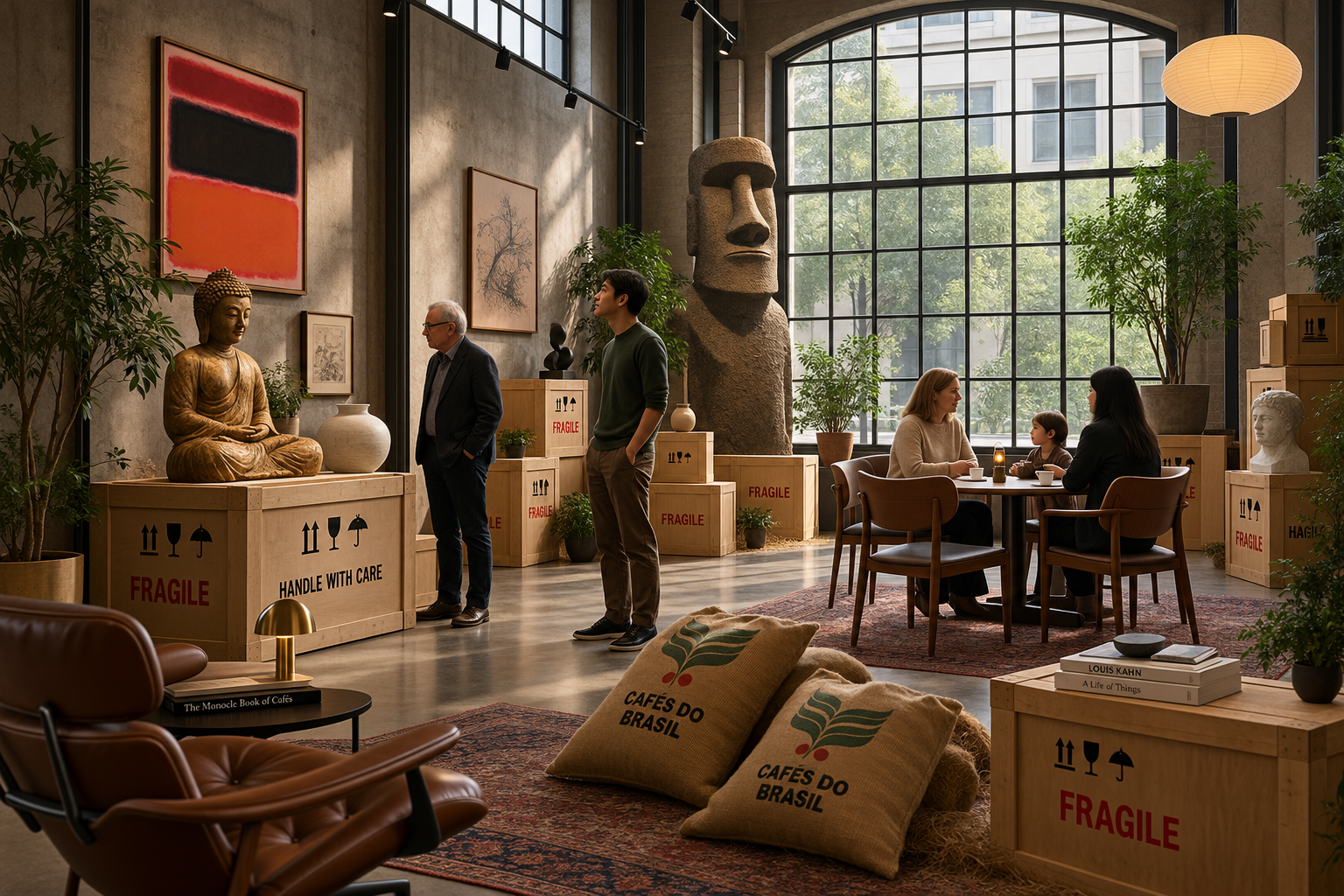
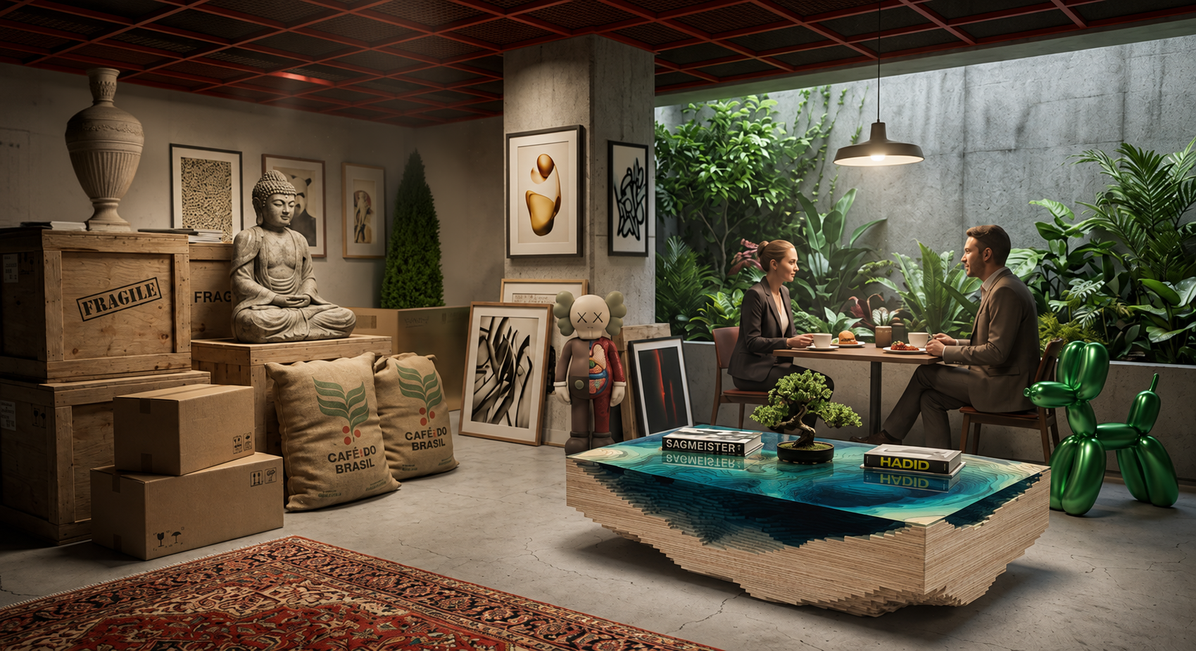
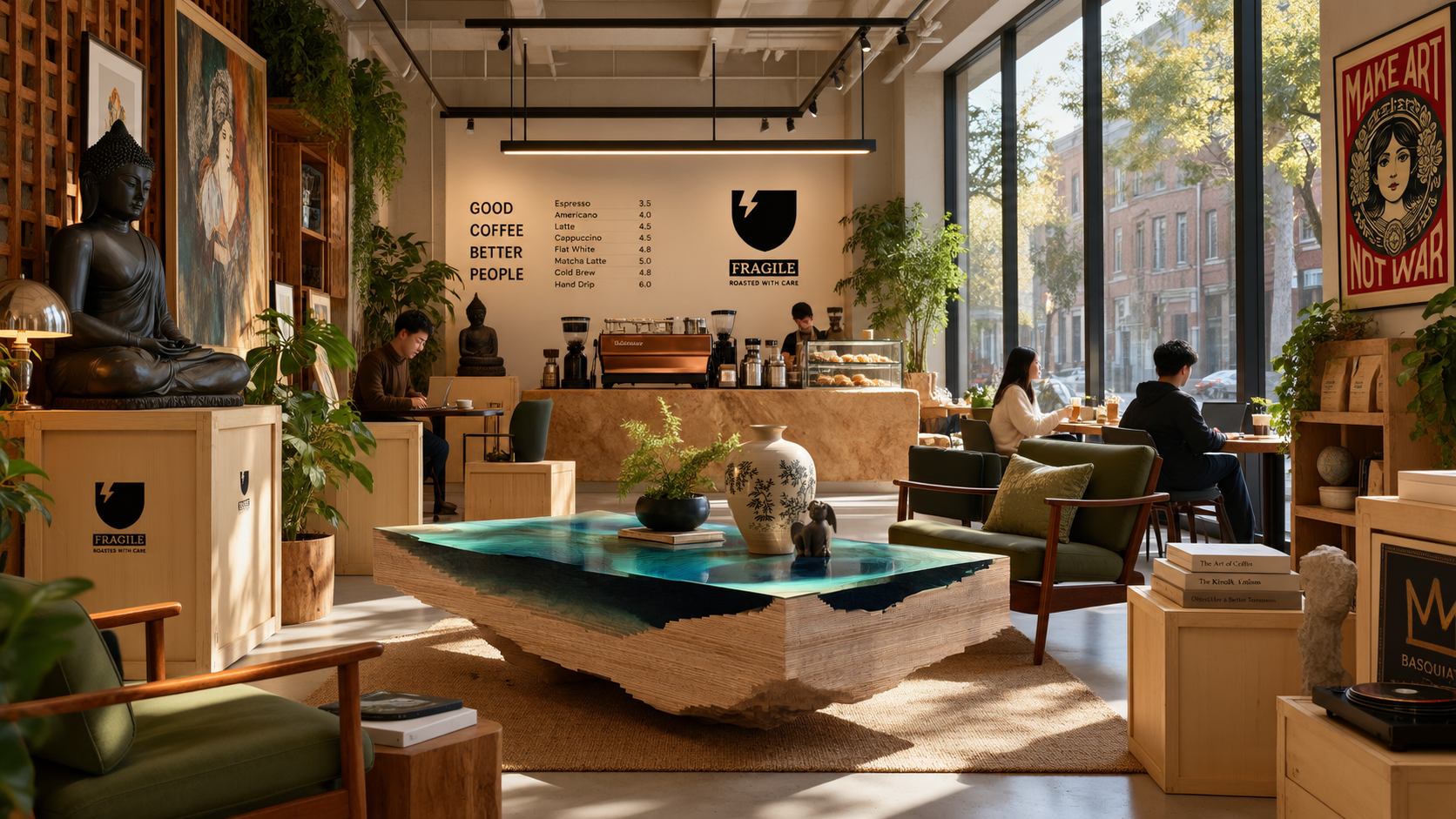
Interior concept visuals generated via Midjourney V7 & ChatGPT Image 2.5 + Photoshop
Project Note
Café FRAGILE explores how a familiar handling symbol can become the foundation of a broader visual identity.
The project is a self-initiated design concept. AI-assisted imagery visualizes merchandise and spatial directions; these images depict proposed settings rather than a built café.