KO&CO Corndog
Packaging Design
& Visual Exploration
An unreleased packaging project, independently revisited and refined to explore its potential as a cohesive Korean street food range.
Brand: KO&CO — Taste of Korea
Category: Frozen Korean Street Food
Products: Crispy Chicken / Crispy Chicken & Potato
Original Role: In-house Graphic Designer — Product Packaging
Project Status: Unreleased · Independently updated for portfolio presentation
01 — Project Background
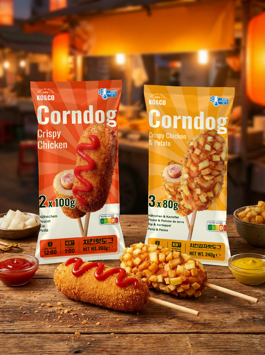
This project began as packaging design work for KO&CO’s frozen corndog range. Although the product never reached commercial release, I felt the design had potential to develop further.
I returned to the project independently, building on the original work and updating its presentation through packaging and product visualizations. This case study brings together that design direction and the thinking behind it.
02 — The Brief
Create a distinctive packaging system for two Korean-style corndogs intended for European frozen food retail.
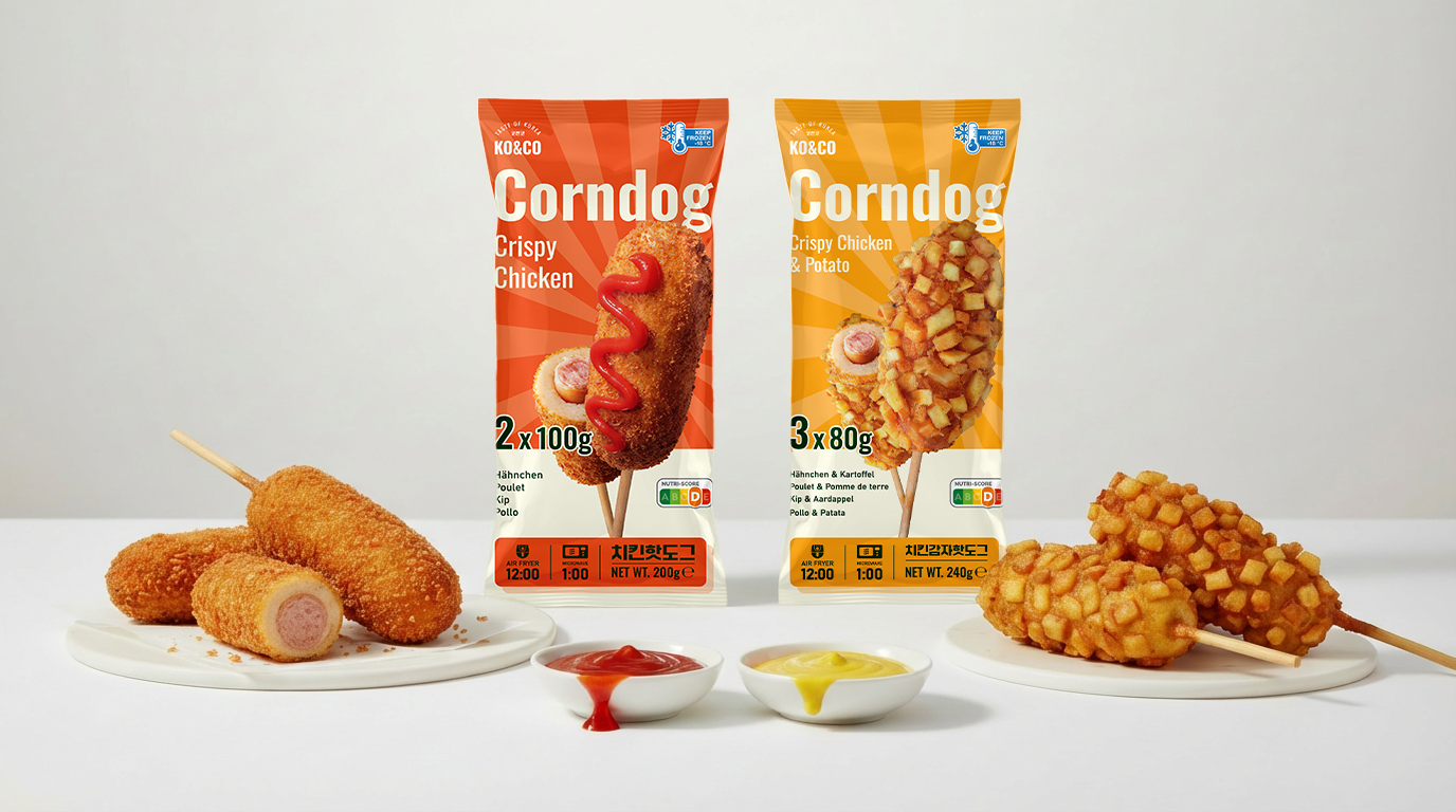
The packaging needed to clearly introduce an unfamiliar snack, communicate its crispy texture, and distinguish the two variants while keeping them recognizably part of the same brand.
The intended audience included younger consumers interested in Korean food culture, alongside shoppers discovering Korean street food for the first time.
Key Design Challenges
Make the product easy to understand
Show the coating, filling, and serving format so shoppers can quickly understand what is inside.
Build a clear product family
Give Crispy Chicken and Crispy Chicken & Potato their own identities within a shared layout.
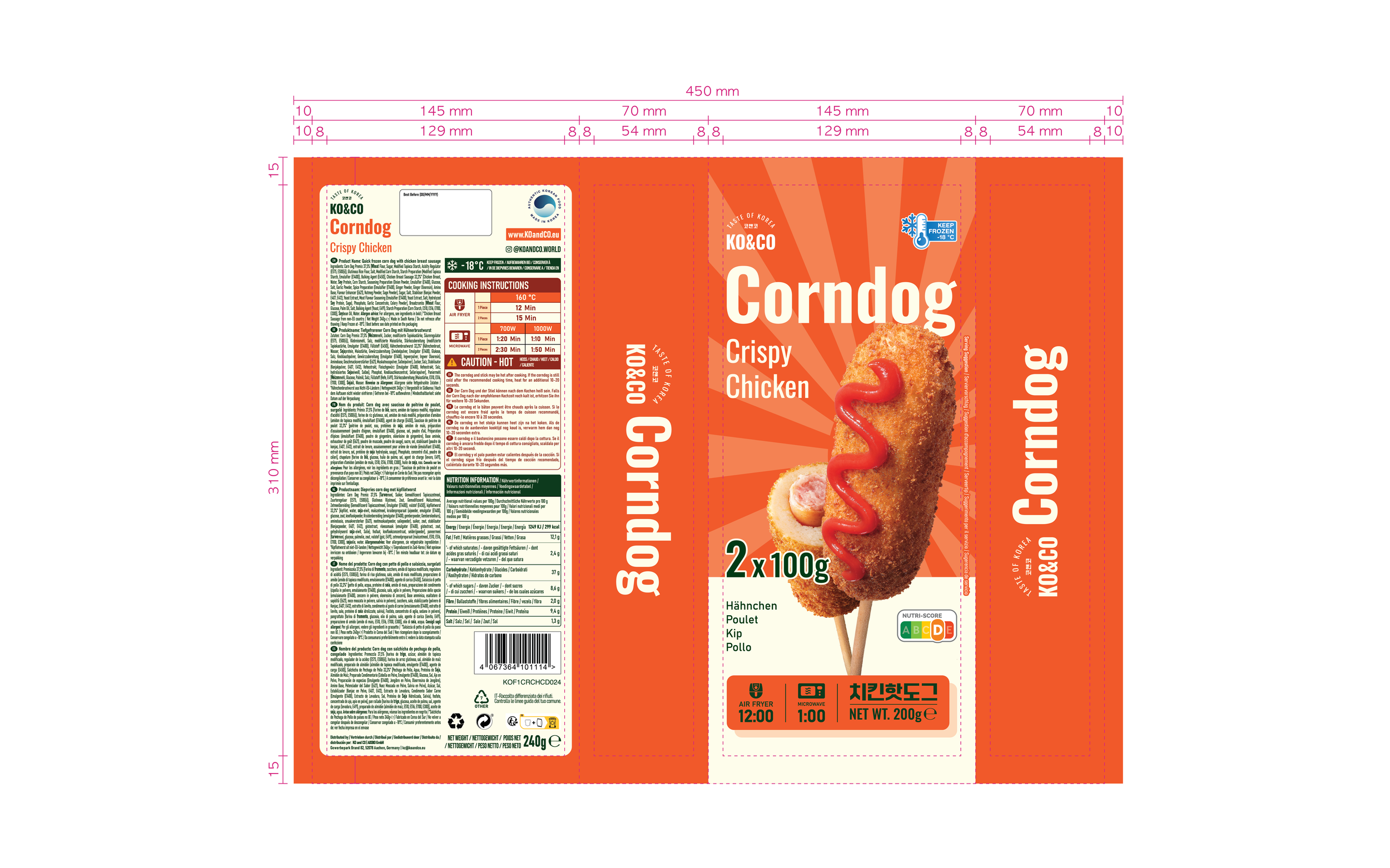
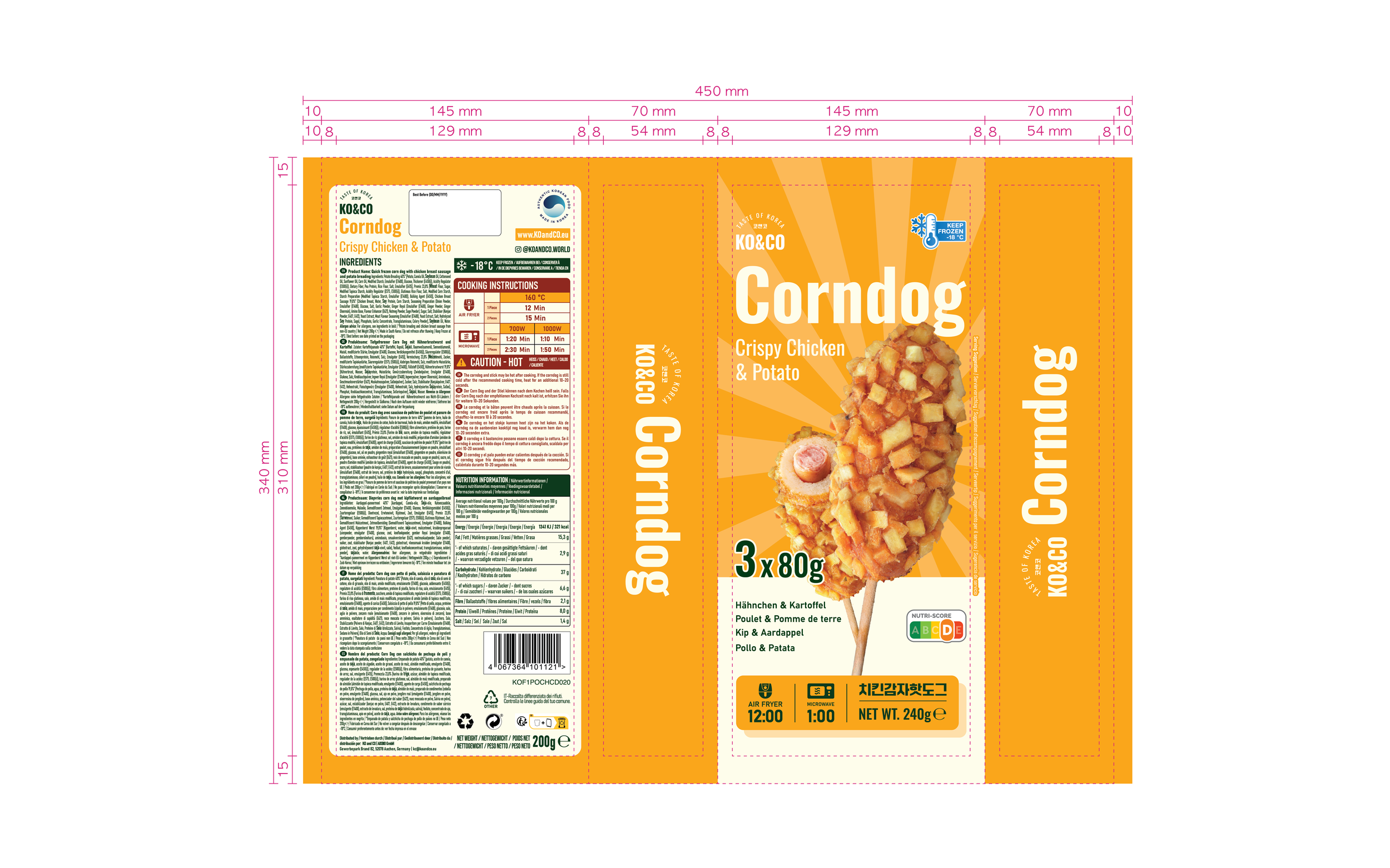
Organize multilingual information
Accommodate German, French, Dutch, and Italian product information while maintaining a clear visual hierarchy.
Target Audience & Market
Primary Audience
Gen Z and Millennial shoppers interested in Korean food culture and looking for a convenient way to enjoy street food at home.
Secondary Audience
Curious shoppers discovering Korean snacks for the first time, who need clear product imagery and straightforward preparation information.
Intended Market
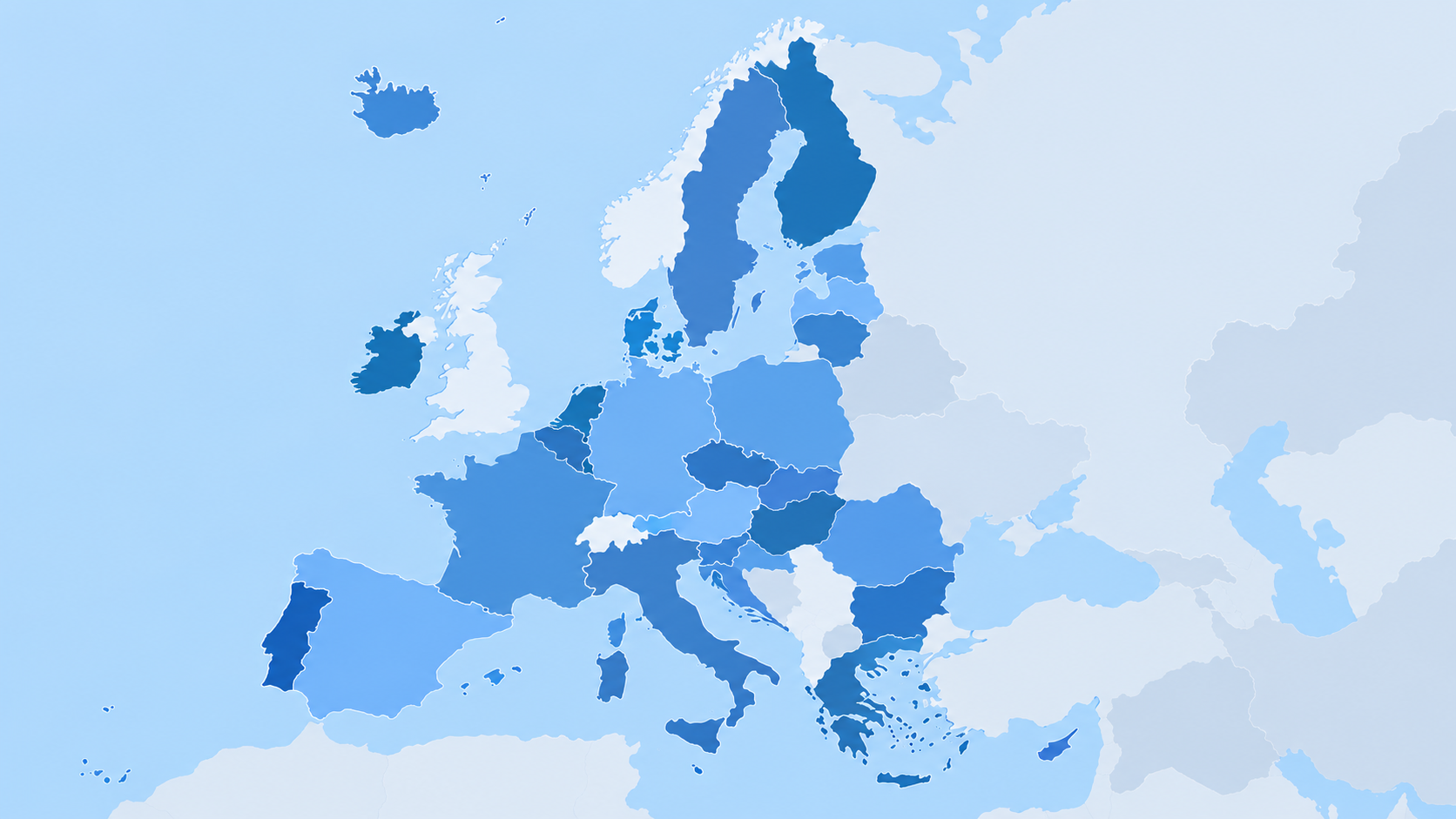
European frozen food retail, with packaging information in German, French, Dutch, and Italian.
The design needed to appeal to consumers already familiar with Korean corndogs while making the product easy for first-time buyers to understand.
03 — Creative Direction
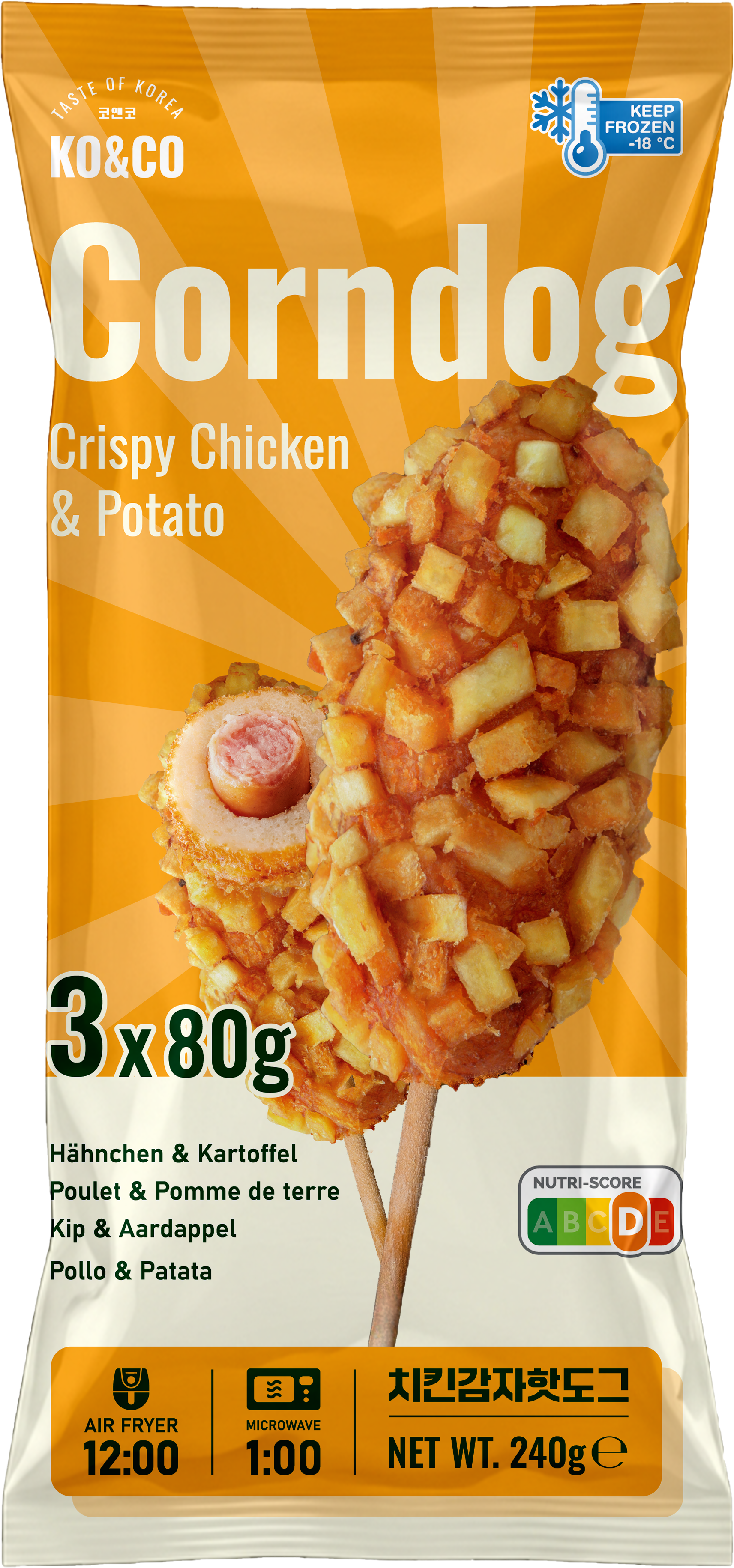
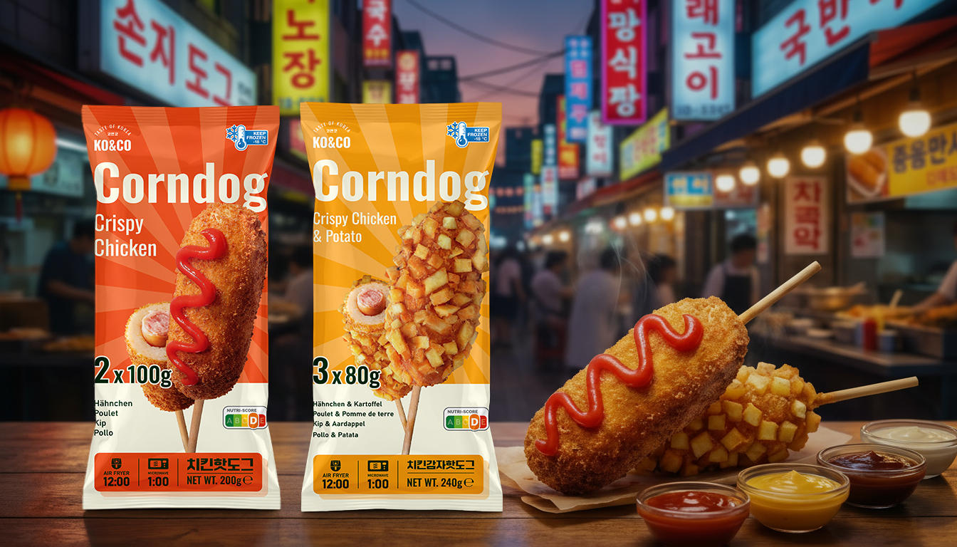
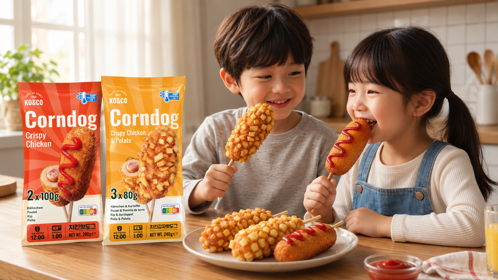
The visual direction draws on the warmth and energy of Korean street food: crisp textures, bold condiment colors, and an expressive sunburst background.
Large product imagery makes the food the focal point, while a consistent layout gives the range a recognizable structure.
Color as a Variant Identifier
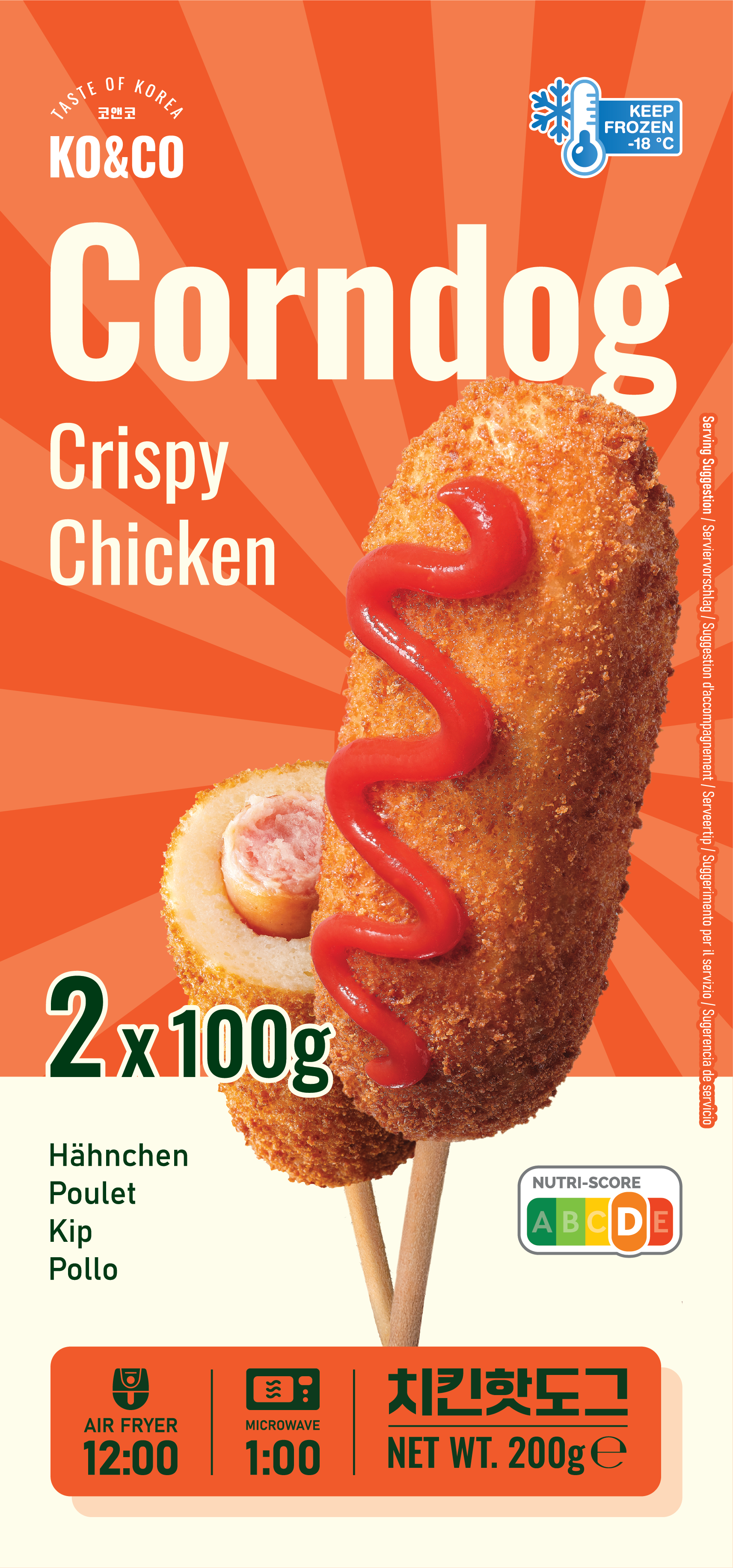
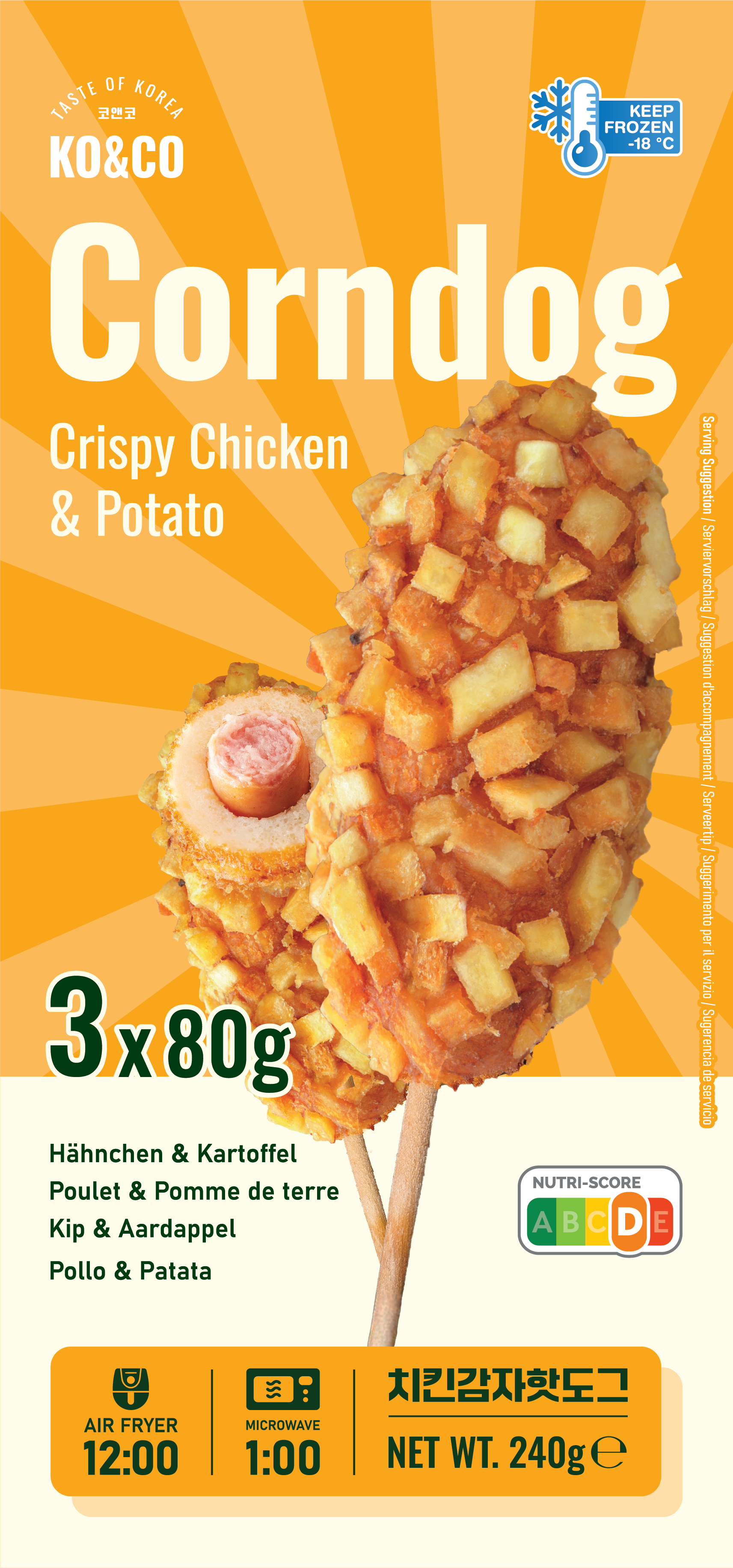
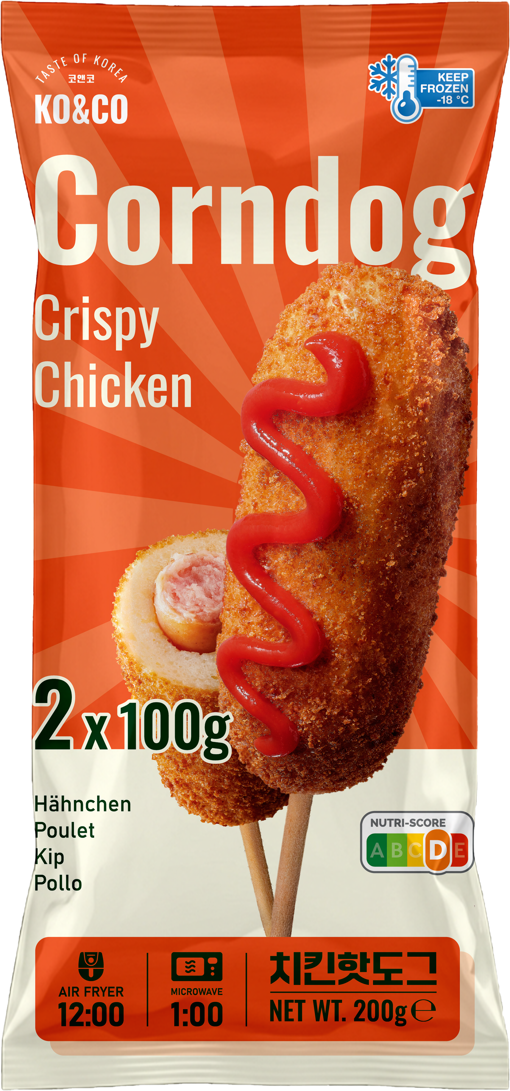
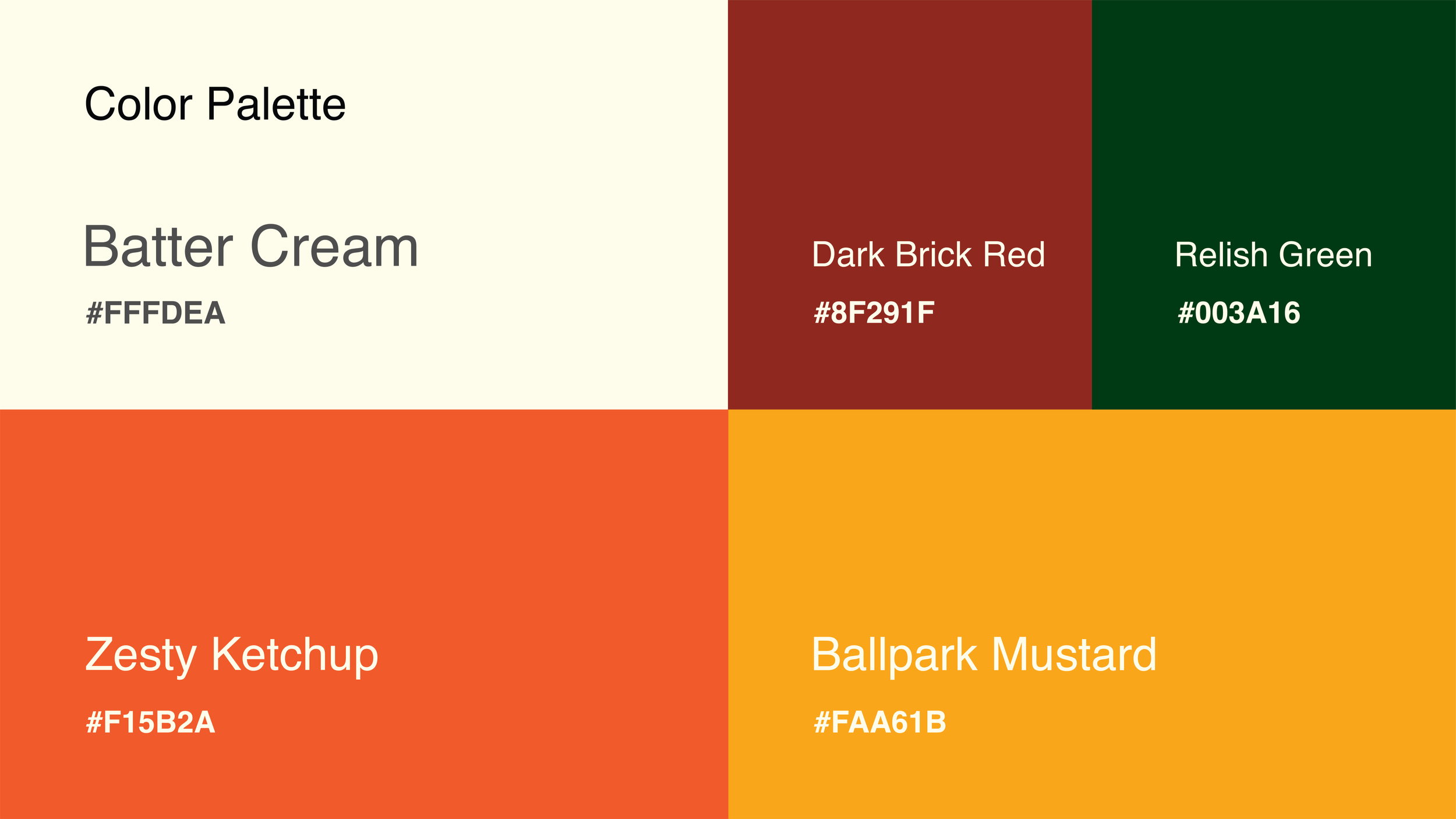
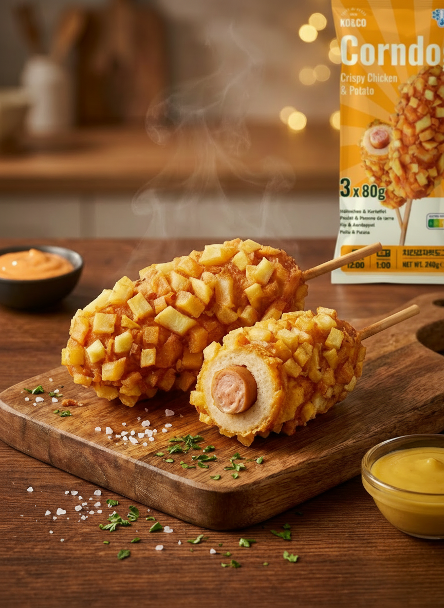
A ketchup-inspired red-orange identifies Crispy Chicken, while a mustard-inspired yellow identifies Crispy Chicken & Potato.
Cream-colored information panels and deep green details connect the two variants and provide a calmer space for supporting information.
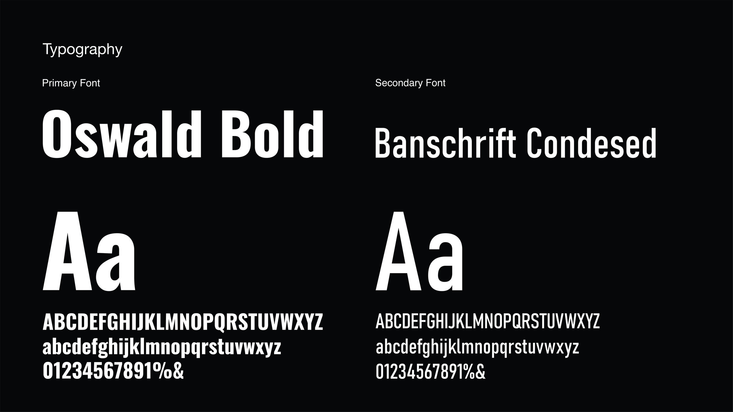
Typography and Hierarchy
Bold, condensed typography gives the product name prominence on the pack. Supporting text sits beneath it, creating a reading sequence from product name to variant to practical information.
Product Imagery
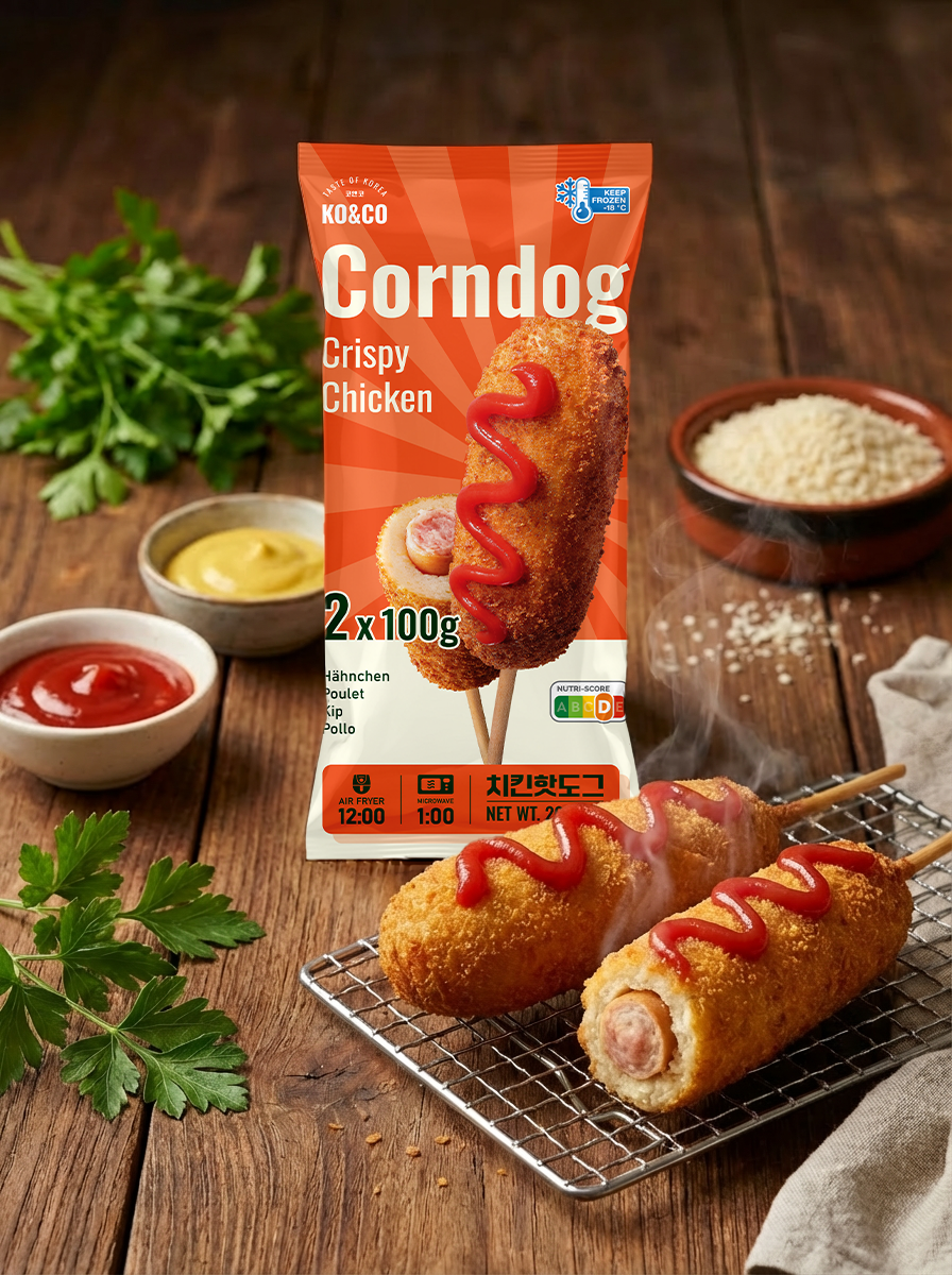
Close-up views of the coating and a visible cross-section help explain the product through its texture and filling. The imagery is intended to make the frozen snack feel tangible and appetizing.





04 — Packaging System
Both variants follow the same core structure: brand and product name, variant description, product imagery, and a lower information panel.
The front introduces the product, while the back organizes preparation instructions and multilingual details. The flat artwork and packaging visualizations show how these elements work across the pack.
The shared layout also provides a foundation for exploring additional variants within the range.
05 — Product & Retail Visualizations
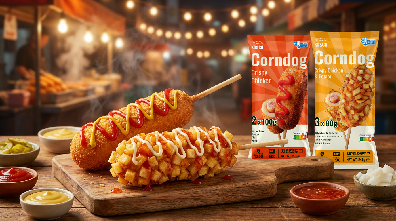
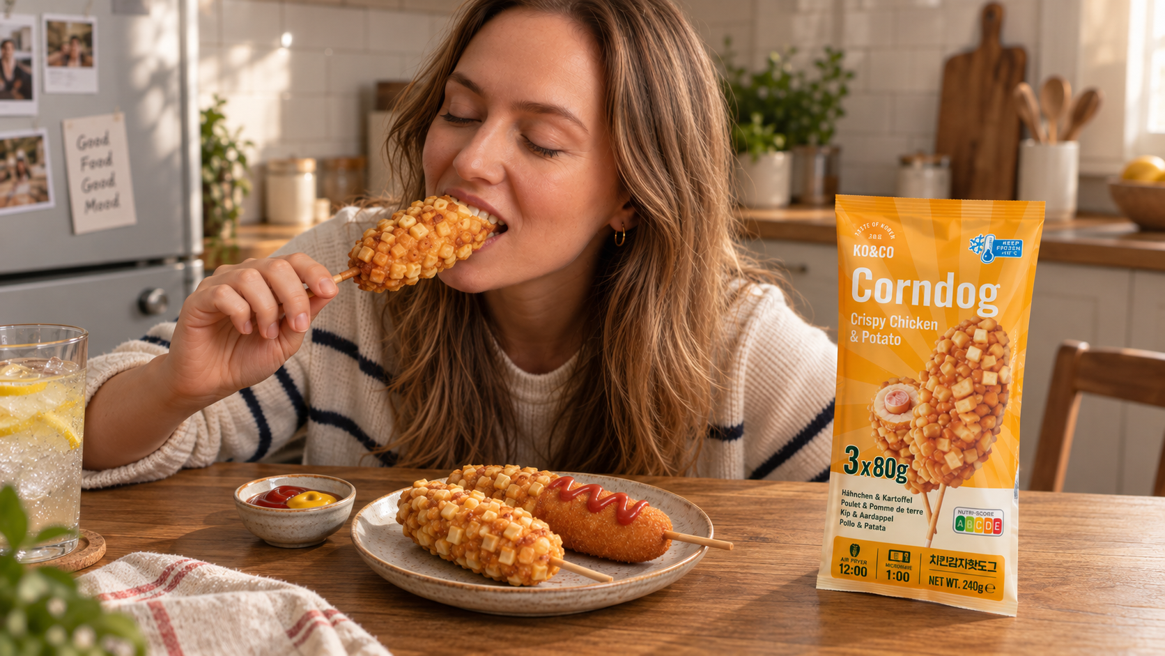
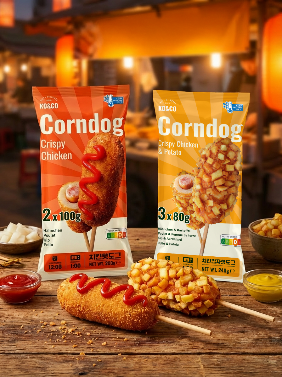
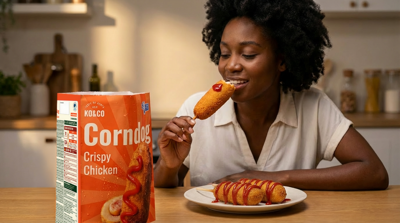
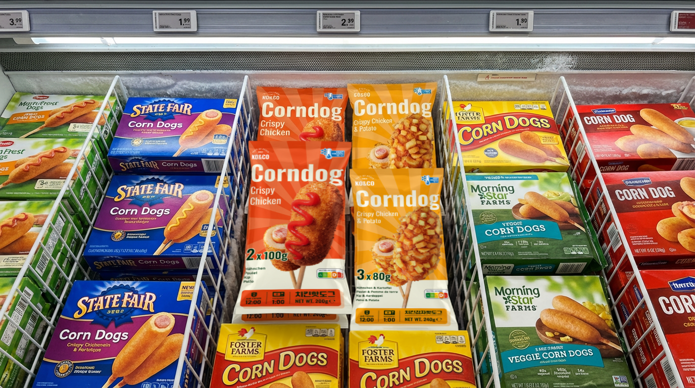
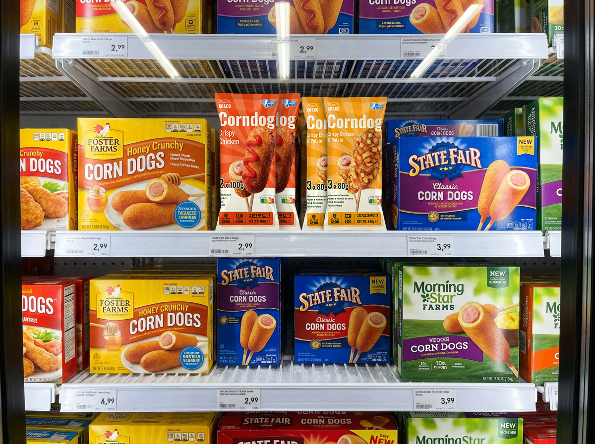
To develop the presentation further, I explored how the packaging could appear in styled food scenes and on a freezer shelf.
The food scenes communicate the intended mood of the range. The shelf visualizations explore how the two colorways might sit alongside other frozen snacks.
These images are presentation visualizations, not photographs of a commercial launch or evidence of retail testing. AI-assisted imagery was used as part of the visualization process.
06 — Reflection
Revisiting this project let me carry an unreleased design forward and fully develop its visual direction.
The resulting work brings together a two-variant packaging system, multilingual layouts, and product and retail visualizations. Its value lies in the design exploration and the clarity of the proposed system; commercial performance remains untested.
A next stage would involve physical print proofs, actual-size readability checks, and shopper feedback on product understanding and variant recognition.
USED TOOLS
Adobe Illustrator
•
Google Gemini (Nano Banana 2)
•
Adobe Photoshop
•
Adobe Illustrator • Google Gemini (Nano Banana 2) • Adobe Photoshop •