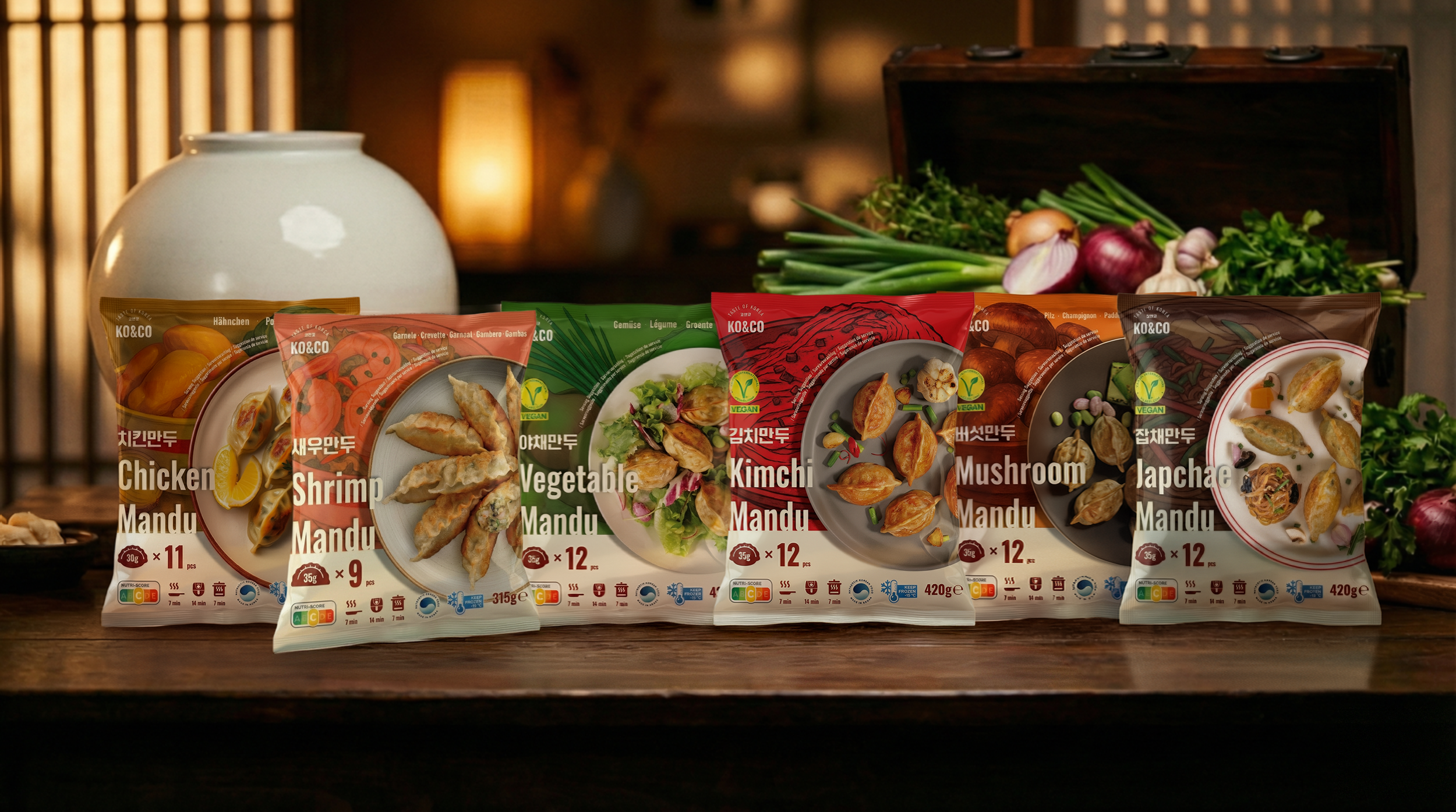
KO&CO Mandu
Independent Packaging Redesign
A self-initiated concept building on my 2024 in-house packaging redesign.
-
![]()
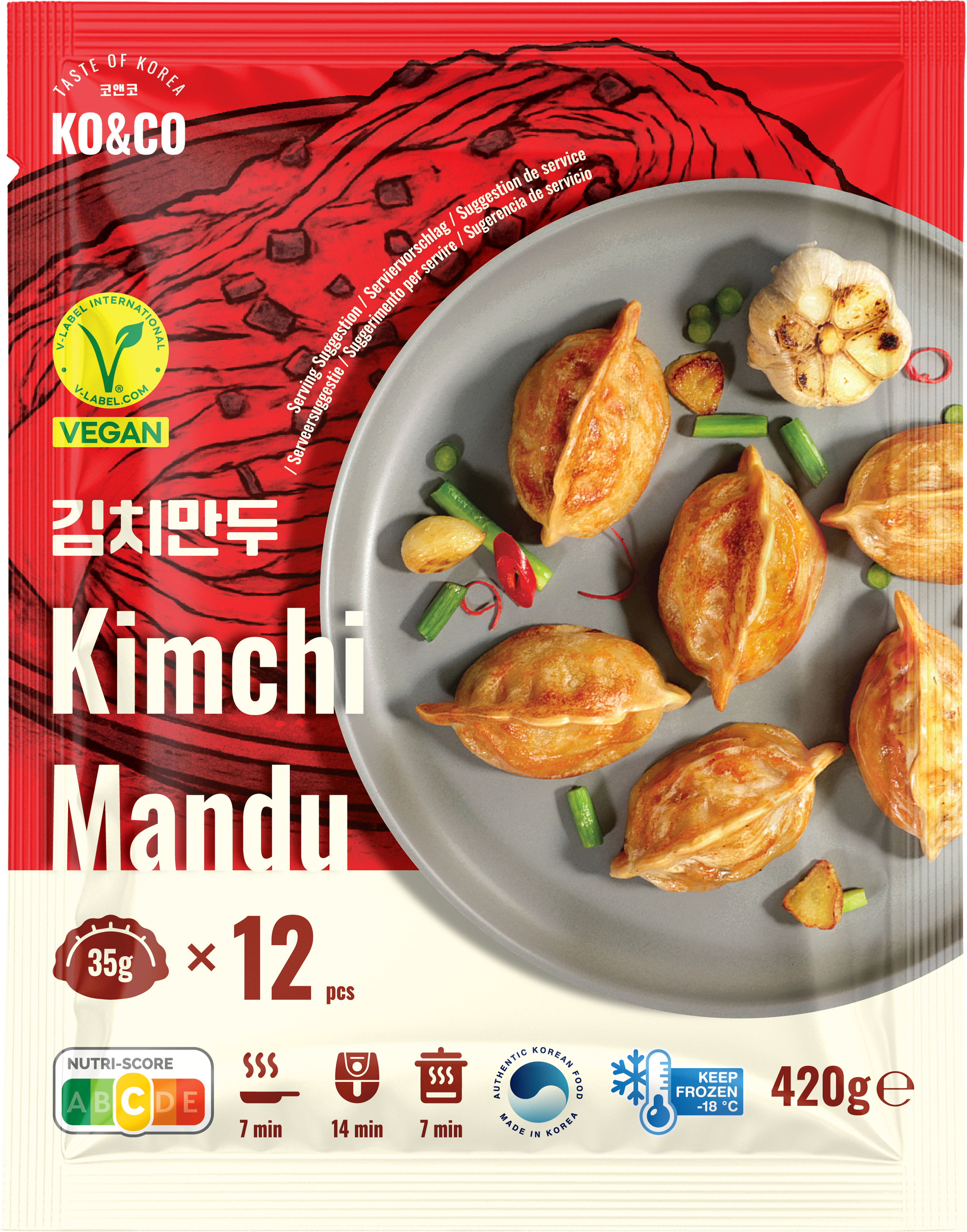
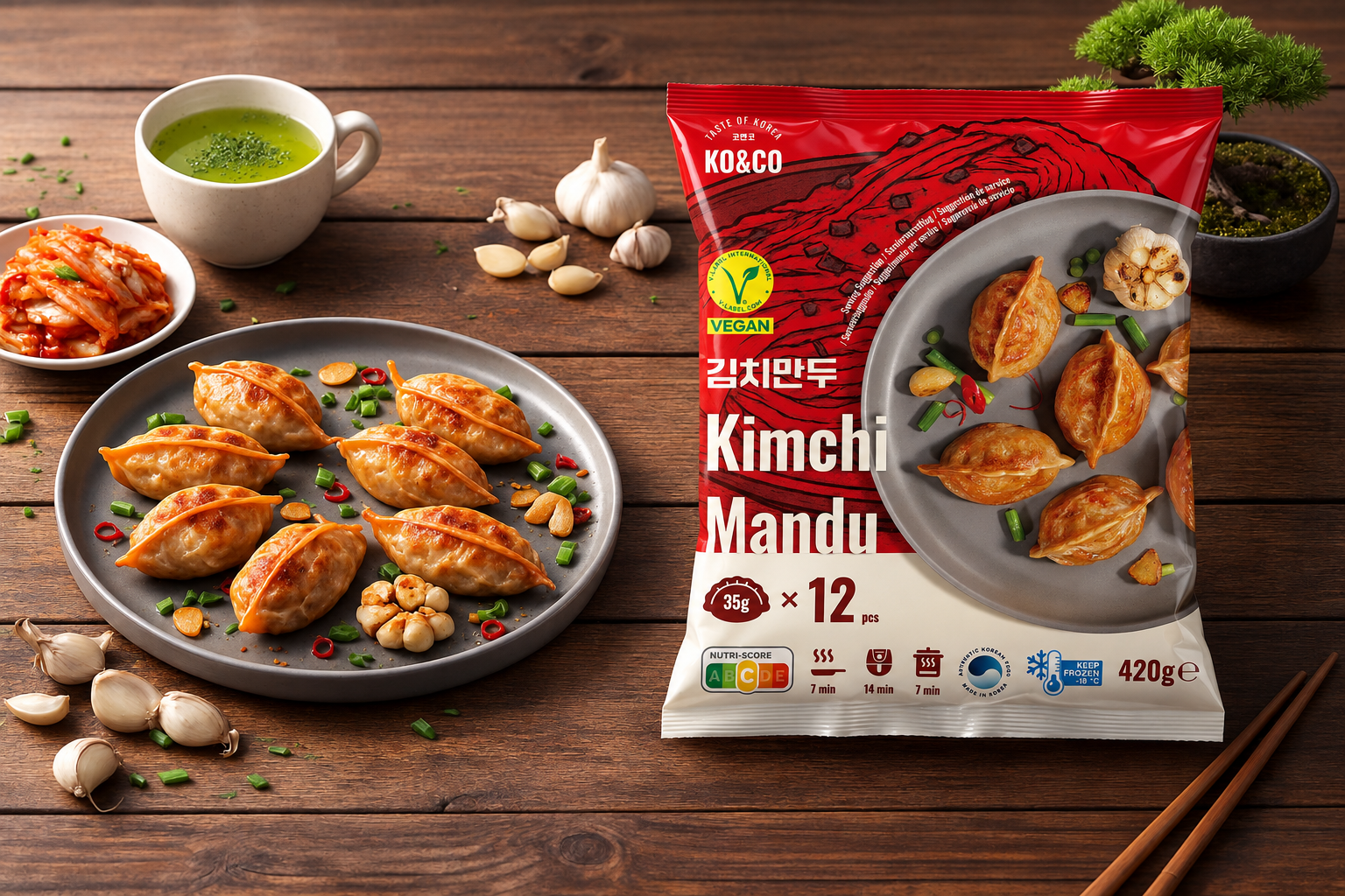
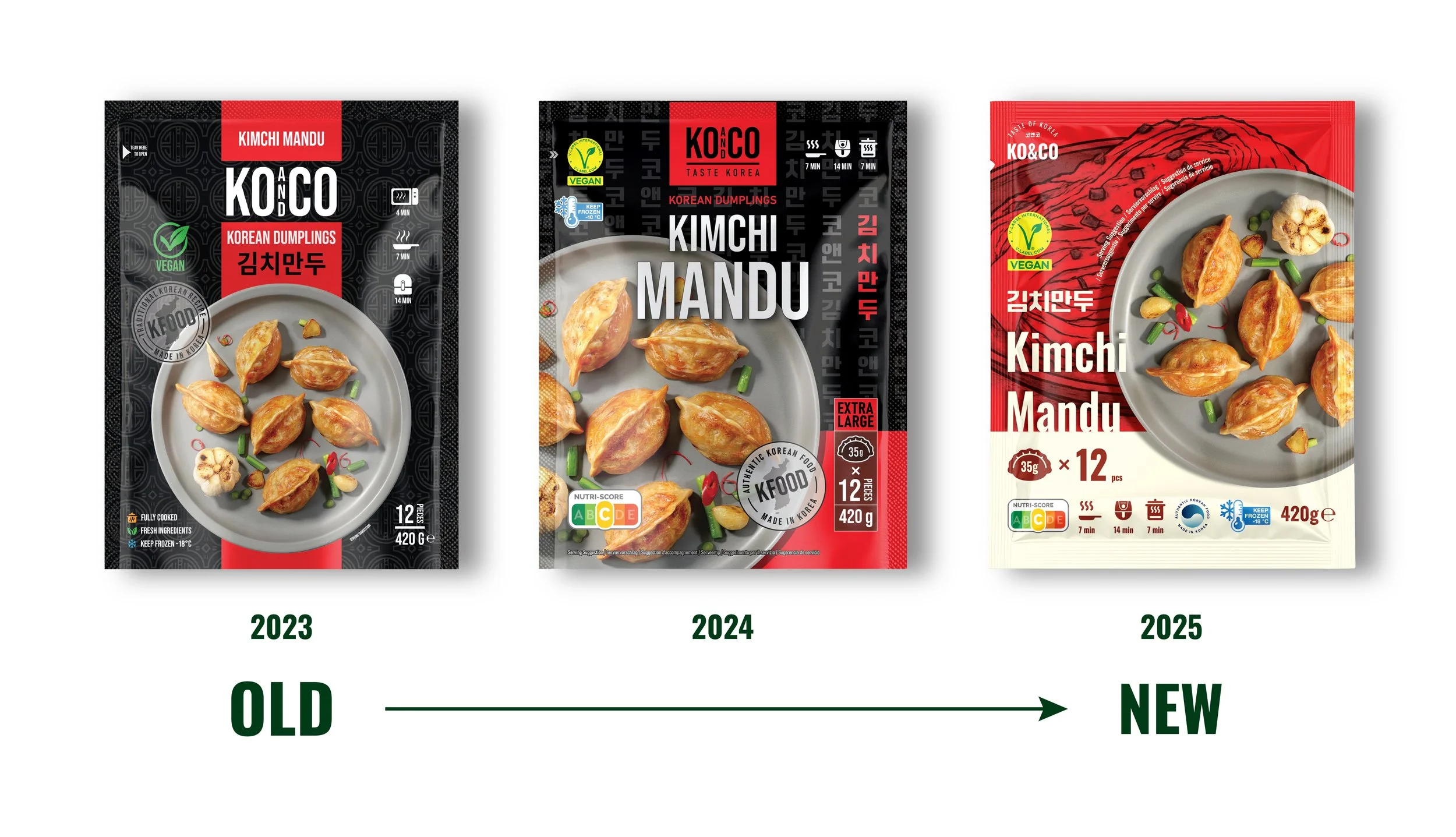
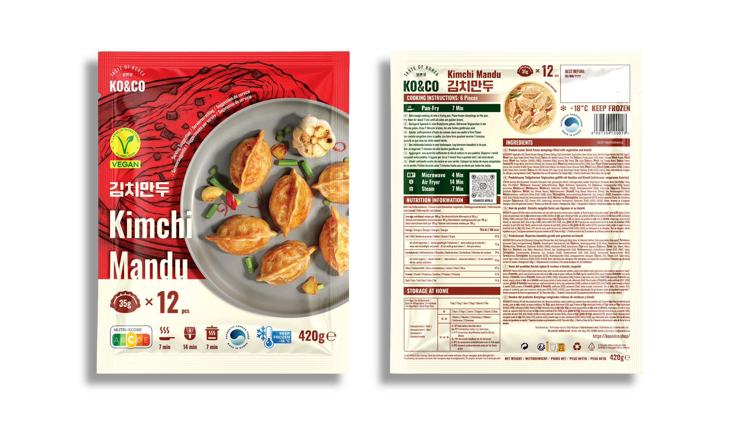
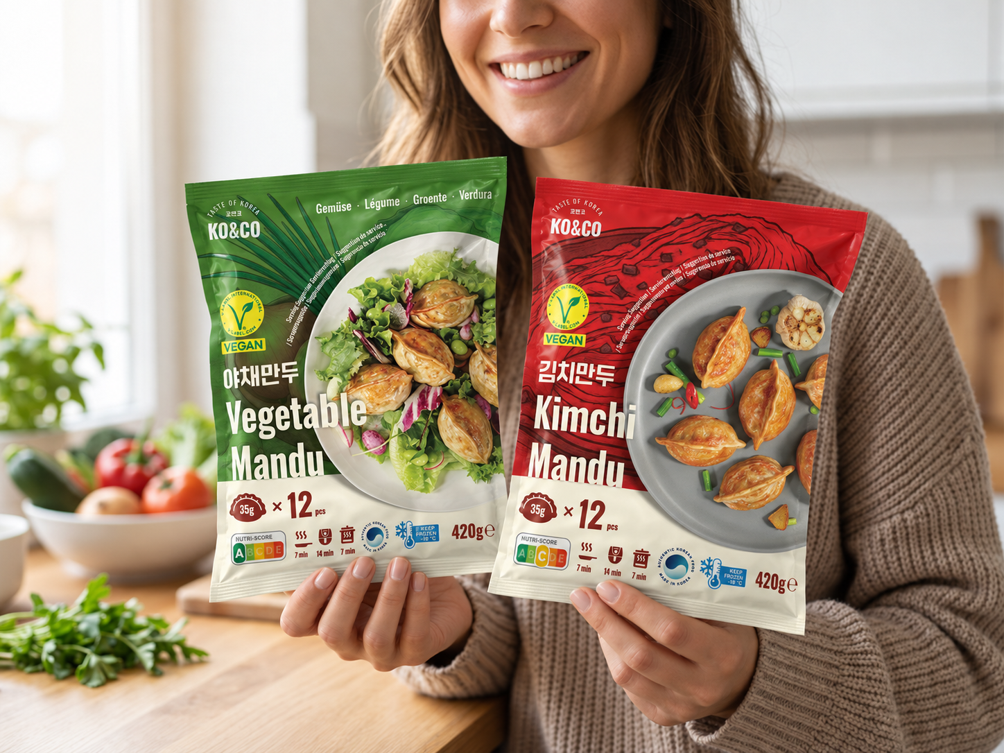
Kimchi Mandu (Vegan)
Vivid red and kimchi illustrations reference the filling’s spicy character. The bold background contrasts with the light plate and product name.
-
![]()
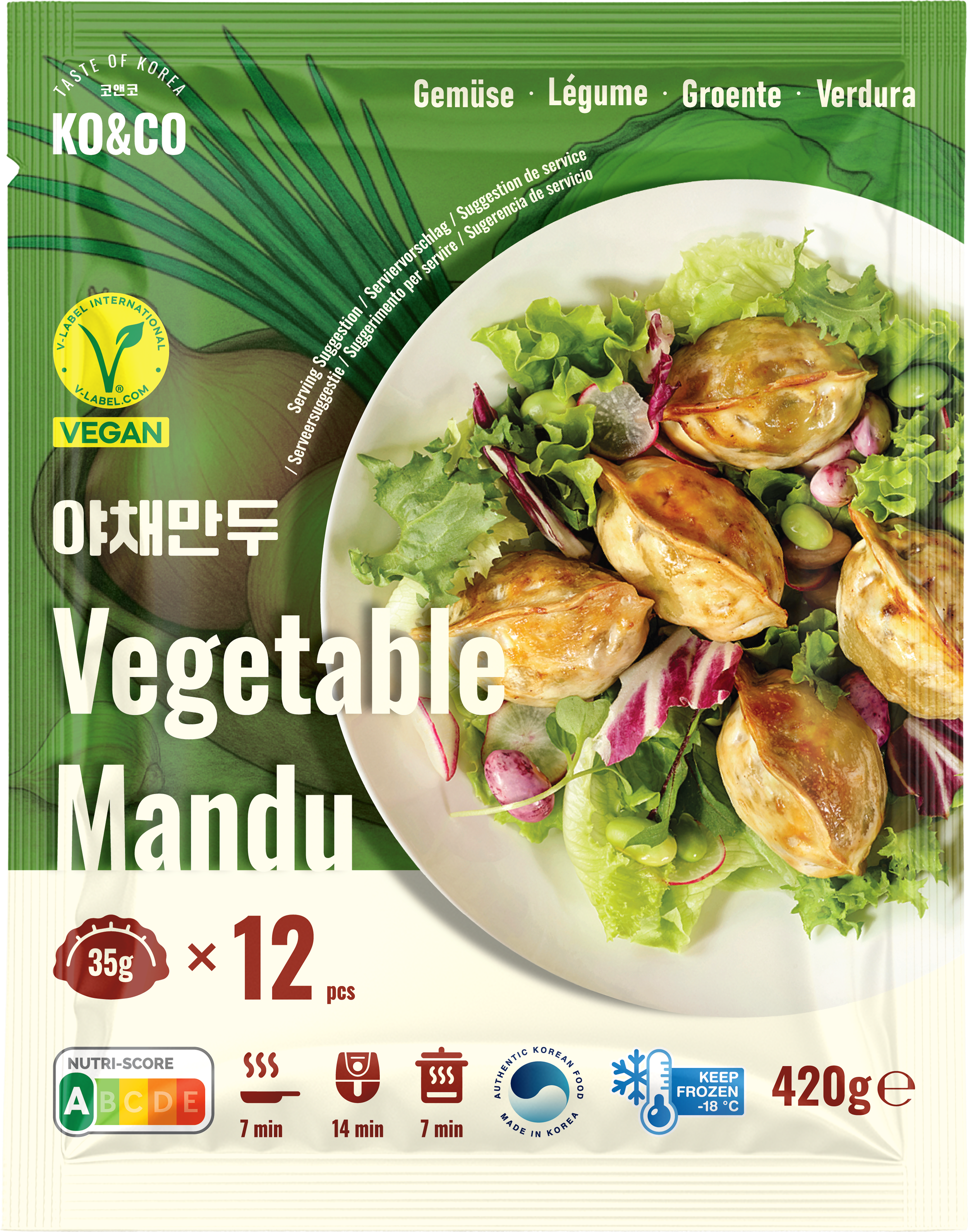
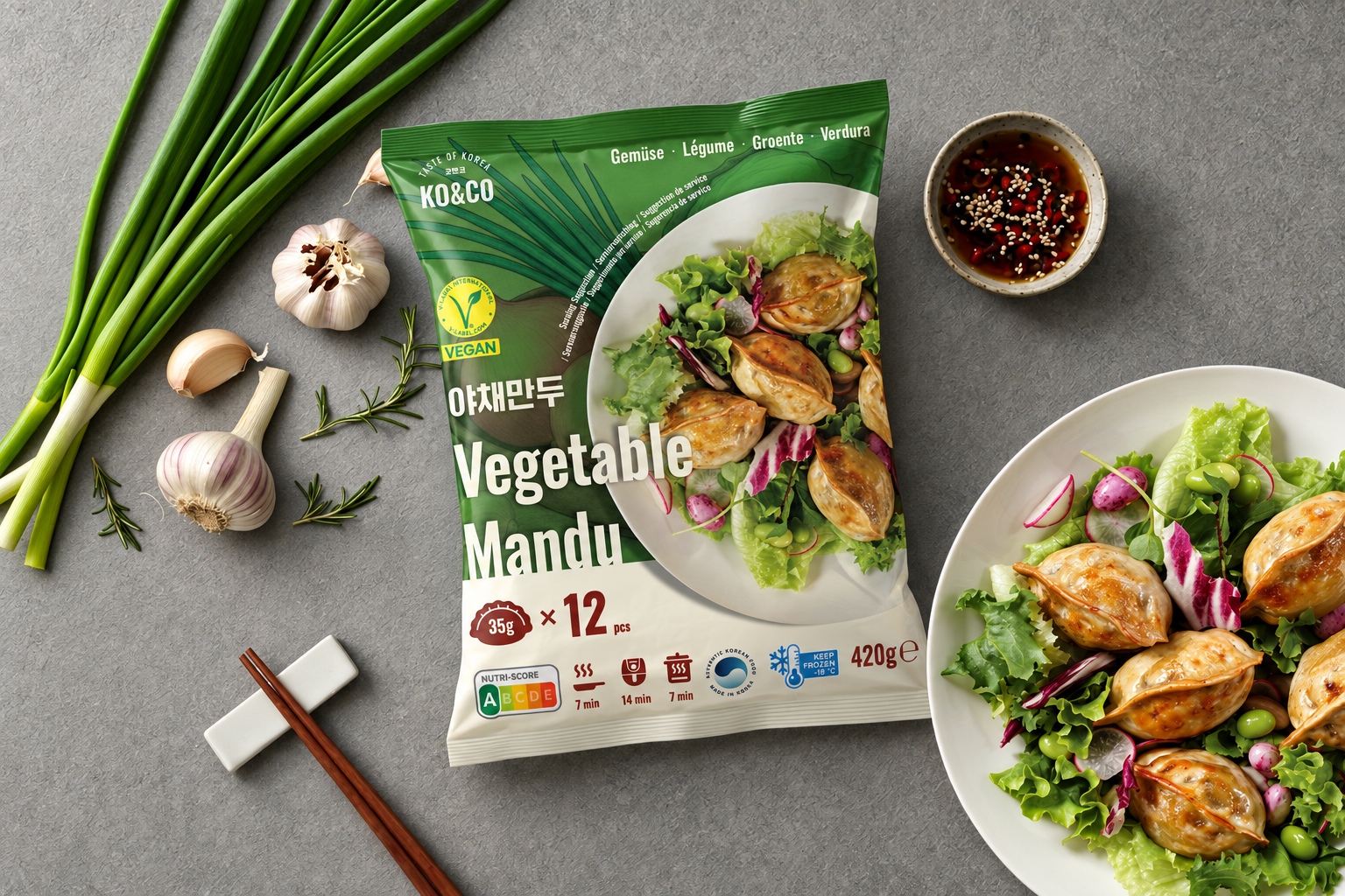
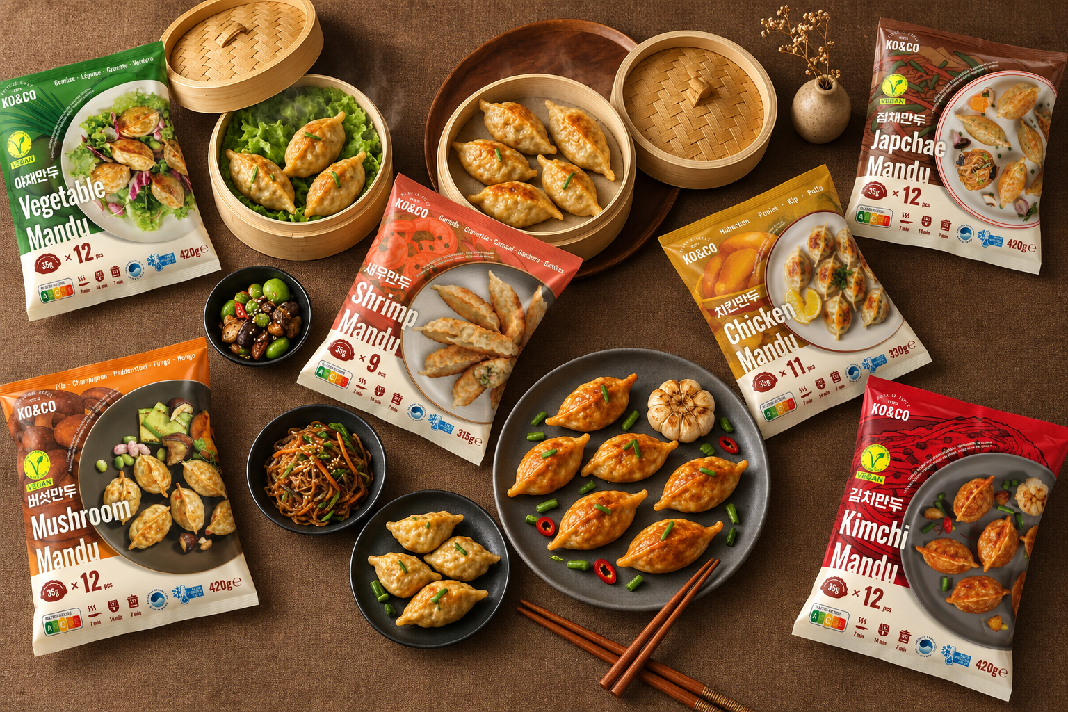
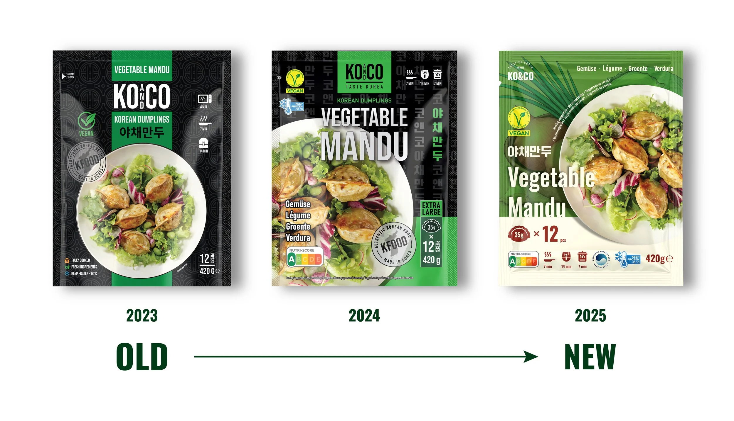
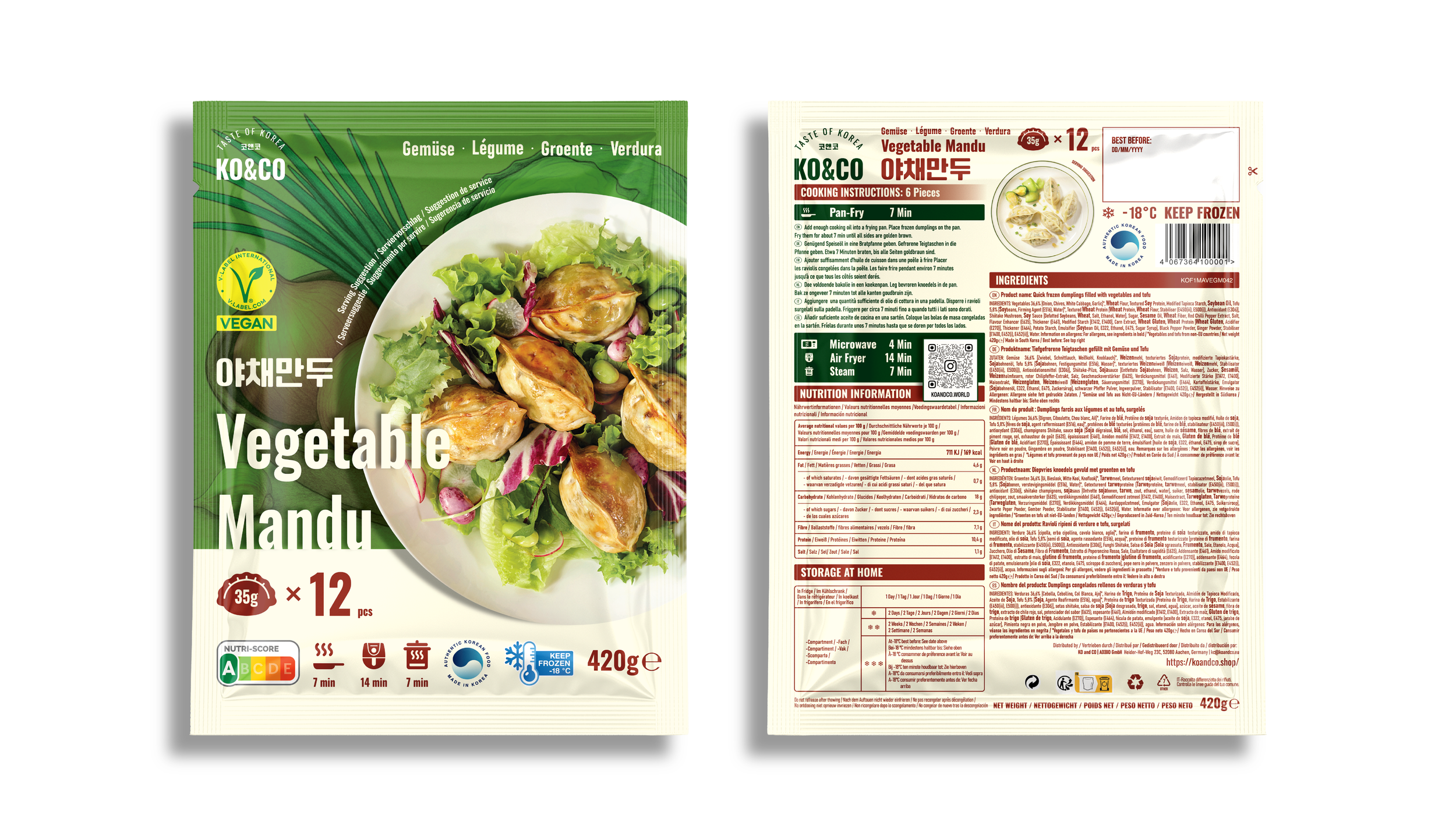
Vegetable Mandu (Vegan)
A green palette and vegetable illustrations bring the filling into focus. Salad-style plating reinforces the ingredient-led presentation.
-
![]()
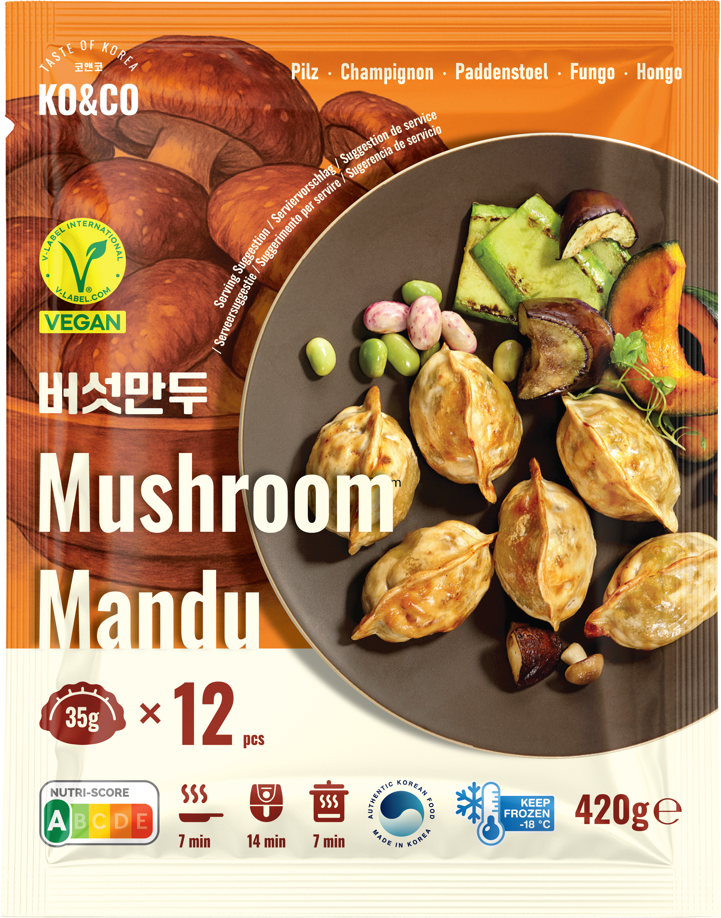
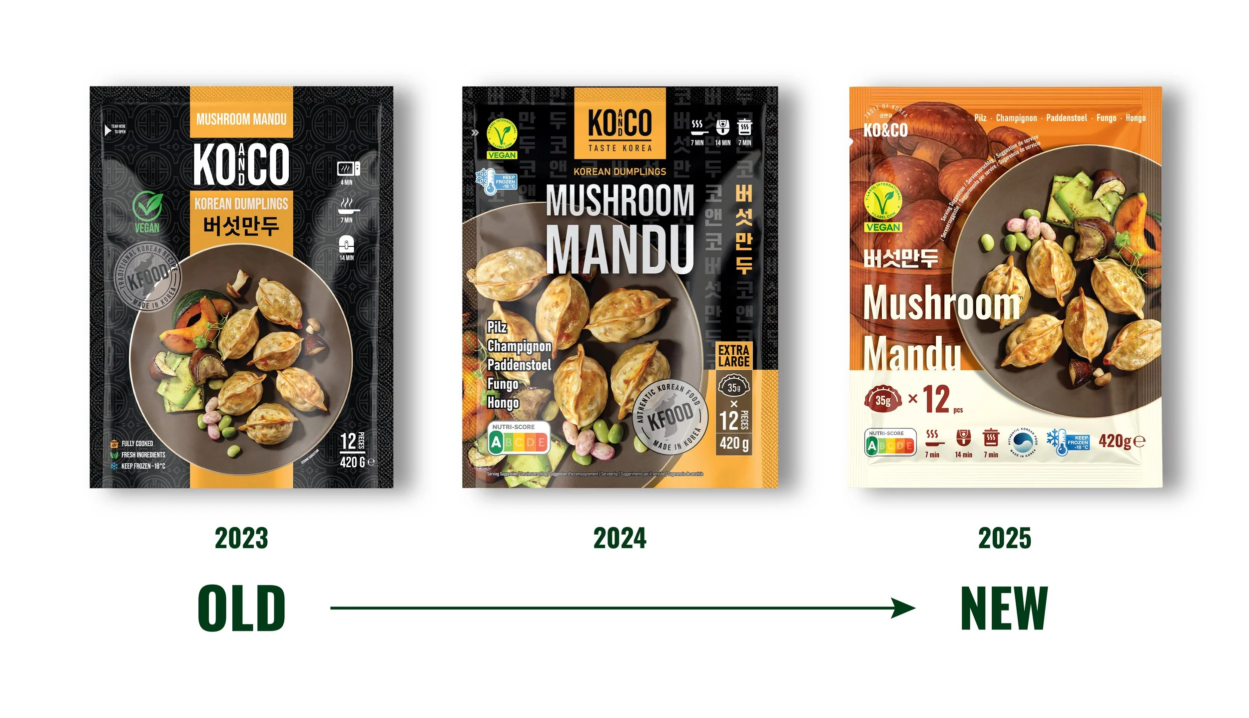
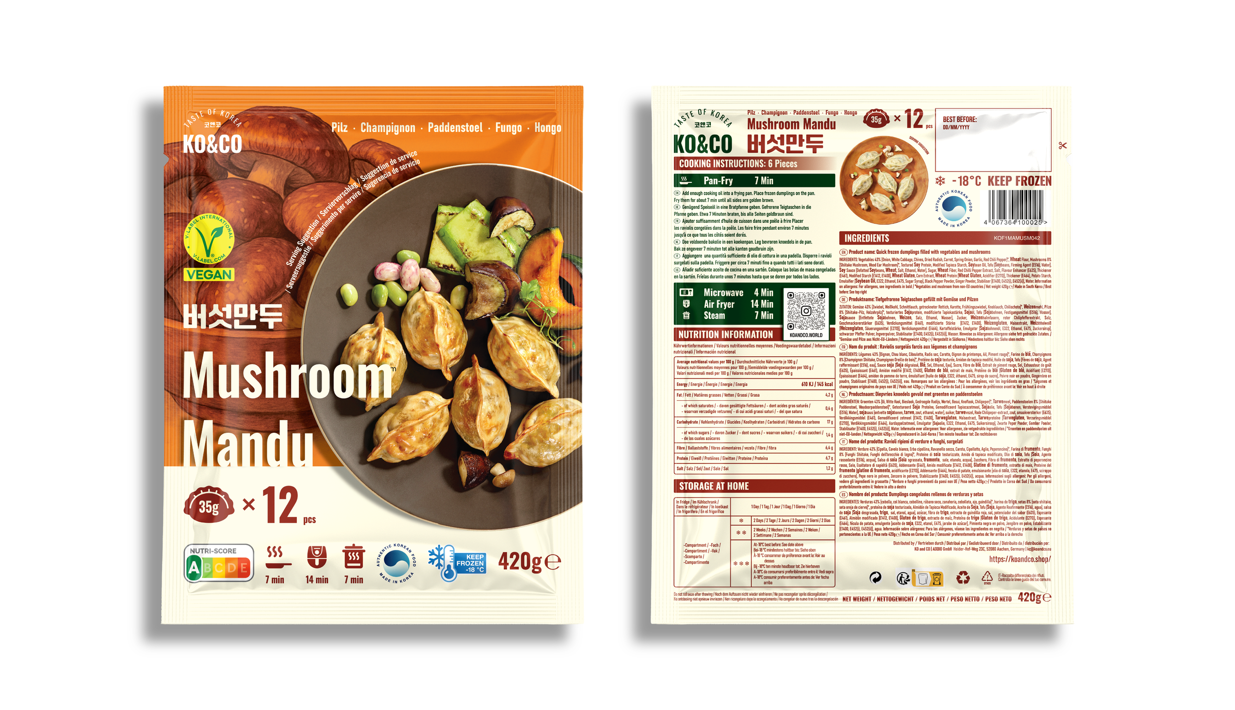
Mushroom Mandu (Vegan)
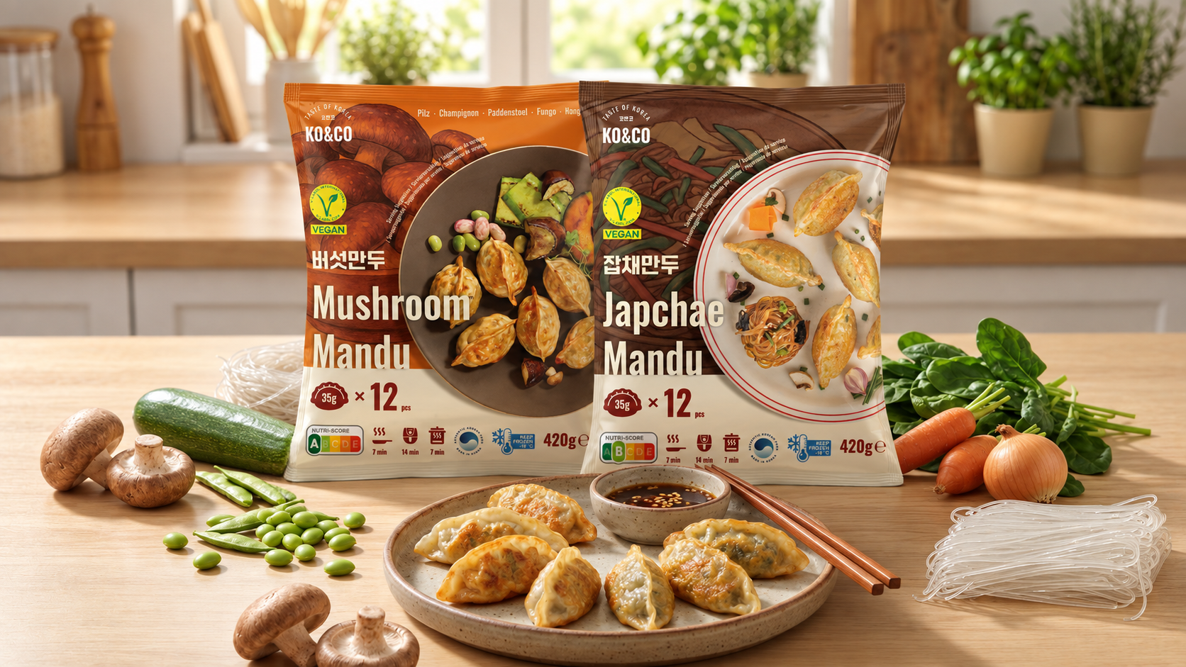
Earthy orange and mushroom illustrations identify the filling. The warm palette distinguishes this variety from the brighter colors elsewhere in the range.
-
![]()
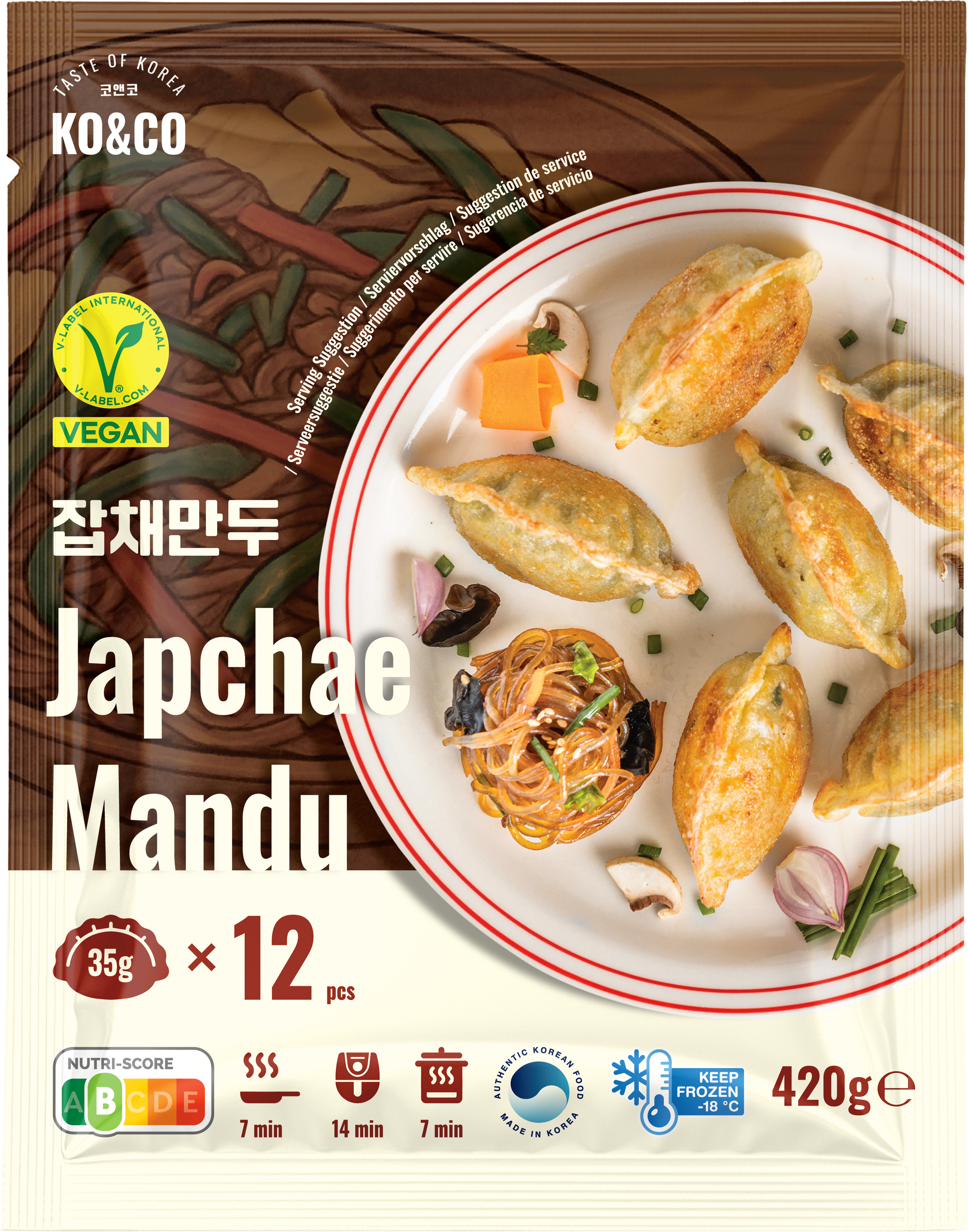
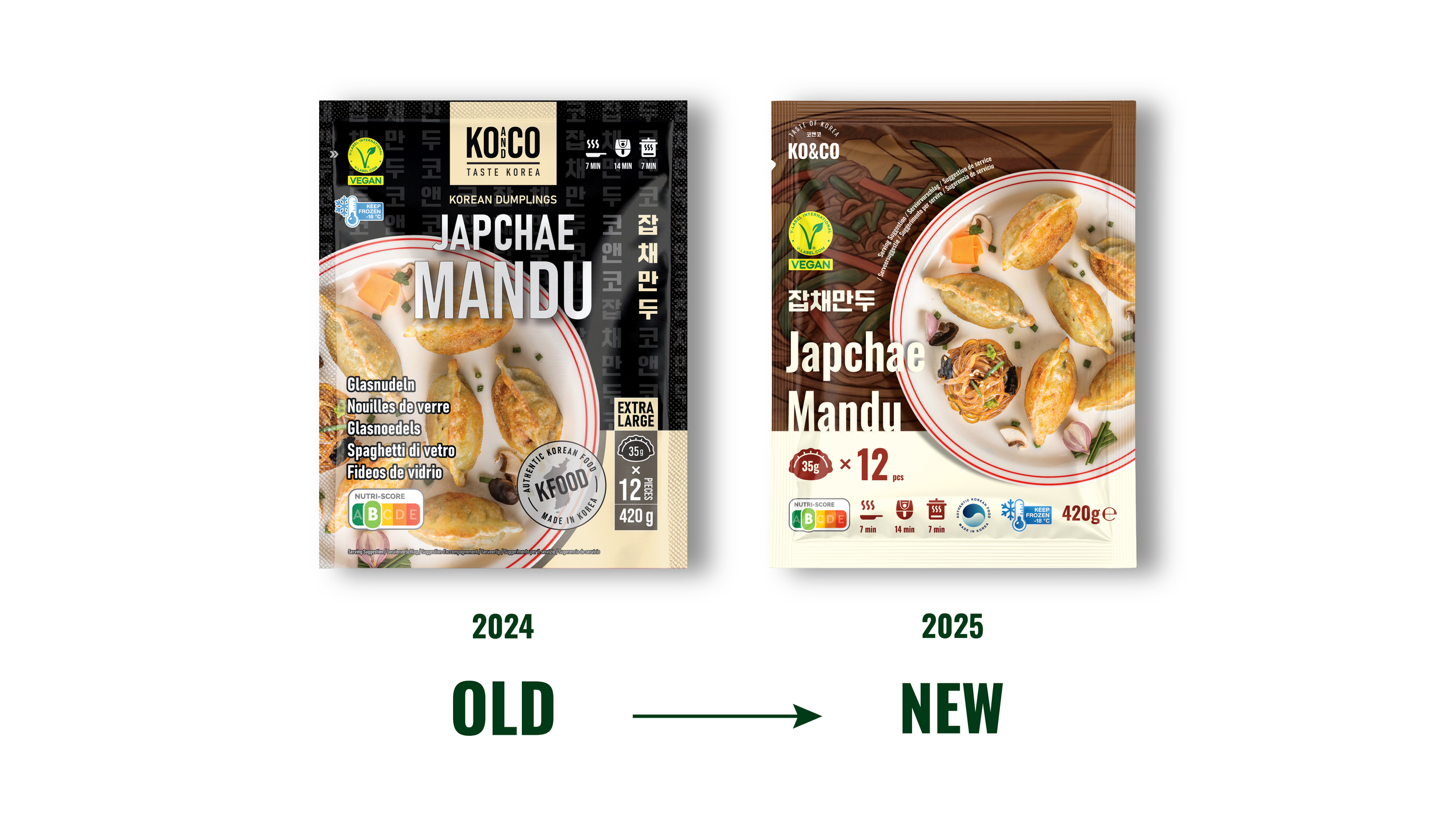
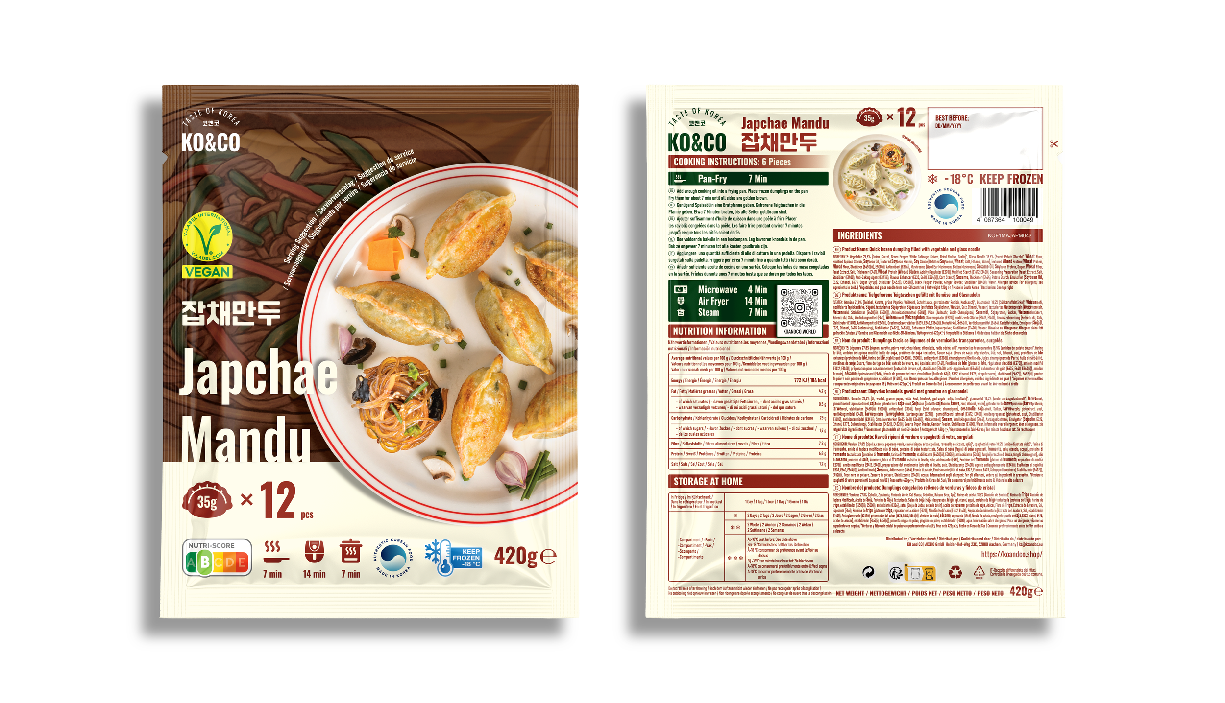
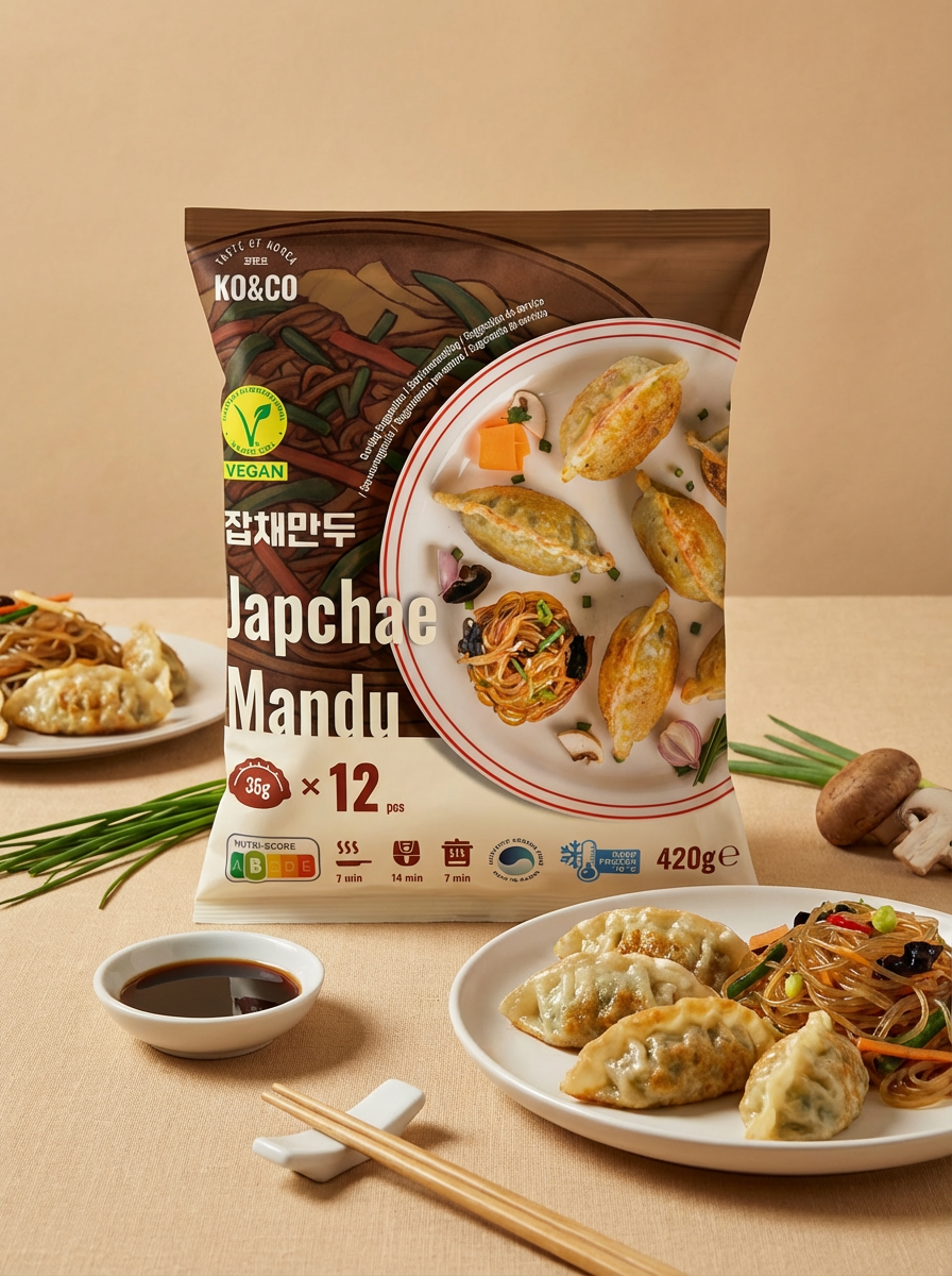
Japchae Mandu (Vegan)
Deep brown references japchae’s soy-based seasoning, while noodle illustrations introduce the filling. These cues give the variety a distinct identity within the range.
-
![]()
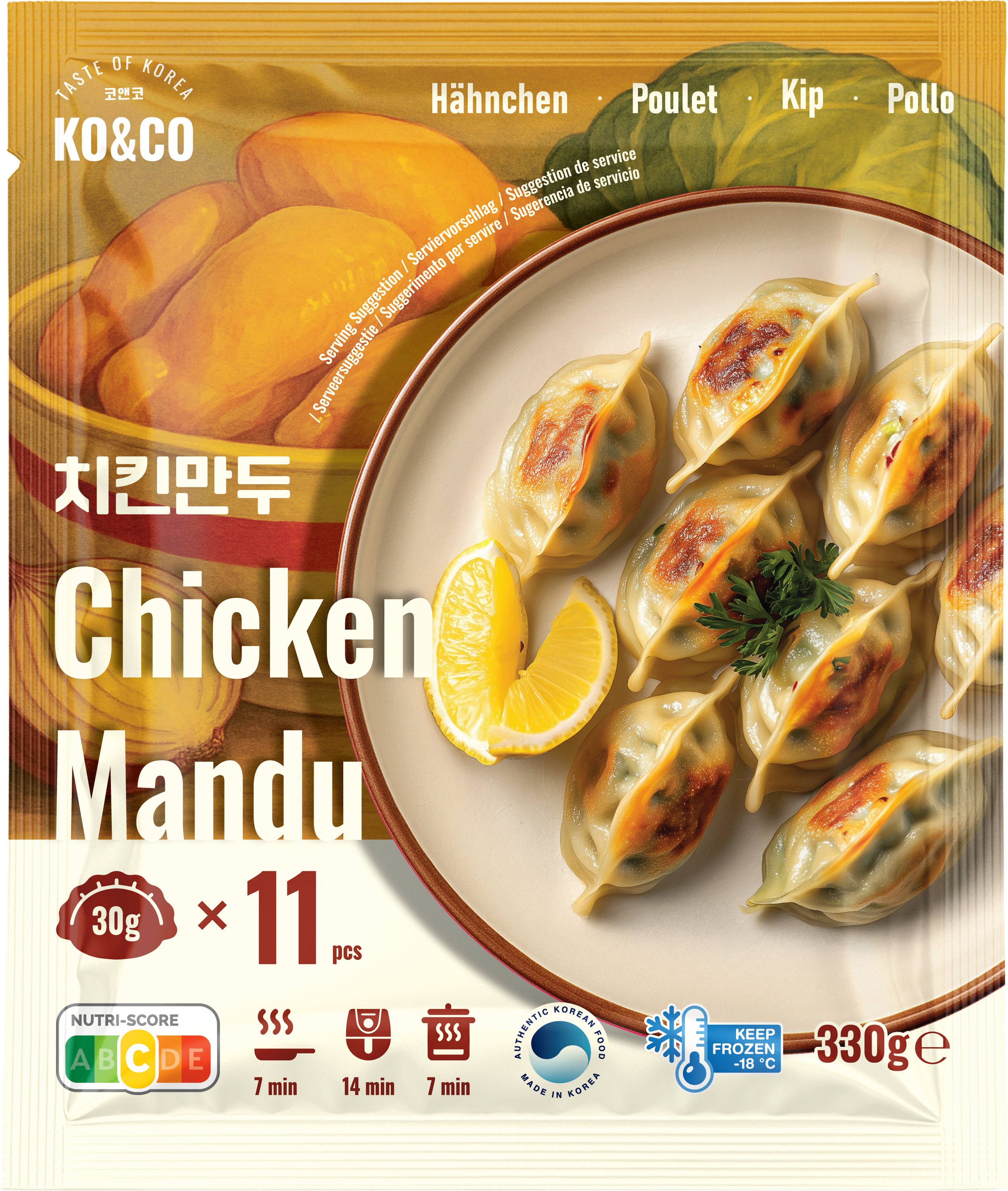
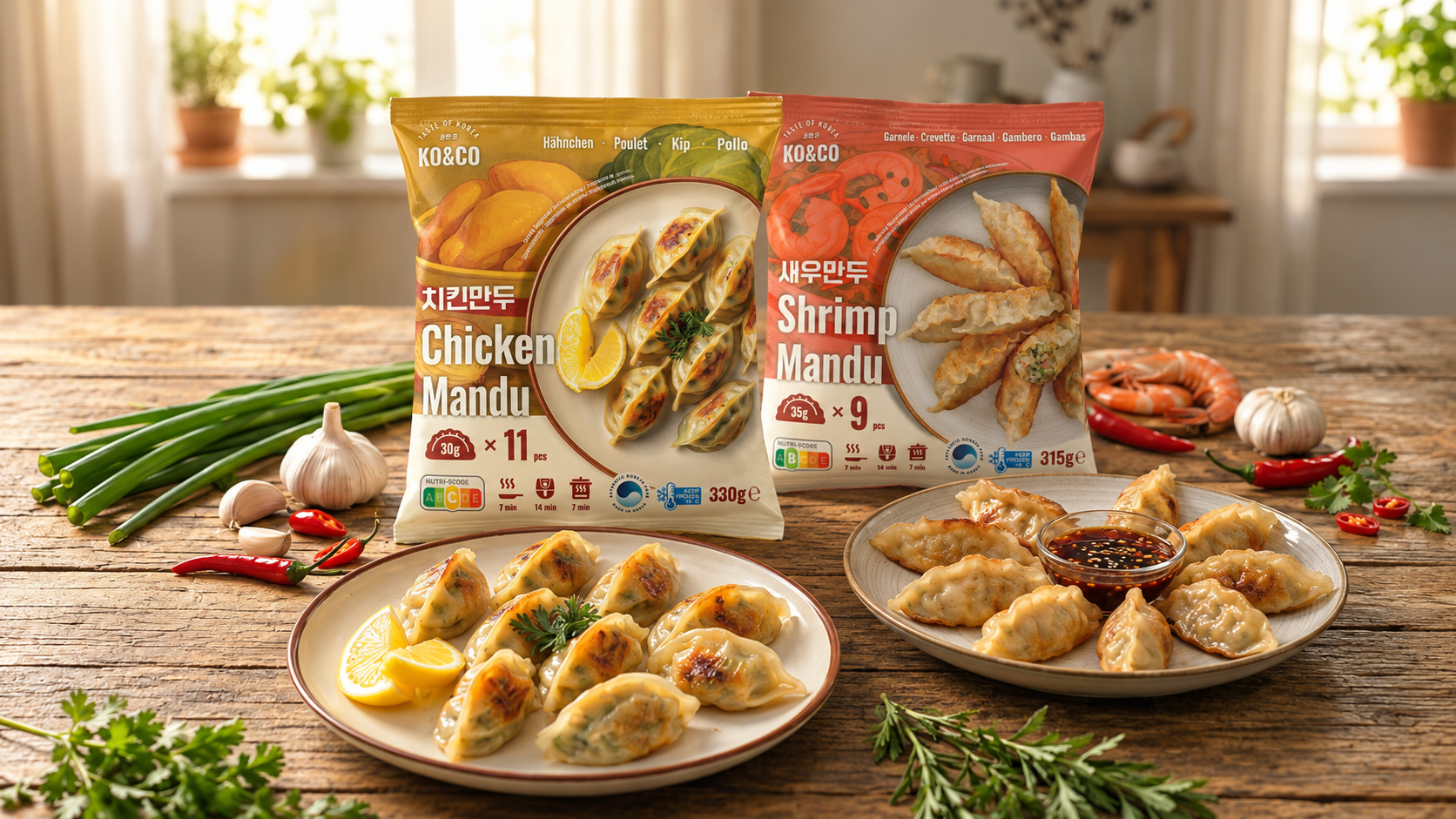
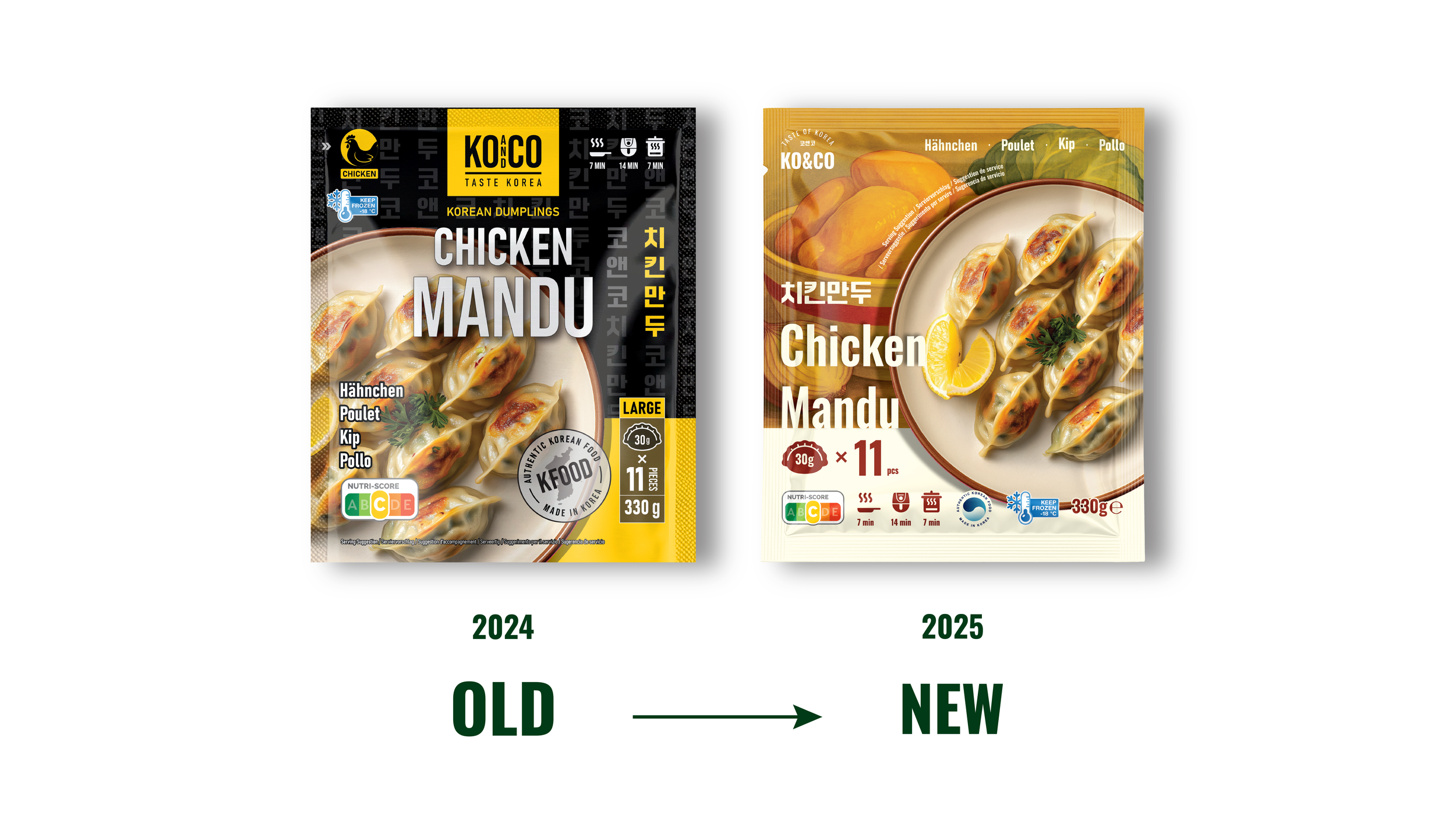
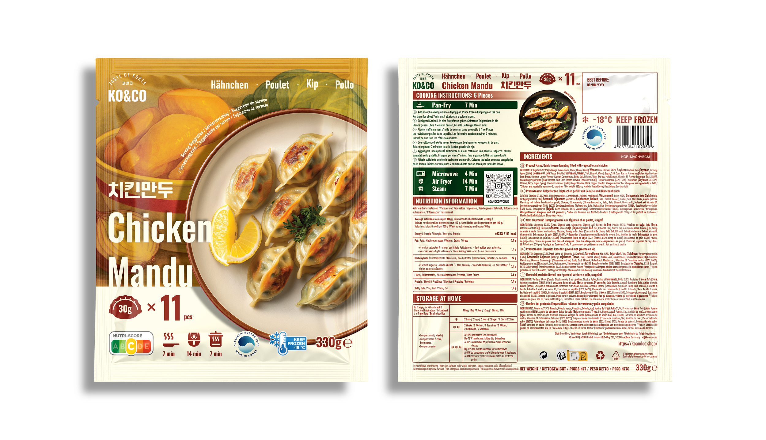
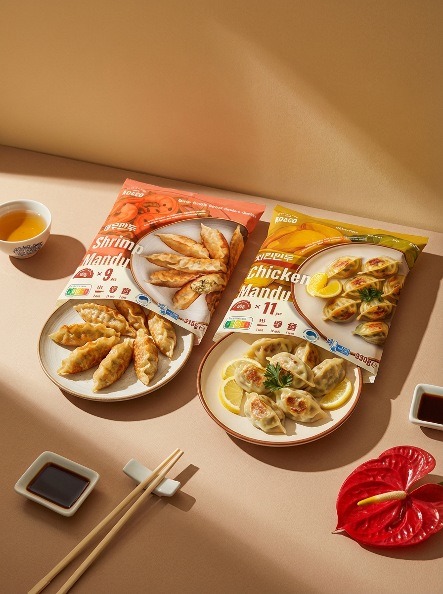
Chicken Mandu
Warm yellow and chicken illustrations set this variety apart. AI-assisted plated-dumpling imagery explores a more appetizing presentation of the food.
-
![]()
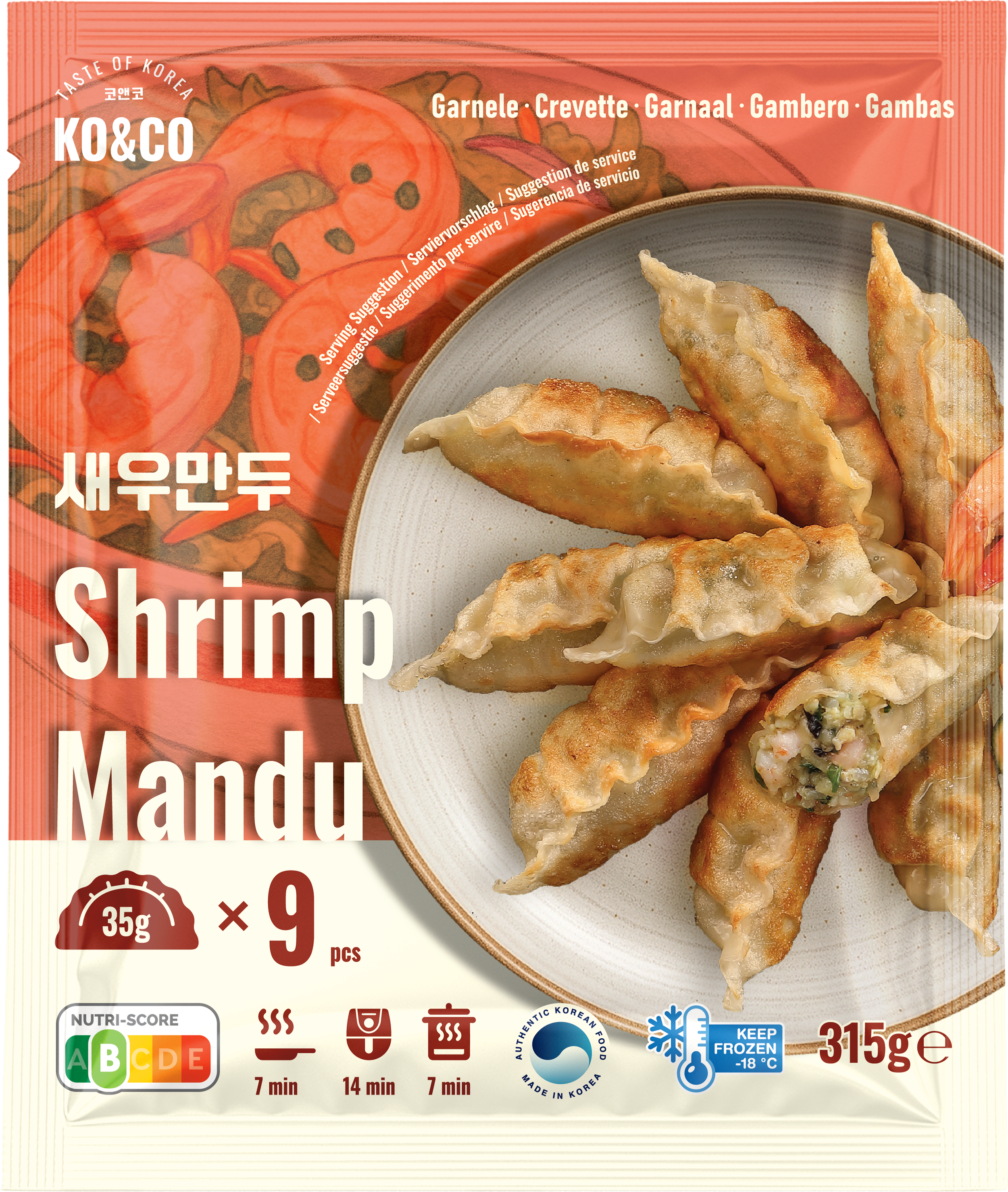
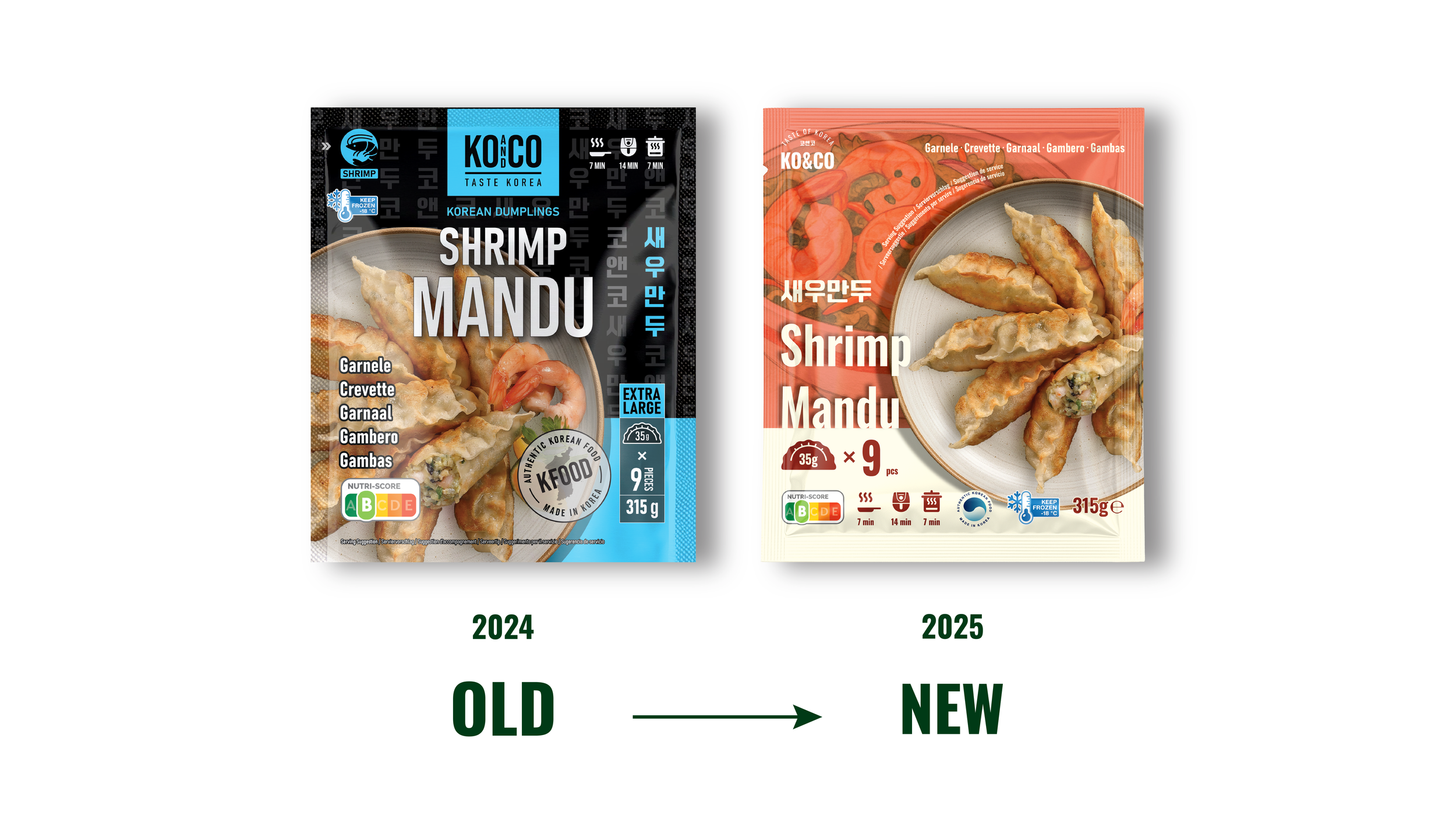
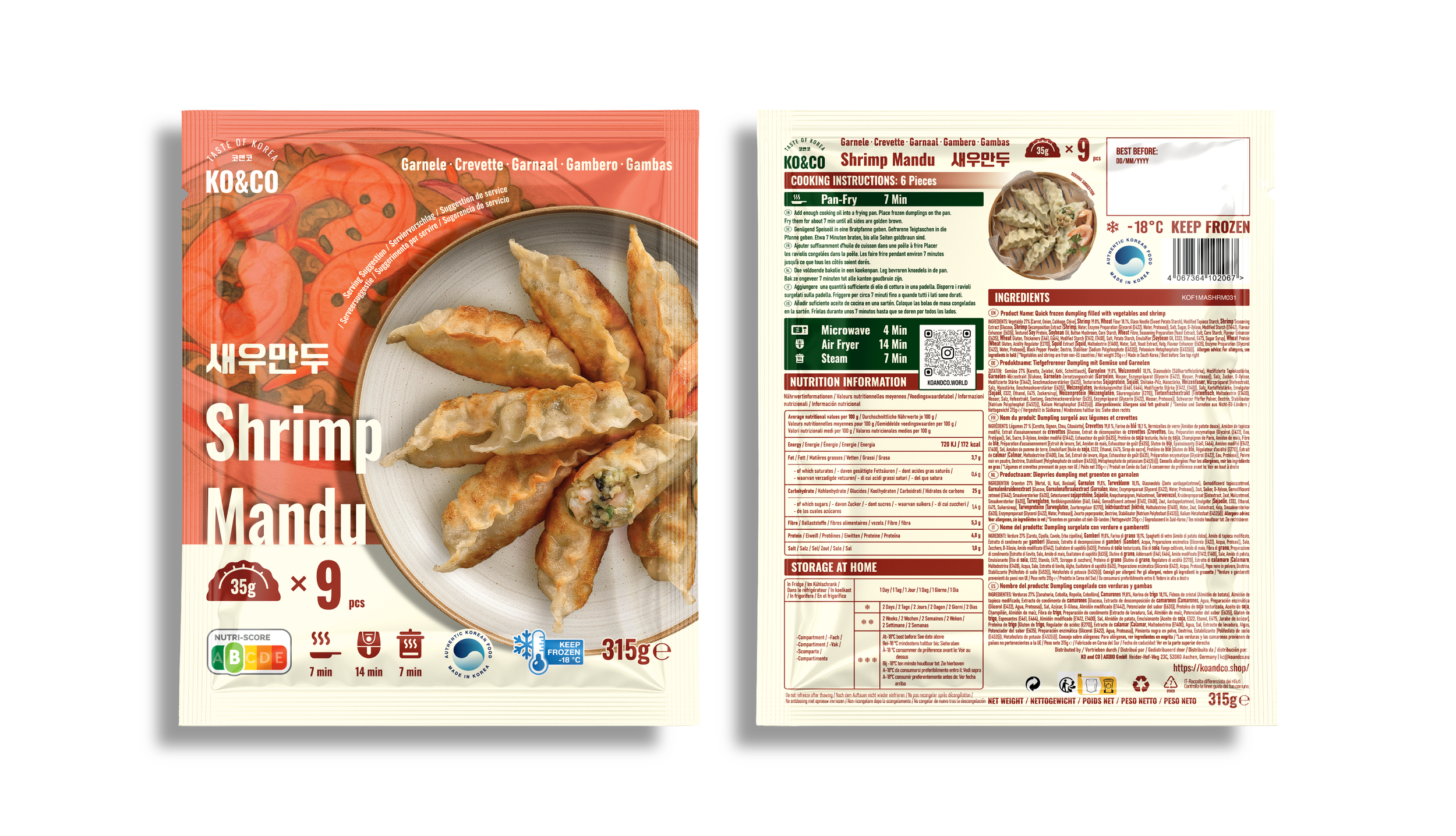
Shrimp Mandu
Coral tones and shrimp illustrations identify the seafood filling. AI-assisted imagery features a cut-open dumpling to illustrate the filling in more detail.
Project Background
After joining the company in November 2023, I redesigned KO&CO’s existing mandu packaging, creating the black version shown here as the 2024 design. I led the overall packaging design and execution.
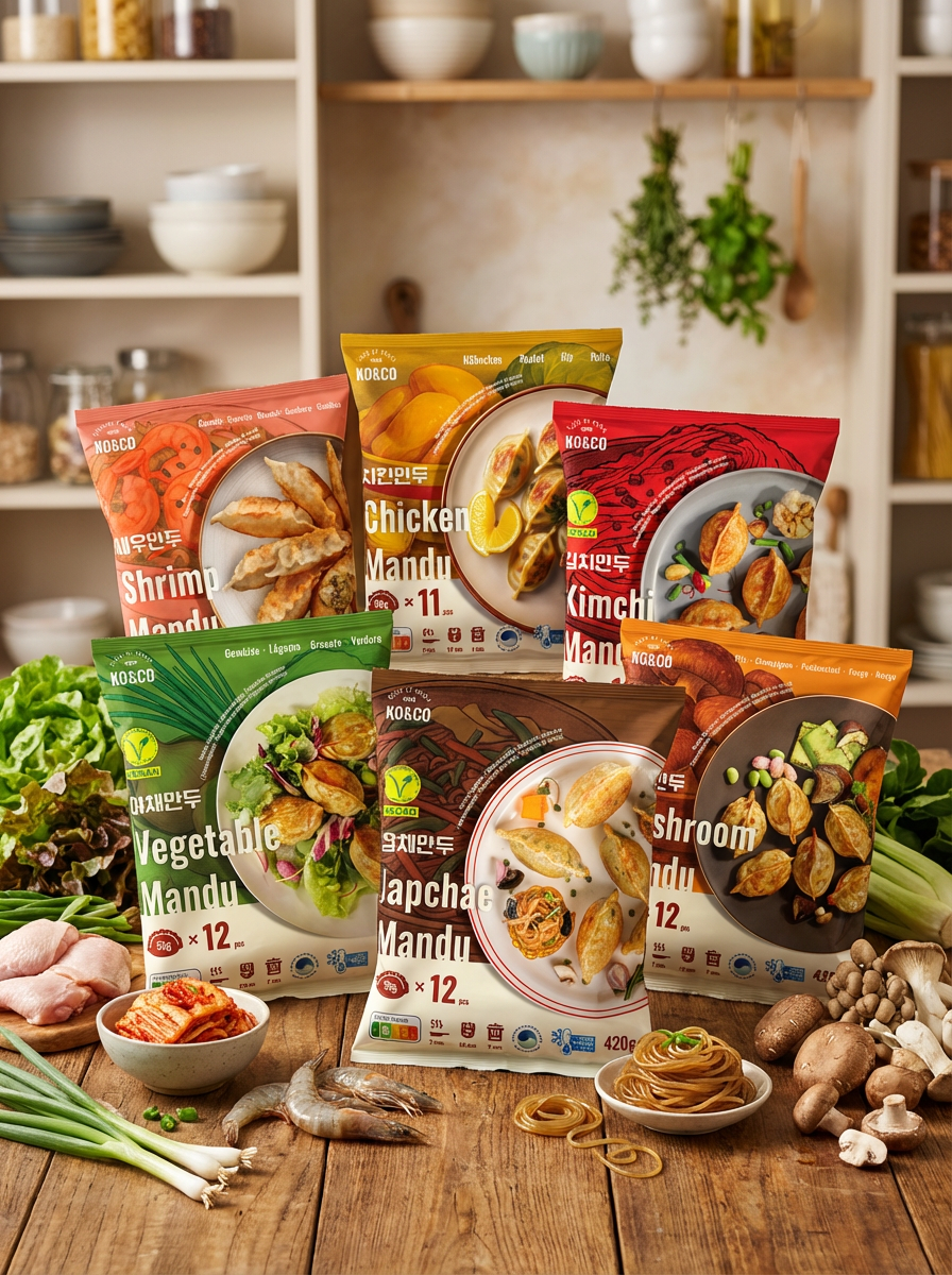
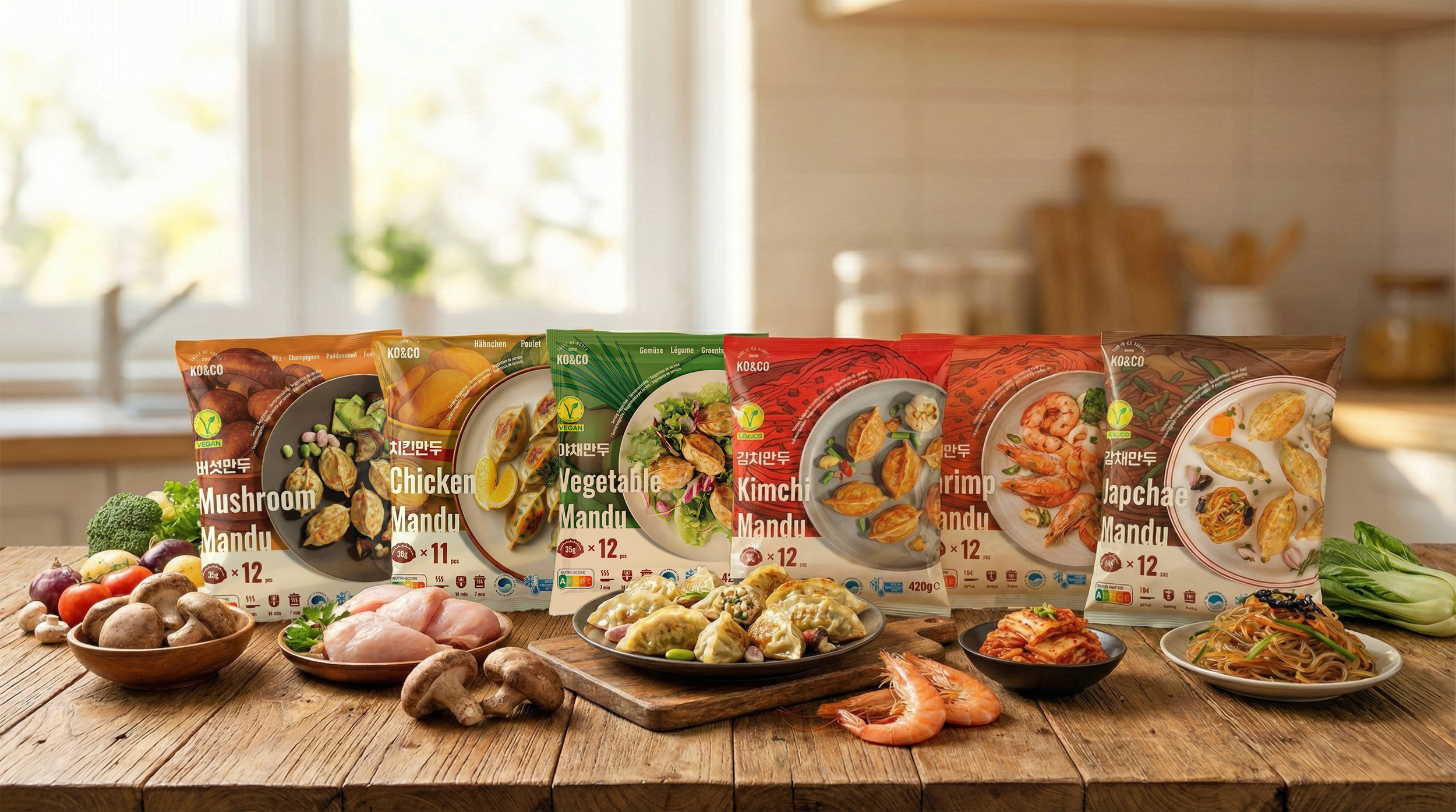
After leaving the company, I revisited the six-product range independently to explore a direction I had wanted to pursue: more prominent flavor colors, a clearer information hierarchy, and a stronger emphasis on food presentation.
The 2025 version is a personal design exploration. The company did not adopt it or release it commercially.
Design Objective
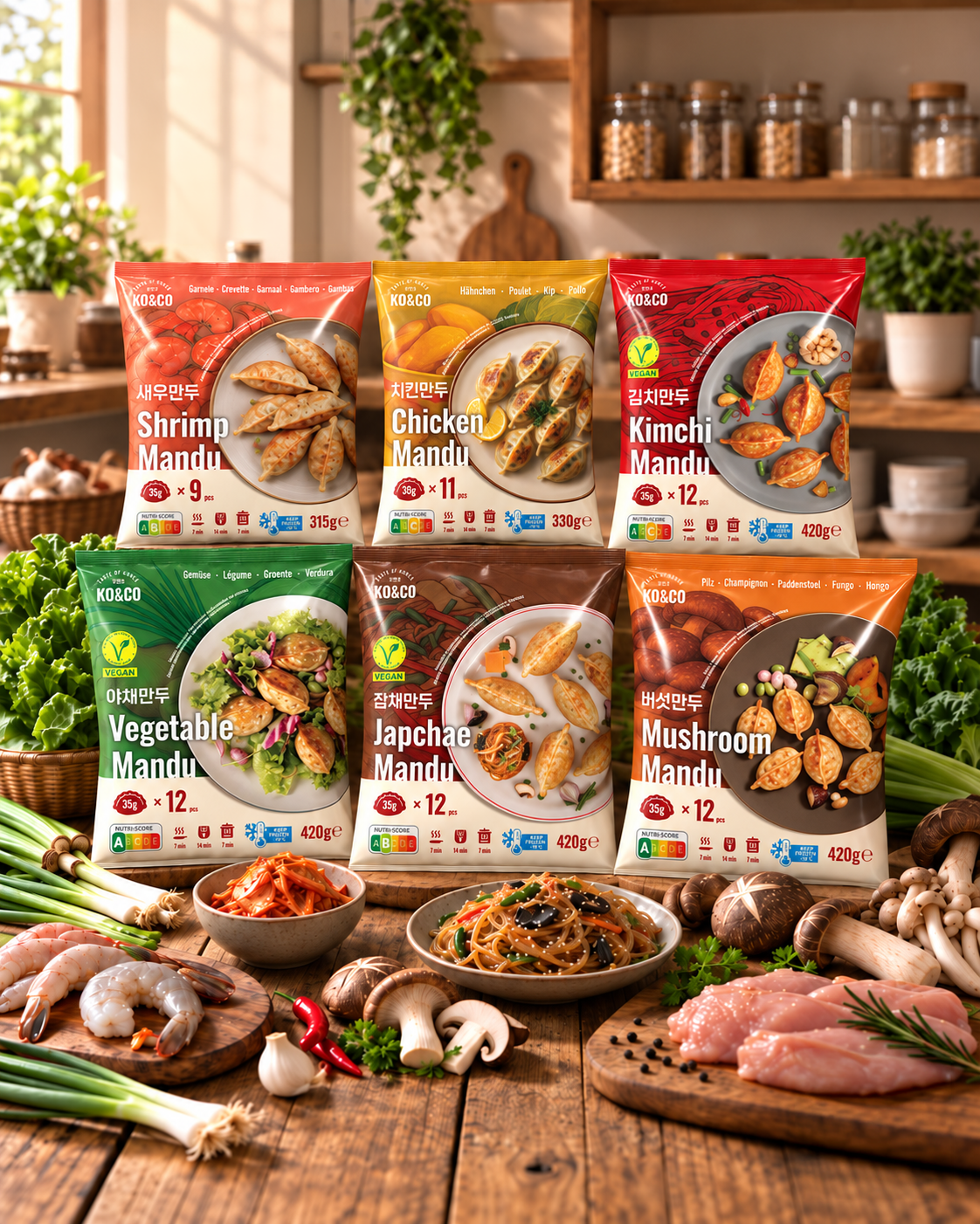
Give each flavor a distinct identity while keeping all six varieties recognizable as one range.
Design Evolution
2023 — Previous Design
The existing packaging before my involvement, included as a reference for the design’s starting point.
2024 — My In-house Redesign
The black packaging redesign I developed after joining the company, with responsibility for the overall packaging design.
2025 — My Independent Concept
A self-initiated exploration developed after leaving the company. I shifted the emphasis toward flavor-specific colors, ingredient graphics, and revised food imagery within a shared packaging structure.
Key strategic design decisions
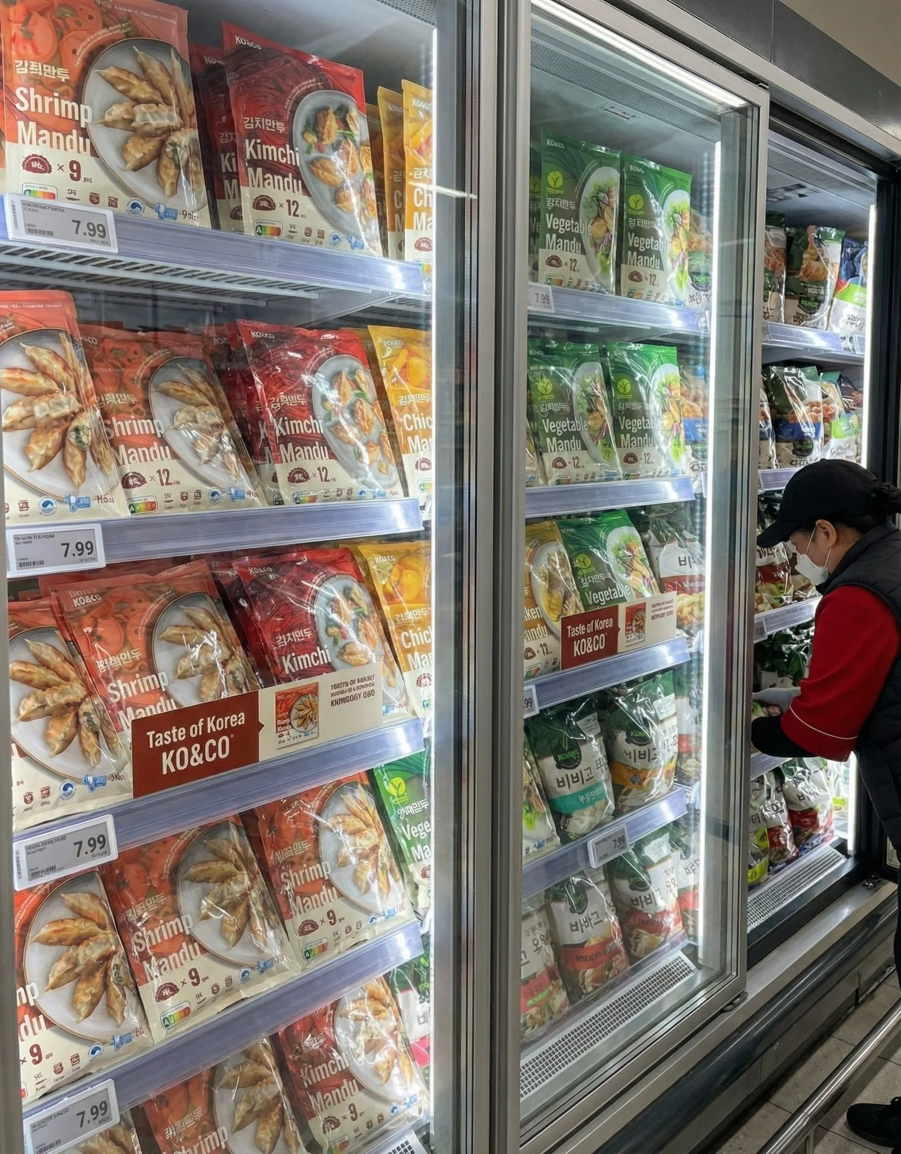
Ingredient-first storytelling
Each SKU uses illustrated ingredients behind the plated product photo to instantly communicate flavor and improve navigation across the lineup.Color-coded differentiation
SKU colors are derived from each filling (Shrimp, Chicken, Kimchi, Japchae, Vegetable, Mushroom) for quick shelf recognition and a cohesive family look.Clearer information hierarchy
The layout prioritizes the product name and food imagery, with weight, piece count, and cooking information grouped as supporting details.Reduced background decoration
I reduced the prominence of decorative patterns to give flavor colors, ingredient graphics, and product names more space.
Typography & Color
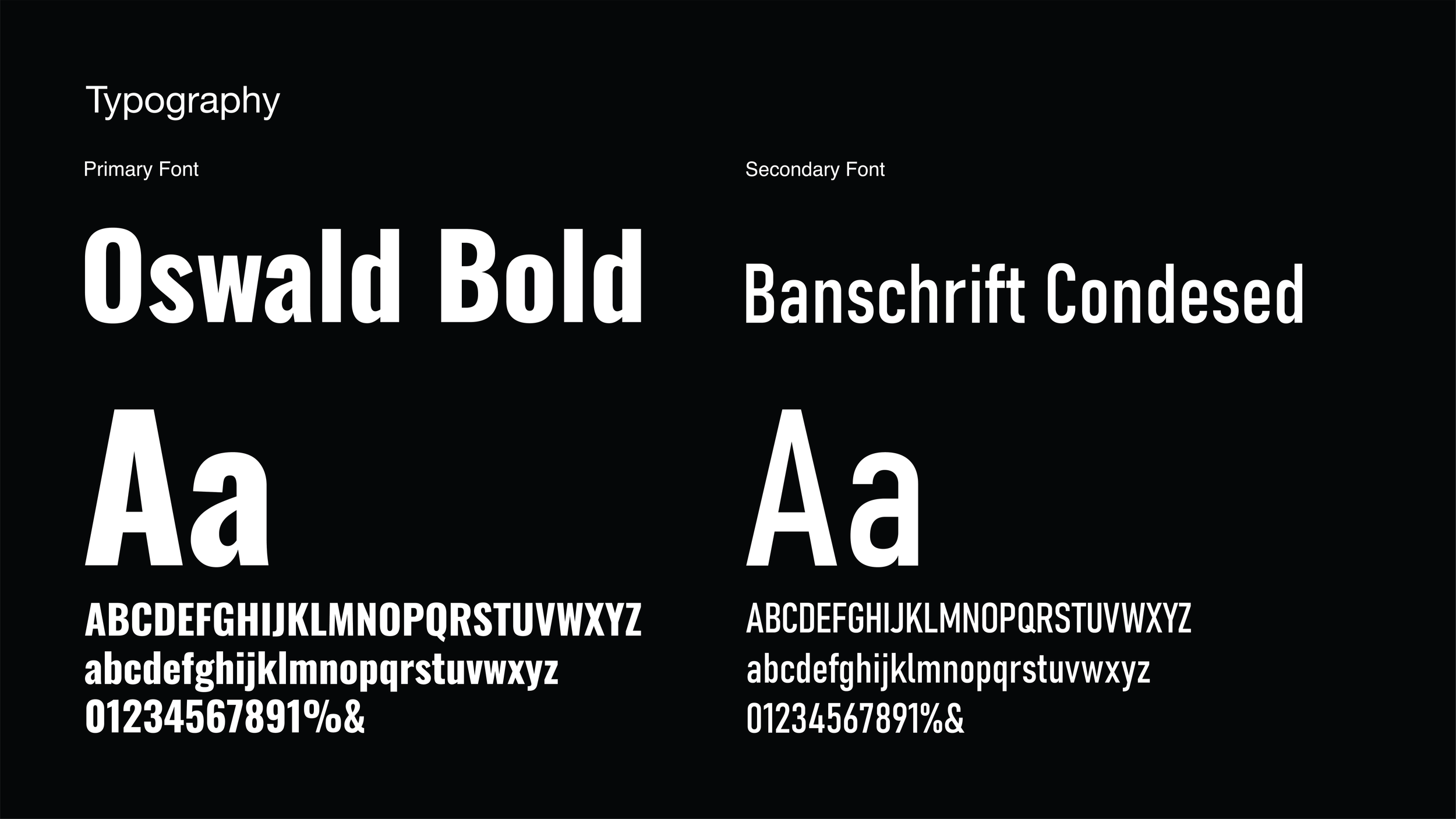
Typography
The packaging design uses a combination of sans-serif fonts to create a modern, clean aesthetic with high legibility.
Primary Font: Oswald Bold
Characteristics: A strong, vertically condensed typeface that creates a bold impact.
Application: Used for the English product names (e.g., "Kimchi Mandu", "Shrimp Mandu") in the center of the package. It instantly grabs the consumer's attention and clearly imprints the product name.
Secondary Font: Bahnschrift Condensed
Characteristics: A modern typeface with mechanical proportions. Its narrow width allows for efficient information layout.
Application: Used for detailed information, such as product descriptions or multilingual text at the top, harmonizing with the main font while providing clean readability.
Color
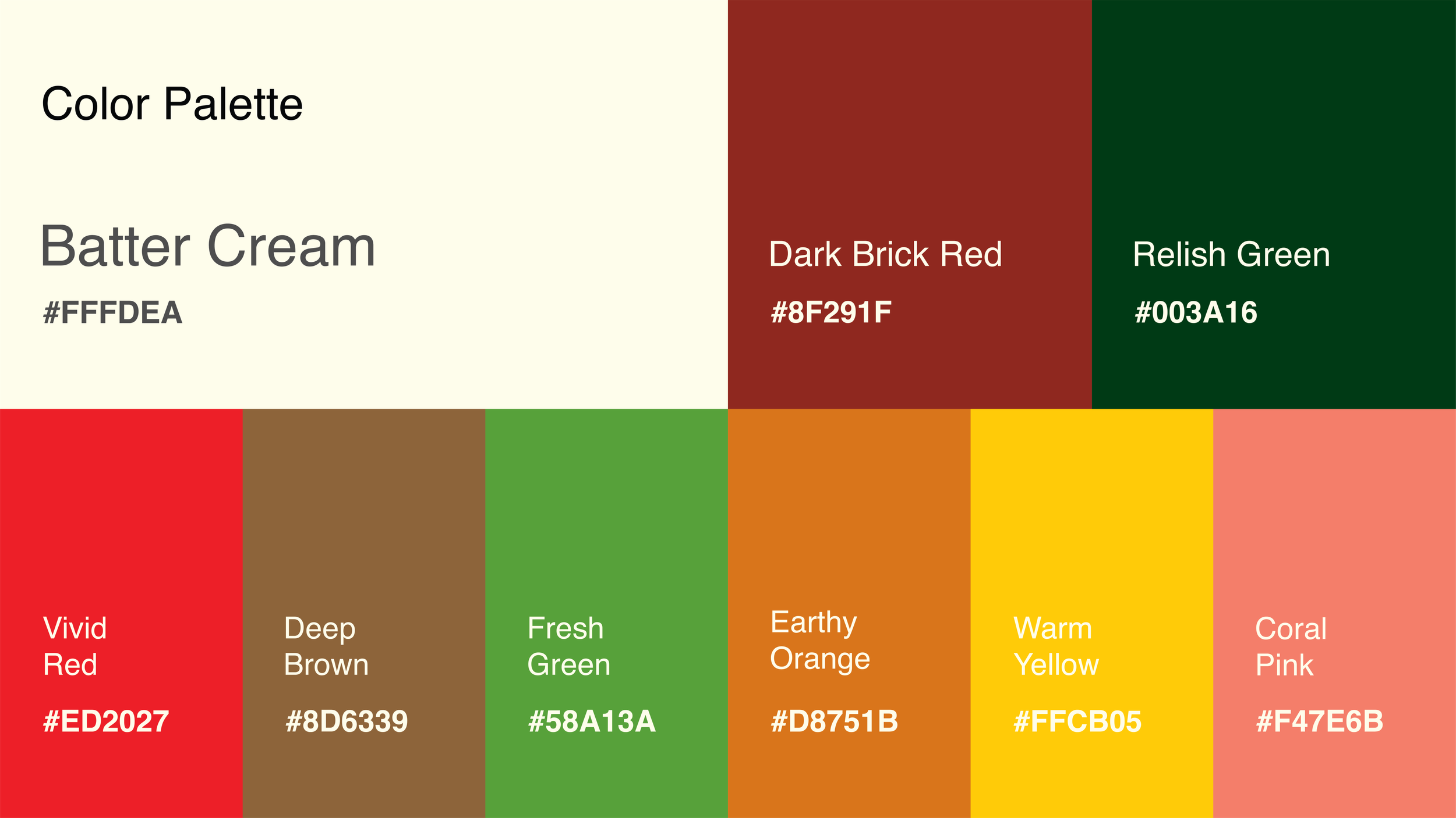
Each product features a unique color code reflecting its core ingredients, helping consumers intuitively distinguish flavors.
#ED2027 (Vivid Red) / Kimchi Mandu
Symbolizes the vibrant red color of well-fermented kimchi and spicy chili powder, stimulating the appetite.
#58A13A (Fresh Green) / Vegetable Mandu
Represents the freshness of chives and green vegetables, emphasizing a healthy and clean image.
#D8751B (Earthy Orange/Bronze) / Mushroom Mandu
Reflects the natural brown tones of shiitake mushroom caps, conveying the deep, savory flavor and earthy nature of the ingredients.
#8D6339 (Deep Brown) / Japchae Mandu
Visualizes the rich, savory taste of the soy sauce seasoning, glass noodles, and wood ear mushrooms used in Japchae.
#F47E6B (Coral Pink) / Shrimp Mandu
Uses the soft coral hue of cooked shrimp meat and shells to highlight the seafood flavor profile.
#FFCB05 (Warm Yellow) / Chicken Mandu
A bright, cheerful yellow evokes the warmth of chicken broth, golden dumpling wrappers, and ingredients like corn.
Reflection
Revisiting a range I previously designed helped me reconsider the balance between brand consistency and flavor differentiation.
The concept explores how a shared layout can connect six products while giving each filling a more distinct visual presence.









Scope & Image Credits
Scope
Overall packaging design direction and execution, including layout, typography, color, packaging graphics, and front- and back-of-pack information.
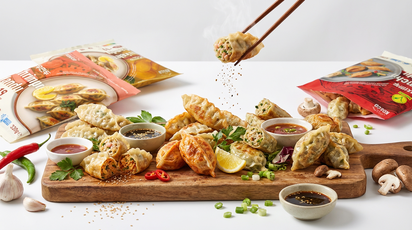
AI-Assisted Food Imagery
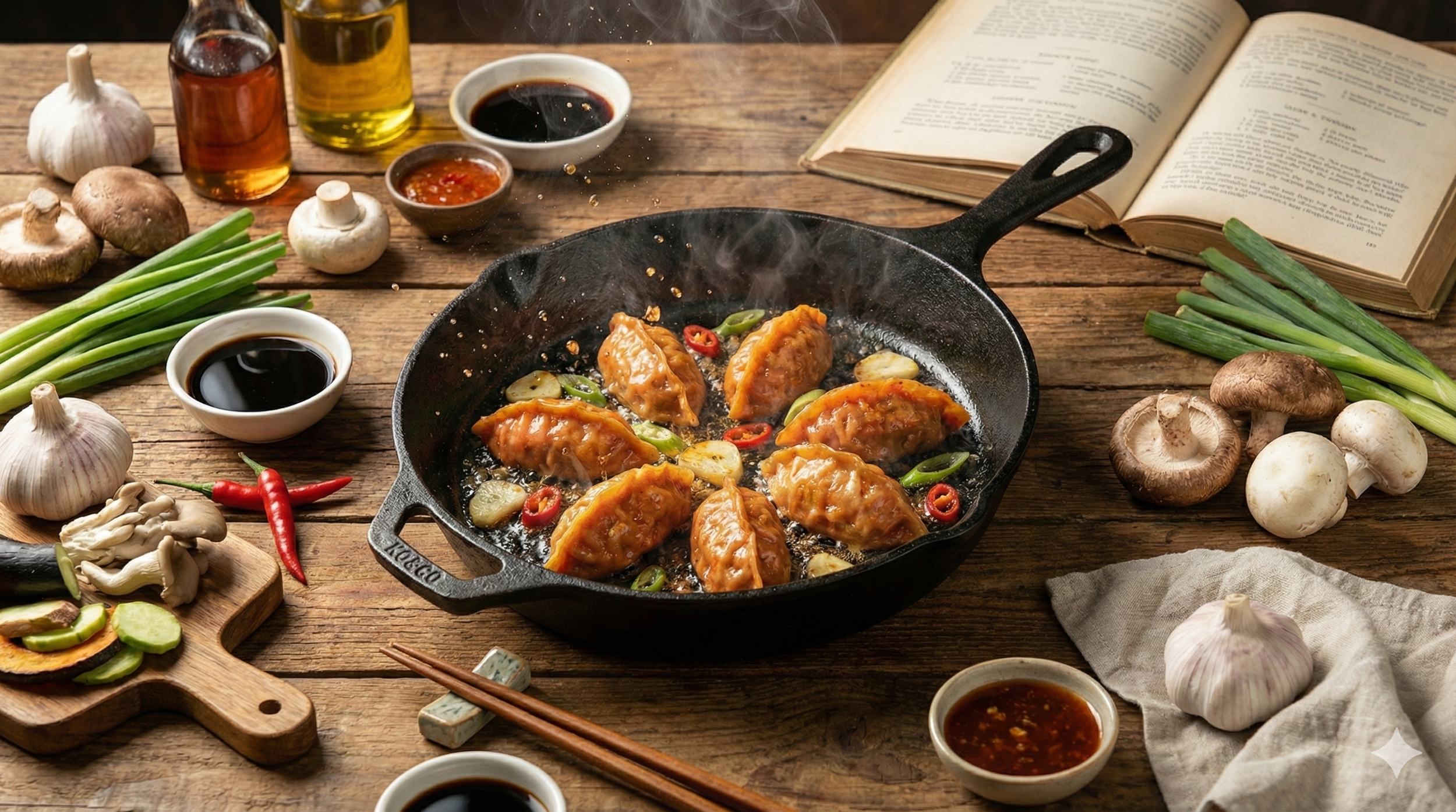
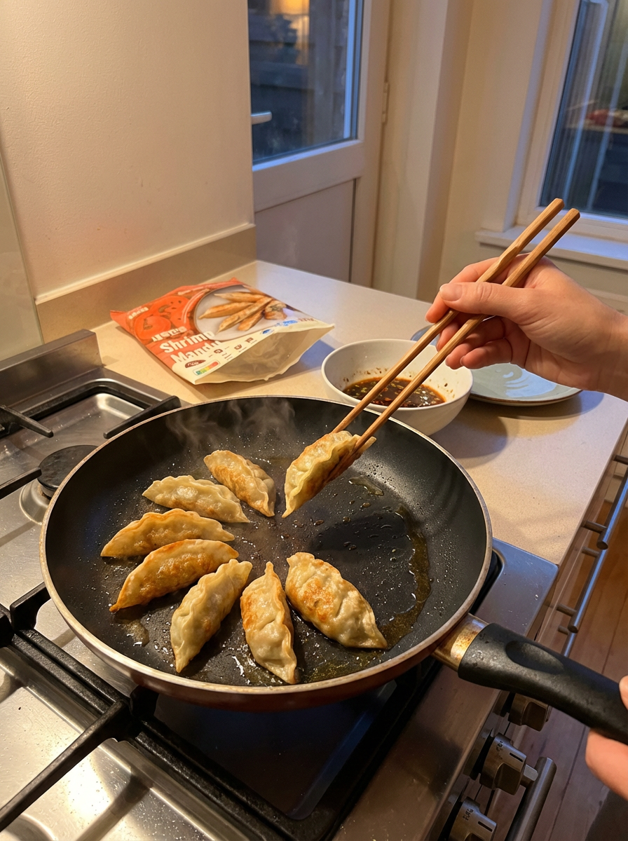
Midjourney was used for selected sizzling food visuals and replacement plated-dumpling imagery for the chicken and shrimp varieties.
-
![]()
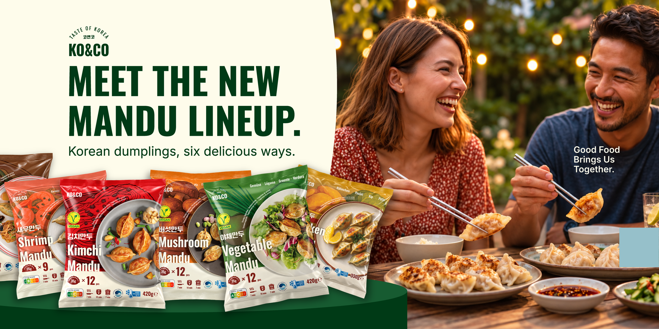
Campaign Key Visual
-
![]()
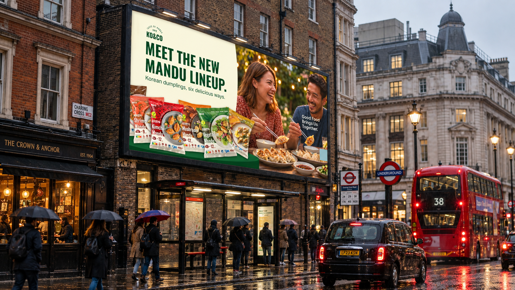
London Billboard — Concept Mockup
-
![]()
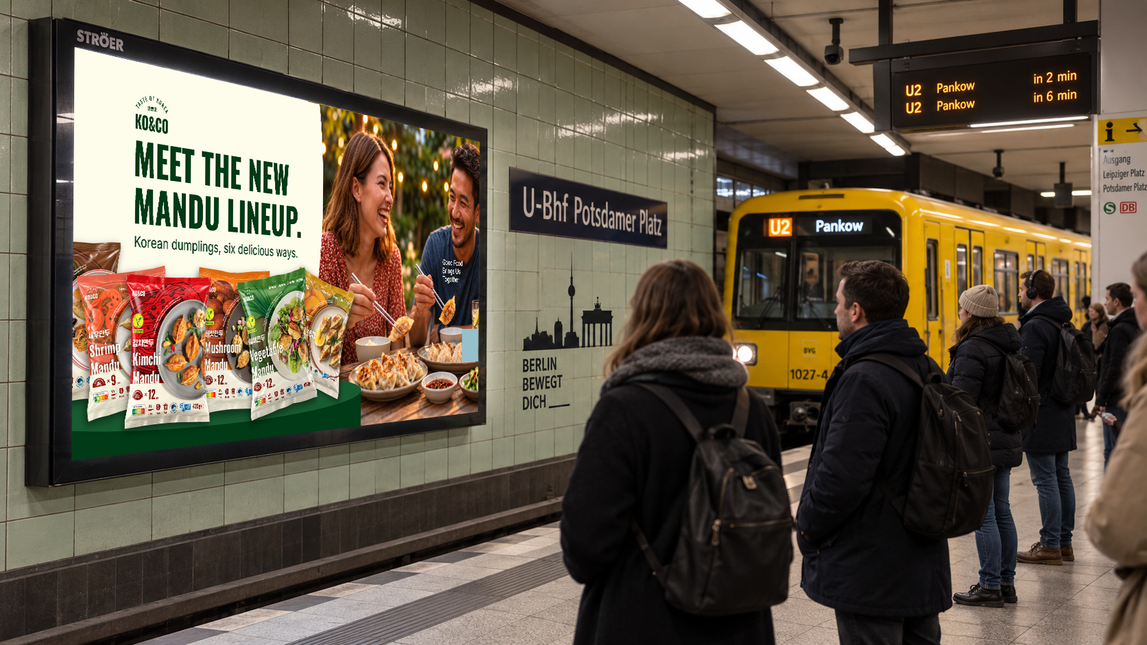
Berlin Billboard — Concept Mockup
-
![]()
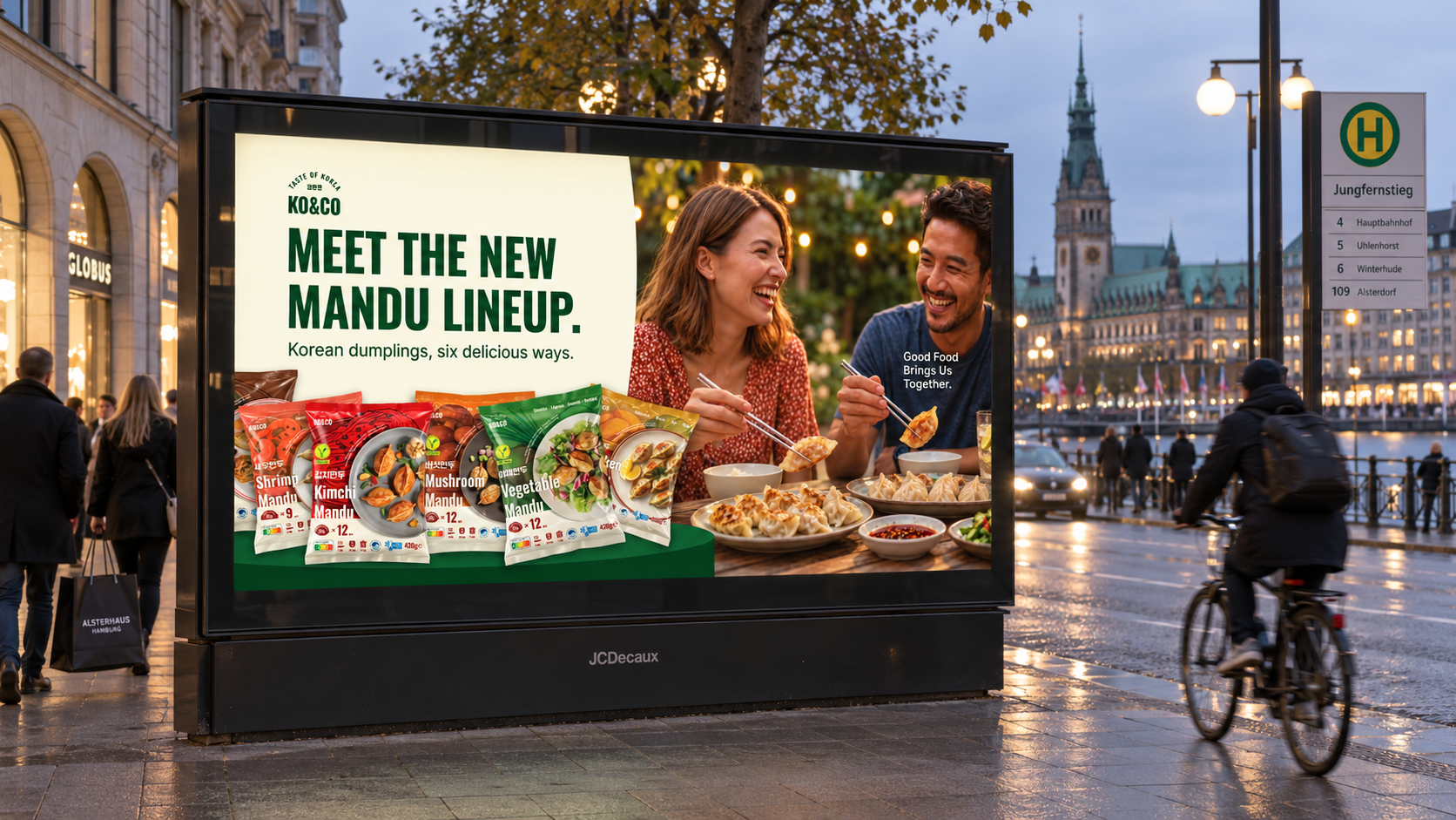
Hamburg Billboard — Concept Mockup
-
![]()
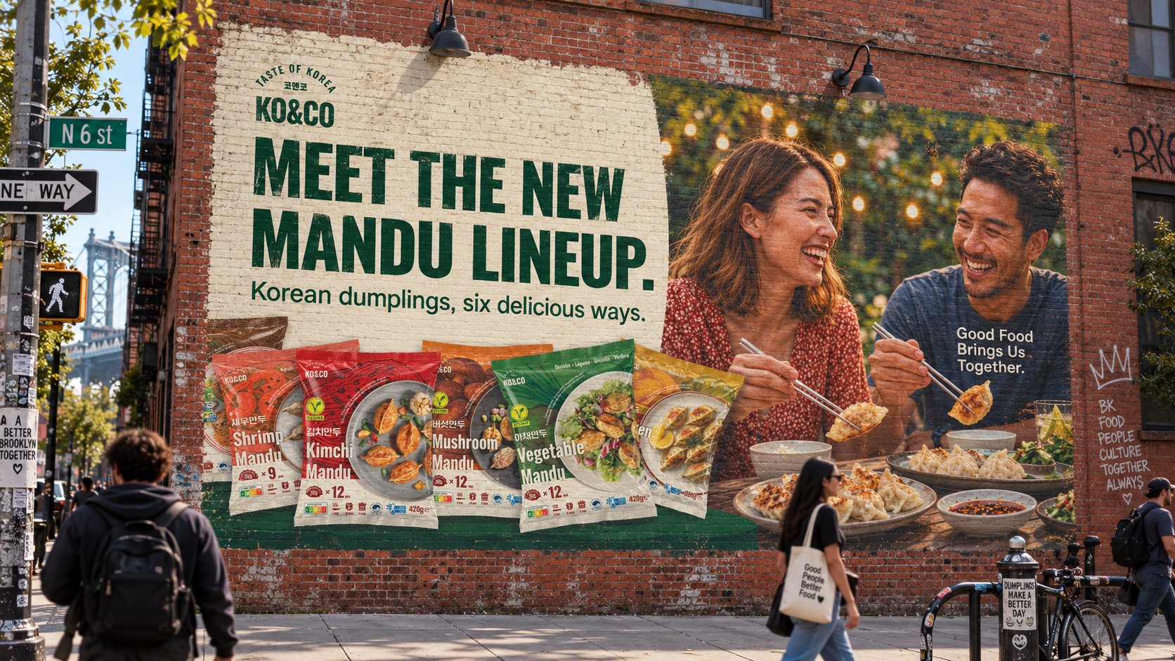
Brooklyn OOH — Concept Mockup
USED TOOLS
Adobe Illustrator
•
Adobe Photoshop
•
Adobe Firefly
•
Midjourney
•
ChatGPT
•
Gemini (Nano Banana 2)
•
Adobe Illustrator • Adobe Photoshop • Adobe Firefly • Midjourney • ChatGPT • Gemini (Nano Banana 2) •