AMUZED.io
Social Media Design
A series of promotional graphics bringing AMUZED.io’s music gaming platform into a bold, consistent social media format.
Role: Working Student — Graphic Design
Location: Berlin, Germany
Scope: Social media graphics and visual variations
Design Tools: Adobe Illustrator · Adobe Photoshop
01 — Project Overview
During my time at AMUZED.io, a Berlin-based Web3 music manager game, I designed social media promotional graphics.
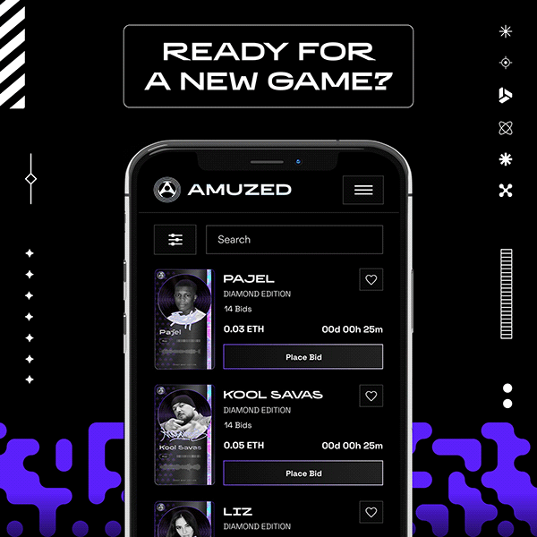
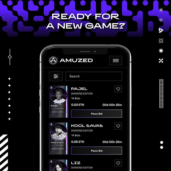
The work built on the brand’s existing identity and app interface. I focused on combining these elements into compositions that introduced the platform and invited viewers to explore the game.
02 — Objective & Audience
The objective was to create visually consistent promotional assets that connected music culture with the platform’s digital gaming identity.
The intended audience included music fans and consumers interested in Web3 experiences. The designs paired short, invitation-led headlines with app imagery to give viewers a first glimpse of the platform.
Design Priorities
Create a clear focal point
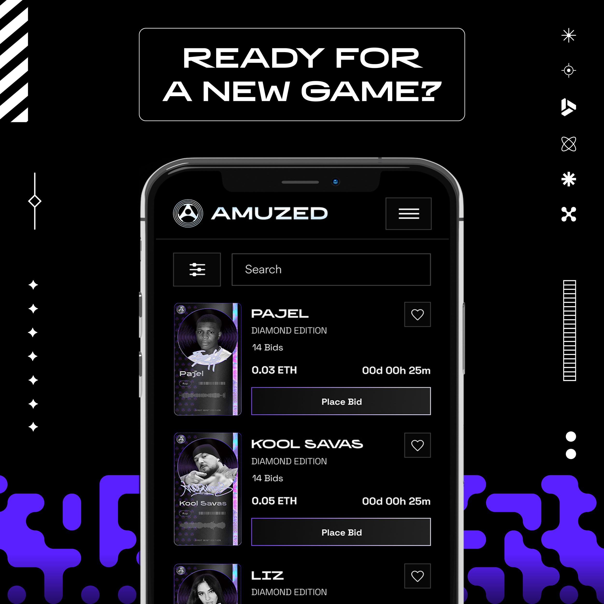
Use a prominent headline and phone mockup to establish a simple visual hierarchy.
Maintain brand recognition
Carry the existing violet palette and dark interface into a consistent series of social graphics.
Explore variation within the system
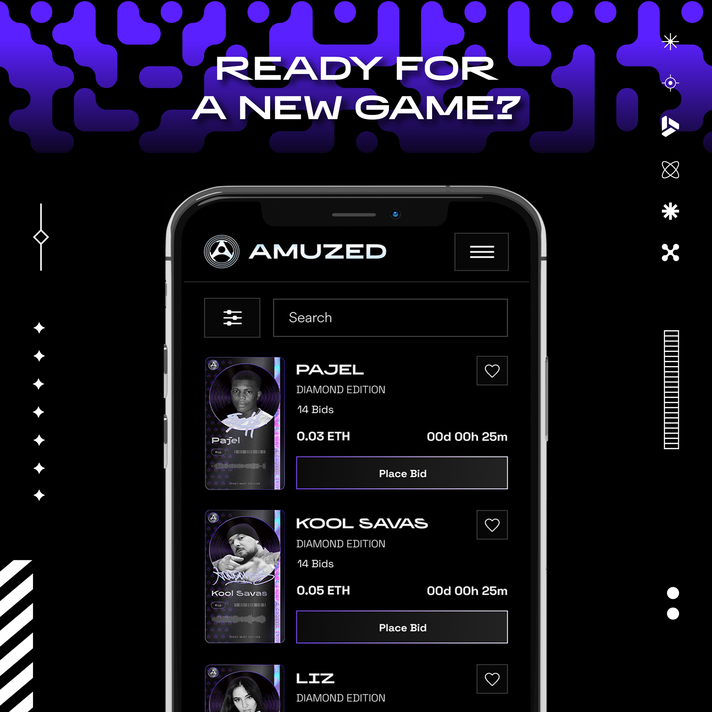
Vary backgrounds, framing, and graphic details while keeping the work recognizably connected.
03 — Visual Direction
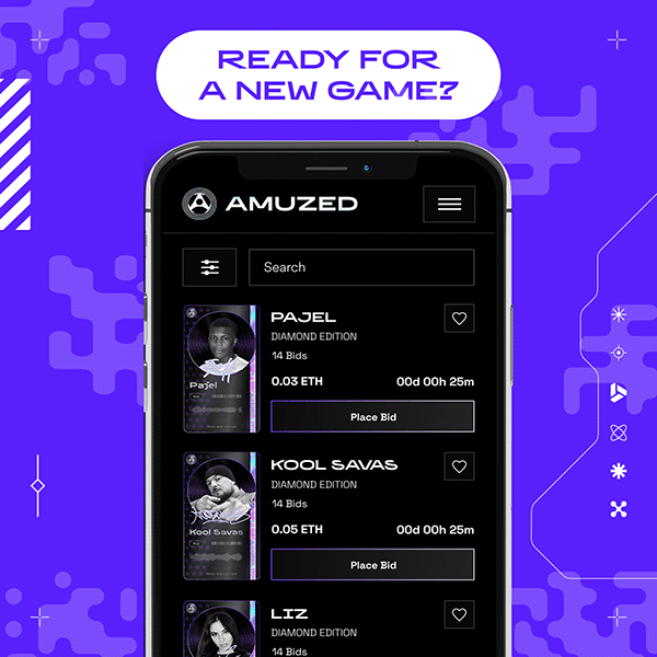
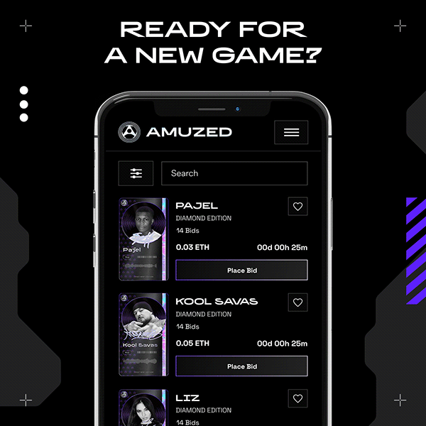
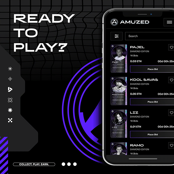
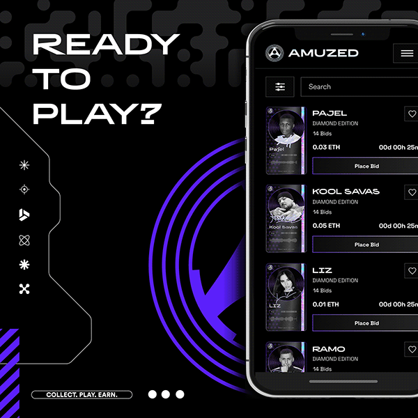
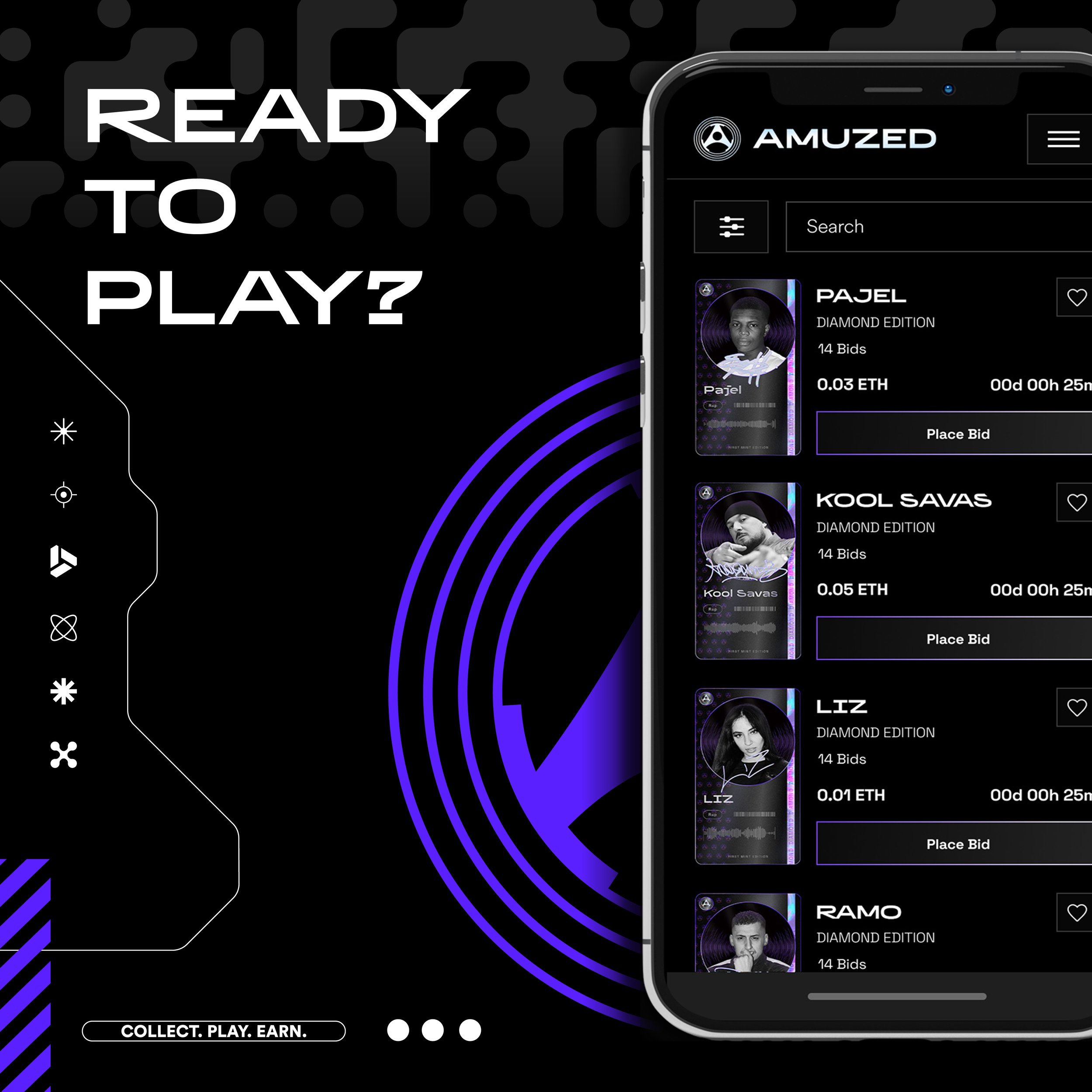
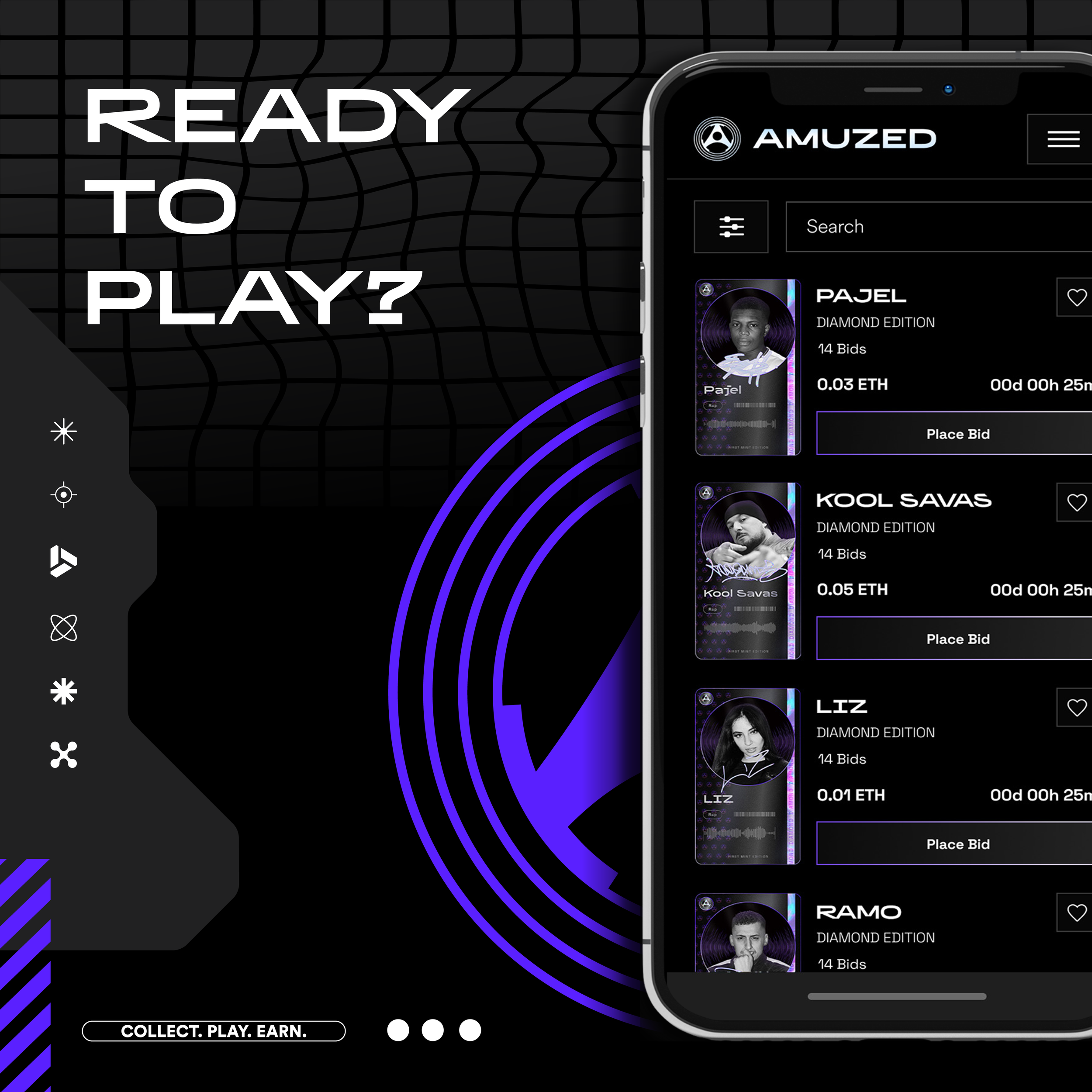
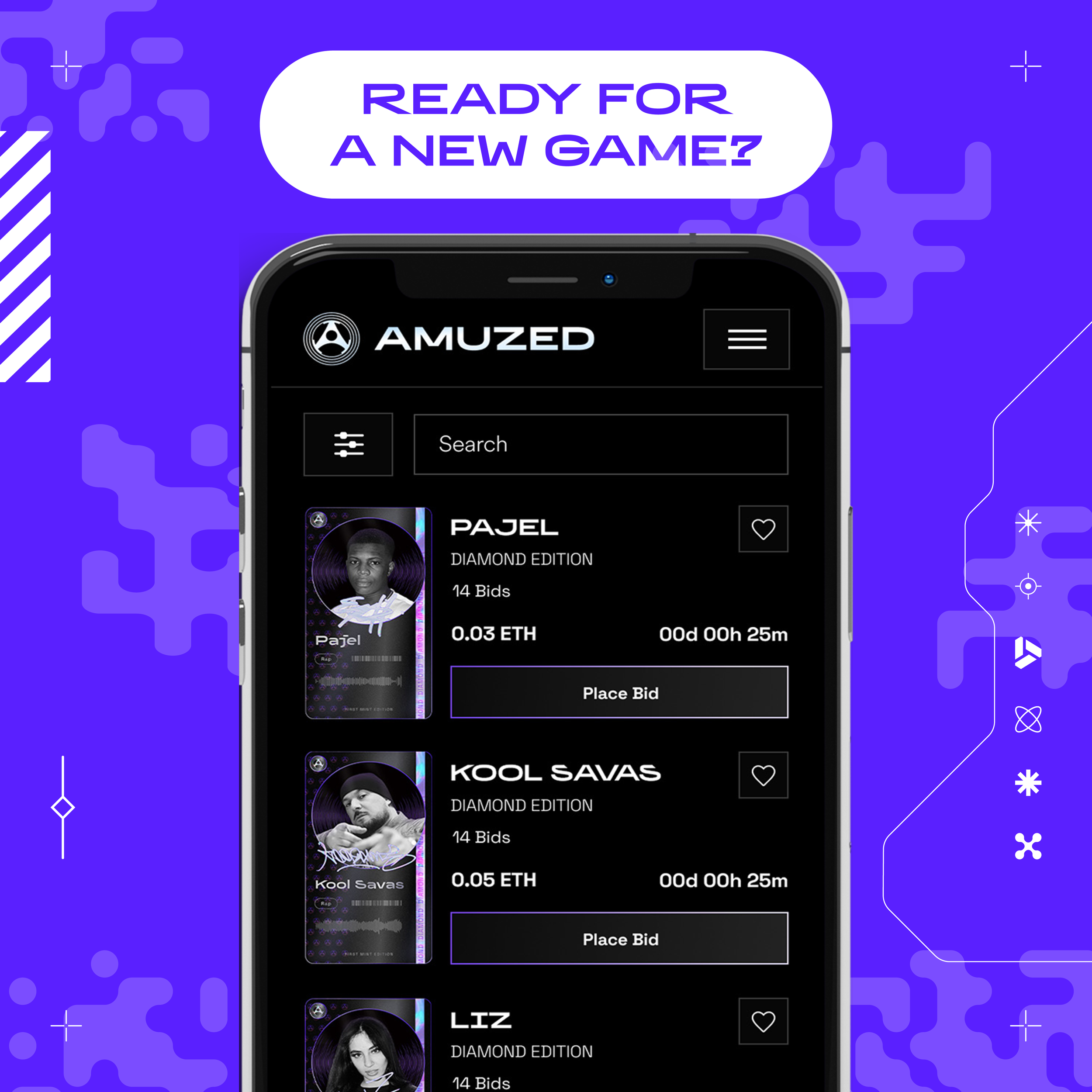
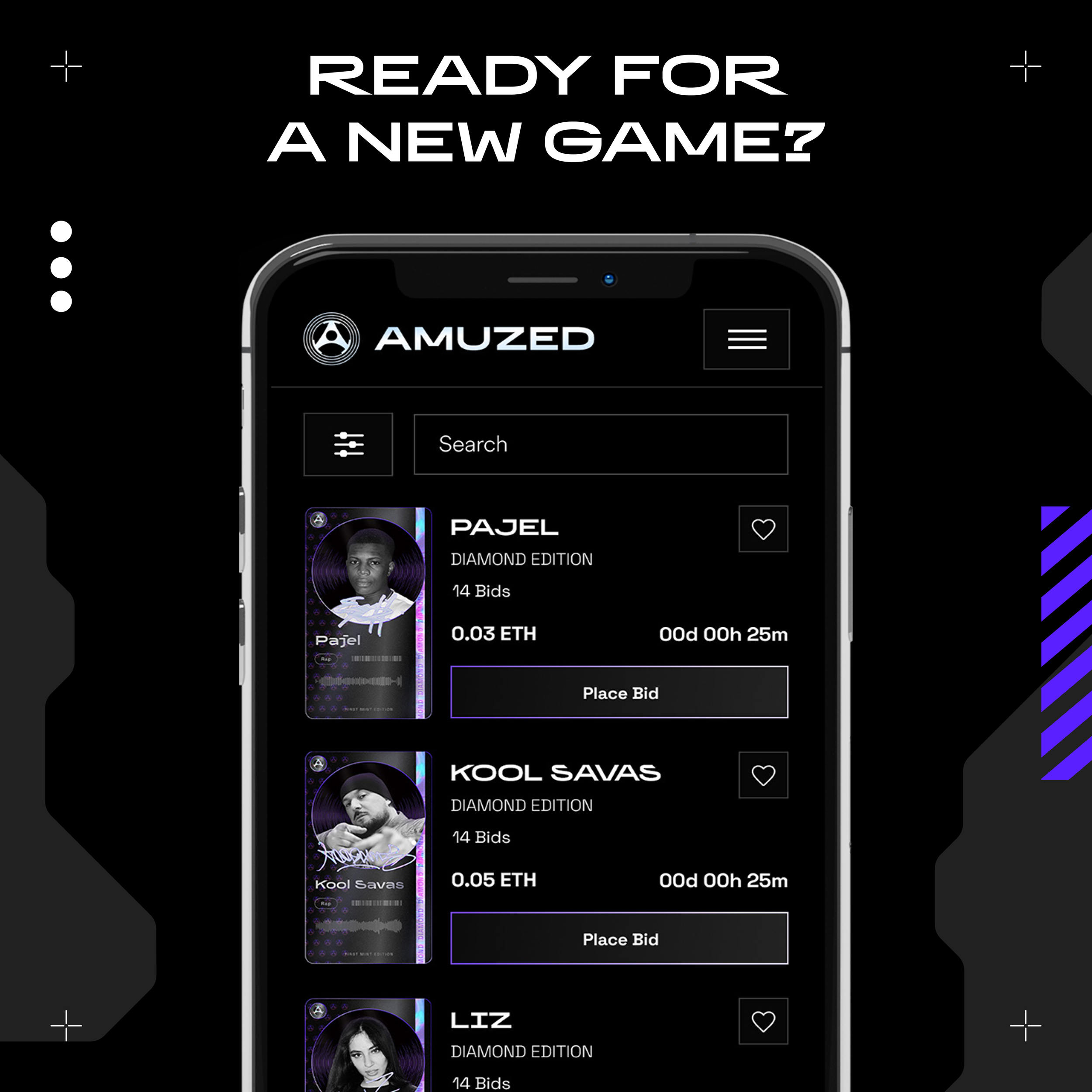
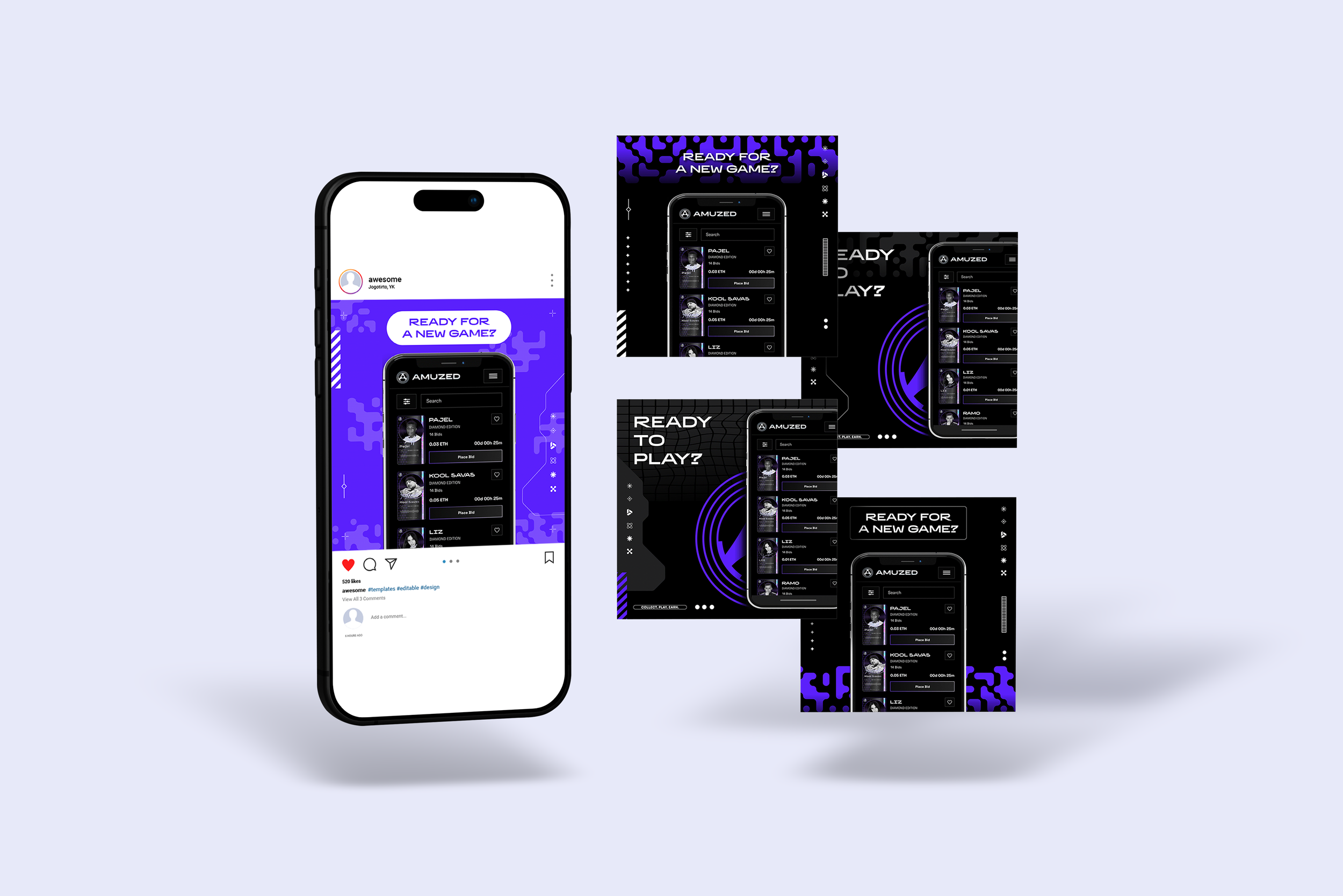
The compositions combine vivid violet, black backgrounds, and white headlines. This contrast establishes the campaign’s visual tone and connects the graphics to the app’s dark interface.
Geometric patterns, fine lines, and circular motifs frame the product imagery. Different arrangements explore how the same brand elements can create both restrained and more expressive compositions.
Headlines such as “Ready for a new game?” and “Ready to play?” introduce the platform through a direct invitation.

04 — Reflection
This project gave me experience extending an existing visual identity into a series of promotional assets.
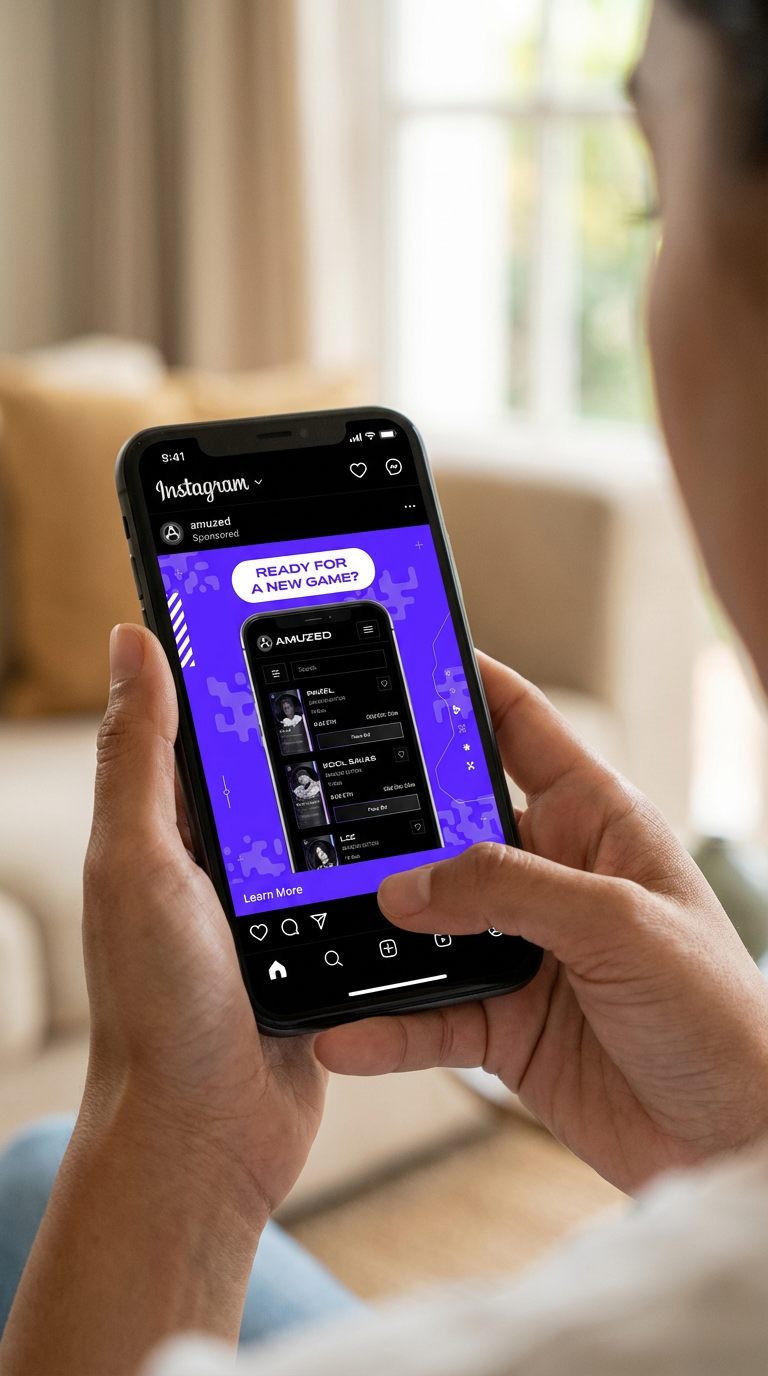
Working with a shared palette, interface, and set of graphic elements allowed me to explore variation while maintaining consistency. It also highlighted the importance of choosing what remains visible at the smaller scale of a social feed.
A further iteration would explore enlarged artist cards and more focused interface details, giving individual messages greater prominence on mobile screens.